npm install vue-editable-grid
Then import in you main file
import Vue from 'vue'

// Vue editable grid component and styles
import VueEditableGrid from 'vue-editable-grid'
import 'vue-editable-grid/dist/VueEditableGrid.css'

// register component in the Vue app
Vue.component('vue-editable-grid', VueEditableGrid)
Now you can use it
<vue-editable-grid
  class="my-grid-class"
  ref="grid"
  id="mygrid"
  :column-defs="columnDefs"
  :row-data="rows"
  row-data-key='shipmentId'
  @cell-updated="cellUpdated"
  @row-selected="rowSelected"
  @link-clicked="linkClicked"
>
  <template v-slot:header>
    Vue editable grid, by eledwinn
  </template>
  <template v-slot:header-r>
    Total rows: {{ rows.length }}
  </template>
</vue-editable-grid>
In your stylesheet:
.my-grid-class {
  height: 400px;
}
Column definition format:
const columnDefs = [
  { sortable: true, filter: true, field: 'eyeColor', headerName: 'Eye color', editable: true },
  { sortable: true, filter: true, field: 'name', headerName: 'Name', editable: true, maxlength: 30 },
  { sortable: true, filter: true, field: 'registered', headerName: 'registered', type: 'date', format: 'MMM dd, yyyy', editable: true, min: '2020-12-01' },
  { sortable: true, filter: true, field: 'age', headerName: 'Age', type: 'numeric', editable: true },
  { sortable: true, filter: true, field: 'balance', headerName: 'Balance', type: 'currency', editable: true },
  { sortable: true, filter: true, field: 'happiness', headerName: 'Happiness percent', type: 'percent', editable: true },
  { sortable: true, filter: true, field: 'isActive', headerName: 'Is active', type: 'boolean', editable: true },
  { sortable: true, filter: true, field: 'picture', headerName: 'Picture', type: 'link', editable: false }
]{
id: { type: String, required: true },
columnDefs: { type: Array, required: true },
rowData: { type: Array, required: true },
rowDataKey: { type: String, required: true },
enableFilters: { type: Boolean, default: true },
pageCount: { type: Number, default: 0 },
itemHeight: { type: Number, default: 30 },
virtualScrollOffset: { type: Number, default: 3 },
onlyBorder: { type: Boolean, default: true }
}Allow to identify the grid for saving some values in local storage
Define the column definition
Define the grid content data
Define the key UNIQUE value in rowData. This field is used in v-for directive.
Enable or disable filters row
Default value: true
Define how many elements per page are showed. If pageCount is 0, grid pagination is disabled.
Default value: 0
Height of rows in pixels.
default value: 30
How many elements (rows) are rendered outside grid visible scroll.
default value: 3
Select and copy multiple cells in the grid
Use the onlyBorder prop to select the style of the selections:
true(default) just the outlinefalseselect all borders
If column can be sort
Default: false
If column can be filtered
Default: false
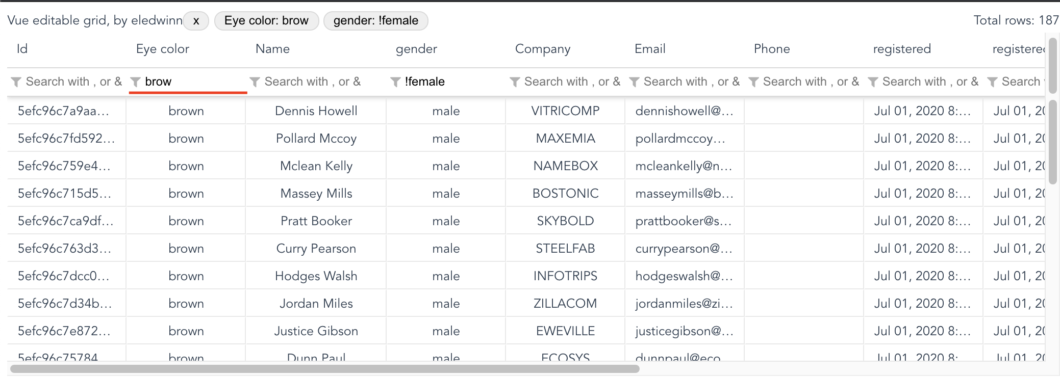
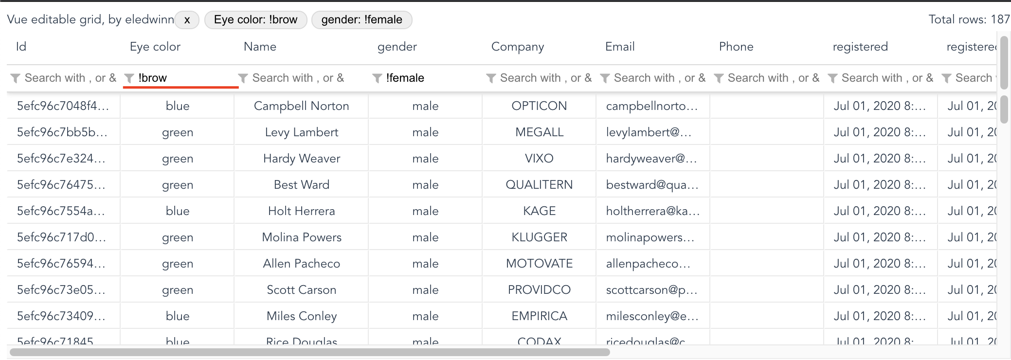
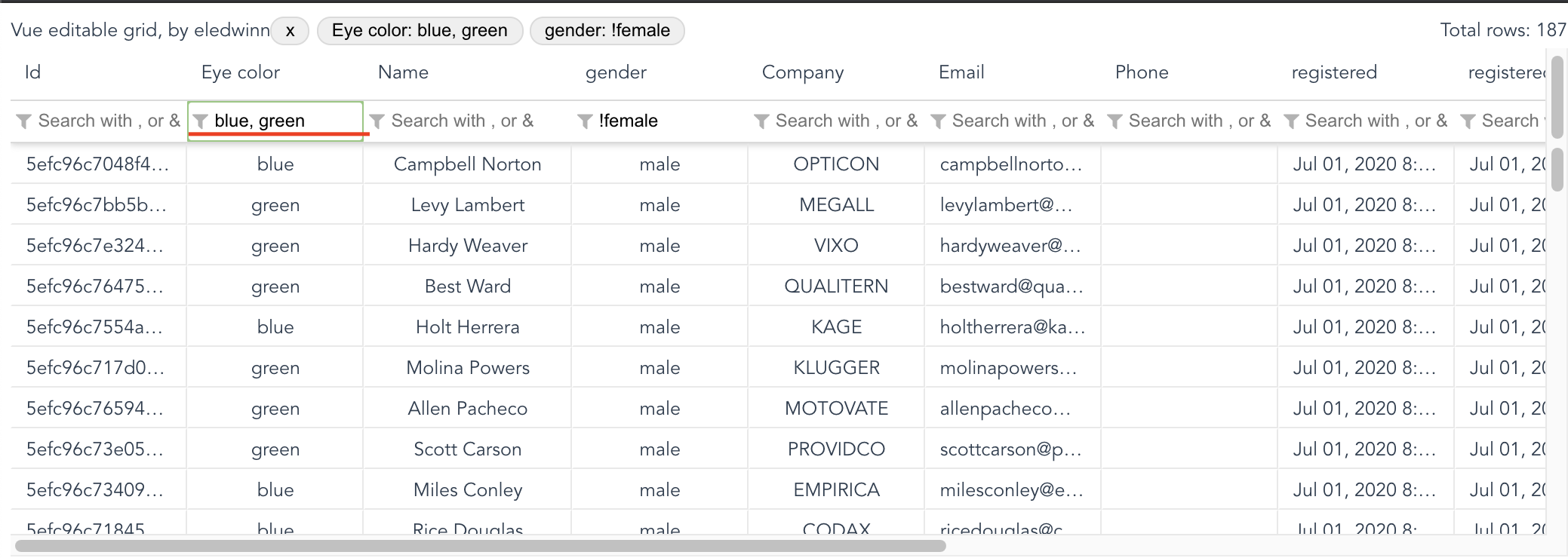
filter usage
- Normal filter : Type the value to filter
- Negative filter : use ! to filter the data that does not match
- Or filter : Filter data that match with some of the values
- And filter : Filter data that match with all values
Key name for column in row-data items
Name for column header
Data type, possible vales: datetime, date, text, numeric, currency, boolean, percent, select
Default: text
Data column format, only apply for date and datetime column types.
Refer to date-fns format table for more details.
Data column selectOptions, only apply for select column type.
Data column selectOptions, will accepts an array of objects with value and text keys
const selectOptions = [
  { value: '', text: 'Select' },
  { value: 'green', text: 'green' },
  { value: 'blue', text: 'blue' },
  { value: 'brown', text: 'brown' }
]
const columnDefs = [
  { sortable: true, filter: true, field: 'eyeColor', headerName: 'Eye color', editable: true, type: 'select', selectOptions: selectOptions },
]Function that allow format the display value.
Event object will be received in function as parameter with the following values:
value: any: Raw valuerow: Object: Row object, referenced from array setted inrow-dataproperty.column: Object: Column object, referenced from array setted incolumn-defsproperty.fromInput (boolean): Indicates if the value comes from an editable inputreverse (boolean): Indicates the direction in which to convert.
const numericFormatter = event => {
  if (event.reverse) {
    // Convert from display to raw
    return event.value && Number(event.value.replace(' years'))
  }
  // Convert from raw to display
  return `${event.value} years`
}Allow to edit column values.
Default: false
The latest date to accept. This value is passed as attribute to input. You can use this in date, datetime and numeric inputs.
The earliest date to accept. This value is passed as attribute to input. You can use this in date, datetime and numeric inputs.
The step attribute is a number that specifies the granularity that the value must adhere to. This value is passed as attribute to input. You can use this in date, datetime and numeric inputs.
The maxlength attribute specifies the maximum number of characters allowed in the element. This value is passed as attribute to input. You can use this in text inputs.
CSS Class name to attach in tableHead (th).
Emited when cell value is changed.
$event object: { value, row, column, rowIndex, columnIndex, $event, preventDefault, markAsPending, confirm, markAsFailed, markAsSuccess }
- value: New cell value
- row: Row object, referenced from array setted in
row-dataproperty - column: Column object, referenced from array setted in
column-defsproperty - rowIndex: The row index
- columnIndex: The column index
- $event: Original event reference
- preventDefault: Function that allow prevent cell update
- markAsPending: Function that allow mark as pending editing (loading status) while define if edit can be executed. Use this funcion if you need to use async processes (like server requests) in cellUpdate event handling.
- confirm: Function that allow confirm cell editing. Is only required if you was called markAsPending.
- markAsFailed: Function that allow mark cell when error has occurred. You can pass string parameter with error message.
$event.markAsFailed('Invalid format') - markAsSuccess: Function that allow mark cell when error has fixed.
Emited when row selection is changed.
$event object: { rowData, colData, rowIndex, colIndex }
- rowData: Row object, referenced from array setted in
row-dataproperty. - colData: Column object, referenced from array setted in
column-defsproperty. - rowIndex: The row index
- colIndex: The column index
Emited when multiple rows or columns are selected or this selection changes.
$event object: { rows, columns, rowIndexStart, colIndexStart, rowIndexEnd, colIndexEnd }
- rows: Rows array, referenced from array setted in
row-dataproperty. - columns: Columns array, referenced from array setted in
column-defsproperty. - rowIndexStart: The row start index
- colIndexStart: The column start index
- rowIndexEnd: The row end index
- colIndexEnd: The column end index
Emited when link cell is clicked.
$event object: { rowData, colData, rowIndex, colIndex }
- rowData: Row object, referenced from array setted in
row-dataproperty. - colData: Column object, referenced from array setted in
column-defsproperty. - rowIndex: The row index
- colIndex: The column index
Emmited when contextmenu is open
$event object: { rowData, colData, rowIndex, colIndex }
- row: Row object, referenced from array setted in
row-dataproperty. - column: Column object, referenced from array setted in
column-defsproperty. - rowIndex: The row index
- colIndex: The column index
- $event: contextmenu event
You can access to VueEditableGrid instance using ref property.
<vue-editable-grid
  ref="grid"
  ...
></vue-editable-grid>
In your component script
export default {
  mounted () {
    const data = this.$refs.grid.getFormattedRows()
  },
  ...
}Allow to get a complete row data passed in row-data property but with all format applied. This is very useful for example when you want to export the data.
Allow to copy to clipboard the selected content grid content. Use withHeaders(true) to copy with headers.
Note: Use Cmd + Shift + C or Ctrl + Shift + C to copy with headers.
Use slot header and header-r to implement own features.
Use only inline/inline-block elements into header for better UX.
You can format cells and rows using the row-data prop.
Attach $cellStyle or $cellStyle objects in each item of row-data to format it.
// apply format to all row
$rowStyle = { backgroundColor: 'black', color: '#fff' }

// apply format to field1 and field2 cells in specific row
$cellStyle = {
  field1: { backgroundColor: 'black', color: '#fff' },
  field2: { color: 'rgb(0, 0, 0)' }
}npm install
npm run serve
npm run build
npm run lint


