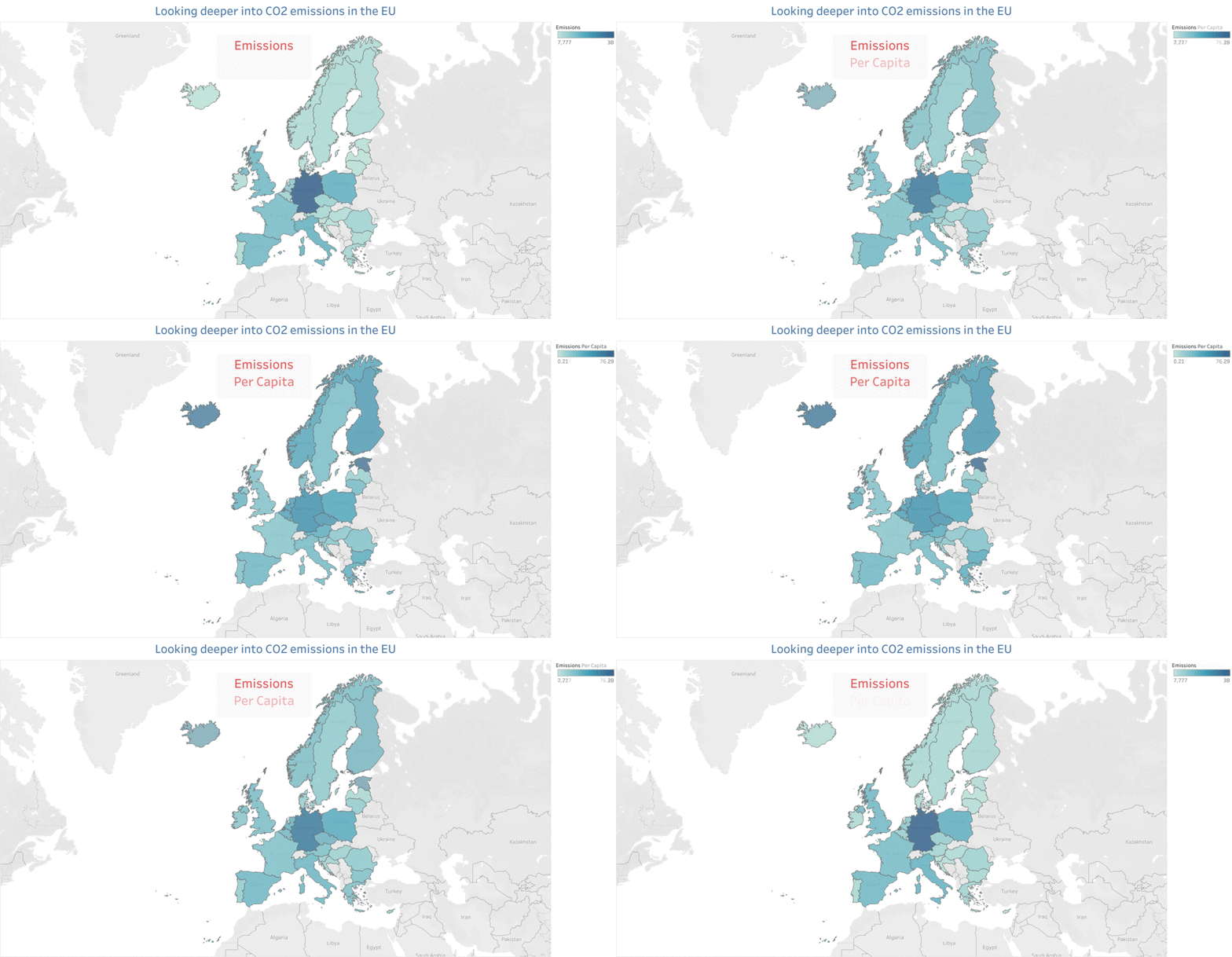
This is a visualization I made for my Data Visualization class as part of my Masters of Data Science at the University of San Francisco. This vizualization was made with Tableau and created into a gif. The data was cleaned and joined using Python in Jupyter Notebook. You can see the code here.
When we just look at the total CO2 emissions, we see that Germany is the largest offender as it shines the deepest blue. After normalizing per capita, however, we see that Germany is not that bad, and is actually even comparable to its Nordic neighbors.
Further, this plot reveals interesting details, such as the fact that Estonia is emitting the most per capita, and its immediate neighbor Latvia is emitting the least per capita. We can attribute Estonia's high per capita CO2 emissions to its shale oil industries.
To improve the plot, I would like to further dive into the different industries present in those countries, and also to normalize for GDP, so we know how much CO2 is emitted per Euro or relevant currency spent.
For EU CO2 emissions: the European Union Emissions (EU ETS) data from EUTL, available here.
For population: population data is from the Worldbank and is available here.
