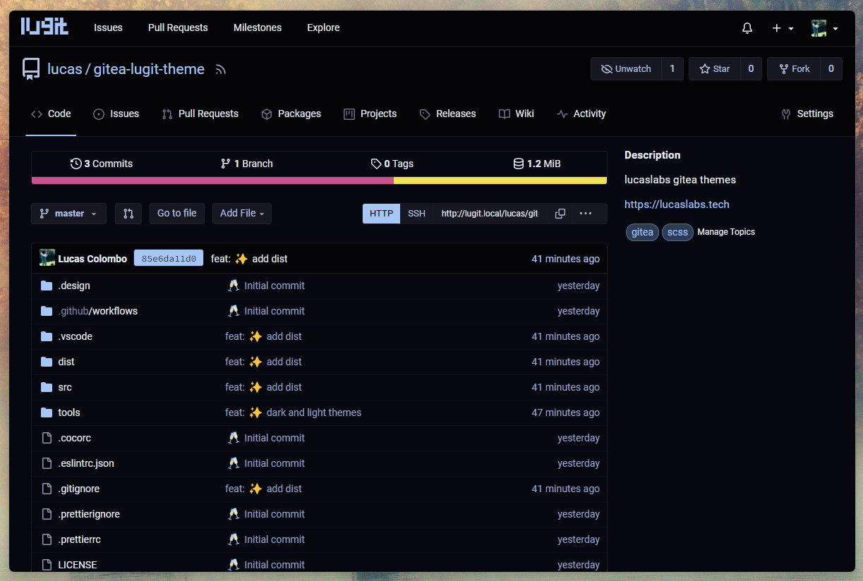
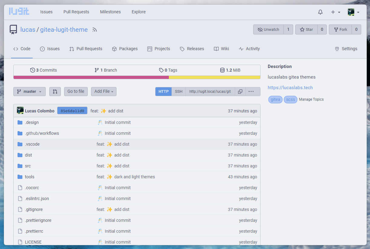
lucaslabs › Gitea theme
Theme for lucaslabs internal gitea server.
Switches between dark and light automatically based on the user's system preference.
- Go to the releases page and get the latest
gitea-lugit-theme.tar.gzrelease file. - Place the
templatesandpublicfolder in your$GITEA_CUSTOMdirectory. - Append the themes in your
app.inifile:
[ui]
THEMES=...,dark,light,auto
DEFAULT_THEME=dark # optional
💡 You can change the names of the themes by changing the name of the theme files in
public/css/theme-{name}.cssand in theapp.inifile, accordingly.
- Restart
gitea.
Note
The latest version works with gitea version v1.22.x.
catppuccin/gitea, these themes are based on them.
$ npm install
$ npm run build$ npm run serve -- --server path/to/gitea/custom
# e.g.
# on linux
$ npm run serve -- --server ~/gitea/custom
# on windows
$ npm run serve -- -- --server c:/gitea/customHere we remove everything (default gitea welcome page). We only keep the logo and the header with the login button.
The only change here is to make the logo smaller.
- <img height="30" width="30" src="{{AssetUrlPrefix}}/img/logo.svg" alt="{{ctx.Locale.Tr "logo"}}" aria-hidden="true">
+ <img height="24" src="{{AssetUrlPrefix}}/img/logo.svg" alt="{{ctx.Locale.Tr "logo"}}" aria-hidden="true">- adds
<div class="lugit-repo-header-data">...</div>as a wrapper for the repo header data (description + labels) - adds
<div class="lugit-repo-content">as a wrapper for the repo content (files, commits, branches, etc.)
Later we use css to go from default 1 column layout to 2 column layout more similar to github's design.
- <div class="ui container {{if .IsBlame}}fluid padded{{end}}>
+ <div class="ui container {{if .IsBlame}}fluid padded{{end}} {{if and (not .IIsViewFile) (not .IsBlame)}}lugit-repo-list-view{{end}}">
Adds the class lugit-repo-list-view to the container of the repo content (only when we are not viewing a file or in blame view). This allows us to change the layout of the main repo view, except when viewing a file or in blame view.

