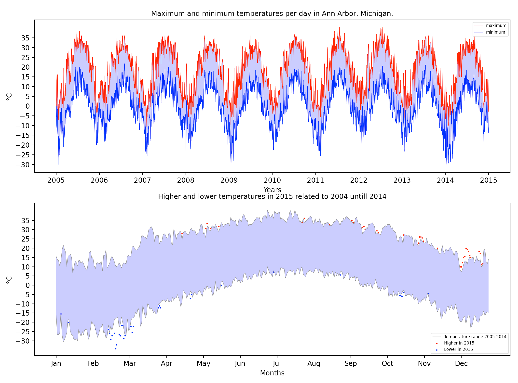
An NOAA dataset has been stored in the file fb441e62df2d58994928907a91895ec62c2c42e6cd075c2700843b89.csv.
This is a dataset from The National Centers for
Environmental Information (NCEI)
Daily Global Historical Climatology Network (GHCN-Daily).
- id : station identification code
- date : date in YYYY-MM-DD format (e.g. 2012-01-24 = January 24, 2012)
- element : indicator of element type
- TMAX : Maximum temperature (tenths of degrees C)
- TMIN : Minimum temperature (tenths of degrees C)
- value : data value for element (tenths of degrees C)
This is a Data Visualization exercise from the course "Applied Plotting, Charting & Data Representation in Python". One should analyze the temperature throughout the years in Ann Arbor, Michigan.
- Read the documentation and familiarize yourself with the dataset, then write some python code which returns a line graph of the record high and record low temperatures by day of the year over the period 2005-2014. The area between the record high and record low temperatures for each day should be shaded.
- Overlay a scatter of the 2015 data for any points (highs and lows) for which the ten year record (2005-2014) record high or record low was broken in 2015.
- Watch out for leap days (i.e. February 29th), it is reasonable to remove these points from the dataset for the purpose of this visualization.
- Make the visual nice! Leverage principles from the first module in this course when developing your solution. Consider issues such as legends, labels, and chart junk.
