- base código tsx:
"use client";
import React from "react";
import { Container } from "./CardStyles";
const FlexBoxTutorial: React.FC<{}> =() => {
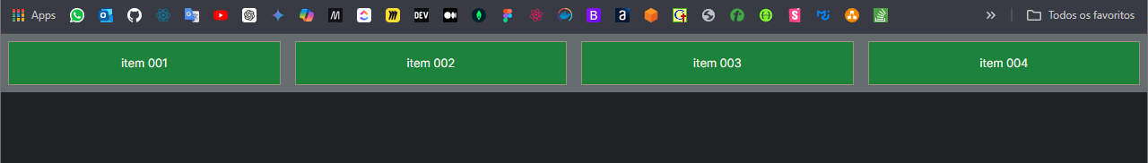
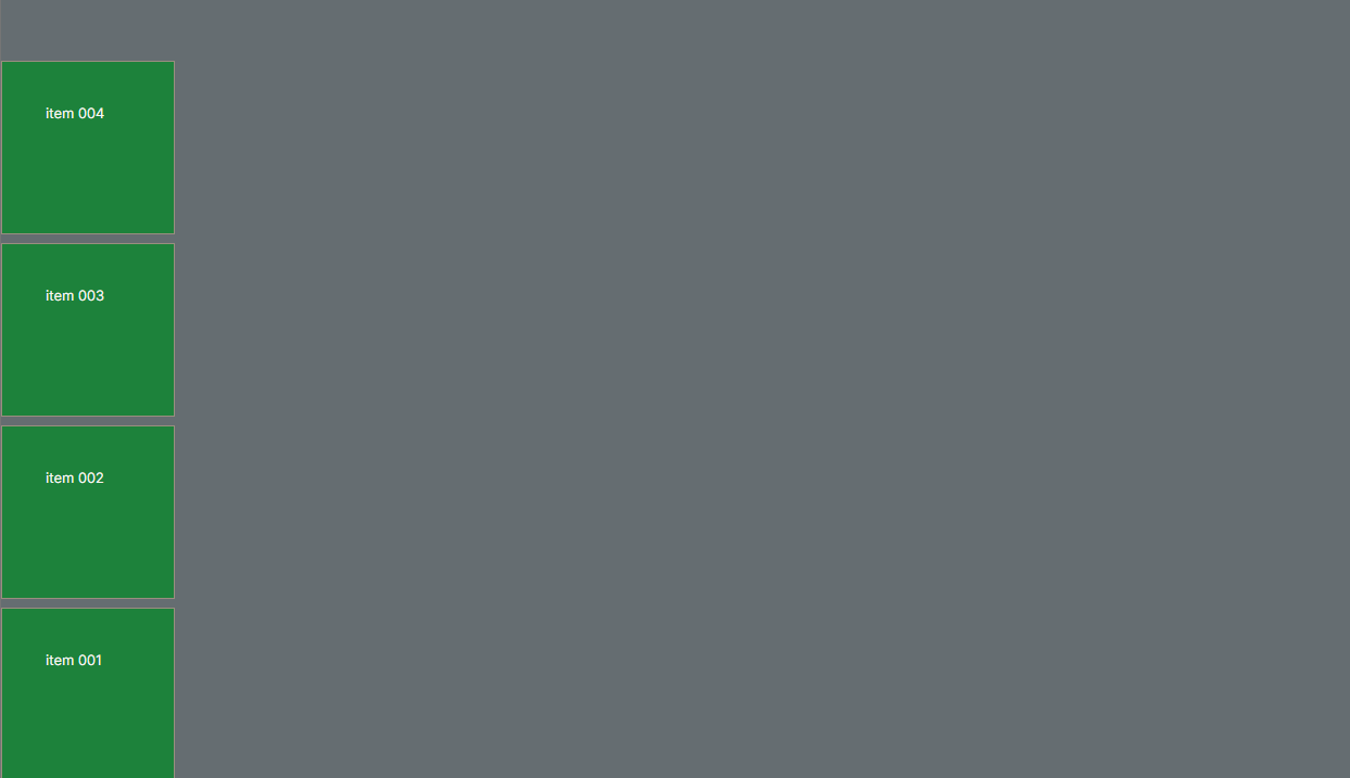
return (
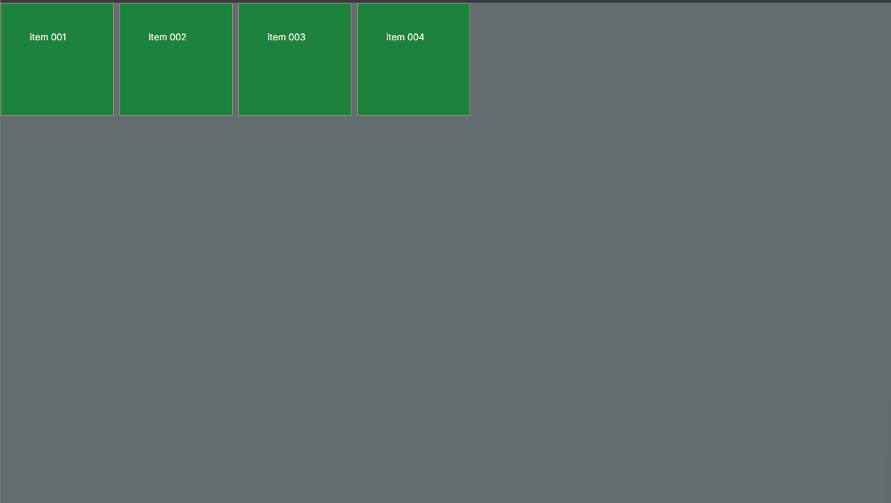
item 001
item 002
item 003
item 004
)
};
export default FlexBoxTutorial;
- Styled components:
"use client";
import styled from "styled-components";
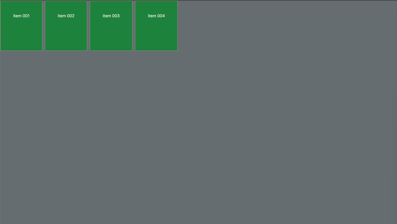
export const Container = styled.div`
display: flex;
background-color: #898989;
div {
flex: 1;
margin: 10px;
border: 1px solid black;
padding: 20px;
text-align: center;
background-color: #1b933f;
}
COMPONENTE PAI (PARENT COMPONENT)
$$$$$$$$$$$$$$$$$$$$$$$$$$$$$$$$$$$$$$$$$$$$
export const Container = styled.div`
display: flex;
gap: 10px;
background-color: #898989;
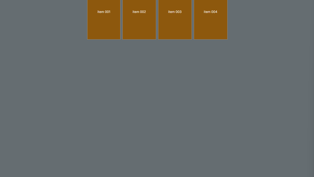
height: 900px;
flex-direction: column;
div {
display: flex;
border: 1px solid black;
padding: 50px;
text-align: center;
background-color: #1b933f;
width: 200px;
height: 200px;
}
`;
result: flex direction column
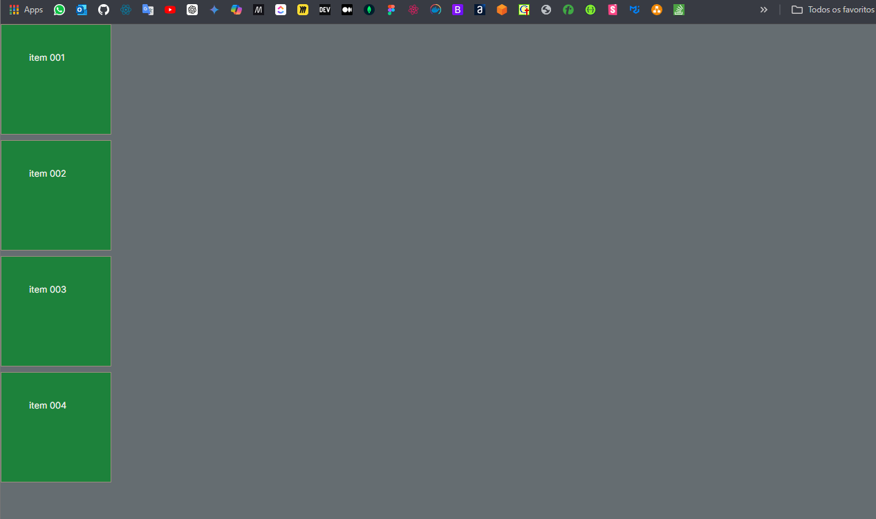
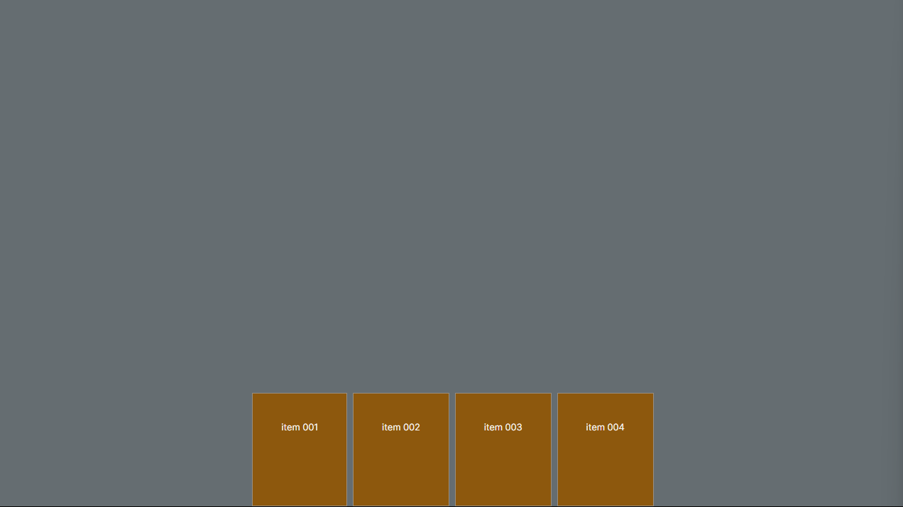
flex-direction: column-reverse;
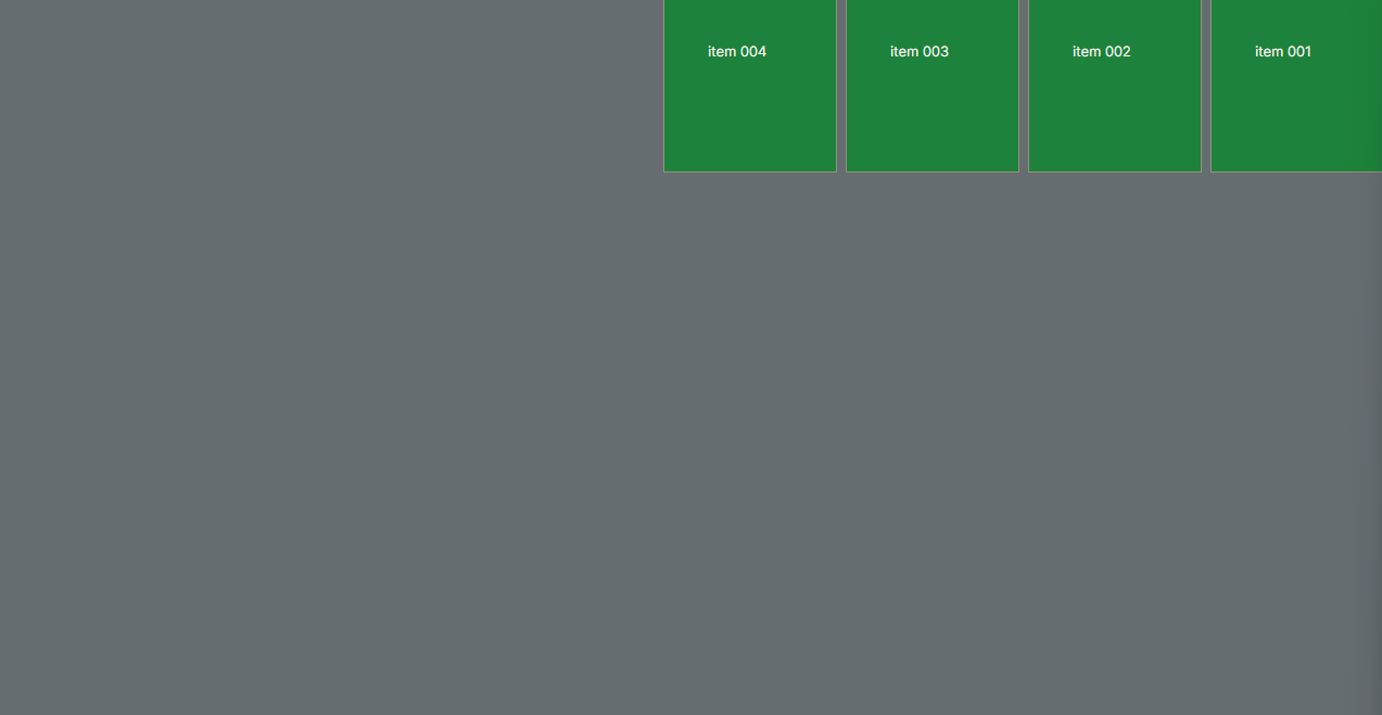
flex-direction: row-reverse;
$$$$$$$$$$$$$$$$$$$$$$$$$$$$$$$$$$$$$$$$$$$$
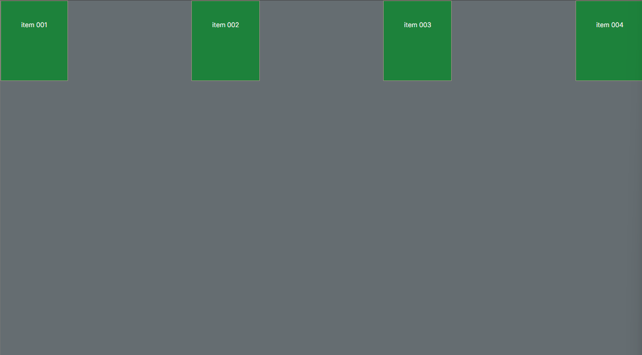
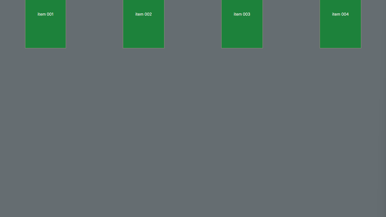
justify-content o justify-content: flex-start não tem mudanças é o padrão:
justify-content: flex-start;
justify-content: flex-end;
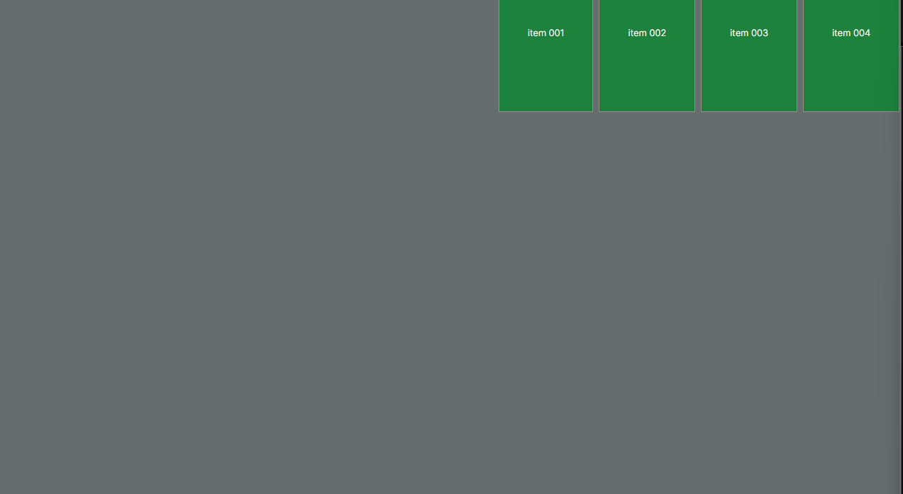
justify-content: space-between;
justify-content: space-around;
justify-content: space-evenly;
$$$$$$$$$$$$$$$$$$$$$$$$$$$$$$$$$$$$$$$$$$$$
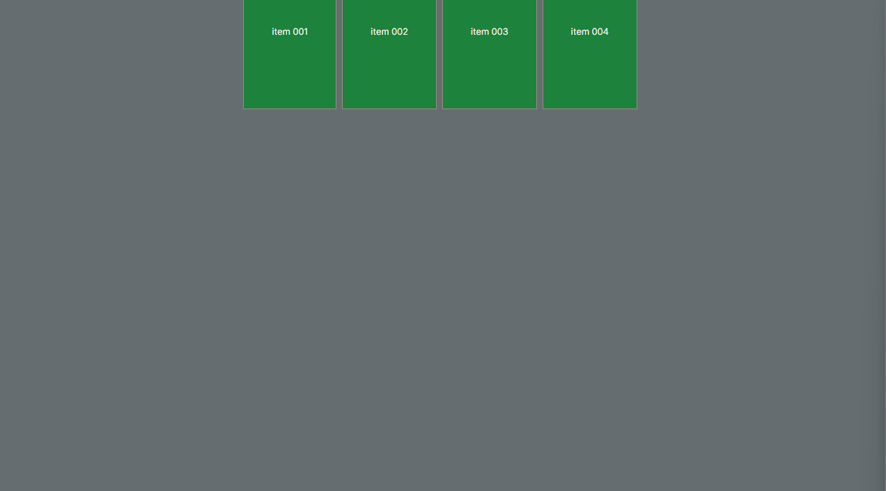
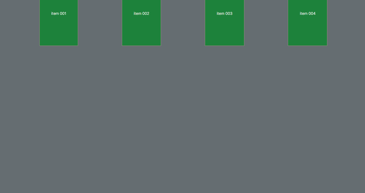
justify-content: center / align-items: center;
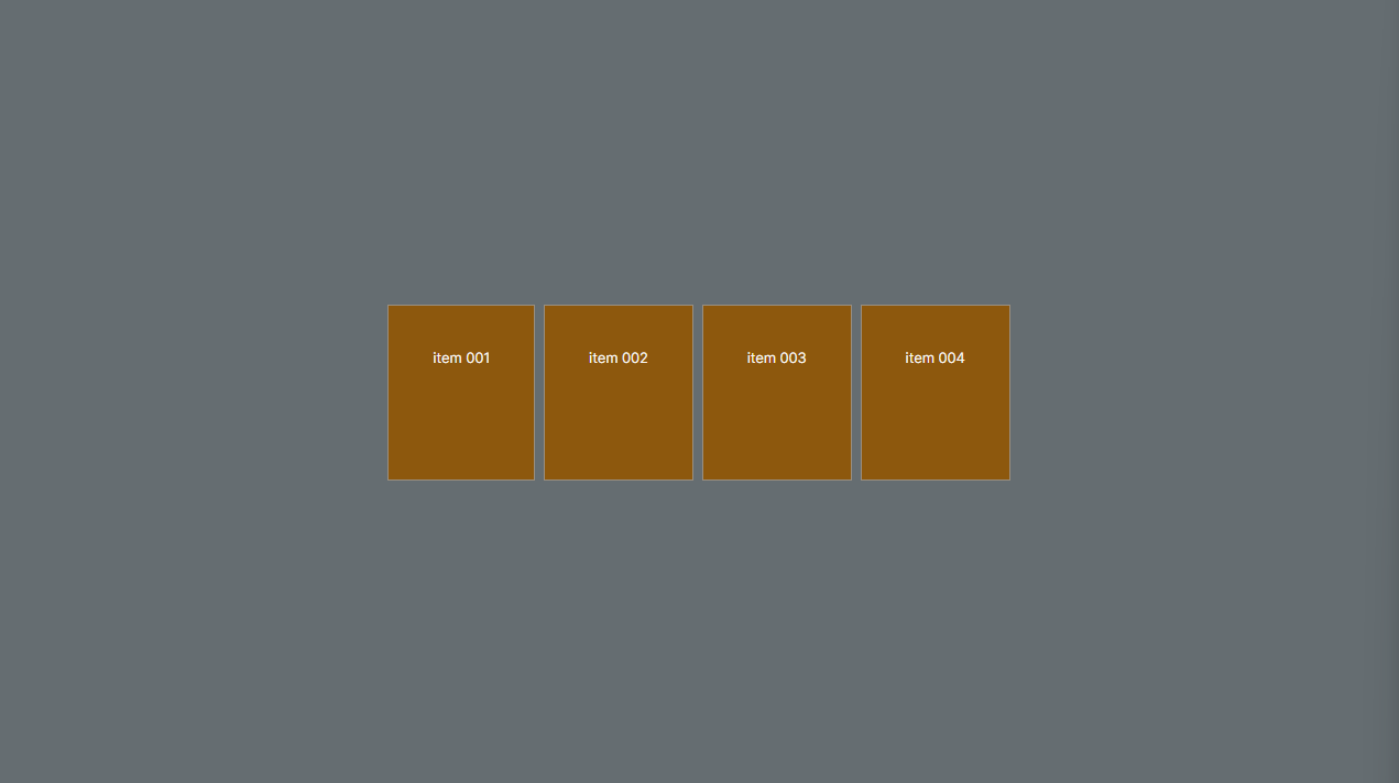
justify-content: center / align-items: start
justify-content: center / align-items: end
$$$$$$$$$$$$$$$$$$$$$$$$$$$$$$$$$$$$$$$$$$$$
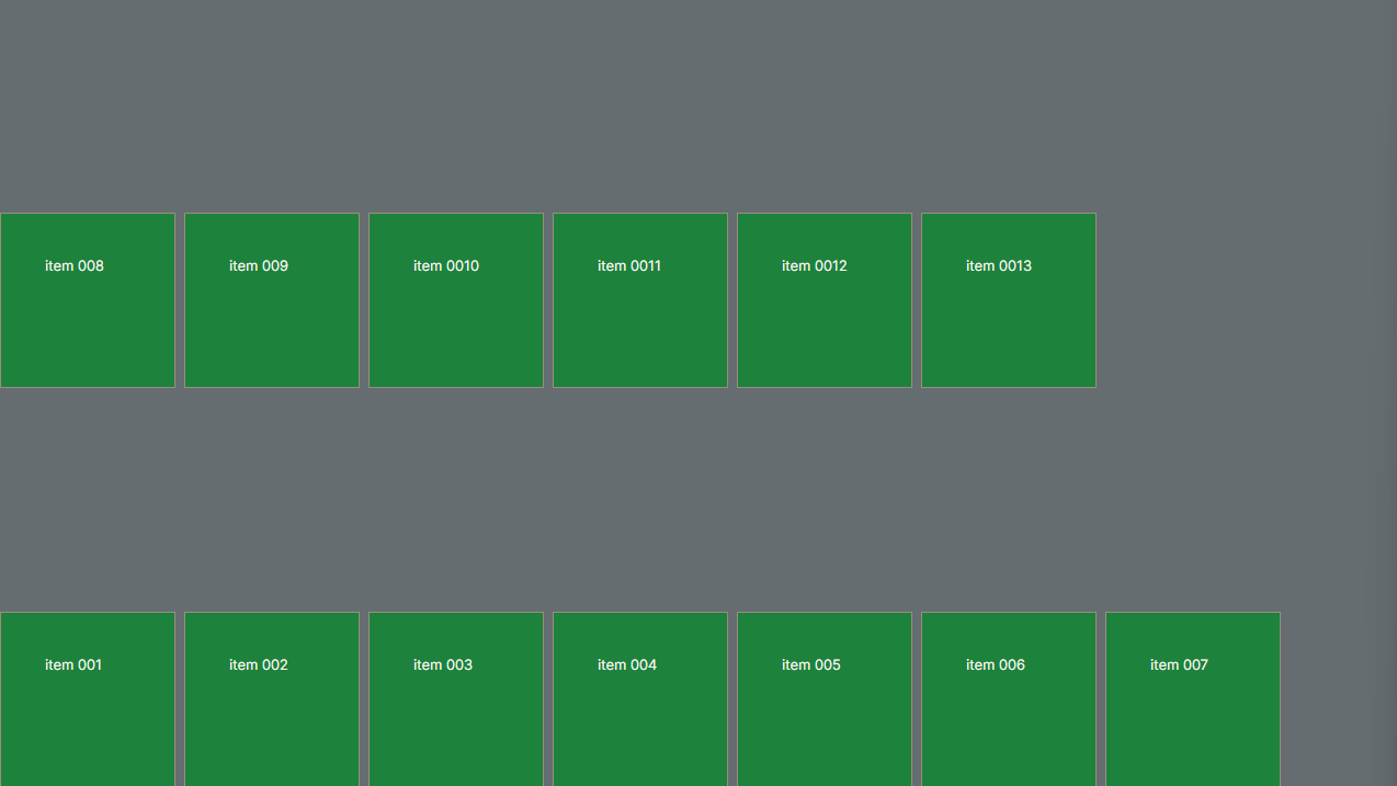
gap: 10px linha 40px coluna;
gap: 50px linha 10px coluna;
###################################################
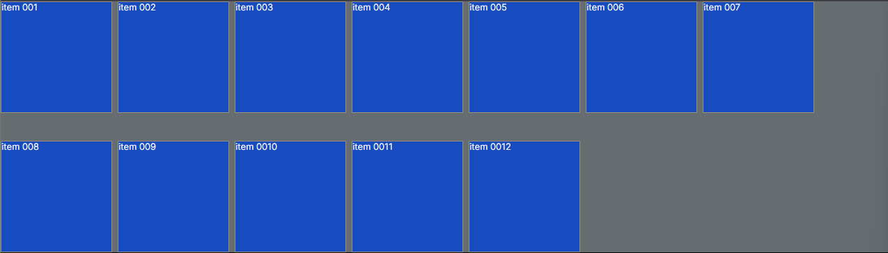
COMPONENTE FILHO (CHILDREN COMPONENT)
- quando estiliza somente o componente filho através de id por exemplo:
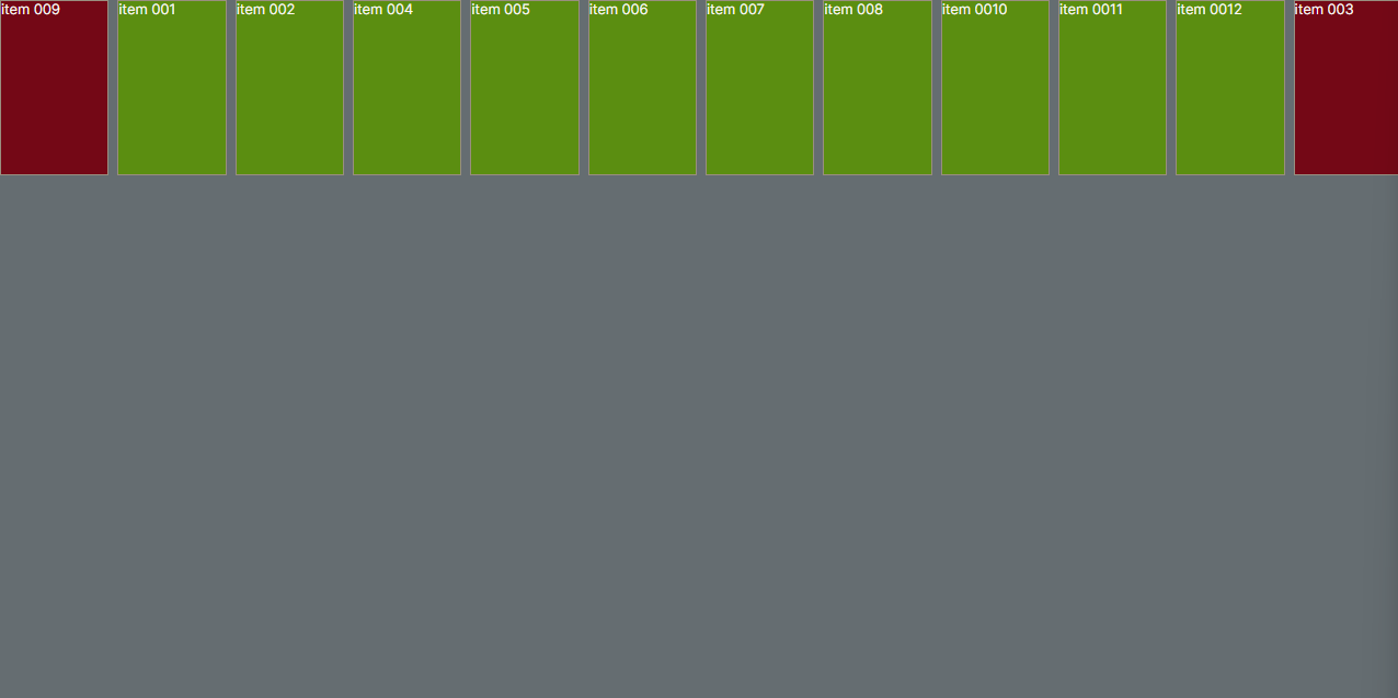
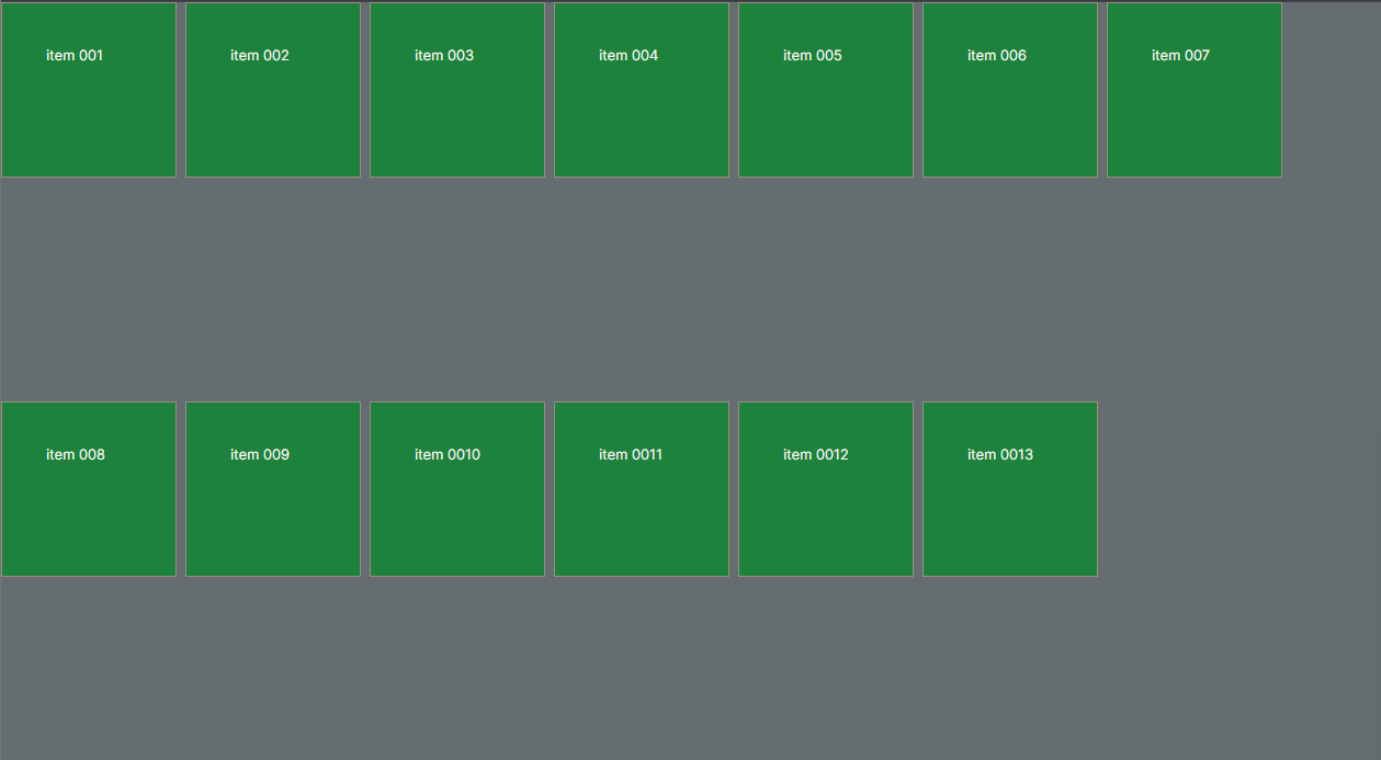
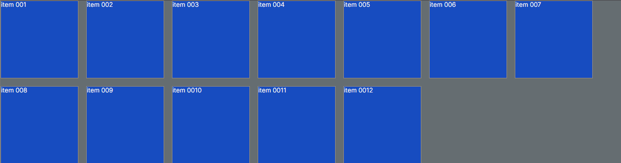
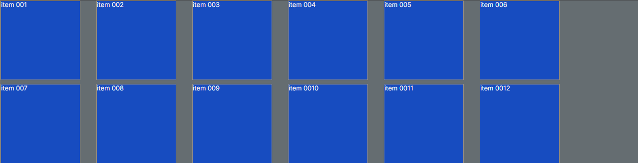
item 001
item 002
item 003
item 004
item 005
item 006
item 007
item 008
item 009
item 0010
item 0011
item 0012
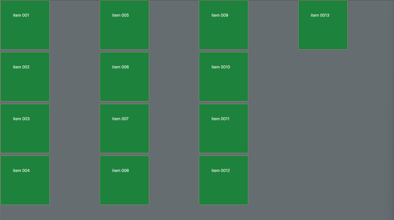
export const Container = styled.div`
display: flex;
gap: 10px;
background-color: #898989;
flex-wrap: wrap;
align-items: center;
div {
border: 1px solid black;
background-color: #7e22ce;
width: 200px;
height: 200px;
}
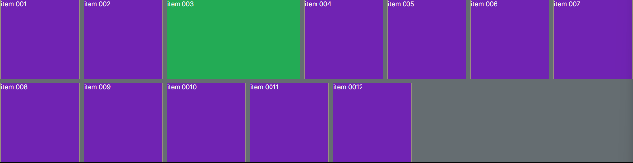
#id-1 {
flex-grow: 1;
background-color: #22c55e;
}
`;
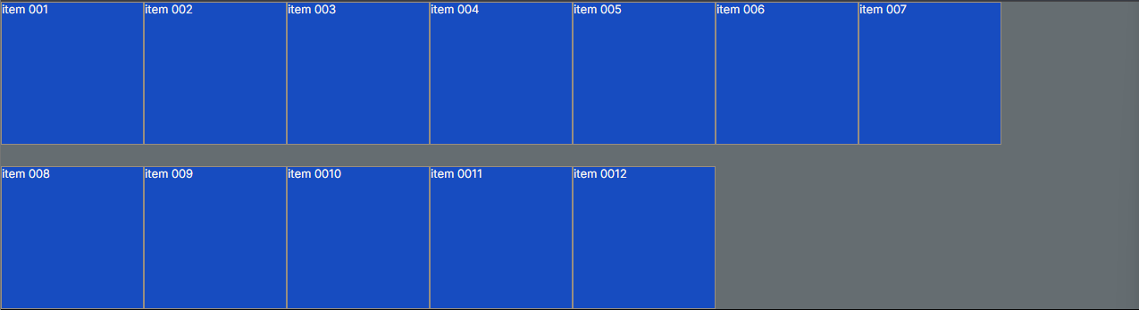
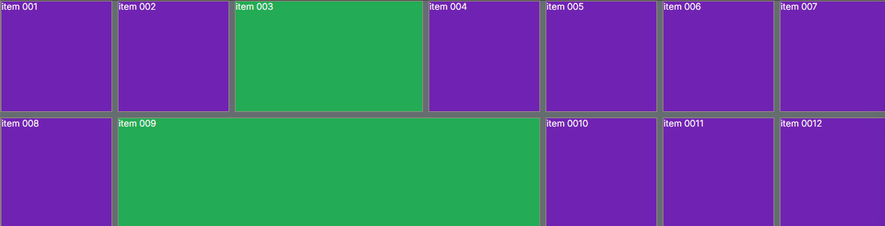
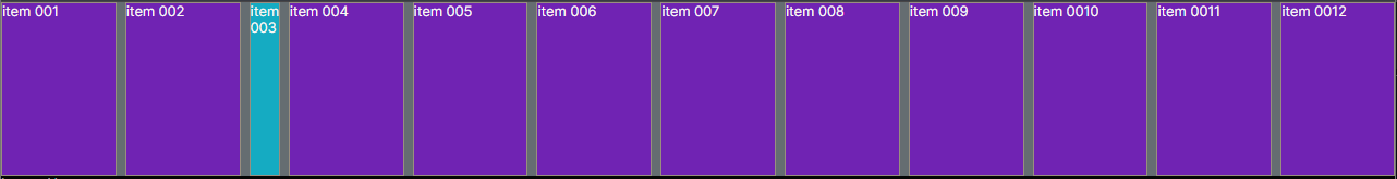
flex-grow: 1 - item 003; vai cobrir todo espaço disponível na sua linha
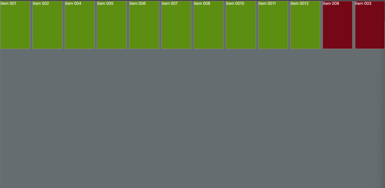
flex-grow: 1 - item 003 e 009; vai cobrir todo espaço disponível na sua linha
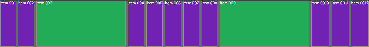
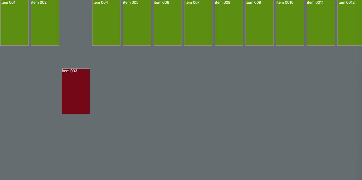
flex-grow: 1 - item 003 e 009; sem width / vai cobrir todo espaço disponível na sua linha sem a width "largura do componente"
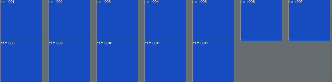
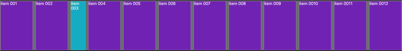
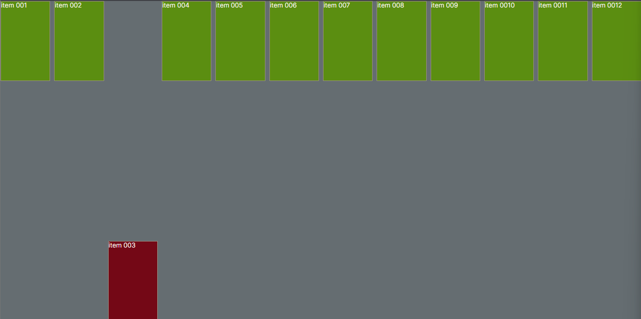
flex-shrink: 2 - item 003; diminuir a metade dos outros itens proporciaonal.
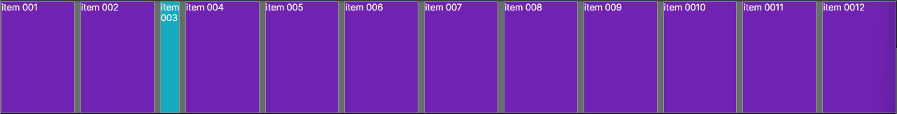
flex-basis: 20px; tamanho específico para um componente filho
flex: 2 2 30px; reune os 3 tipos: flex-grow, flex-shrink, flex-basis
align-self: center; alinha apenas um componente especifico/ basicamente utiliza o mesmo que no align-components
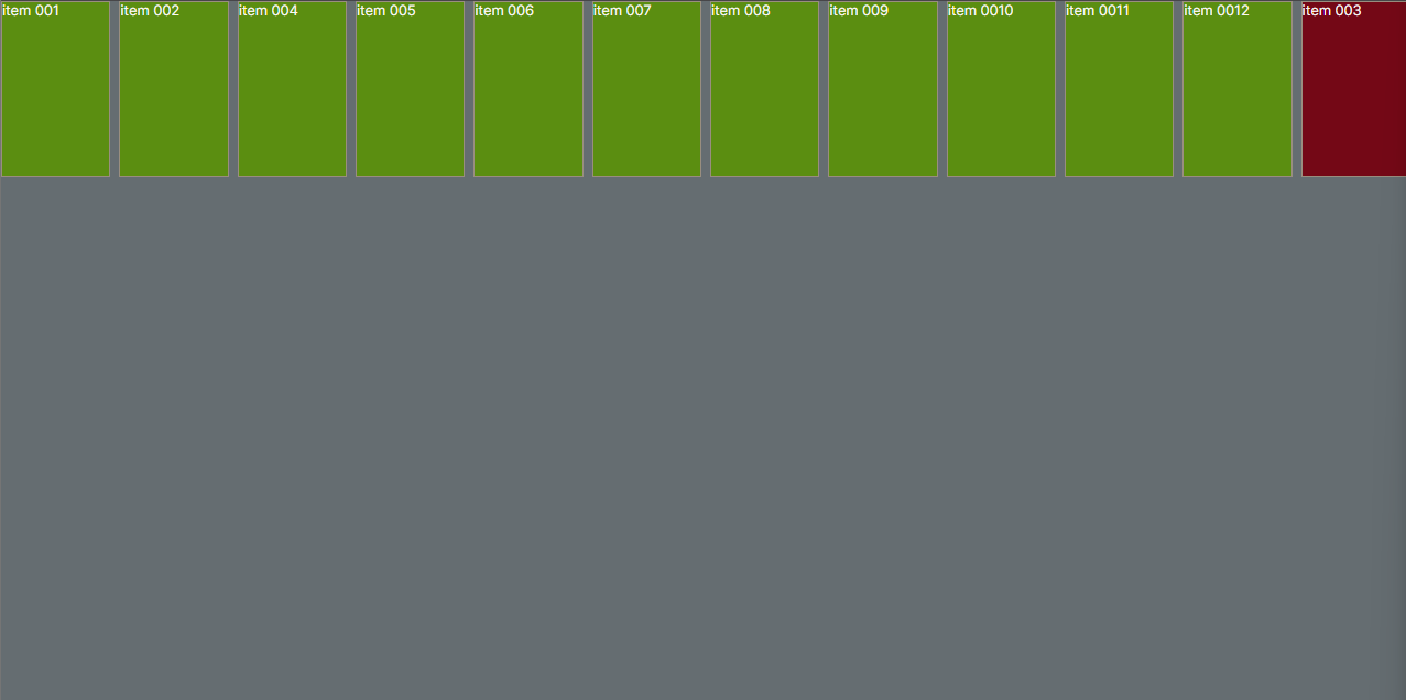
order: 2; todos tem ordem um e o elemento 003 tem ordem 2 por isso foir pora o final.
order: 2; item 003 e order: 1; item 009 / todos tem ordem 0 o item 009 tem order 1 e o 003 tem order 2
order: -1; para colocar em primeiro na ordem tem que colocar -1 pois começa com 0.