LINKS
FUNDAMENTALS
Meanings
Using in CONTAINER
- Setting
- The container with grid
- Define number of column with grid-template-columns
- Define number of rows with grid-template-columns
.container{
  display: grid;
  grid-template-columns: 100px 100px 100px;
  grid-template-rows: 100px 100px 100px;
}
- Grid-gap specifying the gutters between grid rows and columns.
- shorthand to
- grid-row-gap
- grid-column-gap
.container{
  grid-gap: 10px 15px;
}
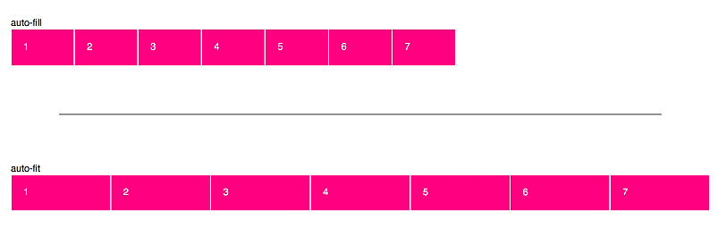
- AutoFill, create implicit columns
.container{
  grid-template-columns: repeat(auto-fill, 120px);
}
- AutoFit, ont create implicit, dont have empty spots, best to responsives
.container{
  grid-template-columns: repeat(auto-fit, 120px);
}
Using in ITEMS
.item{
  grid-column: span 2;
  grid-row: span 2;
}
- Placing items
- Define start item
- Define end item
.item{
  grid-column-start: 2;
  grid-column-end: 6;
  grid-row-start: 2;
  grid-row-end: 6;
  /* or */
  grid-column: 2 / 5;
  grid-row: 2 / 5;
}
Grid Area
- Defines a grid template by referencing the names of the grid areas which are specified with the grid-area property
.container{
  grid-template-columns: 50px 50px 50px 50px;
  grid-template-rows: auto;
  grid-template-areas:
    "header header header header"
    "main main . sidebar"
    "footer footer footer footer";
}
.item-d {
  grid-area: 1 / col4-start / last-line / 6
}
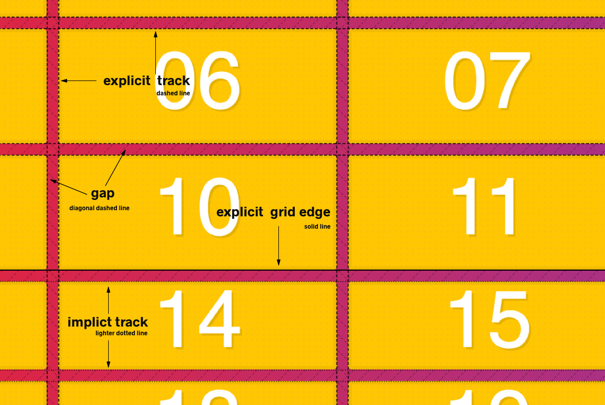
EXPLICIT
IMPLICIT
- Define automatically rows size
.container{
  grid-auto-rows: 200px;
}
- Define automatically columns size
.container{
  grid-auto-columns: 200px;
}
- Define automatically rows(default) or columns quantity
.container{
  grid-auto-flow: column | dense | row;
}
UNIT
- FR Fractional Unit, represent is for par of the available space
.container{
    display: grid;
    grid-gap: 20px;
    border: 10px solid var(--yellow);
    grid-template-columns: 1fr 2fr;
  }
Alignment + Centering
- AligItems and JustifyItems
.container{
  align-items: center;
  justify-items: center;
  /* or */
  place-items: center center;
}
- AlignContent and JustifyContent
.container{
  align-content: center;
  justify-content: center;
}
- AlignSelf and JustifySelf
.item{
  justify-self: center;
  align-self: center;
}FUNCTIONS
.container{
  grid-template-columns: repeat(5, 100px);
}
- MinMax, use to responsive
.container{
  grid-template-columns: repeat(auto-fit, minmax(100px, 1fr));
}
- FitContent, function clamps a given size to an available size according to the formula min(maximum size, max(minimum size, argument)).
.container{
  grid-template-columns: fit-content(120px), 190px;
}
OBSERVATIONS
- When use
display:grid automatically your childrens are called griditem
- Implicit vs Explicit
- If you do not create them they are called implicit
- In placing the value 100% are:


