uicollectionview-layouts-kit 
Last Update: 30/July/2019.
If you like the project, please give it a star ⭐ It will show the creator your appreciation and help others to discover the repo.
✍️ About
UICollectionView with examples. All the layouts support both portrait and landscape UI orientations as well as support for all iOS-related size classes (iPhone & iPad).
⚠️ Warning
The assets used in this project were taken from the Web. Do not use them for commertial purposes and proprietary projects. They are used just for demostration only.
🏗 Setup
In order to add layouts to your project, simply copy-paste corresponding Layout file (each of the targets has folder called Layout that contains all the related sources). There is no point in adding any dependency manager, since each custom UICollectionViewLayout can be more easily added just by dropping the corresponding layout source file into your project.
✈️ Usage
The next step is to either programmatically or via Storyboard/Nib file connect the layout and override the default one.
Programmatic Setup
If you choose programmatic approach, all you need to do is to set the instance of a layout using the following scheme:
...
let verticalSnapCollectionFlowLayout = VerticalSnapCollectionFlowLayout()
// Use custom properties that are available for each layout
verticalSnapCollectionFlowLayout.minLineSpacing = 30
verticalSnapCollectionFlowLayout.spacingMultiplier = 8

collectionView.collectionViewLayout = verticalSnapCollectionFlowLayout

// or

collectionView.setCollectionViewLayout(verticalSnapCollectionFlowLayout, animated: true)
Storyboard/Nib Setup
Setting up the layouts via Storyboard/Nib is very easy as well. All you need to do is the following:
- Find your
Collection Viewin Xcode's visual editor - Select it
- Open
Attributes Inspector - Find and change UI menu called
LayouttoCustom - Set the class to the one that you wish to use
In your view controller you need to provide a valid reference to the UIViewController from Storyboard/Nib file where you overriden the default layout class.
For cases when you need to tell your custom layout what class is going to delegate the layout handling, use the following code:
...
if let layout = collectionView?.collectionViewLayout as? PinterestLayout {
    layout.delegate = self
}
...
For cases when you simply need to change properties for custom layouts that were set via visual editor, use the following code:
...
if let layout = collectionView?.collectionViewLayout as? InstagridLayout {
    layout.itemSpacing = 10
    layout.fixedDivisionCount = 4
    layout.scrollDirection = .vertical
}
...
If you use Storyboard/Nib approach, consider creating an IBOutlet to the custom layout and directly set it up, instead of casting layout using the collection view reference:
...
@IBOutlet weak var instagridLayout: InstagridLayout!

override func viewDidLoad() {
    super.viewDidLoad()

    // InstagridLyout setup
    instagridLayout.delegate = self
    instagridLayout.itemSpacing = 10
    instagridLayout.fixedDivisionCount = 4
    instagridLayout.scrollDirection = .vertical
}
...
📚 Contents
Please wait while the
.giffiles are loading (each of them is around 10Mb)
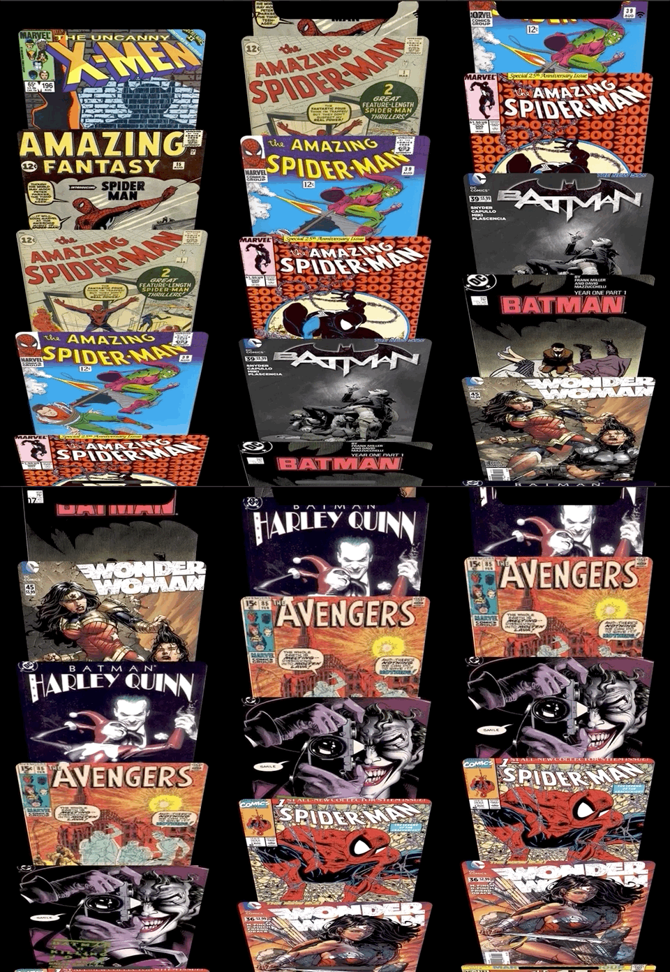
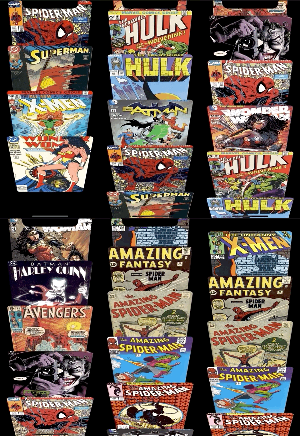
Safari iPhone
It's a custom layout that mimics UICollectionView layout that can be seen on iPhones in portrait orientation. The layout only supports portrait orientation, but can be adjusted for landscape orientation and even for n-column layout, that can be used, for example on wider screens, such as iPads.
- Perspective transformation that reveal cell's content while scrolling up and down
- Automatically adjusts contents to fit the current screen
- Portrait orientation
- Only for
iPhones - Adjustable: various properties can be changed
- Scalable: can be adopted to support
iPadand various, sophisticated perspective transformation while scrolling
Snap
Is a custom flow layout that adds snapping behavior to single column collection view. Landscape layout changes the number of columns to two - in order to more ergonomically fill in the horizontal space.
- Snapping behavior when scrolling
- Automatically adjusts the cell sizes
- Supports both scrolling directions e.g.
.verticaland.horizontal - Portrain & landscape orientations, with customizable
horizontalOrientationDeviderproperty, which adds an additional row of in the collection view layout - Has customazable properties
Vertical Scrolling
Horizontal Scrolling
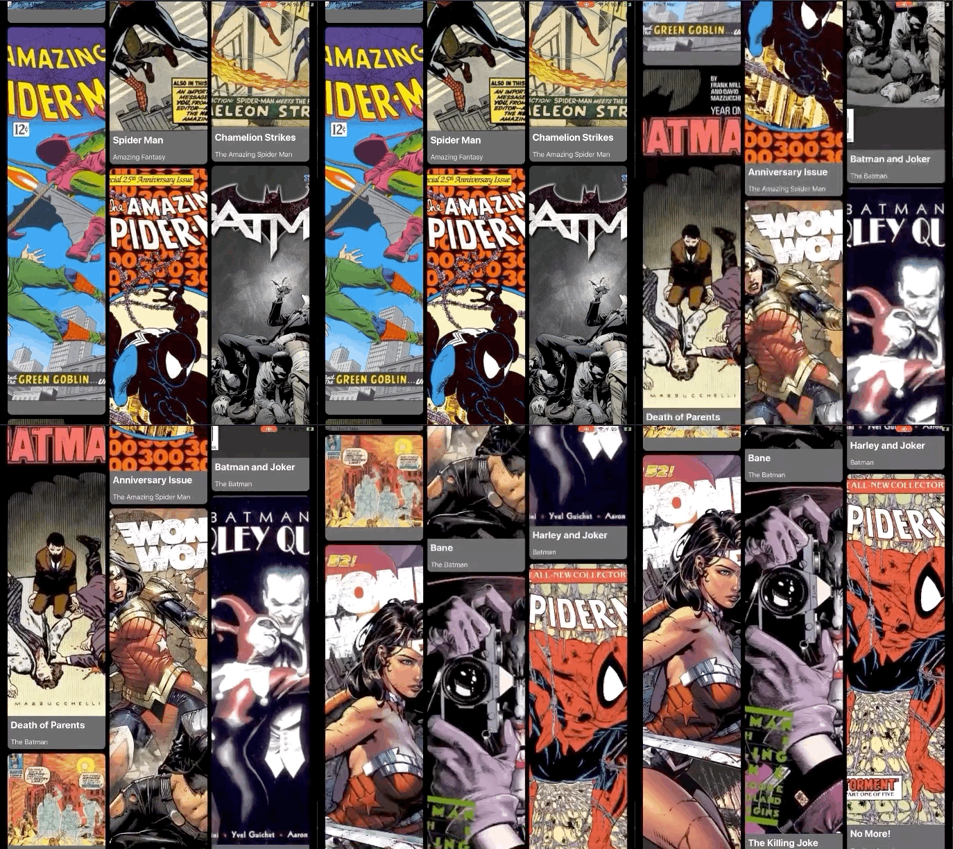
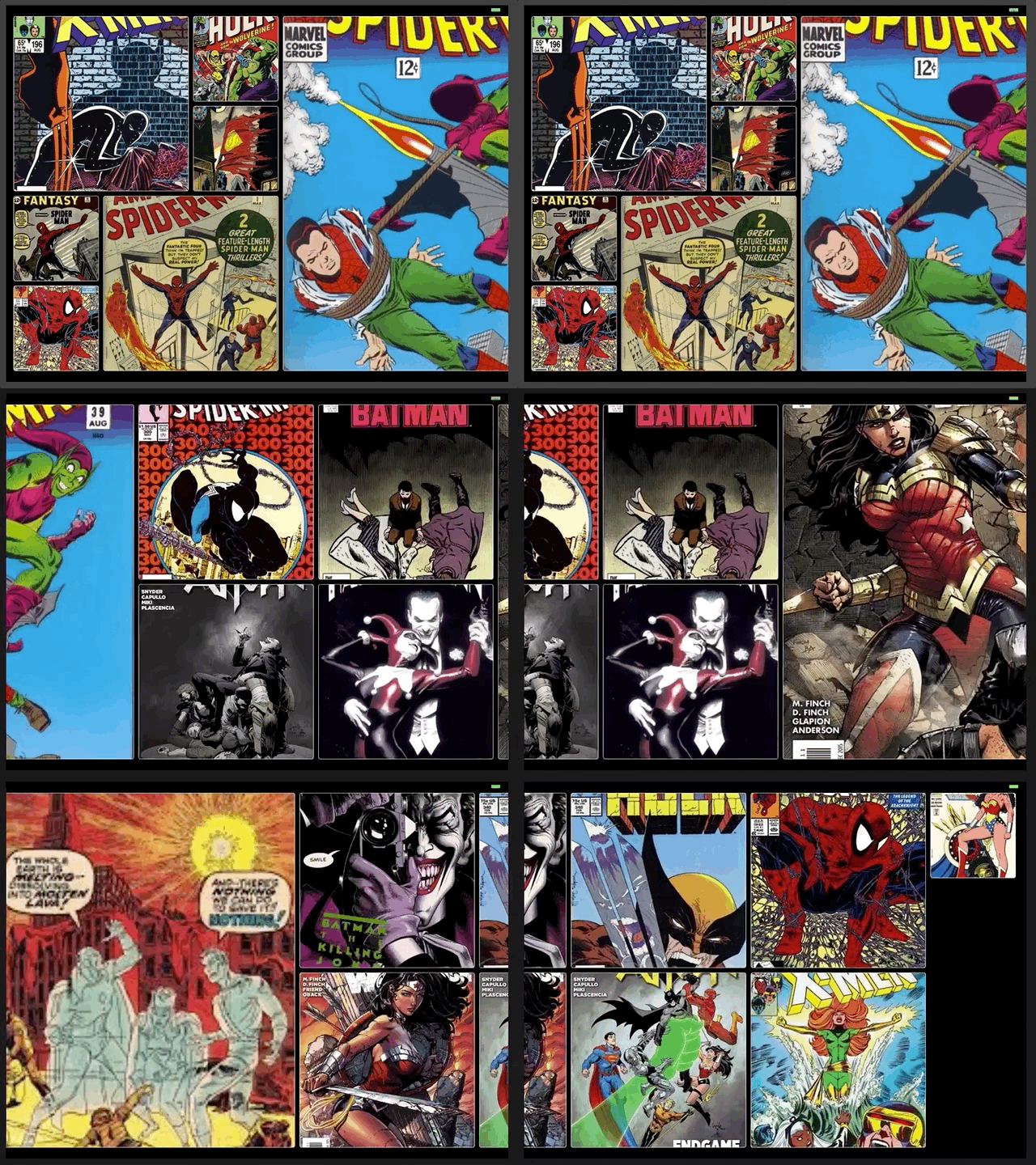
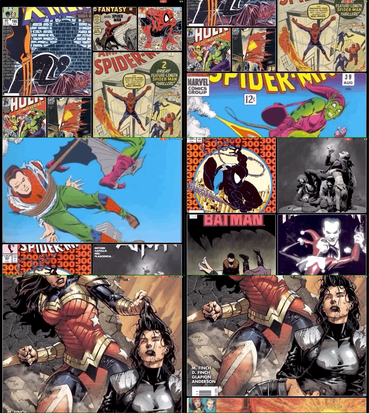
Is a custom layout that mimics Pinterest layout. Can be customized with a variable number of rows and custom cells.
- Automatically adjusts the cell sizes
- Supports both scrolling directions e.g.
.verticaland.horizontal - Portrain & landscape orientations
- Has customazable properties
Spinner
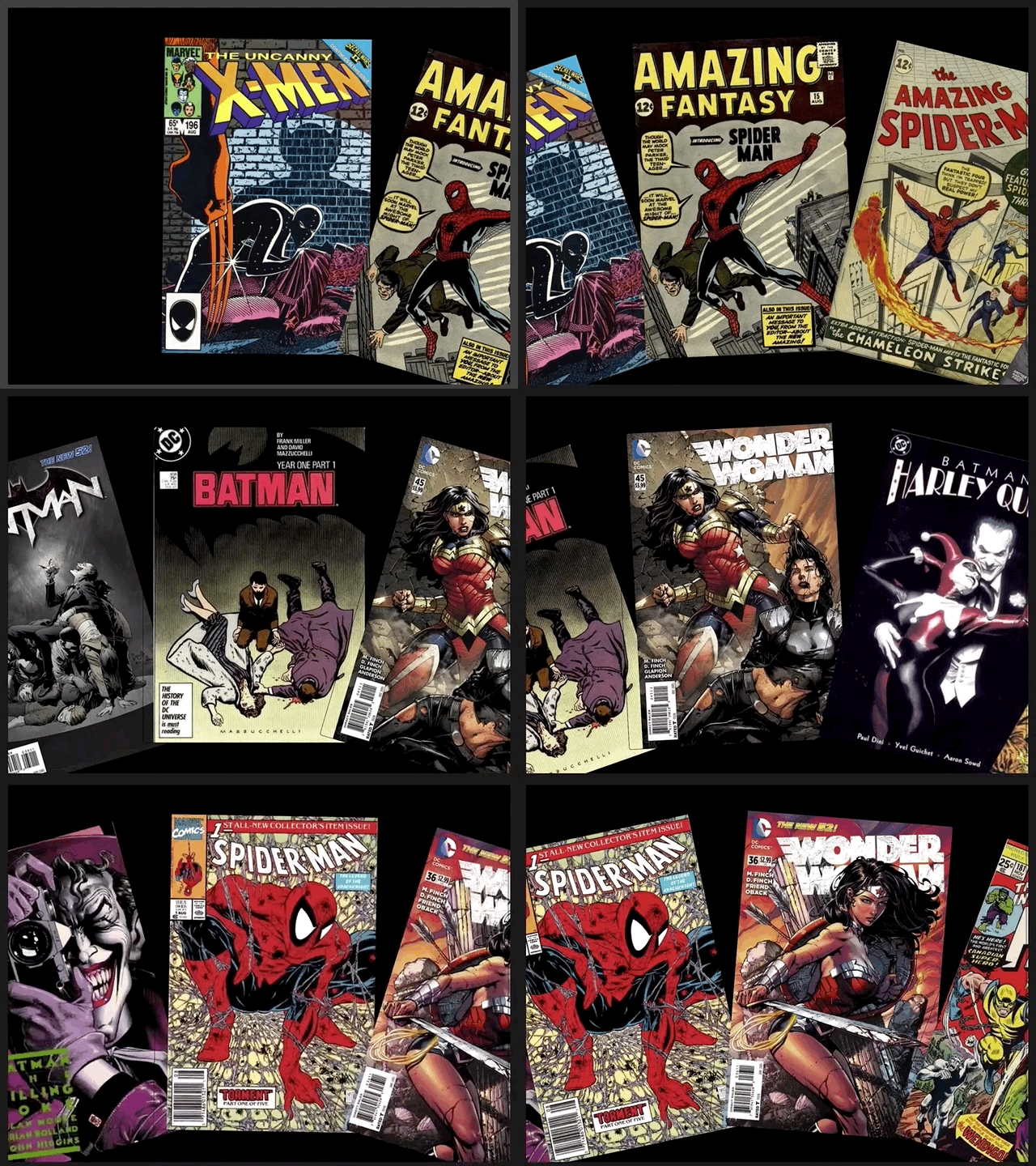
Is a custom layout that places collection view cells in a circular fashion with a snapping behavior. The spinning circle radius, cell size and cell decoration view can be customized. Supports both landscape and portrait layouts.
- Snapping behavior
- Automatically adjusts the cell sizes
- Supports both scrolling directions e.g.
.verticaland.horizontal - Portrain & landscape orientations
- Has customazable properties
Instagrid
Is a custom layout similar to Instagram's feed layout. Has several customization points and a delegate protocol for cell size runtime customization.
- Snapping behavior
- Automatically adjusts the cell sizes
- Supports both scrolling directions e.g.
.verticaland.horizontal - Portrain & landscape orientations
- Has customazable properties
Horizontal
Vertical
👨💻 Author
🔖 Licence
The project is available under MIT Licence


