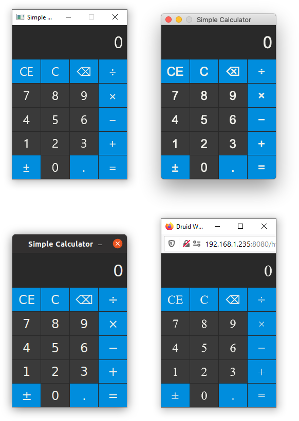
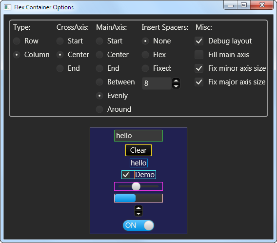
Druid is an experimental Rust-native UI toolkit. Its main goal is to offer a polished user experience. There are many factors to this goal, including performance, a rich palette of interactions (hence a widget library to support them), and playing well with the native platform. See the goals section for more details.
Druid's current development is largely driven by its use in Runebender, a new font editor.
We have been doing periodic releases of Druid on crates.io, but it is under active development and its API might change. All changes are documented in the changelog.
For an overview of some key concepts, see the (work in progress) Druid book.
A very good place to ask questions and discuss development work is our Zulip chat instance, in the #druid-help and #druid channels, respectively.
We gladly accept contributions via GitHub pull requests. Please see CONTRIBUTING.md for more details.
Here's a simple counter example app:
use druid::widget::{Button, Flex, Label};
use druid::{AppLauncher, LocalizedString, PlatformError, Widget, WidgetExt, WindowDesc};

fn main() -> Result<(), PlatformError> {
    let main_window = WindowDesc::new(ui_builder());
    let data = 0_u32;
    AppLauncher::with_window(main_window)
        .log_to_console()
        .launch(data)
}

fn ui_builder() -> impl Widget<u32> {
    // The label text will be computed dynamically based on the current locale and count
    let text =
        LocalizedString::new("hello-counter").with_arg("count", |data: &u32, _env| (*data).into());
    let label = Label::new(text).padding(5.0).center();
    let button = Button::new("increment")
        .on_click(|_ctx, data, _env| *data += 1)
        .padding(5.0);

    Flex::column().with_child(label).with_child(button)
}
This example works with master. Here's an example for 0.7.0: https://docs.rs/druid/latest/druid/#examples
Check out the the examples folder for a more comprehensive demonstration of Druid's existing functionality and widgets. Check druid_widget_nursery for more widgets.
An explicit goal of Druid is to be easy to build, so please open an issue if you
run into any difficulties. Druid is available on crates.io and should work as
a lone dependency (it re-exports all the parts of druid-shell, piet, and kurbo
that you'll need):
druid = "0.7.0"Since Druid is currently in fast-evolving state, you might prefer to drink from the firehose:
druid = { git = "https://github.com/linebender/druid.git" }On Linux, Druid requires gtk+3; see GTK installation page.
(On ubuntu-based distro, running sudo apt-get install libgtk-3-dev from the terminal will do the job.)
On OpenBSD, Druid requires gtk+3; install from packages:
pkg_add gtk+3Alternatively, there is an X11 backend available, although it is currently
missing quite a few features.
You can try it out with --features=x11.
Druid's goal is to make it easy to write and deploy high quality desktop applications with a smooth and polished user experience on all common platforms. In order to achieve this we strive for a variety of things:
- Make it easy to build and package on all supported platforms.
- Implement abstractions to avoid platform specific quirks.
- Respect platform conventions and expectations.
- Handle display resolution and scaling reliably with little effort.
- Enable easy, yet powerful internationalization.
- Offer robust accessibility support.
- Produce small and fast binaries with low memory usage.
- Have a small dependency tree, a high quality code base and good organization.
- Focus on powerful, desktop-grade applications.
- Provide a flexible set of layouts and common widgets.
- Ease creation of custom components and application logic as needed.
In order to fulfill those goals, we cannot support every use case. Luckily the Rust community is working on a variety of different libraries with different goals, so here are some of Druid's non-goals and possible alternatives that can offer those capabilities:
- Use the the platform-native widgets or mimic them. (Relm, Slint)
- Embed easily into custom render pipelines. (Conrod)
- Adhere to a specific architectural style such as Elm. (Iced, Relm)
- Support rendering to HTML when targeting the web. (Iced, Moxie)
Druid is just one of many ongoing Rust-native GUI experiments. If it doesn't suit your use case, perhaps one of the others will!
The Druid toolkit uses druid-shell for a platform-abstracting application shell.
druid-shell is responsible for starting a native platform runloop, listening to
events, converting them into a platform-agnostic representation, and calling a
user-provided handler with them.
While druid-shell is being developed with the Druid toolkit in mind, it is
intended to be general enough that it could be reused by other projects
interested in experimenting with Rust GUI. The druid-shell crate includes a
couple of non-druid examples.
Druid relies on the Piet library for drawing and text layout. Piet is a 2D graphics
abstraction with multiple backends: piet-direct2d, piet-coregraphics, piet-cairo,
piet-web, and piet-svg are currently available, and a GPU backend is planned.
In terms of Druid platform support via Piet, macOS uses piet-coregraphics,
Linux and OpenBSD use piet-cairo, Windows uses piet-direct2d, and web uses piet-web.
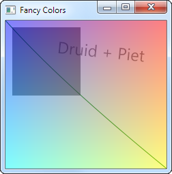
use druid::kurbo::{BezPath, Point, Rect};
use druid::piet::Color;

// Create an arbitrary bezier path
// (ctx.size() returns the size of the layout rect we're painting in)
let mut path = BezPath::new();
path.move_to(Point::ORIGIN);
path.quad_to(
    (80.0, 90.0),
    (ctx.size().width, ctx.size().height),
);
// Create a color
let stroke_color = Color::rgb8(0x00, 0x80, 0x00);
// Stroke the path with thickness 1.0
ctx.stroke(path, &stroke_color, 1.0);

// Rectangles: the path for practical people
let rect = Rect::from_origin_size((10., 10.), (100., 100.));
// Note the Color:rgba8 which includes an alpha channel (7F in this case)
let fill_color = Color::rgba8(0x00, 0x00, 0x00, 0x7F);
ctx.fill(rect, &fill_color);Widgets in Druid (text boxes, buttons, layout components, etc.) are objects
which implement the Widget trait. The trait is parametrized by a type (T)
for associated data. All trait methods (event, lifecycle, update, paint,
and layout) are provided with access to this data, and in the case of
event the reference is mutable, so that events can directly update the data.
Whenever the application data changes, the framework traverses the widget
hierarchy with an update method.
All the widget trait methods are provided with a corresponding context (EventCtx, LifeCycleCtx, UpdateCtx, LayoutCtx, PaintCtx). The widget can request things and cause actions by calling methods on that context.
In addition, all trait methods are provided with an environment Env, which
includes the current theme parameters (colors, dimensions, etc.).
impl<T: Data> Widget<T> for Button<T> {
    fn event(&mut self, ctx: &mut EventCtx, event: &Event, data: &mut T, env: &Env) {
      ...
    }

    fn lifecycle(&mut self, ctx: &mut LifeCycleCtx, event: &LifeCycle, data: &T, env: &Env) {
      ...
    }

    fn update(&mut self, ctx: &mut UpdateCtx, old_data: &T, data: &T, env: &Env) {
      ...
    }

    fn layout(&mut self, ctx: &mut LayoutCtx, bc: &BoxConstraints, data: &T, env: &Env) -> Size {
      ...
    }

    fn paint(&mut self, ctx: &mut PaintCtx, data: &T, env: &Env) {
      ...
    }
}
Druid provides a number of basic utility and layout widgets and it's easy to implement your own. You can also compose widgets into new widgets:
fn build_widget() -> impl Widget<u32> {
    let mut col = Flex::column();
    for i in 0..30 {
        let button = Button::new(format!("Button {}", i).padding(5.0);
        col.add_child(button);
    }
    Scroll::new(col)
}Druid's layout protocol is strongly inspired by Flutter's box layout model.
In Druid, widgets are passed a BoxConstraint that provides them a minimum and
maximum size for layout. Widgets are also responsible for computing appropriate
constraints for their children if applicable.
Druid uses a Data trait to represent value types. These should be cheap to compare and cheap to clone.
In general, you can use derive to generate a Data impl for your types.
#[derive(Clone, Data)]
struct AppState {
    which: bool,
    value: f64,
}The Lens datatype gives access to a part of a larger data structure. Like
Data, this can be derived. Derived lenses are accessed as associated constants
with the same name as the field.
#[derive(Clone, Data, Lens)]
struct AppState {
    which: bool,
    value: f64,
}
To use the lens, wrap your widget with LensWrap (note the conversion of
CamelCase to snake_case):
LensWrap::new(WidgetThatExpectsf64::new(), AppState::value);Alternatively, lenses for structs, tuples, and indexable containers can be
constructed on-demand with the lens macro:
LensWrap::new(WidgetThatExpectsf64::new(), lens!(AppState, value));This is particularly useful when working with types defined in another crate.
The main authors are Raph Levien and Colin Rofls, with much support from an active and friendly community.


