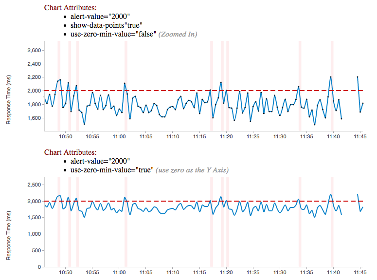
This project provides AngularJS directives for displaying custom visual representations of time series data as charts. It uses D3 as its charting toolkit and tries to simplify creating advanced metrics visualizations with Angular.js.
Hawkular Charts is a direct result of wanting metric visualizations for the parent project: Hawkular - An Open Source Monitoring Tool. The console in Hawkular uses these charting components and will further push the development of these charting components into the future with additional features and specialized chart types. This will also make adhoc development quicker/easier with components that can render Hawkular Metrics charts with very little effort.
The quickest way to start using the charts is to fire up a http server and start playing with the code. To run the examples, start an http server from the hawkular-charts root directory:
`python -m SimpleHTTPServer 8000 .`
Then start playing around the the examples (each has data in the example):
These controls are currently being used in the Hawkular Console to view various metrics charts displayed there. Please see https://github.com/hawkular/hawkular/tree/master/console for more real examples.
Chart types are set via the chart-type attribute of the hawkular-chart directive. The following chart types are available:
-
histogram: histogram bar chart (used in Hawkular GC chart)
-
area: standard area chart with hawkular extensions
-
scatter: regular scatter plot supporting avg/high/low
-
hawkularline: line chart with settings defaulted to hawkular project
-
hawkularmetric: specifically tailored toward Single Metrics Display
-
multiline: specifically made for display multiple metrics in a singe graph
-
rhqbar: RHQ/JON style graphs https://docs.jboss.org/author/display/RHQ/d3+Charts
All of the chart types are either in the process of being approved by Red Hat UxD, or have been approved.
Sample code for this chart:
<hawkular-chart
    data="{{dataPoints}}"
    chart-type="hawkularmetric"
    alert-value="{{threshold}}"
    y-axis-units="Response Time (ms)"
    chart-height="250">
</hawkular-chart>
Want to update the chart, no problem, just alter the dataPoints array with new data and the chart will re-render itself. Through custom attributes it is very easy to configure a custom chart just the way you want using advanced capabilities that standard charting libraries don’t provide. Need to change the threshold alert value or chart-type just use Angular’s two way binding to bind to a field on the screen and watch the dynamics unfold.
Explore an actual implementation in Hawkular Console: here
Sample code for this chart:
<availability-chart
    data="{{vm.availabilityDataPoints}}"
    chart-type="availability">
</availability-chart>
The availability chart makes it easy to visualize the availability types:
-
up
-
down
-
unknown (no data was collected for this time period, so we don’t know if it was up or down)
on a time line. (The data formats are discussed later). Hovering over one of the areas provides additional information such as: when the period started/ended, the duration of the period and the status of the period.
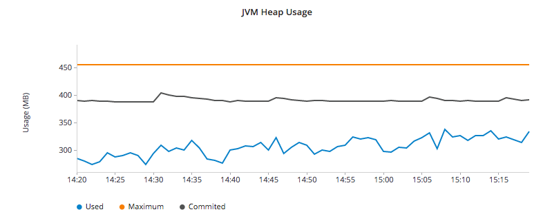
Here is an screen shot from the Hawkular Console that uses the multi-line chart for displaying JVM metrics:
This chart type would also be used for displaying multiple metrics in a single chart. Don’t like the charts we have? Take one of the existing charts and modify (there are many types in the code).
Bind to a javascript array of metrics:
 <hawkular-chart
     data="{{vm.getChartDataFor(selectedMetric)}}"
     chart-type="{{selectedChart.chartType}}"
     chart-height="250">
 </hawkular-chart>
The nice part of about using angular in the charting framework is that whenever the underlying data changes, watchers automatically load and re-render the chart (as well as any of the properties that may have changed like chart-type). This results in less code and more productivity.
-
Add the hawkular-charts.css to the main index.html page
-
Add the hawkular-charts.js to the main index.html page
-
Add the charting module to the application module:
app.module('myApp', ['hawkular.charts']);
All that’s left to do now is select the chart type and bind the data attribute on the <hawkular-chart> directive.
Quickly and easily add some dynamically updating charts to your own pages
The stand alone version of the tag allows for linking to hawkular-metrics servers (or any supplier of formatted metric data) without any dependencies except for a few js libs and 2 lines of script to setup an Angular app.
<hawkular-chart
        chart-type="bar"
        metric-id="server2.cpu.user"
        metric-url="http://127.0.0.1:8080/hawkular/metrics"
        time-range-in-seconds="86400002"
        refresh-interval-in-seconds="30"
        chart-height="250" >
</hawkular-chart>
This allows plain html web pages to be sprinkled with tags and a couple js libs and you can have dynamic live updating metrics. Great for NOCs or dashboards. These pages can even be emailed around and then thrown behind an http server for viewing.
Sample Stand Alone Example Page: stand-alone-chart-sample.html This allows dashboard templates to be emailed around (although they need to be rendered behind a http server of your choice).
Metric Time Series data is generally viewed as a Tuple: {metric, time, value}. The Hawkular charts version looks like
this:
| Name | Type | Required | Description |
|---|---|---|---|
start |
number |
Yes |
Integer representing Starting period timestamp - milli-seconds since epoch(unix) |
end |
number |
Yes |
Integer representing Ending period timestamp - milli-seconds since epoch(unix) |
value |
text |
Yes |
String enum of Availability Type('up','down','unknown') |
duration |
text |
No |
String with duration period to show in hover |
message |
text |
No |
String with message Not Used Yet |
Example:
 var availChartData = [{"timestamp": 1438025381038, "value": "up"},
{"timestamp": 1438031047504, "value": "down"}];| Name | Type | Required | Description |
|---|---|---|---|
timestamp |
number |
Yes |
Integer representing milli-seconds since epoch(unix) |
avg |
number |
Yes |
Any valid number (int or decimal) |
min |
number |
No |
Any valid number (int or decimal) |
max |
number |
No |
Any valid number (int or decimal) |
empty |
boolean |
No |
boolean indicating if the chart should show missing data representation for this time period. This overrides the actual values. |
Aggregate Metrics Example:
  var metricData = [{
        "timestamp": 1434476761167,
        "avg": 1912,
        "min": 1482,
        "max": 2342,
        "empty": false
      }, {
        "timestamp": 1434476791167,
        "avg": 1816,
        "min": 1816,
        "max": 1816,
        "empty": false
}];|
Tip
|
If you don’t have aggregate values then just populate the avg value with the desired metric value. Min, Max and Empty are optional. |
|
Note
|
Everything ends up being an aggregated value in time (usually after 8 hours). This is due to needing a consistently representable dataset that charts nicely. Raw datasets can easily become bottlenecks to the clients charting the data and unintended consequences of very large or small datasets can make for strange looking charts. For this reason, we recommend bucketing data into a fixed set of datapoints that the charting client is comfortable handling performance-wise and that generally fits the chart |
The multi-chart data format used to show multiple charts(metrics) on a single chart is the same values data as the above metrics data format, but just adds a nested (d3 nested) array of map values. This consists of key -→ values pairs with the key being the name of the dataset and the values being the array of values metric data described in the preceding section. This is probably most easily illustrated by a code example:
Example:
 var nestedData = [
  {"key" : "red hat", "values" : redhatData },
  {"key" : "amazon", "values" : amazonData }
];-
Most cosmetic issues are controlled via standard css through the hawkular-charts.css.
-
Additional(new) functionality is offered through custom attributes.
-
Install Node.js - Find more information on Node.js
-
Install npm - If npm is not already installed with Node.js, you have to install it manually. Find more information on npm
-
-
Install Gulp and Bower globally:
npm install -g bower gulp -
Install npm dependencies with:
npm install -
Install bower dependencies with:
bower install
The environment is now ready to be built.
The Hawkular Charts directives can be built with: gulp build. Or, for dev build that updates with every
change: gulp watch
The resulting javascript file is placed in the root directory as hawkular-charts.js
Easily setup bower linking so that changes to the charts are instantly reflected in Hawkular console…
-
Interactive Hovers: https://issues.jboss.org/browse/HAWKULAR-355
-
Visual Alert Markers (and annotation markers in general): https://issues.jboss.org/browse/HAWKULAR-344
-
Automatically Scale Units for Human Readability: https://issues.jboss.org/browse/HAWKULAR-535
-
Add Gauge Chart type: https://issues.jboss.org/browse/HAWKULAR-378
What good is a chart if you don’t have a way to get the metric data?
If you don’t want to retrieve data directly from the REST Url, we have an API that is a wrapper around ngResources. For angular apps this is probably the easiest and most powerful way to access Hawkular data. There are currently API wrappers around:
-
Hawkular Agent (via websockets)
//
// Querying Availability
//
 HawkularMetric.AvailabilityMetricData(this.$rootScope.currentPersona.id).query({
          availabilityId: metricId,
          start: startTime,
          end: endTime,
          distinct: true
        }).$promise
          .then((response) => {
            this.availabilityDataPoints = response;
          }, (error) => {
            this.NotificationsService.error('Error Loading Avail Data: ' + error);
          });
//
// Here is a real-world example querying multiple metrics for a multi-line graph
// the data is put into the chartWebSessionData array for charting
// Querying both Gauge and Counter metrics
//
 HawkularMetric.GaugeMetricData(this.$rootScope.currentPersona.id).queryMetrics({
        gaugeId: 'MI~R~[' + this.$routeParams.resourceId +
        '~/]~MT~WildFly Aggregated Web Metrics~Aggregated Active Web Sessions',
        start: this.startTimeStamp,
        end: this.endTimeStamp, buckets:60}, (data) => {
        this.chartWebSessionData[0] = { key: 'Active Sessions',
          color: AppServerWebDetailsController.ACTIVE_COLOR, values: this.formatBucketedChartOutput(data) };
      }, this);

 HawkularMetric.CounterMetricData(this.$rootScope.currentPersona.id).queryMetrics({
        counterId: 'MI~R~[' + this.$routeParams.resourceId +
          '~/]~MT~WildFly Aggregated Web Metrics~Aggregated Expired Web Sessions',
        start: this.startTimeStamp,
        end: this.endTimeStamp, buckets:60}, (data) => {
        this.chartWebSessionData[1] = { key: 'Expired Sessions',
          color: AppServerWebDetailsController.EXPIRED_COLOR, values: this.formatCounterChartOutput(data) };
}, this);We’re always interested in contributions from the community.
-
Detailed description of the proposed changes
-
Use the Angular Typescript Style Guide for reference.
-
Rebased onto the latest master commit
-
This is a Typescript project, so please submit the Typescript source (not the javascript source; javascript submissions will be rejected)
-
Issues/Bugs can be reported via Hawkular Jira
We would like to give special Thanks to the Red Hat, User Experience Team (UxD) for their design expertise.


