Tuix is a cross-platform GUI toolkit written in Rust.
The driving principle behind tuix is to be a self-contained, small-as-possible, but still fast, toolkit for creating graphical user interfaces in Rust.
(TODO: Add screenshots)
- Cross-platform
- GPU based drawing using opengl (powered by femtovg)
- Flexbox-based layout system
- CSS-like styling
- Animatable style properties
- Built-in composable widgets
Add tuix to your project by adding tuix = {git = "https://github.com/geom3trik/tuix", branch = "main"} to your projects Cargo.toml under dependencies.
You can run any of the examples with:
cargo run --example example_name
To run any example with the baseview backend:
cargo run --example example_name --no-default-features --features "baseview"
Since it's probably best to learn by example, here is the "hello world" of GUI applications:
extern crate tuix;

use tuix::widgets::Button;
use tuix::Application;

use tuix::events::BuildHandler;

use tuix::style::themes::DEFAULT_THEME;

fn main() {
    let mut app = Application::new(|win_desc, state, window| {

        state.insert_theme(DEFAULT_THEME);

        Button::new().build(state, window, |builder| {
            builder.set_text("Button")
        });

        win_desc.with_title("Hello GUI")
    });

    app.run();
}
You can run this example with: cargo run --example hello_gui
Tuix can be thought of as 5 seperate processes which happen in order:
- Building
- Events
- Styling
- Layout
- Drawing
Building is the process of creating the widgets in the application. This can be done before the application loop begins, or in response to an event. The hello_gui example shown above demonstrates how to create and then build a button widget. The build() function takes three parameters: a mutable reference to State, the Entity id of the parent widget, and a closure which provides a builder which can be used to set inline style properties on the button.
More information about building widgets can be found on the Building Widgets wiki page.
Tuix uses an event queue to pass custom messages between widgets.
Tuix uses a modified subset of CSS properties to perform styling of widgets. The hello_gui example uses the DEFAULT_THEME provided within the tuix crate. The custom_styling example shows how to style the button with a custom theme provided by a stylesheet in a css file, as well as inline styling using setter functions on the builder.
extern crate tuix;

use tuix::widgets::Button;
use tuix::Application;

use tuix::events::BuildHandler;

use tuix::style::themes::DEFAULT_THEME;

use tuix::style::Length;

// This example uses a custom theme defined in the 'custom_theme.css' stylesheet
static CUSTOM_THEME: &'static str = include_str!("themes/custom_theme.css");

fn main() {
    let app = Application::new(|win_desc, state, window| {

        state.insert_theme(DEFAULT_THEME);

        // Properties defined in CUSTOM_THEME override the same properties defined in DEFAULT_THEME
        state.insert_theme(CUSTOM_THEME);

        Button::new().build(state, window, |builder| {
            builder
                // These are inline properties which cannot be overriden by a theme
                .set_left(Length::Pixels(100.0))
                .set_top(Length::Pixels(50.0))
                .set_text("Button")
        });

        win_desc.with_title("Hello GUI")
    });

    app.run();
}
More information about styling can be found on the Styling Widgets wiki page.
Tuix uses a flexbox model to perform layout. The layout process positions the widgets based on the style properties you give them. Users should also be familiar with the css box model.
The example flexible_layout shows how to create three flexible elements with their own inline properties as well as showing how to center a button widget within another element. By default, the flex direction of elements, including the window, is set to column.
extern crate tuix;

use tuix::widgets::{Element, Button};
use tuix::Application;

use tuix::events::BuildHandler;

use tuix::style::themes::DEFAULT_THEME;

use tuix::style::{Length, Color, JustifyContent, AlignItems};

// This example uses a custom theme defined in the 'custom_theme.css' stylesheet
static CUSTOM_THEME: &'static str = include_str!("themes/custom_theme.css");

fn main() {
    let app = Application::new(|win_desc, state, window| {

        state.insert_theme(DEFAULT_THEME);

        // Properties defined in CUSTOM_THEME override the same properties defined in DEFAULT_THEME
        state.insert_theme(CUSTOM_THEME);

        // An element is the simplest widget. It has no built in styling and doesn't handle any events.
        let first = Element::new().build(state, window, |builder|
            builder
                // Allow the element to grow in size to fill the parent (in height)
                .set_flex_grow(1.0)
                // The flexbox way of centering the child elements
                .set_justify_content(JustifyContent::Center)
                .set_align_items(AlignItems::Center)

                .set_background_color(Color::rgb(100,50,50))
        );

        Element::new().build(state, window, |builder|
            builder
                // A flex-grow of 2 rsults in a twice as large element in this case
                .set_flex_grow(2.0)
                .set_background_color(Color::rgb(50,100,50))
        );

        Element::new().build(state, window, |builder|
            builder
                .set_flex_grow(1.0)
                .set_background_color(Color::rgb(50,50,100))
        );

        // The button is now a child of the first element instead of the window
        Button::new().build(state, first, |builder| {
            builder.set_text("Button")
        });

        win_desc.with_title("Flexible Layout")
    });

    app.run();
}
More information about how widgets are psoitioned can be found on the Layout Widgets wiki page.
After styling, the widgets are drawn to the window. The visual look of the widgets is determined by the style propeties set on them, but it's also possible to override this with a custom drawing function for your own custom widgets.
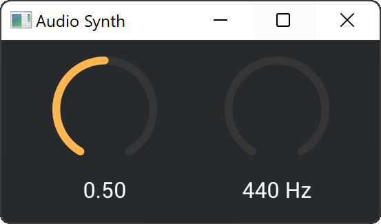
You can find a more complex example application and a tutorial for building a simple synth with a tuix gui here: https://github.com/geom3trik/tuix_audio_synth