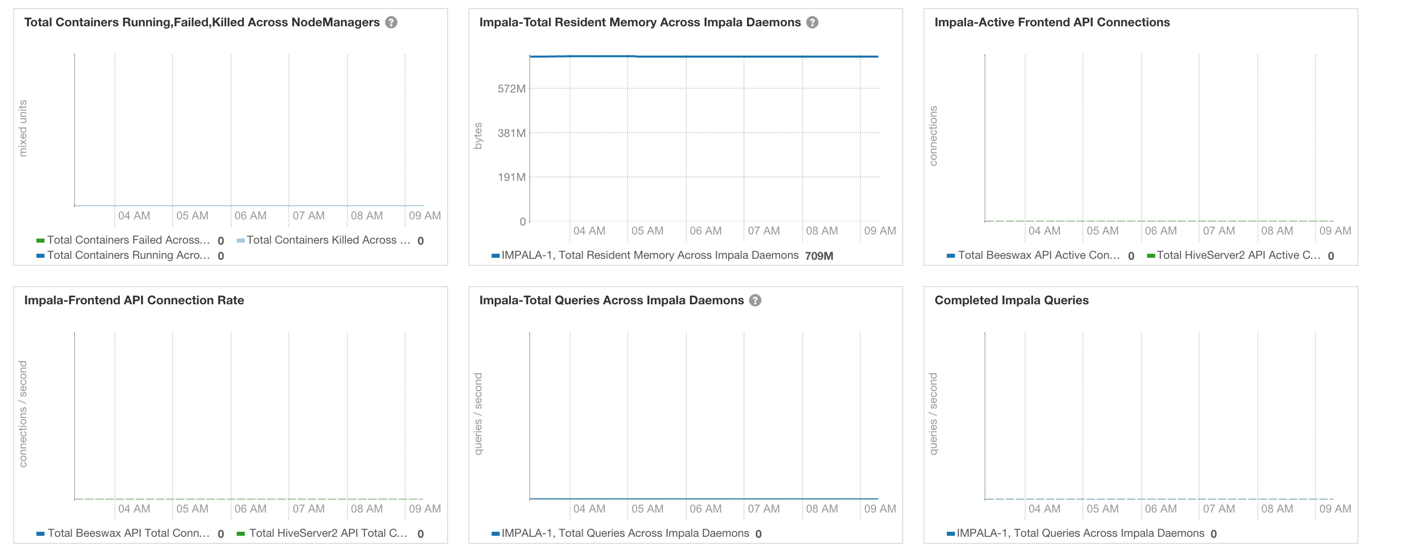
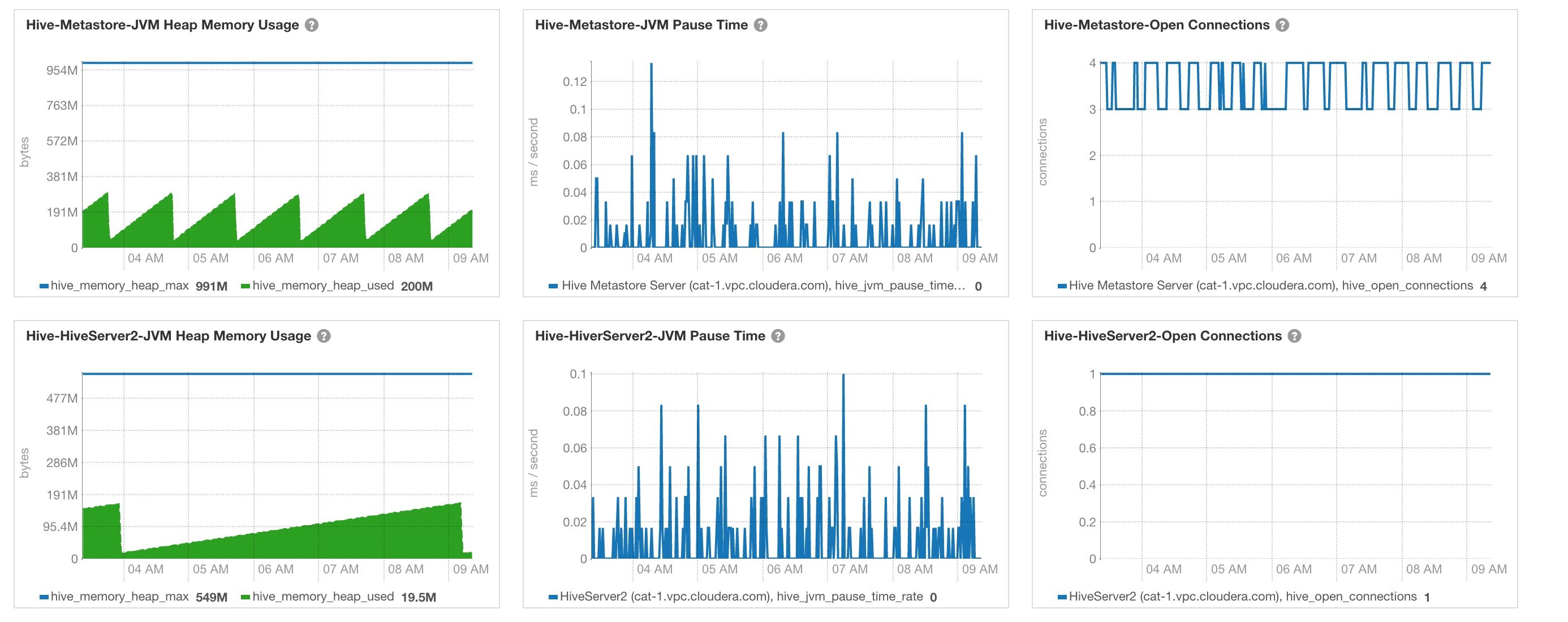
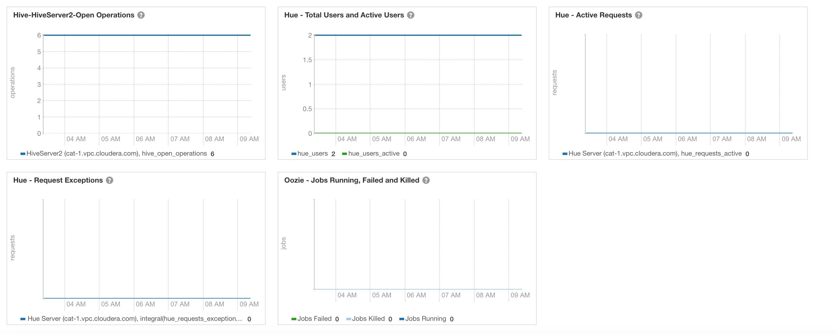
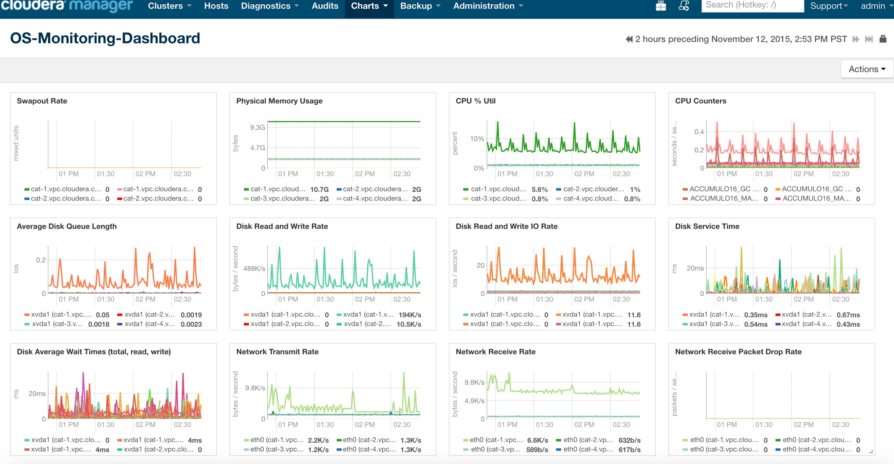
This repository is a collection of dashboards and charts Cloudera customers use as part of their daily tasks to answer the famous question 'How is my cluster doing today?'
To learn more about how to build charts and dashboards, please visit the following link Cloudera Manager Charting Time-Series data.
To learn more about how to interpret the charts and various metrics in the charts, please visit Cloudera Manager Metrics.
Based on our experience at several of our large customers, most popular charts are placed into the following main dashboards.
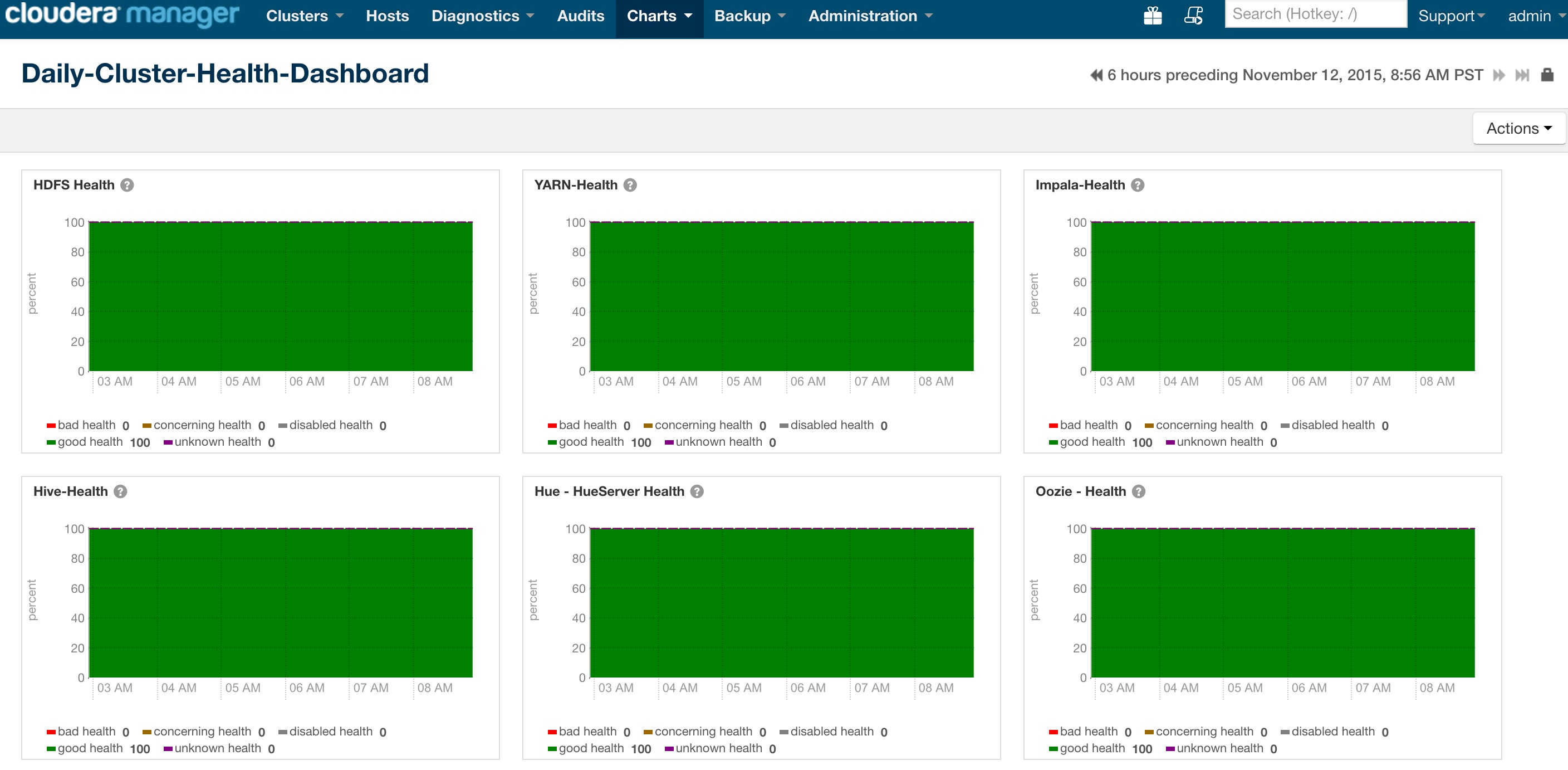
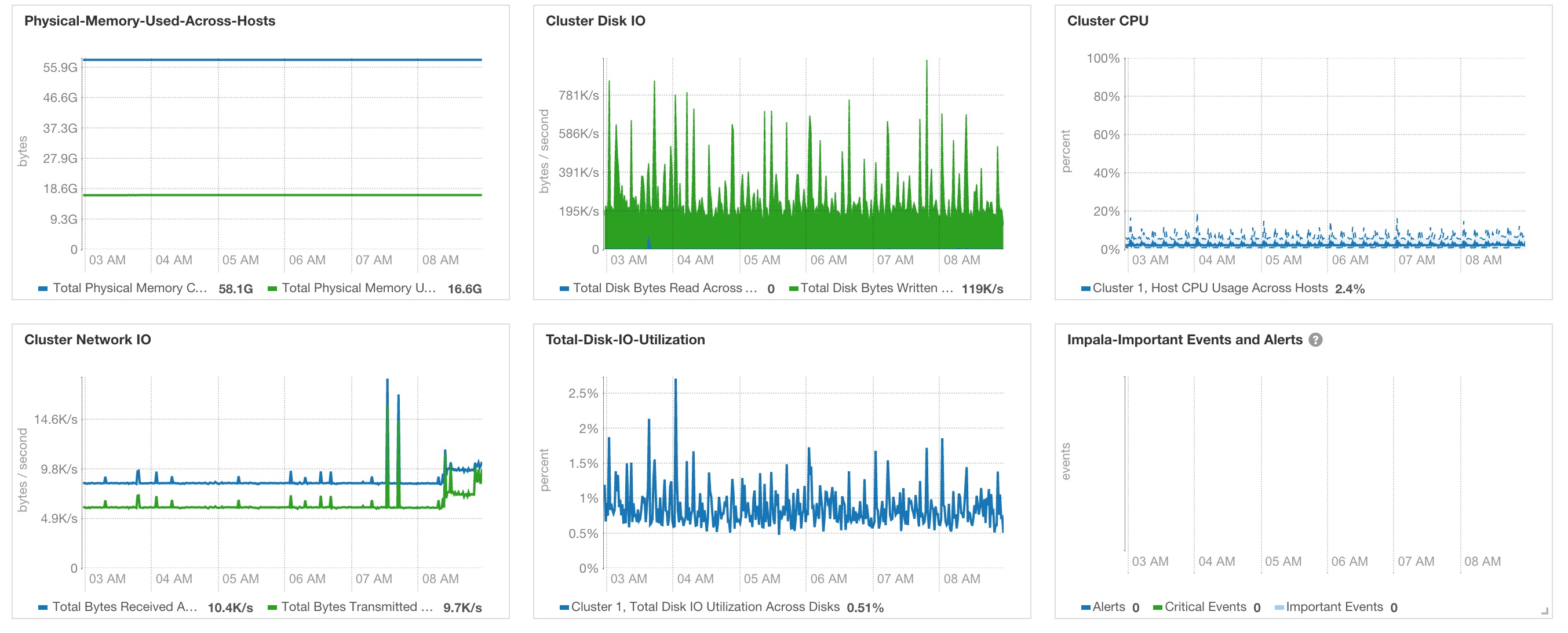
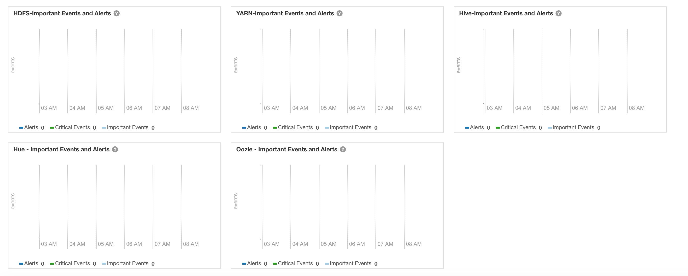
- Daily-Cluster-Health-Dashboard
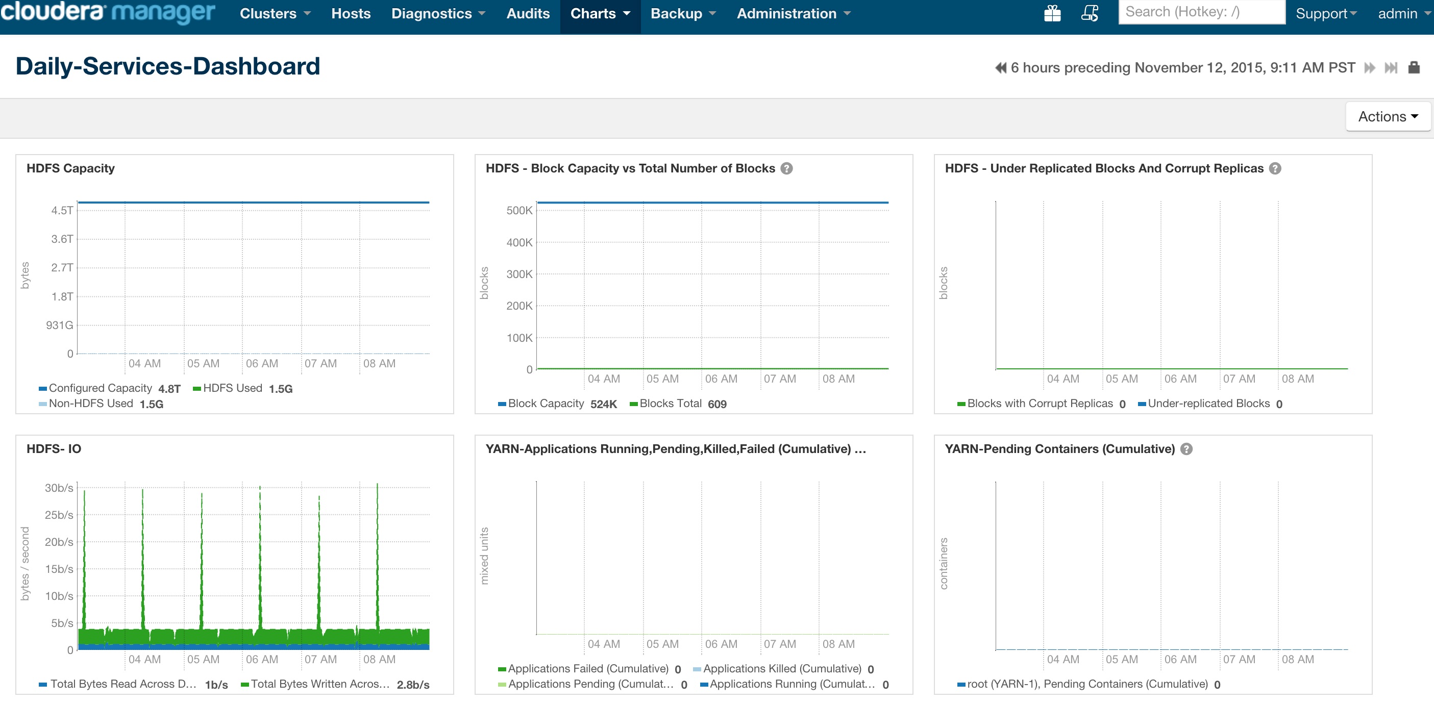
- Daily-Services-Dashboard
- OS-Monitoring-Dashboard
Dashboard consists of the following charts.
tsqueries for the below charts are here.
Dashboard consists of the following charts.
tsqueries for the below charts are here.
Dashboard consists of the following charts.
tsqueries for the below charts are here
tsquery Language is very powerful and super useful in querying the Time-Series data in Cloudera Manager.
Charts displayed in the above dashboards are just a few of 100's of charts that Cloudera Manager provides out of the box. Different customers use Hadoop clusters differently and we encourage you to modify the dashboards we present here based on your needs (example, may be you only need HBase and Solr).
Even better we encourage you to identify the most common issues that you see on your cluster and create dashboards to monitor metrics that can help you proactively monitor to prevent these common issues.
TL;DR - Add your personal touch to these dashboards
To-Do: Add documentation to export/import the dashboards into a user's cluster.
