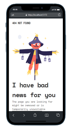
Solution for a challenge from Devchallenges.io.
- Welcome :)
- You can see deployement by clicking on DEMO above. Open DevTool and resize as you wish.
- Try to avoid fixed widths as much as possible they are unconvenients and time-consuming for responsive coding.
- You can reduce page's width in de DevTool to 187.50px (A lmost as small as a SmartWatch) the component stills usable/readable.
- Nested containers and flex are powerfull.
- BEM is cool, please enjoy cheat sheet for naming inspiration in section below.
- It was like tinkering, you know when you start but never when you finish.
- I played with Github, created another account and did a pull request. I Used rebase, branches. SSH keys to work on same project on two differents machines.
- Next project i'll use styled component.
- I have to notice that Vercel deployment doen't work on real mobile device.
- Will fix this for next challenge
- If you know why, please pull request :)
This application/site was created as a submission to a DevChallenges challenge. The challenge was to build an application to complete the given user stories.
- Steps to replicate a design with only HTML and CSS
- Marked - a markdown parser
- FlexBoxFroggy Put some music and speeddrun this game.
- StackOverflow 4 different methods to handle footer position. I tried to innovate and used justify-content:space-between to fix footer.
- FlexBoxFroggy Put some music and speeddrun this game.
- BEM Cheat Sheet
- GitHub @maax6
- Twitter @Maximedevweb

