DVIA assign 4
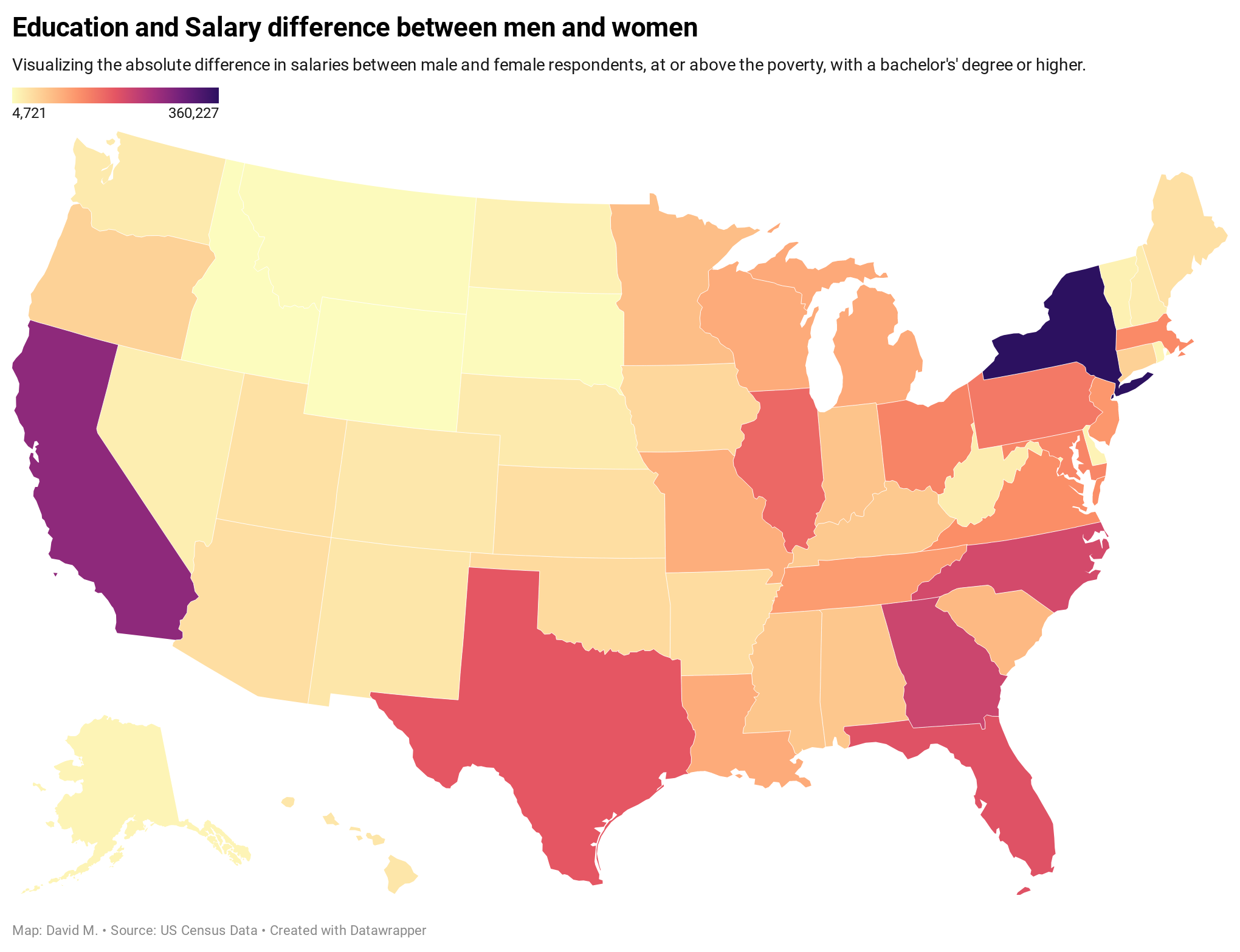
Education and Salary difference btw men and women
- npm install
- node fileName.js
- open local server to index:html
============================================================
Reqs & output
Data + reqs
https://canvas.newschool.edu/courses/1525001/assignments/8211916
Output:
============================================================
Project Approach
Answer project questions as you go along
- Audience questions + sketch
- Check + prep data (acquire, parse, filter)
- Mine/explore/sketch/iterate several simple graphics, re: stories (same or diff?), pick one
- Code initial draft (pseudo first?)
- Refine/declutter/clean/annotate/clarify (color, labels, titles, legend, summary, etc)
- Interactivity (more than tooltips, eg: scrolling)
- Share
===================== 1
-
Why are we doing this?
- What are questions that you want to explore with this visualization?
-
What are you hoping to achieve?
- What will I be looking at(title)?
-
Who are we targeting?
- How is the end product going to be used?
- How are we publishing?
-
Sketch summary:
- sketch
- Questions
- Data set
- Inspirations
- Data vis method
- Current problems
===================== 2
- What data do we have available?
- Which quantitative dataset is used?
https://measuringu.com/qual-methods/ https://www.questionpro.com/blog/qualitative-research-methods/
- What are the properties of the data set?
- How many data points
- What's the quality of the data?
- Which other existing materials should we take into account?
- Which constraints do we have?
- Which quantitative dataset is used?
- explore
- clean
https://csvjson.com/csv2json https://www.npmjs.com/package/csvtojson
===================== 3-6
- Which visualization method is used and why?
https://www.data-to-viz.com/ https://www.d3-graph-gallery.com/ https://www.d3indepth.com/ https://observablehq.com/@d3/ https://observablehq.com/@d3/gallery https://python-graph-gallery.com/ https://www.r-graph-gallery.com/ https://bl.ocks.org/ https://bost.ocks.org/mike/ https://www.axismaps.com/projects http://datamaps.github.io/ | https://github.com/markmarkoh/datamaps/blob/master/README.md#getting-started https://kepler.gl/ https://plotly.com/ | https://github.com/plotly/plotly.js
- What does the visualization enable?
- Is this a static visualization? Is it interactive?
- color: Is it intentional and intuitive? data decodable by audience?
https://colorhunt.co/ https://d3-legend.susielu.com/ https://colorbrewer2.org/
- legends, annotations
- clear text hierarchy?
- link to raw data?
===================== 7
- Who else is doing something similar?
- Abstract/summary/about, re: methodolgy? (1-2 pars)
- What were your considerations?
- What tools did you explore?
- What challenges did you run into?
- How did you iterate?
============================================================
Concept & build
- Questions
- education difference btw men and women?
- calc difference in edu of men vs women, for bachelor+
- at or above poverty line
- can we show additional data? eg toggle button for states where female salary > male salary
- Unemployment rate by county/state?
- Insured rates?
- Diabetes and obesity prevalence/other health stats?
- Election results by race/age/etc?
- Utilities data?
- education difference btw men and women?
- Goal
- visualize salary difference between men and women, for the same education group (bachelor+), and same socio-economic group (> poverty)
- this visual would be useful for policy makers, students, researchers
- Data source:
- We'll be using a choropleth map visual.
============================================================
Project refs
https://github.com/madhat5/DVIA-ex_assign-2 https://www.d3-graph-gallery.com/graph/bubble_tooltip.html https://www.d3-graph-gallery.com/graph/interactivity_tooltip.html https://www.d3-graph-gallery.com/graph/line_select.html https://observablehq.com/@d3/bubble-map https://bost.ocks.org/mike/bubble-map/ https://www.d3indepth.com/scales/ https://d3-legend.susielu.com/ http://statchatva.org/data-visualizations/
Notes
- Methodology influences:
- Ben Fry, Amanda Cox, Alberto Cairo, Mike Bostock