-
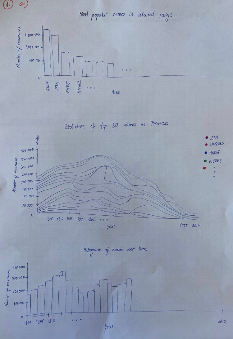
a For this visualization we used 1a sketch. We used interactive visualization with 3 components. The main component is a stacked area chart in which every area is encoding one name (and each area is coloured differently). It is showing number of occurences of top 50 most popular names in France (overall popular - including all the data). This chart allows us to see popularity of most common names in France through years. With mouseover, we can see which area is encoding which name. It is allowing us to see for each name some periods when it was more or less popular. In the same time, for a chosen name there is a histogram under the chart showing popularity of that name over time. Here it is easier to see exact numbers of occurences of chosen name through the years. Besides choosing a name from a stacked area chart, we can also choose an interval of years through the x-axis. Above the stacked area chart there is another histogram showing most popular names in selected range of years and number of their occurences.
-
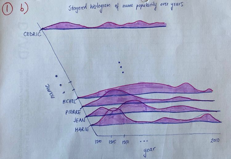
b Second idea for visualization 1 which we haven't implemented includes stagered histogram of name popularity over the years. Here, every histogram is encoding one name and showing its popularity through the years. In this idea, we can not use as many names as in 1a (max 20 names), because then it would become hard to read the histograms. Additionally, in 1a stacked area chart it is much easier to compare popularity of two names at the same time (height of the areas in the same x-axis position).


-
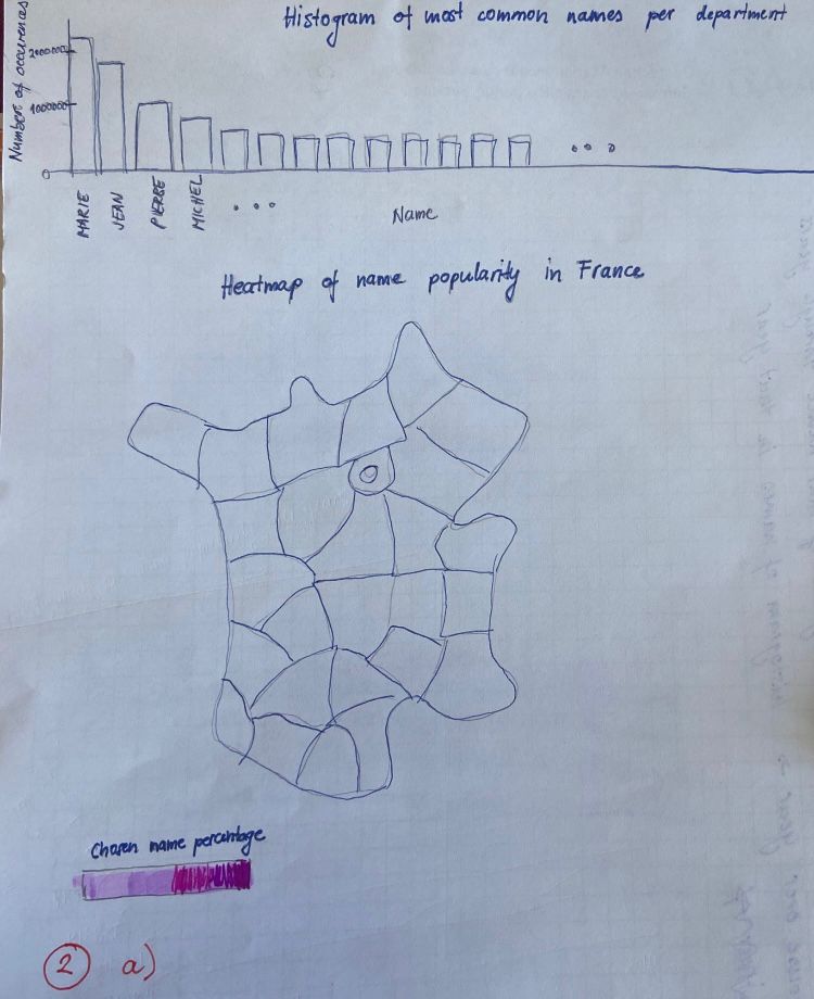
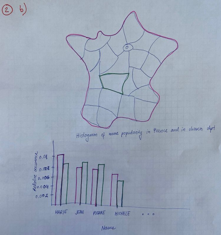
a For visualization 2 we used 2a sketch. It is interactive visualization with 2 components. One of them is a map and another a histogram. Those 2 components are mutually interactive, so they would be able to answer all the posed questions. When we choose an area (department) in the map, the histogram shows number of occurences of the top 35 names in that department (this answers the question "Are some names more popular in some regions?"). Histogram is also interactive. When we choose a bar from the histogram, the map turns into a heatmap of percentage of chosen name through the departments (this answers the question "Are popular names generally popular across the whole country?"). The map is showing percentages of names because if more children are born in some departments, it also affects the heatmap and we wanted to visualize only popularity not affected by natality.
-
b Second idea for visualization would be a map on which we can choose an area. Under the map there is a histogram showing relative occurence of most popular overall names in whole of France and in a chosen department. That visualization answers the question: "Are popular names generally popular across the whole country?", but it doesn't answer the question: "Are some names more popular in some regions?".


-
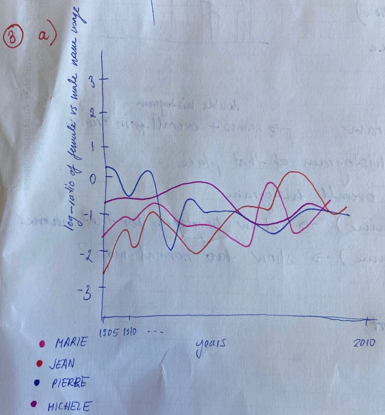
a All the sketches shows log-ratio of female vs male name usage through the years. We used log-ratio because otherwise, chart would be biased depending if we choose men vs women ratio or women vs men ratio. In this idea, every name is encoded with a colour. We didn't use this idea because there is no sense in encoding names with colours because it would be either too few names or it would be impossible to read the encodings.
-
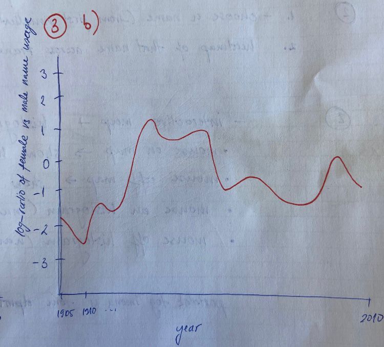
b We used second sketch (3b) for this implementation. It shows the log-ratio of female vs male name usage through the years as the first and the third idea, but it shows the average ratio of all names used for both genders (one line in chart), instead of showing it for all the names. We used this implementation because the other two show extra information which are not relevant regarding the questions and were very messy. This one is the most clear one.
-
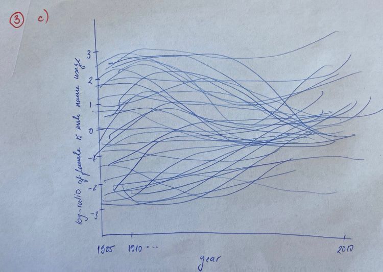
c For the third sketch we showed all names without colour encodings (one blue line for each name). In theory, we thought that this idea would be best to answer all of the questions. The idea is to see when are the lines more concentrated around zero (names equally used for both genders) and when they are concentrated far away from zero and on which side (names used more for women or men). It would be also interesting to use mouseover to see which line is encoding which name and to see how the name was used for both genders during the years. Unfortunately, this chart was very messy and not as informative as 1b.