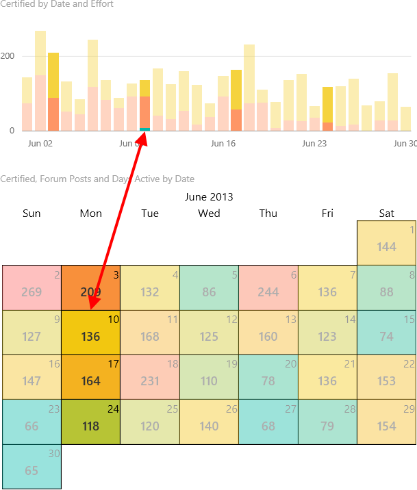
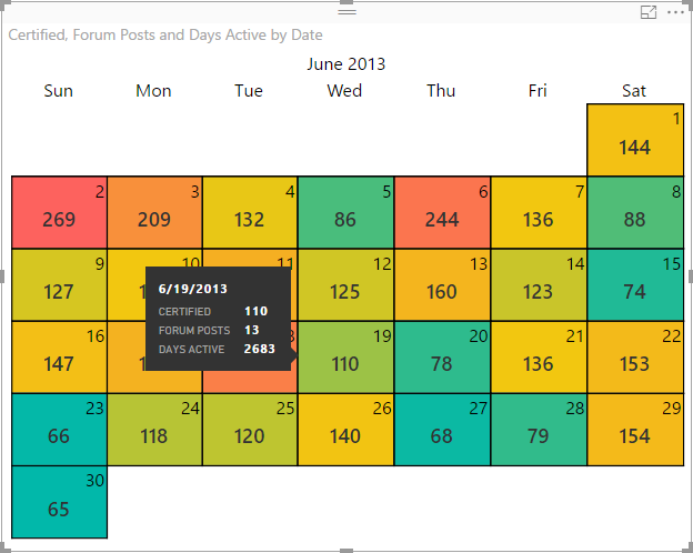
BCI Calendar is a Power BI custom visual that allows you to view your aggregated data in a month view. It offers many customization features ranging from basic formatting options like font size, color, etc, to more advanced features such as divergent data color scales, data labels, tooltips, and selection interaction.
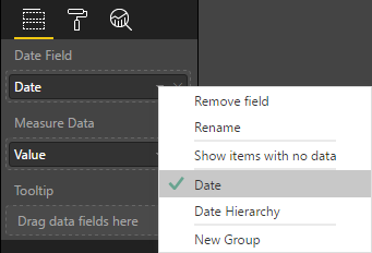
Choose a date field from your dataset to use as the Date Field in the visual (also known as the Category field). Please note that this visual does not currently support date hierarchies. See Known Limitations below for details. If you are having issues viewing your data in the visual, make sure your Date Field is not displaying as "Date Hierarchy".
Choose a value field from your dataset to display in the calendar. You can choose the appropriate aggregation type to be displayed for each day where data exists. Sum is the default aggregation type.
By default, the Date Field will be displayed as the tooltip header and the Measure Data will be displayed in the tooltip body. You can use the Tooltip setting to add any number of additional data fields that will be displayed in the tooltip body area.
Choose a minimum and maximum color value and the visual will display a color gradient based on the Measure Data field supplied. By default, the visual will use the minimum and maximum values from the data, however you can also specify Minimum Value and/or Maximum Value to supply your own min/max for the colors to be based on.
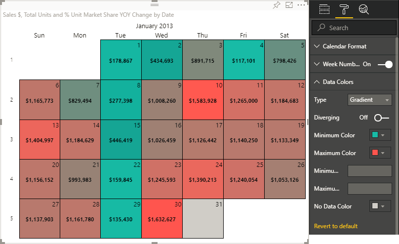
If you would like to include a center color, toggle the Diverging slider to On and specify a Center Color. You can also specify a Center Value if desired.
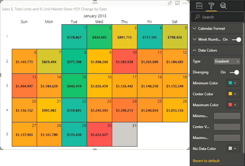
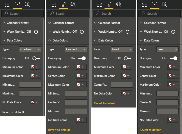
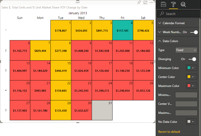
You now have the ability to choose your desired Data Colors Type. The available options are Gradient (default) and Fixed. With the new Fixed option, the data colors will only display the colors you select, and not a gradient color based on the data value. Similar to using the Gradient option, you can toggle the Diverging slider. If On, you can choose Minimum Color, Center Color, and Maximum Color as well as Minimum Value, Center Value, and Maximum Color.
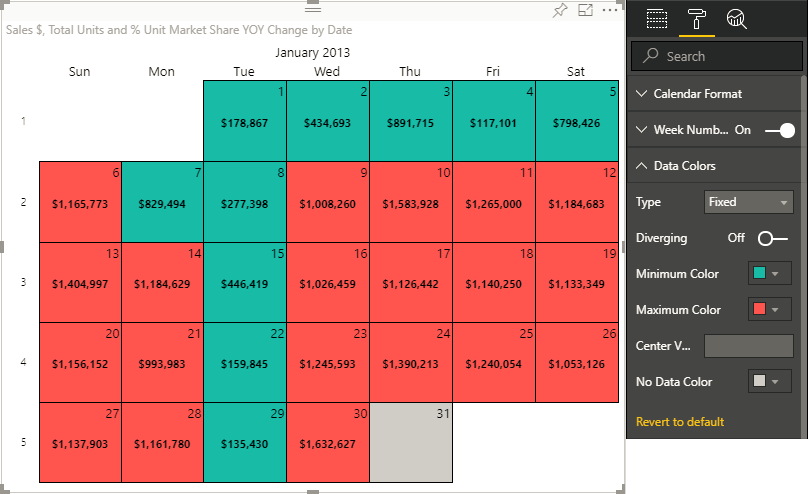
If Off, you can choose Minimum Color and Maximum Color and if desired, can also specify Center Value.
The visual includes selection interaction functionality. Clicking on one or more days in the calendar visual will update the selection in other visuals on the page accordingly. Conversely, selections made in other visuals on the page will also update the selection within the calendar as appropriate.
As described in the Tooltip section above, this visual supports tooltips and allows customization by adding additional data fields to the Tooltip field.
The Power BI custom visual is available at Microsoft App Source. Follow the instructions to download the visual to your computer, and optionally download a sample Power BI report containing the visual and providing examples of using and customizing it.
-
If editing a report using the Power BI Service, be sure to first be in edit mode on your desired report.
-
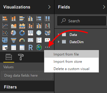
From the visualizations fly-out, choose
Import from file.Note: If using older versions of Power BI, this may be labeled
Import custom visual. -
Browse to the location where you downloaded the custom visual to and choose the
BciCalendar.1.0.0.0.pbivizfile. Note: The version number may vary from what's shown in this document. Be sure to select the correct file. -
Once installed, you will see the BciCalendar icon
 in the Visualizations pane's toolbox area.
Select your Date Field, Measure Data, and Tooltip fields as necessary for your reporting needs. Please see Known Limitations for an explanation on a limitation with using the Date Field. Note: You are limited to one Date Field and one Measure Data field. You can choose as many Tooltip fields as desired.
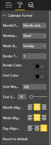
The following customization and formatting options are available for this custom visual.
Month/Year Display: Choose fromNone,Month Only, andMonth and Yearto customize how the month and/or year are displayed in the visual.Weekday Format: Choose fromShortorLongto customize how the weekday labels are displayed.Shortdisplays the first three letters of the weekday.Longdisplays the full weekday name.Week Start Day: Choose the starting day of the week.Border Thickness: Specify the thickness, in pixels, of the border displayed around each day.Border Color: Use the color picker to choose a color for the border displayed around each day.Font Color: Use the color picker to choose a color for the font displaying the Month/Year, Weekdays, and Days.Font Weight: Enter a value, between 100 and 900, to specify the weight of the font (i.e., level of boldness) displaying the Month/Year, Weekdays, and Days.Text Size: Use the slider to choose a size, in pixels, of the text displaying the Month/Year, Weekdays, and Days.Month Alignment: Choose the desired alignment for the Month/Year.Week Alignment: Choose the desired alignment for the Weekdays.Day Alignment: Choose the desired alignment for the Days.
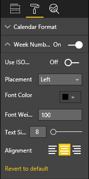
On/Off: Toggle this slider to control whether the calendar should display week numbers.Use ISO week-numbering: Toggle this slider to control which week should be considered week 1. The ISO 8601 definition for week 01 is the week with the Gregorian year's first Thursday in it.Placement: Choose betweenLeftandRight. Based on this selection, week numbers will either be placed as the left-most column of the calendar month or the right-most column.Font Color: Use the color picker to choose a color for the font displaying the week numbers.Font Weight: Enter a value, between 100 and 900, to specify the weight of the font (i.e., level of boldness) displaying the week numbers.Text Size: Use the slider to choose a size, in pixels, of the text displaying the week numbers.Alignment: Choose the desired alignment for the week numbers.
Type: Choose betweenGradient(default) andFixed.Type=GradientDiverging: Toggle this slider to control whether the data colors use a center color and value.Minimum Color: Use the color picker to choose a color for the either minimum data value, or if specified, for theMinimum Value.Center Color: Use the color picker to choose a color for the either middle (mean) data value, or if specified, for theCenter Value. This value is not available ifDivergingis set toOff.Maximum Color: Use the color picker to choose a color for the either maximum data value, or if specified, for theMaximum Value.Minimum Value: If specified, theMinimum Colorwill be based on this value. Leave blank to have theMinimum Colorbe based on the minimum value of theMeasure Datafield.Center Value: If specified, theCenter Colorwill be based on this value. Leave blank to have theCenter Colorbe based on the middle (mean) value of theMeasure Datafield. This value is not available ifDivergingis set toOff.Maximum Value: If specified, theMaximum Colorwill be based on this value. Leave blank to have theMaximum Colorbe based on the maximum value of theMeasure Datafield.
Type=FixedDiverging=OffMinimum Color: Use the color picker to choose a color for values below either the middle (mean) value, or if specified, theCenter Value.Maximum Color: Use the color picker to choose a color for values above either the middle (mean) value, or if specified, theCenter Value.Center Value: If specified, values below this value will be colored usingMinimun Colorand values above this value will be colored using theMaximum Color. If left blank, the visual will use the middle (mean) value of the dataset.
Diverging=OnMinimum Color: Use the color picker to choose a color for values below either the middle (mean) value, or if specified, theCenter Value.Center Color: Use the color picker to choose a color for the either middle (mean) data value, or if specified, for theCenter Value.Maximum Color: Use the color picker to choose a color for values above either the middle (mean) value, or if specified, theCenter Value.Minimum Value: If specified, theMinimum Colorwill be based on this value. Leave blank to have theMinimum Colorbe based on the minimum value of theMeasure Datafield.Center Value: If specified, values below this value will be colored usingMinimun Colorand values above this value will be colored using theMaximum Color. If left blank, the visual will use the middle (mean) value of the dataset.Maximum Value: If specified, theMaximum Colorwill be based on this value. Leave blank to have theMaximum Colorbe based on the maximum value of theMeasure Datafield.
No Data Color: Use the color picker to choose a color for days with no data.
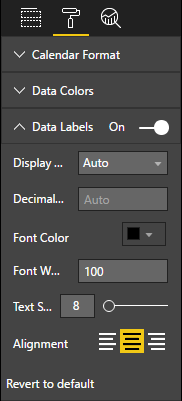
On/Off: Toggle this slider to control whether the aggregated data values from theMeasure Datafield are displayed for each day.Display Unit: Use this dropdown to choose a desired display unit to convert the data labels to.Decimal Places: Enter the number of desired number of decimal places to be displayed in the data labels.Font Color: Use the color picker to select a font color for the data labels.Font Weight: Enter a value, between 100 and 900, to specify the weight of the data labels font (i.e., level of boldnesss).Text Size: Use the slider to choose a size, in pixels, of the text displaying the data labels.Alignment: Choose the desired data label alignment.
These are all default Power BI visual formatting options.
-
The visual doesn't support date hierarchies. If you are having issues viewing your data in the visual, make sure your
Date Fieldis not displaying as "Date Hierarchy". -
Date/Time (versus Date) date fields might not display data properly. When using a Date/Time column in the
Date Field, it is likely that the underlying data set will have multiple data points for a single day which prevents the visual from displaying the data properly. The current workaround for this is to use aDatecolumn for theDate Fieldinstead or create aDatecalculated column if needed. This is being tracked with issue #7. -
The visual will use the month/year from the first date in the selected dataset. If your dataset spans multiple months or years, the visual will only show the first month/year.
-
The optimal experience for visualizing your data using this visual is when your report or page is filtered to view one month at a time. For example, using a month/year slicer or page filter.
