Native Angular (8+) datetime picker component styled by Twitter Bootstrap 4.
Read this in other languages: Spanish
Use install version 3.1.0
npm install angular-bootstrap-datetimepicker@3.1.0
See angularjs-bootstrap-datetimepicker
I know this is a tiny component but many people use it in production (high 5 to all of us) - if you happen to use this component please click the star button (at the top of the page) - it means a lot to all the contributors.
Peer dependencies:
- Angular 8.x or higher (1.x will not work)
- moment.js 2.22.2 or higher for date parsing and formatting
- bootstrap 4.x for css/layout
- open-iconic for the default icon's (you can use any icon library you like)
jQuery is NOT required.
If you are using the Angular CLI there are a few simple steps to add this component to your project.
First, install this module and it's peer dependencies.
npm install --save angular-bootstrap-datetimepicker bootstrap moment open-iconicThen update ./src/app/app.module.ts to include the following:
import { AppComponent } from './app.component';
import { BrowserModule } from '@angular/platform-browser';
import { FormsModule } from '@angular/forms';
import { NgModule } from '@angular/core';
import { DlDateTimeDateModule, DlDateTimePickerModule } from 'angular-bootstrap-datetimepicker';

@NgModule({
  declarations: [
    AppComponent
  ],
  imports: [
    BrowserModule,
    FormsModule,
    DlDateTimeDateModule,  // <--- Determines the data type of the model
    DlDateTimePickerModule,
  ],
  providers: [FormsModule],
  bootstrap: [AppComponent]
})
export class AppModule { }
Next, add the following to ./src/app/app.component.html
<dl-date-time-picker
	startView="day"
	maxView="year"
	minView="minute"
	minuteStep="5"
	[(ngModel)]="selectedDate"
>
</dl-date-time-picker>
Next, add the following to ./src/styles.css
@import '~bootstrap/dist/css/bootstrap.min.css';
@import '~open-iconic/font/css/open-iconic-bootstrap.css';
Note: This component uses open-iconic icons by default, but you can use any icon library
that supports styling with classes.
Finally, run npm start and you should see the date/time picker on http://localhost:4200/
By default, the date/time picker is as wide as it's container { width:100% }.
It uses bootstrap's flex row and col classes to layout the date/time picker into rows and columns.
If the parent container is too narrow (less than 340px in english), the row and column layout may wrap in ways that are not attractive.
Other languages/locals may require a wider container to fit the contents.
The user interactions with a date-time picker make it difficult to write e2e tests that exactly replicate the users interaction with the picker.
Fortunately, this repository contains a file you can use in your e2e tests to cause the date/time picker to select any specified date.
See ./e2e/src/dl-date-time-picker-protractor.ts for details.
Use the automated configuration generator (please let me know if it does not work for your use case!), or see https://dalelotts.github.io/angular-bootstrap-datetimepicker/ for the automatically generated documentation.
The first day of the week is determined by moment's i18n settings.
For example, setting the locale to 'fr' will cause Monday to be the first day of the week.
The format of hours and minutes is also determined by moment's i18n settings.
hours are displayed using ll as the format.
minutes are displayed using lll as the format.
I recommend you use the default locale settings from Moment (if they are incorrect, submit a PR to moment to correct the settings) If for some reason the default Moment settings will not work, you can customize the existing locale or create a custom locale with the desired formats.
You can generate the documentation by running npm run documentation
or see https://dalelotts.github.io/angular-bootstrap-datetimepicker/
The DlDateTimePickerComponent component adds aria-label attributes to the left, right, and up buttons
in addition to all calendar cells where the text of the cell may not fully describe the value.
The DlDateTimePickerComponent component supports the following keyboard shortcuts in all views:
| Shortcut | Action |
|---|---|
LEFT_ARROW |
Go to the cell to the left |
RIGHT_ARROW |
Go to the cell to the right |
UP_ARROW |
Go to the cell above |
DOWN_ARROW |
Go to the cell below |
HOME |
Go to the first cell in the view |
END |
Go to the last cell in the view |
PAGE_UP |
Go to the same cell in the previous time period |
PAGE_DOWN |
Go to the same cell in the next time period |
ENTER or SPACE |
Select current cell |
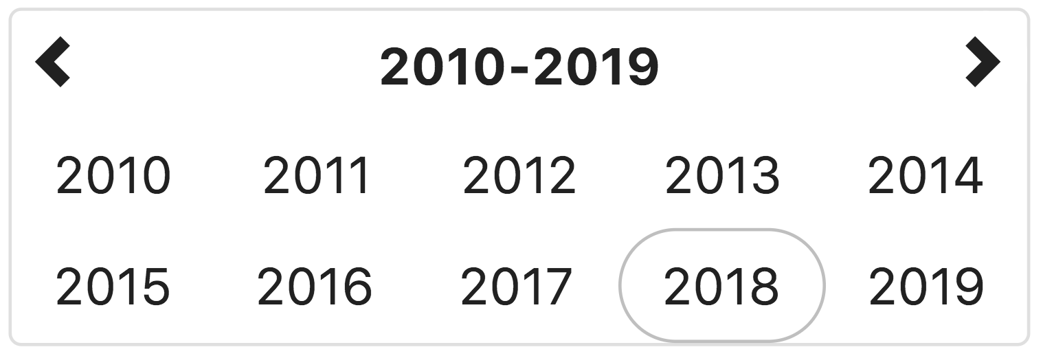
This view allows the user to select the year for the target date. If the year view is the minView, the date will be set to midnight on the first day of the year
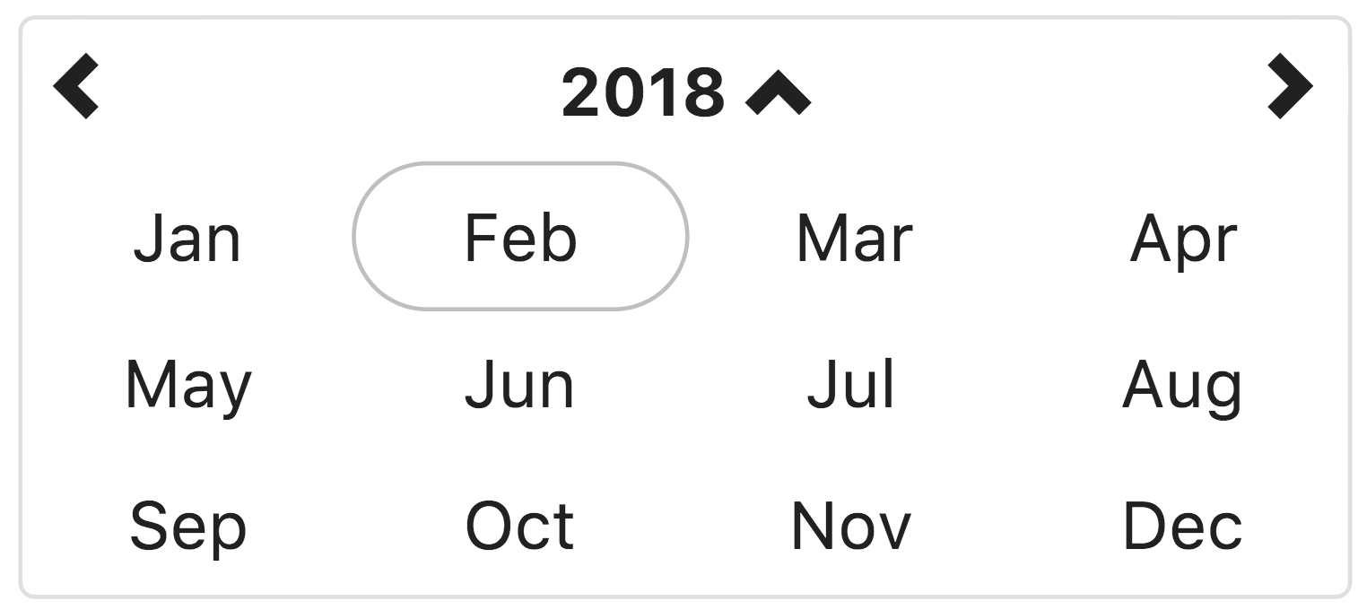
This view allows the user to select the month in the selected year. If the month view is the minView, the date will be set to midnight on the first day of the month.
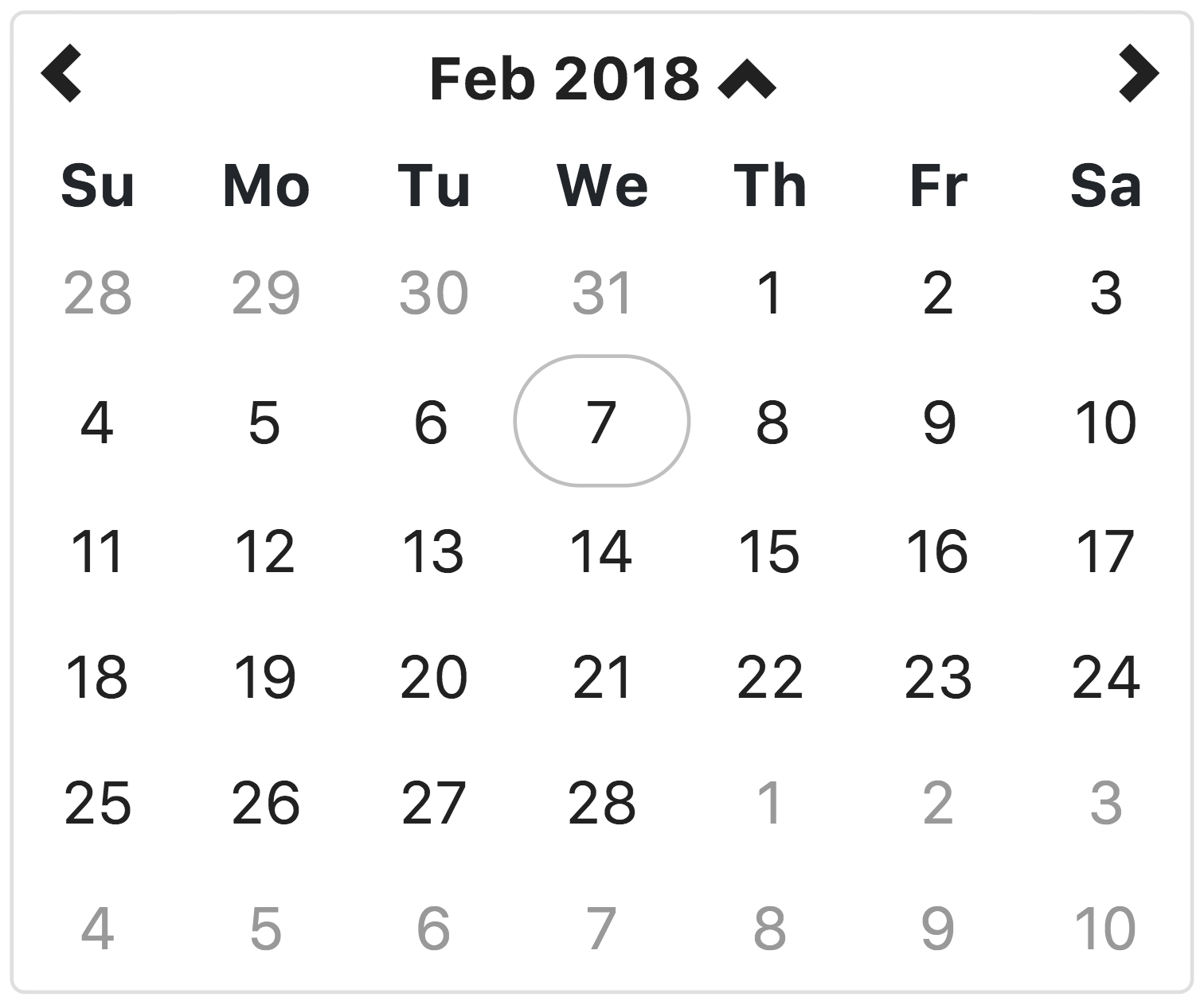
This view allows the user to select the the day of the month, in the selected month. If the day view is the minView, the date will be set to midnight on the day selected.
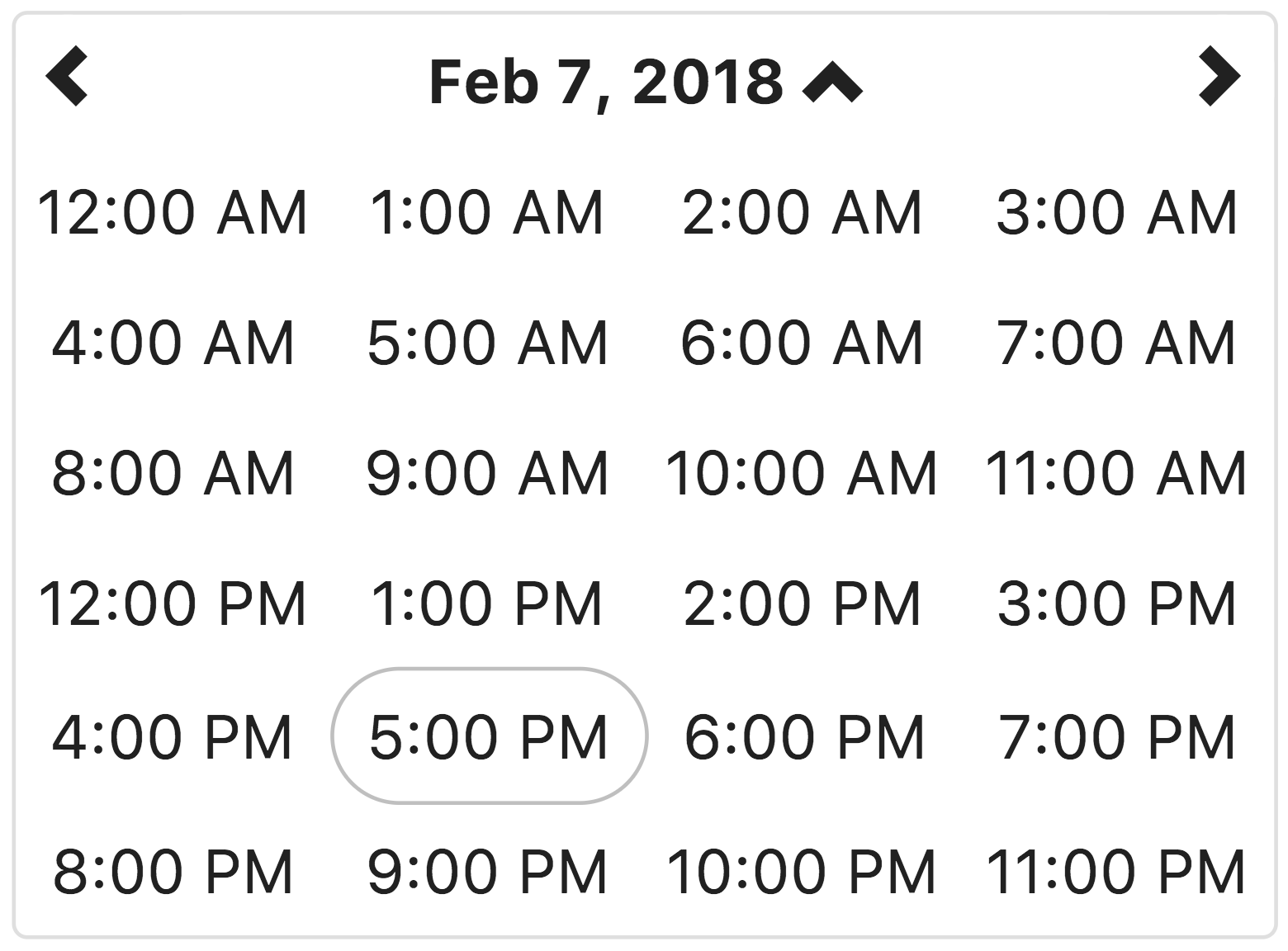
This view allows the user to select the hour of the day, on the selected day. If the hour view is the minView, the date will be set to the beginning of the hour on the day selected.
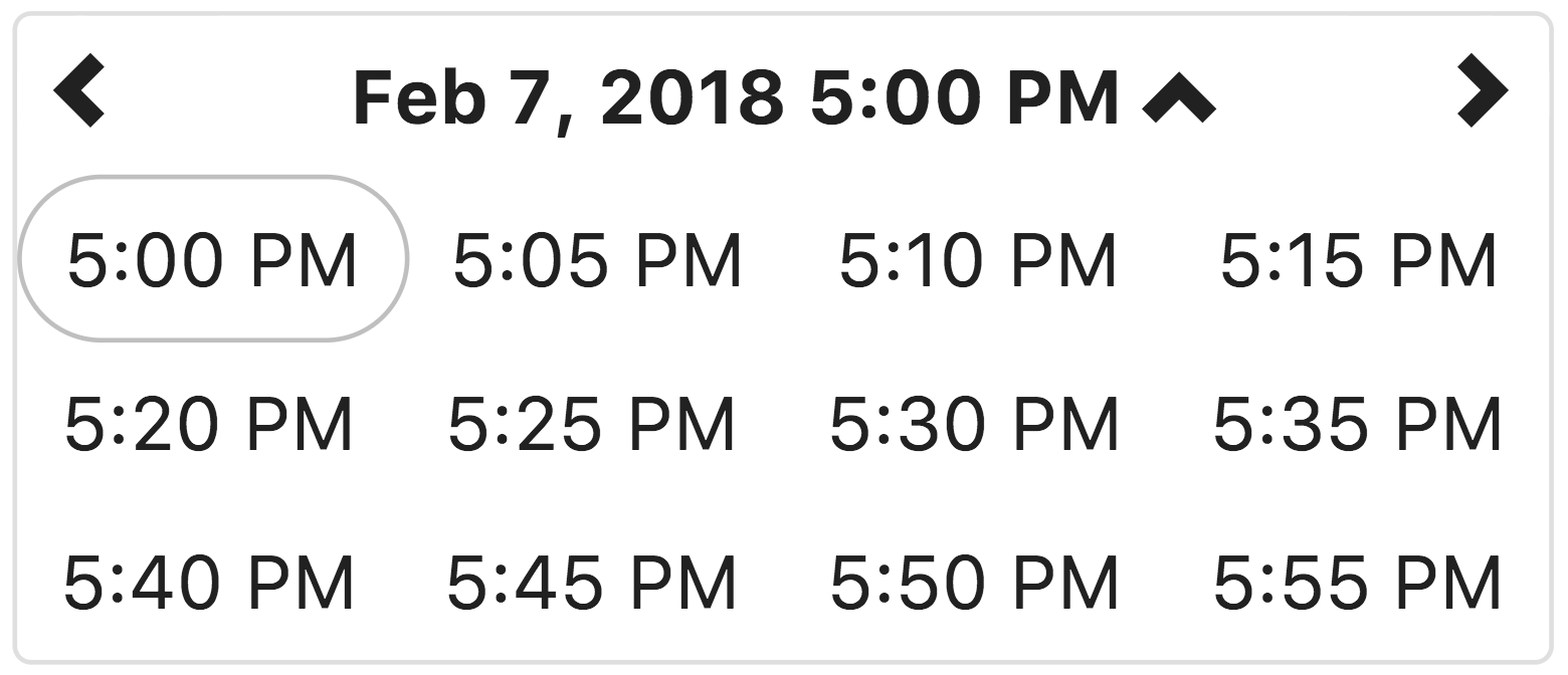
This view allows the user to select a specific time of day, in the selected hour.
By default, the time is displayed in 5 minute increments. The minuteStep property controls the increments of time displayed.
If the minute view is the minView, which is is by default, the date will be set to the beginning of the hour on the day selected.
See Contributing.md
This component was written using TDD and all enhancements and changes have related tests.
We use karma and jshint to ensure the quality of the code. The easiest way to run these checks is to use gulp:
npm install
npm test
The karma task will try to open Chrome as a browser in which to run the tests. Make sure Chrome is available or change the browsers setting in karma.config.js
angular-bootstrap-datetimepicker is released under the MIT license and is copyright 2015 Knight Rider Consulting, Inc.. Boiled down to smaller chunks, it can be described with the following conditions.
- Keep the license and copyright notice included in angular-bootstrap-datetimepicker's CSS and JavaScript files when you use them in your works
- Freely download and use angular-bootstrap-datetimepicker, in whole or in part, for personal, private, company internal, or commercial purposes
- Use angular-bootstrap-datetimepicker in packages or distributions that you create
- Modify the source code
- Grant a sublicense to modify and distribute angular-bootstrap-datetimepicker to third parties not included in the license
- Hold the authors and license owners liable for damages as angular-bootstrap-datetimepicker is provided without warranty
- Hold the creators or copyright holders of angular-bootstrap-datetimepicker liable
- Redistribute any piece of angular-bootstrap-datetimepicker without proper attribution
- Use any marks owned by Knight Rider Consulting, Inc. in any way that might state or imply that Knight Rider Consulting, Inc. endorses your distribution
- Use any marks owned by Knight Rider Consulting, Inc. in any way that might state or imply that you created the Knight Rider Consulting, Inc. software in question
- Include the source of angular-bootstrap-datetimepicker itself, or of any modifications you may have made to it, in any redistribution you may assemble that includes it
- Submit changes that you make to angular-bootstrap-datetimepicker back to the angular-bootstrap-datetimepicker project (though such feedback is encouraged)
The full angular-bootstrap-datetimepicker license is located in the project repository for more information.


