A Flutter package with custom implementation of the Slider Drawer Menu
To start using this package, add flutter_slider_drawer dependency to your pubspec.yaml
dependencies:
flutter_slider_drawer: '<latest_release>'- Slider with custom animation time
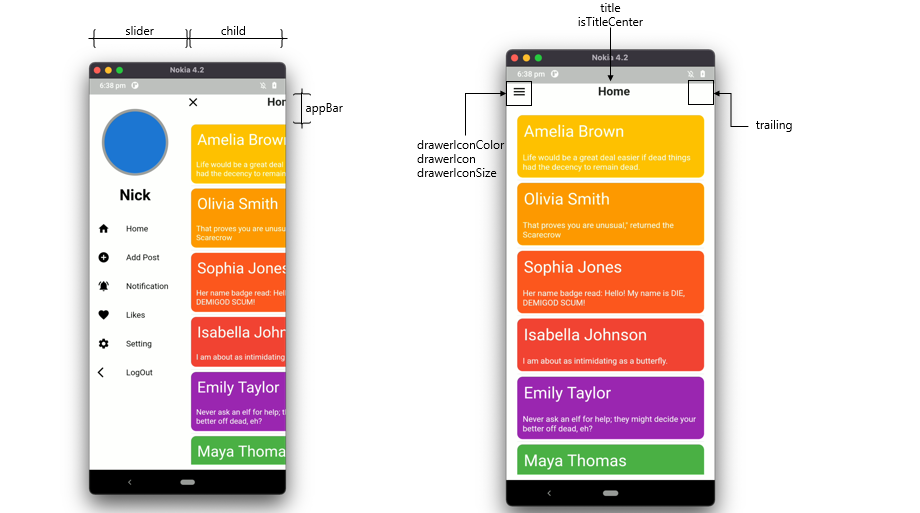
- Provide Basic Appbar with customization of color, size and title
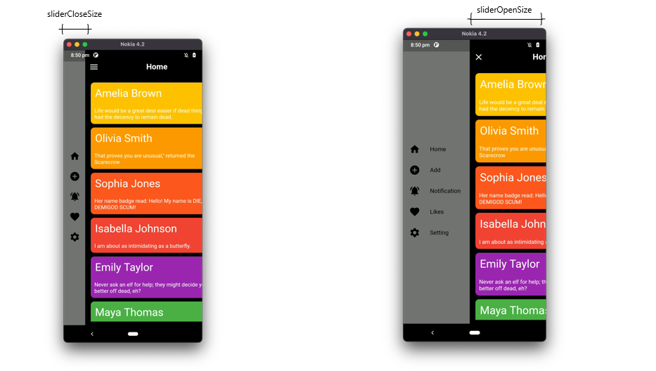
- Dynamic slider open and close offset
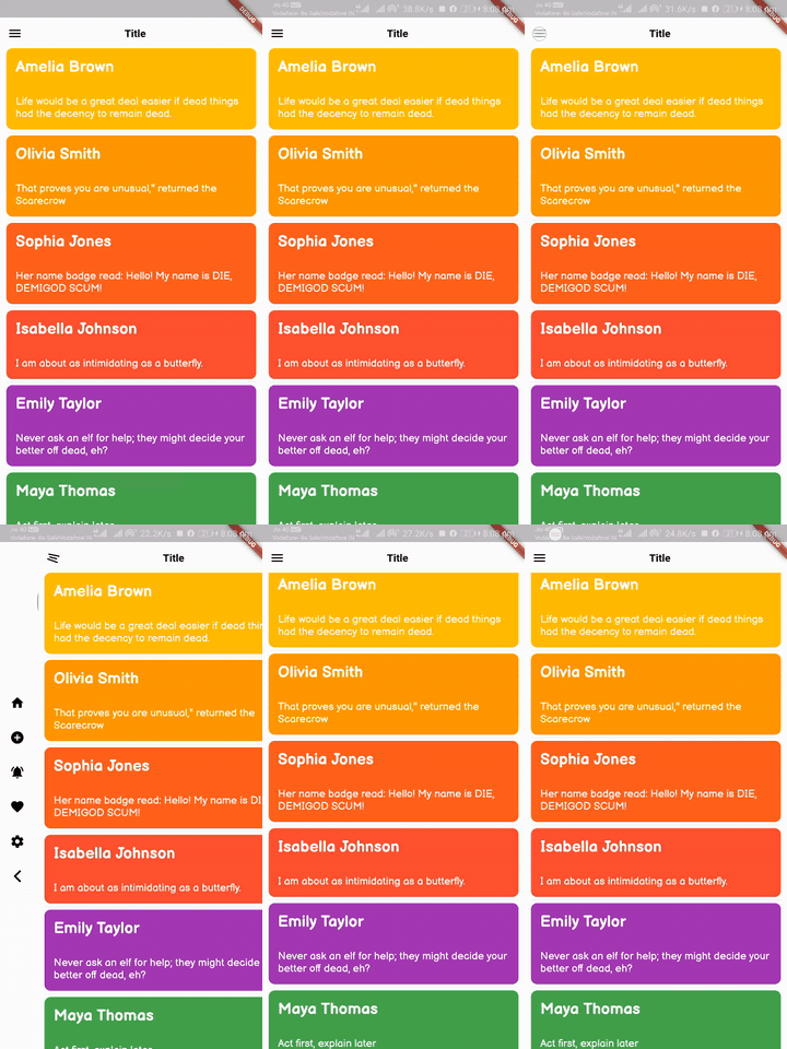
- Provide drawer icon animation
- Provide shadow of Main screen with customization of shadow colors,blurRadius and spreadRadius
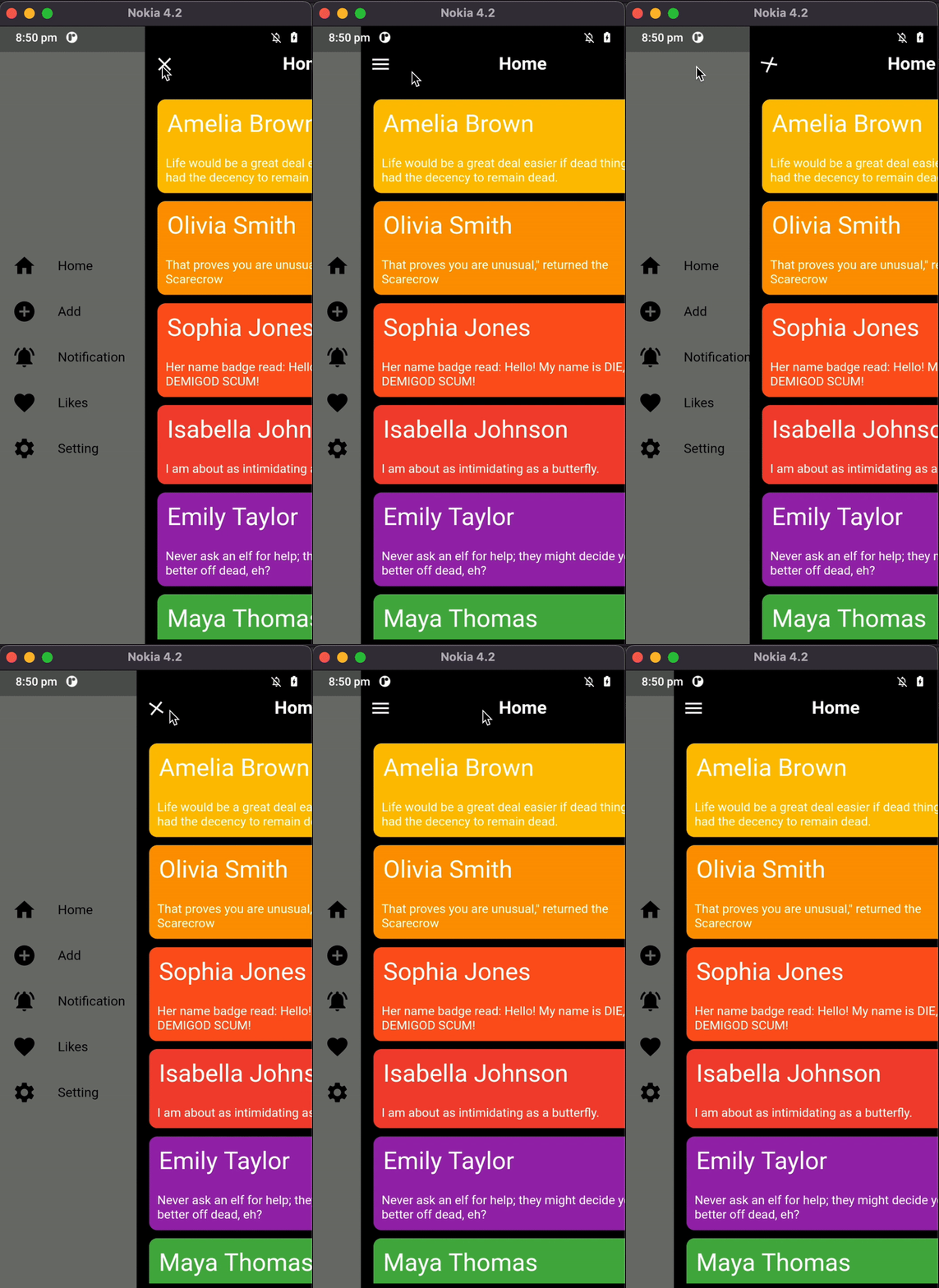
- Provide RTL(RightToLeft),LTR(LeftToRight) and TTB(TopToBottom) slider open selection
- Provide Custom Appbar support and you can also use plugin appBar with use of
SliderAppBarwidget
  Widget build(BuildContext context) {
     return Scaffold(
         body: SliderDrawer(
           key: _key,
           appBar: SliderAppBar(
               appBarColor: Colors.white,
               title: Text(title,
                   style: const TextStyle(
                       fontSize: 22, fontWeight: FontWeight.w700))),
           slider: Container(color: Colors.red),
           child: Container(color: Colors.amber),
         ));
   }
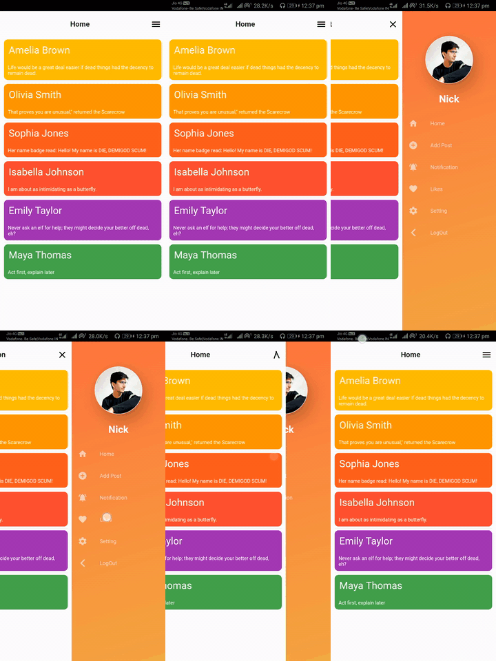
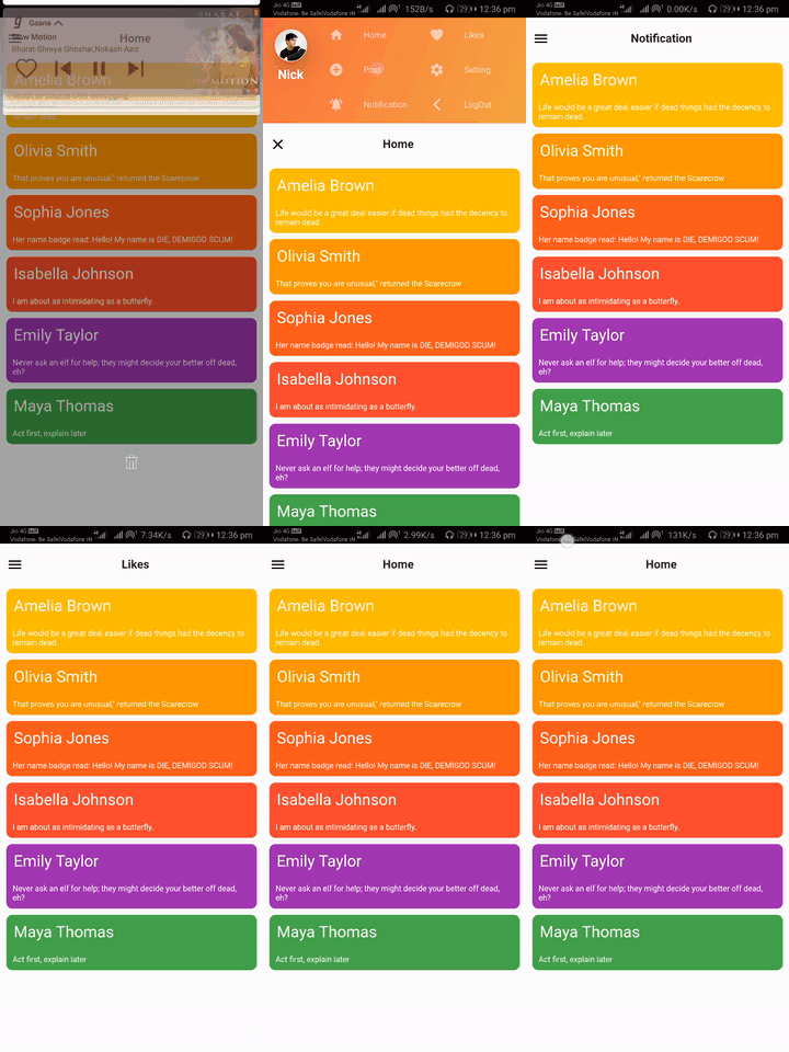
# Slider open
| SliderOpen.LEFT_TO_RIGHT | SliderOpen.RIGHT_TO_LEFT | SliderOpen.TOP_TO_BOTTOM |
|---|---|---|
 |
 |
 |
class _MyAppState extends State<MyApp> {
  GlobalKey<SliderDrawerState> _key = GlobalKey<SliderDrawerState>();

  @override
  Widget build(BuildContext context) {
    return Scaffold(
        body: SliderDrawer(
      key: _key,
      appBar: SliderAppBar(
          appBarColor: Colors.white,
          title: Text('Title',
              style:
                  const TextStyle(fontSize: 22, fontWeight: FontWeight.w700))),
      slider: Container(color: Colors.red),
      child: Container(color: Colors.amber),
    ));
  }
}
- Using the below methods to control drawer .
 _key.currentState.closeDrawer();
 _key.currentState.openDrawer();
 _key.currentState.toggle();
 _key.currentState.isDrawerOpen();
- Use below variable if you want to control animation.
_key.currentState.animationController
BSD 2-Clause License


