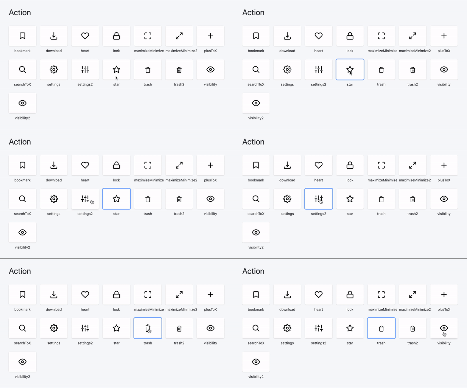
React-useanimations is a collection of free animated open source icons for React.js.
https://react.useanimations.com and play with examples or visit our Storybook
Using Yarn:
yarn add react-useanimations
or using NPM:
npm install -S react-useanimations
If you still need to use v1, please refer to this README instead - react-useanimations@v1
Basic usage
import React from 'react';
import UseAnimations from 'react-useanimations';
// EVERY ANIMATION NEEDS TO BE IMPORTED FIRST -> YOUR BUNDLE WILL INCLUDE ONLY WHAT IT NEEDS
import github from 'react-useanimations/lib/github'

const App = () => <UseAnimations animation={github} />;

export default App;
Icons can be configured with inline props:
<UseAnimations animation={github} size={56} wrapperStyle={{ padding: 100 }} />These props are available:
| Prop | Default | Definition |
|---|---|---|
| animation | / | animation file |
| size | 24 |
animation size |
| strokeColor | 'inherit' |
animation stroke color |
| fillColor | '' |
animation fill color |
| wrapperStyle | {} |
wrapper div styles |
| pathCss | '' |
css string for the animation path element |
| reverse | false |
assing to true when eg. checkbox should be checked initally |
| autoplay | false* |
false except in animations like loading etc. |
| loop | false* |
false except in animations like loading etc. |
| options | {} |
provide any other custom options which will override the default ones |
| speed | 1 |
a number to determine the speed of lottie(1 is normal speed) |
Controlled checkbox example
export const RadioButton = () => {
  // JUST EXAMPLE - THIS PART OF THE STATE WILL PROBABLY COME FROM A PARENT FORM COMPONENT
  const [checked, setChecked] = useState(true);

  return (
    <div style={{ padding: '20px' }}>
      <span>radioButton</span>
      <UseAnimation
        reverse={checked}
        onClick={() => {
          setChecked(!checked);
        }}
        size={40}
        wrapperStyle={{ marginTop: '5px' }}
        animation={radioButton}
      />
    </div>
  );
};
Animation wrapped in element (use render prop).
export const WrapperElement = () => {
  return (
    <UseAnimation
      animation={heart}
      size={60}
      onClick={() => {
        // eslint-disable-next-line
        console.log('additional onClick cb is working');
      }}
      render={(eventProps, animationProps) => (
        <button style={{ padding: '20px' }} type="button" {...eventProps}>
          <div {...animationProps} />
        </button>
      )}
    />
  );
};
Note that eventProps consists of onClick, mouseOver and other DOM events which you probably want to assign to your wrapping element (e.g. Button) and animationProps consist of an actual animation which you should spread inside a simple <div>


