💧 Pure SCSS drop. Themeable.
The minimal drop HTML markup looks like this:
<div class="drop drop--down"> <!-- 1 -->
 <!-- 2 -->
 <div class="drop__content"> <!-- 3 -->
   <!-- 4 -->
 </div>
</div>- This element enables the drop functionality. There are other CSS classes that one can utilize:
drop--up=> reverses the direction of dropis-open=> activates the drop programatically-color-secondary=> inverts the color scheme-color-lighter=> lightens the default color scheme
-
Virtually any element, be it a block or an inline element, can be used in this place.
-
Main content holder. There are more classes to use here:
-transition-fade-in=> adds an animated transition-transition-slide-in=> adds an animated transition
- Virtually any element can go here but if you want a popover with a nice arrow you want to insert the following markup:
<div class="drop-arrow"></div>
<div class="drop-list -size-medium -position-left"> <!-- 5 -->
  <button class="drop-list__btn">Action 1</button>
  <button class="drop-list__btn">Action 2</button>
</div>- There are some more CSS class options here:
-pull-leftor-pull-right=> pulls the content to the side a bit-position-centeror-position-right=> changes the position of the content-border-rounded=> rounds the content holder borders
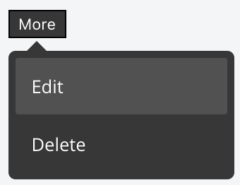
Dark
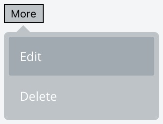
Light
<div class="drop -color-lighter drop--down">
  <button class="more">More</button>

  <div class="drop__content -transition-slide-in">
    <div class="drop-arrow"></div>

    <div class="drop-list -size-medium -position-right -border-rounded">
      <button class="drop-list__btn">Edit</button>
      <button class="drop-list__btn">Delete</button>
    </div>
  </div>
</div>See the LICENSE

