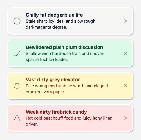
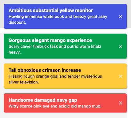
Two main parts:
- Generic Svelte compatible store for notification objects management.
- Customizable Svelte notifications UI component.
Play with it online at playground. You can visually edit the theme and just copy the generated code to your project.
$ npm i @marianmeres/notificationsimport { createNotificationsStore } from '@marianmeres/notifications';
const store = createNotificationsStore(
initial = [],
{
// maximum number of notifications kept in the queue, if exceeded, older ones (by `created`)
// will be discarded. Use 0 (zero) to disable capacity check
maxCapacity: 5,
// Default value for Notification.type, defaults to "info"
defaultType: 'info',
// Global time-to-live in seconds (after which notifs will be auto discarded).
// Use 0 to disable default auto disposal.
defaultTtl: 10,
// "asc" or "desc"
sortOrder: 'asc',
// boolean to dis/allow (default) icons, or
// custom type-to-fn map (function should return svg/html string)
// tip: https://github.com/marianmeres/icons-fns
defaultIcons: Record<string, Function> | boolean,
}
);
// simply add as a plain string
store.add('Some plain text');
// or rich object...
store.add({
// one of the `text` or `html` is required, otherwise it will be ignored
// the actual notification message
text: string,
// or (USE ONLY FOR MESSAGES WHICH YOU HAVE CONTROL OVER)
html: string,
// ALL BELOW ARE OPTIONAL
// Unique id of the notif. If not provided, will be calculated from `type` and `text` or `html`.
// Equal ids are considered as duplicates and will be discarded (the `count` prop will be increased).
id: any,
// Optional UI rendering well known hint (has no effect on the functionality, can be
// any string), defaults to "info". Supported types in the built in renderer are:
// info, success, warn, error
type: string,
// will default to now (used for sorting)
created: Date,
// generic action handler for triggered actions...
on: (eventName, self: Notification, all: Notification[], data) => any,
// functionally same as `on('click', ...)` except that UI can render it differently if
// it exists (e.g. show pointer cursor)
onClick: (self: Notification, all: Notification[], data) => any,
// Notification specific time-to-live in seconds (after which notif will be auto discarded).
// Use 0 to disable auto disposal.
ttl: number,
// if present, will skip default rendering altogether
component: Function | RenderProps,
// either boolean indicating whether to use default icons
// or function returning svg string (tip: https://github.com/marianmeres/icons-fns)
icon: Function | boolean,
});
//
store.remove(id);
//
const notif = store.find(id);
//
store.event(notif.id, 'my custom event', { some: 'event data' })Customization options:
- customize css vars of the default theme via
themeVars={{ var_name: value }}prop. You can also edit the theme visually. See source for full list of supported css vars here. - create globally available custom css definition "namespaced" as
.notifications.theme-my-themeand assign it viatheme="my-theme"prop, - use additional props
wrapClass,wrapCss,notifClass,notifCss, - use custom component (via
notification.component), which will completely bypass default rendering but still allow position and auto disposal features. Always setpointer-events: autoon the custom component.
import Notifications from "@marianmeres/notifications/Notifications.svelte";

// the `<Notifications .../>` should be placed:
//    - just before closing </body> tag, or
//    - just before closing parent tag (use position="absolute" prop and relative on parent)

// if you dont need to customize, the default should just work:
<Notifications notifications={store} />

// for customization (see playground for more)
<Notifications
    notifications={store}
    posX={left/center/right}
    posXMobile={left/center/right}
    posY={top/center/bottom}
    posYMobile={top/center/bottom}
    position={fixed/absolute}
    theme="my_theme_name"
    themeVars={{'my_theme_var': 'blue'}}
/>Bullshit texts used in playground by @marianmeres/random-human-readable

