This microservice generates a summary dashboard of yield data uploaded to 360, developed with Streamlit and Python
Try Demo App
·
Report Bug
·
Request Feature
Table of Contents
This microservice generates a summary dashboard of Fields and Crops data uploaded to 360, based on the selected Domain, Area(s), Workspace(s), Season(s), and Farm(s), Crop(s), Hybrid(s)/Variety(ies) and Yield Layer(s).
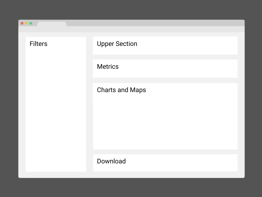
Users can filter data according to Domain, Area(s), Workspace(s), Season(s), Farm(s), Crop(s), Hybrid(s)/Variety(ies) and Yield Layer(s). An option to "select all" is available for all categories. Additionally, the sidebar includes a color palette selector for use in the charts.
This section includes the Domain logo, the dashboard title, a language selector, and user information.
Coming soon.
Users can group information according to Area, Workspace, Season, Farm, Crop, and Hybrid/Variety. This grouping will be the basis for visualizations in the following charts.
Displays a bar chart for each layer of yields, grouped according to the previously selected grouping value. The bars are ordered from highest to lowest yield.
Shows a bar chart with the weighted average yield value for each unique value of the selected grouping field. It maintains the same order as the previous chart.
Displays the centroid of each yield layer, grouped according to the selected grouping field. They maintain the same order and symbolism as the previous charts. Additionally, it is possible to change the background map and view a heatmap generated from the yield values of each layer.
Enables downloading the information used in the analysis as a CSV file according to the filters in the sidebar.
Coming soon, it will allow downloading a PDF printout of the dashboard.
-
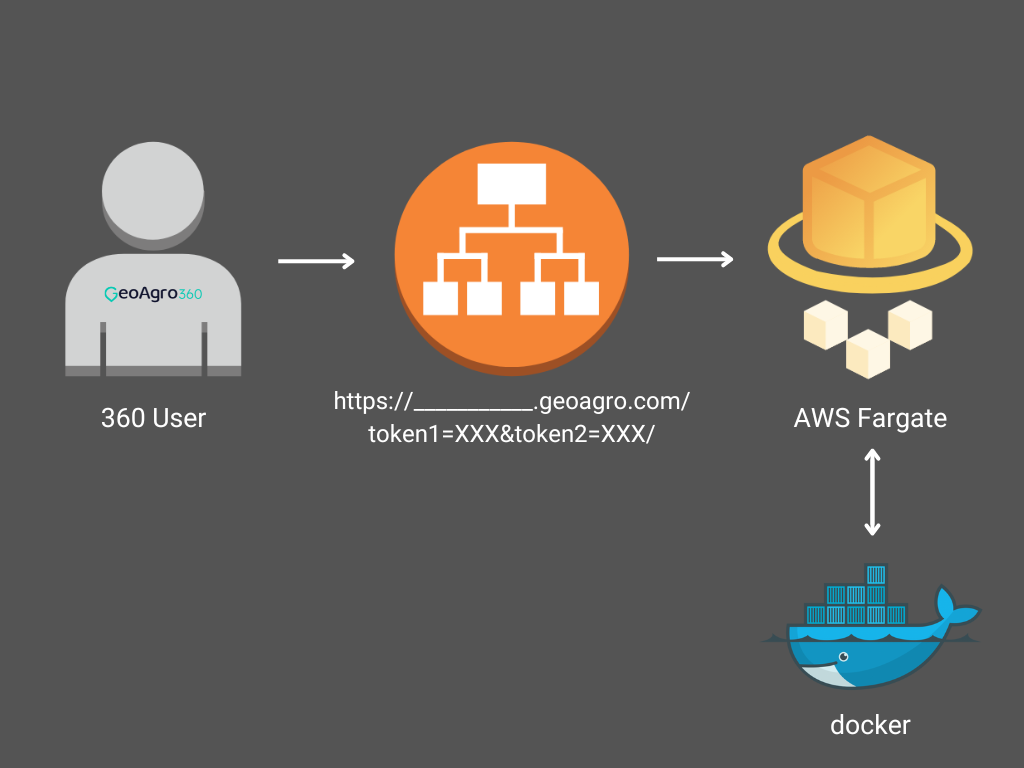
The user must login in 360.geoagro.com.
-
In the switcher (up-right corner) must select "___________".
-
It opens the url with two tokens, token1 has an info of user like:
user_info={'email': user_email, 'language': 'es', 'env': 'prod', 'domainId': None, 'areaId': None, 'workspaceId': None, 'seasonId': None, 'farmId': None}
-
An Application Load Balancer take the request and send to fargate.
-
In fargate, the dashboard is running troughby docker as service.
To get a local copy up and running follow these simple example steps.
- Clone the repo
git clone https://github.com/marianobonelli/tablero_rindes_streamlit.git
- Install dependencies
pip3 install -r requirements.txt
- Execute
streamlit python3 tablero_rindes_st.py
Uncomment lines __ to __ and Comment lines __ to __.
In this way, the app runs with info presetted in user_info (Please, use your email).
Run:
http://localhost:5000/


