Made with ❤️ by Xmartlabs team. XLPagerTabStrip for SwiftUI!
PagerTabStripView is the first pager view built in pure SwiftUI. It provides a component to create interactive pager views which contains child views. It allows the user to switch between your views either by swiping or tapping a tab bar item.
 |
 |
 |
|---|
Unlike Apple's TabView it provides:
- Flexible way to fully customize pager tab views.
- Each pagerTabItem view can be of different type.
- Bar that contains pager tab item is placed on top.
- Indicator view indicates selected child view.
onPageAppearcallback to easily trigger actions when page is selected.- Ability to update pagerTabItem according to highlighted, selected, normal state.
..and we've planned many more functionalities, we have plans to support each one of the XLPagerTabStrip styles.
Creating a page view is super straightforward, you just need to place your custom tab views into a PagerTabStripView view and apply the pagerTabItem( _: ) modifier to each one to specify its navigation bar tab item.
import PagerTabStripView

struct MyPagerView: View {

    var body: some View {

        PagerTabStripView() {
            MyFirstView()
                .pagerTabItem {
                    TitleNavBarItem(title: "Tab 1")
                }
            MySecondView()
                .pagerTabItem {
                    TitleNavBarItem(title: "Tab 2")
                }
            if User.isLoggedIn {
                MyProfileView()
                    .pagerTabItem {
                        TitleNavBarItem(title: "Profile")
                    }
            }
        }

    }
}
To specify the initial selected page you can pass the selection init parameter.
struct MyPagerView: View {

    @State var selection = 1

    var body: some View {
        PagerTabStripView(selection: $selection) {
            MyFirstView()
                .pagerTabItem {
                    TitleNavBarItem(title: "Tab 1")
                }
            ...
            ..
            .
        }
    }
}
As you may've already noticed, everything is SwiftUI code, so you can update the child views according to SwiftUI state objects as shown above with if User.isLoggedIn.
PagerTabstripView provides 3 different ways to show the views. You have the ability to select it and customize some aspects of each one using the pagerTabStripViewStyle modifier.
This is likely the most common pager type. The customizable settings are:
- Spacing between navigation bar items
- Navigation bar height
- Indicator bar height
- Indicator bar color
struct PagerView: View {

	var body: some View {
		PagerTabStripView(selection: 1) {
			MyView()
				.pagerTabItem {
					TitleNavBarItem(title: "Tab 1")
				}
			AnotherView()
				.pagerTabItem {
					TitleNavBarItem(title: "Tab 2")
				}
			if User.isLoggedIn {
				ProfileView()
					.pagerTabItem {
						TitleNavBarItem(title: "Profile")
                    }
			}
		}
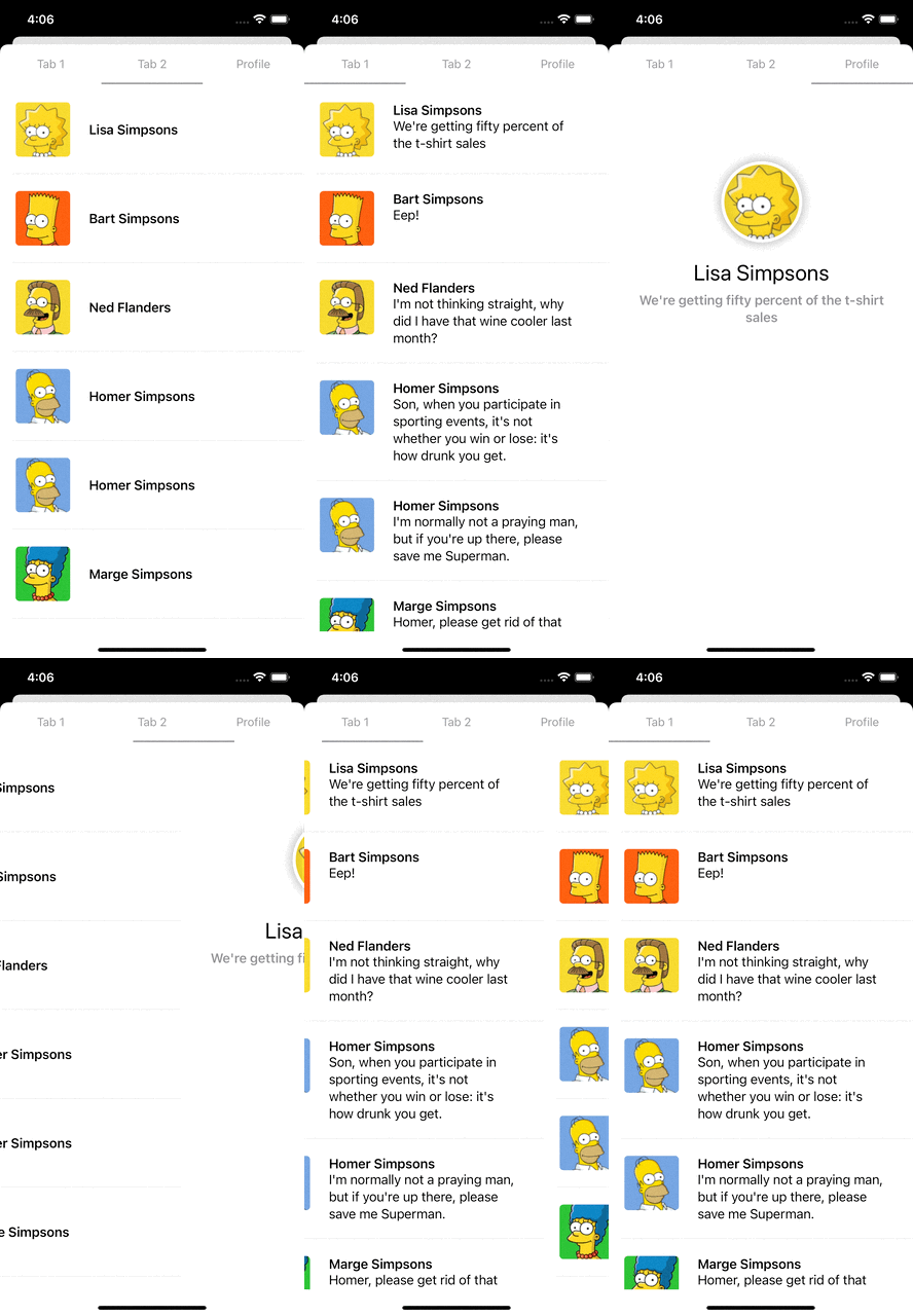
        .pagerTabStripViewStyle(.normal(indicatorBarColor: .gray, tabItemSpacing: 0, tabItemHeight: 50))
	}
}
In this example, we add some settings like the tab bar height, indicator bar color and indicator bar height. Let's watch how it looks!
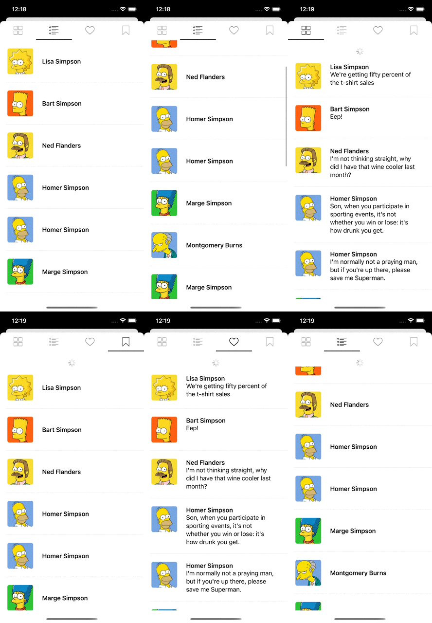
This style only shows a bar that indicates the current view controller. The customizable settings are:
- Spacing between navigation bar items
- Indicator bar height
- Indicator bar color
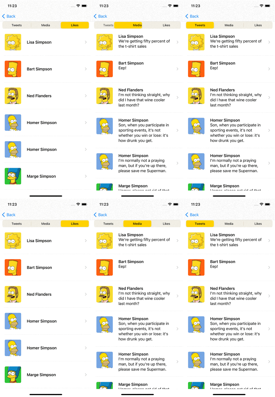
This style uses a Segmented Picker to indicate which view is being displayed. You can indicate the selected color, its padding and if you want it setted in the toolbar.
The navigation bar supports custom tab items. You need to specify its appearance creating a struct that implements View protocol.
For simplicity, we are going to implement a nav bar item with only a title. You can find more examples in the example app.
struct TitleNavBarItem: View {
    let title: String

    var body: some View {
        VStack {
            Text(title)
                .foregroundColor(Color.gray)
                .font(.subheadline)
        }
        .frame(maxWidth: .infinity, maxHeight: .infinity)
        .background(Color.white)
    }
}You can define the style of your nav items when they are selected or highlighted by conforming PagerTabViewDelegate protocol in your nav item view.
In the following example we change the text and background color when the tab is highlighted and selected.
private class NavTabViewTheme: ObservableObject {
    @Published var textColor = Color.gray
    @Published var backgroundColor = Color.white
}

struct TitleNavBarItem: View, PagerTabViewDelegate {
    let title: String
    @ObservedObject fileprivate var theme = NavItemTheme()

    var body: some View {
        VStack {
            Text(title)
                .foregroundColor(theme.textColor)
                .font(.subheadline)
        }
        .frame(maxWidth: .infinity, maxHeight: .infinity)
        .background(theme.backgroundColor)
    }

    func setState(state: PagerTabViewState) {
        switch state {
        case .selected:
            self.theme.textColor = .blue
            self.theme.backgroundColor = .lightGray
        case .highlighted:
            self.theme.textColor = .pink
        default:
            self.theme.textColor = .gray
            self.theme.backgroundColor = .white
        }
    }
}
onPageAppear callback allows you to trigger some action when a page view gets selected, either by scrolling to it or tapping its tab. This modifier is applied only to its associated page view.
struct PagerView: View {

    var body: some View {
        PagerTabStripView(selection: 1) {
            MyView(model: myViewModel)
                .pagerTabItem {
                    TitleNavBarItem(title: "Tab 1")
                }
                .onPageAppear {
                    model.reload()
                }
        }
        .pagerTabStripViewStyle(.normal(indicatorBarHeight: 2, indicatorBarColor: .gray, tabItemSpacing: 0, tabItemHeight: 50))
    }
}Follow these 3 steps to run Example project
- Clone PagerTabStripView repo.
- Open PagerTabStripView workspace.
- Run the Example project.
To install PagerTabStripView using CocoaPods, simply add the following line to your Podfile:
pod 'PagerTabStripView', '~> 2.0'To install PagerTabStripView using Carthage, simply add the following line to your Cartfile:
github "xmartlabs/PagerTabStripView" ~> 2.0- iOS 14+
- Xcode 12.X
- If you want to contribute please feel free to submit pull requests.
- If you have a feature request please open an issue.
- If you found a bug or need help please check older issues and threads on StackOverflow (Tag 'PagerTabStripView') before submitting an issue.
Before contribute check the CONTRIBUTING file for more info.
If you use PagerTabStripView in your app We would love to hear about it! Drop us a line on Twitter.


