A complete collection of fragments that can be used independently in any demo.
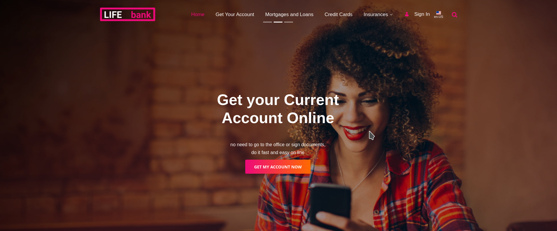
A Slider which has a dark overlay to darken the background images in order to use white text over them.
- Text color: you can select the color of the text over the image.
- Gradient: select if the button will be a gradient or not.
- Gradient goes from primary to secondary color.
A full width banner with white text which darken the background image and use a waves overlay.
A button with background gradient from your primary color to your secondary.
- Text align: the alignment of the button's text can be selected.
- spacing: top and bottom spacing can be selected.
A title which is underlined with a gradient moving line.
- Heading level: you can configure the level of this heading (h1, h2, h3, h4, h5 or h6).
- Icon: The icon can be selected. It's a text field where you must fill in a Clay Icon name.
- Color: The icon's color can be selected as well.
- The texts inside the card can be modified using the editor.
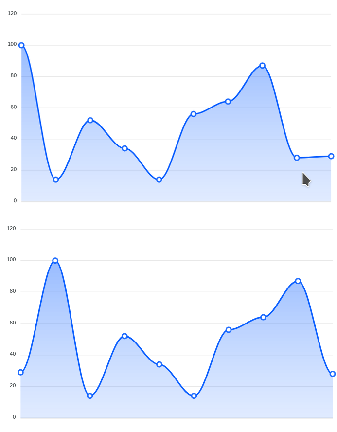
A dynamic line chart which can be configured with different values and they will rotate creating a movement efect. Useful to simulate data obtained in real-time.
- Fragment ID: If you are going to use more than one of this fragments in a page, you'll need different ids.
- Stroke Color: The color of the line in the graph.
- Data: Y-Axis values. The more you add the wider will be the graph.
1,2,3,4,5 - Interval: the inteval of update and the difference between the X-Axis values.
- X-Axis values are automatically established based on the current time and the interval configured.
- Y-Axis values are configured manually.
- Min and Max: You can configure starting and ending values.
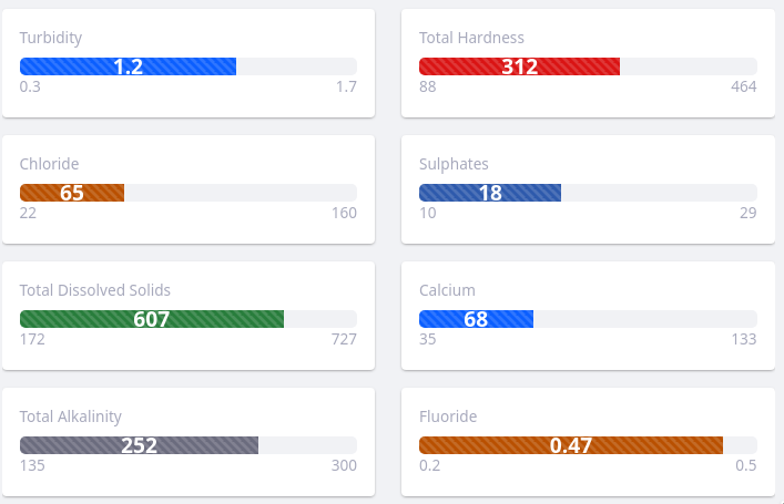
- Color: The progress bar's color can be configured.
- Current value: The current value shown inside the bar.
- The length of the bar will be calculated based on max, min and current values.
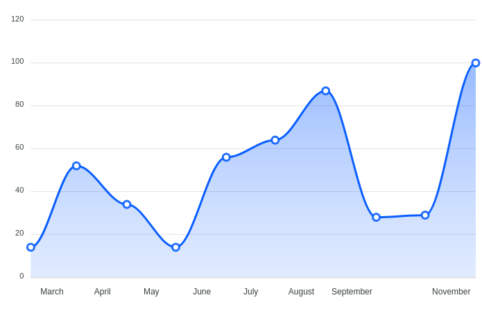
A line chart which shows values by months.
- Fragment ID: If you are going to use more than one of these fragments in a page, you'll need different ids.
- Stroke Color: The color of the line in the graph.
- Data: Y-Axis values. The more you add the wider will be the graph.
1,2,3,4,5
- X-Axis values are automatically established based on the current month.
- Y-Axis values are configured manually.
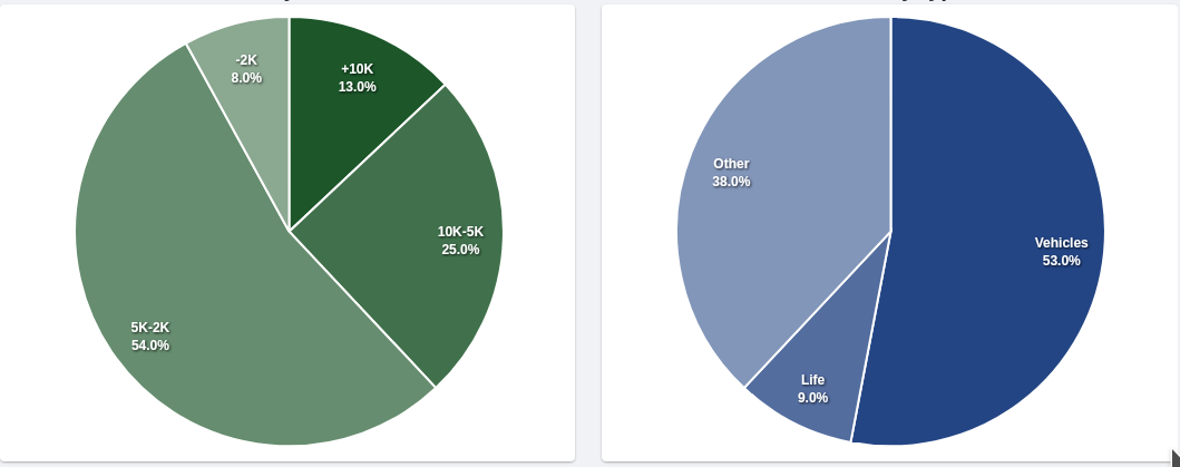
A monochromatic pie chart.
- Fragment ID: If you are going to use more than one of this fragments in a page, you'll need different ids.
- Color: The color of the chart.
- Data: Values for each section of the pie.
1,2,3,4,5 - Labels: Labels for each value. Same order:
"Team A, Team B, Team C"
- The more values you add the more sections will have the pie.
- The labels are assigned to values in ascending order.
- Progress: The progress value.
- Color: The progress bar's color can be configured.
- The length of the bar will be calculated based on the progress value.
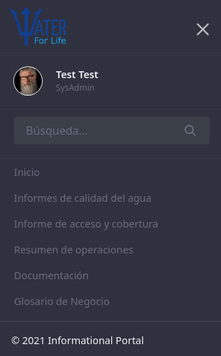
A responsive sidebar menu. It has integrated the personal-bar, search box and copyright area.
A responsive sticky menu. It has integrated personal bar, search and fields for email and phone.
-- Background Color: you can select the top bar's background color
- The number of items is limited due to the width
- The company name can be shown when the menu is not sticky, when you scroll down it disappears.
- Delay: Delay in ms to show the modal.
- Footer button style
A user welcome message area, with a link to the user's profile and the user's portrait.
- Background Color
- Text color
- a drop zone intead of text
- opacity configurable
- overlay color configurable
- configure the number of slides
- let choose the position of the slides navigation
Discarded
- fix the top margin issue.
- select colors using hex codes
- hight
- colors
- check if a negative margin config is needed
- use fragementElement instead of the fragmentID
- Create a theme contributor
- Turn the fragments into osgi modules.
- make it configurable
- in utilities collection
Check generateFragmentDocs.py --> Autodocs
