Huge props to Travis Borsa at LHL Vancouver for the notes and demo 🤜🤛
Notes and code here

- Writing semantic HTML
- Cascading Style Sheets
- Reset / Normalize
- Box Model
- Block level elements vs inline elements and their nesting
- Float
- Modern CSS
⏫ More new Concepts!
⏫ More chance for you to explore and find material!
📚The Course is going to be less direct in its guidance.
This means that during lecture if/when a new concept comes up that you don't fully understand, consider writing it down and researching it post-lecture. There are too many new things that you'll encounter directly or tangentially in morning lecture for everyone to ask "What's XYZ?". That is a question to explore with Google first.
We're happy to discuss XYZ with you once you've spent some time trying to understand it for yourself.
We will work a little more on the front end and styling with html and css with this project.
DEMO
-
Look at css and the box model and get a history of css.
-
CSS Box model is the focus for today, it still has many confusion parts, and many hacks. You'll encounter some this week. For this reason, you really need to (especially at first) "poke things until they work".
-
We have to understand the "older" box model first before we look at the new stuff.
- we are not looking at css frameworks Bootstrap (CSS/UI grid frameworks in general) comes later. It makes more sense to focus on vanilla CSS.
- SCSS (also known as Sass) is another way to write CSS, and there are other alternatives to it. You'll be learning SCSS in Week 4 to implement your Midterm (requirement).
- we are not focusing on html
- do want to look at semantic html
The Idea that an html tag should be expressive about what content it holds. Tags whose names describe their purpose.
For example using <strong> tag instead of <b>
<div>Rocks</div>
<div>
   Rocks are cool
   <div>
       🗿
   </div>
</div>
<div></div><header>Rocks</header>
<article>
Rocks are cool
<figure>
🗿
</figure>
</article>
<footer></footer>- Chrome
- Developer tools DevTools is your biggest friend with front-end development
Cascading Style Sheets
- Acts like a tiered waterfall styles cascade or flow downwards adding to the styles below them.
The cascading algorithm determines how to find the value(style) to apply for each property for each document element.
Embedded
<style>.inner{font-weight: 700;} </style>External StyleSheet*
<link rel="stylesheet" href="waterfall.css">.inner{
font-weight: 700;
color: snow;
}Inline
<div class="box inner four" style="color: coral"></div>DEMO
- Embedded and External style sheets are applied in the order that they appear in the HTML document. You should think about the order that you want things applied. Sort of
selector list{
   property: value,
}🎣 Hooks to grab elements in order to apply style to them.
When to use IDs vs Classes
Classes
- Same class on multiple elements
- Multiple classes on one element
<div class="shaman"></div>
<div class="rogue"></div>
IDs are unique
- each element can have at most one ID
- You should have only one element with a particular ID
- secret browser power url#idname
<div id="introduction"></div>** Elements can have both classes and ID's
There is nothing you can do with a class in css that you can do with an ID and vise versa
Way we use tags, ID's, Classes to apply CSS to them.
div, .primary {

}div.primary {
}div .primary {
}
Reset
A reset is removing any default browser styling, often called the user agent stylesheet.
The Goal is to remove any browser inconsistencies.
https://meyerweb.com/eric/tools/css/reset/
Normalize
"Resets impose a homogenous visual style by flattening the default styles for almost all elements. In contrast, normalize.css retains many useful default browser styles. This means that you don’t have to redeclare styles for all the common typographic elements."
- Preserves user defaults
- Corrects common bugs
http://nicolasgallagher.com/about-normalize-css/

Margin -> { Border -> Padding -> Content }
DEMO boxes
*, *:before, *:after {
   border: 4px solid red;
}
http://guyroutledge.github.io/box-model/
DEMO How big is this box
http://guyroutledge.github.io/box-model/
Content-box
- Height/Width = Content Size.
- Padding & Border additionally add to the size of the box.
- Cannot set total box size.
Border-box?
- Height/Width = Content Size + Padding + Border.
- Padding & Border accounted for in size.
- Width/Height sets total box size.
It is better to use border-box
*{
   Box-sizing: border-box; //(non-default)
}
Block Level:
- Starts on a new line
- Takes as much width as it can by default
- Structural
- Default:
<div>,<h1>-<h6>,<p>,<ul>,<nav>
Inline:
- Does not start on a new line
- Doesn't affect the elements around it
- Can't set width or height ext..
- Content related
- Default:
<span>,<a>,<input>,<button>,<img>
Demo
Don't put block elements inside inline elements
<a><div>Block</div></a>- can cause inconsistent render, conflict between properties ** is a violation of html standards
DO put inline inside block
<div> <a>Inline</a></div>Block and Inline are display properties, and can be changed in CSS
   p{
       display: block;
   }
*another display property is inline-block.
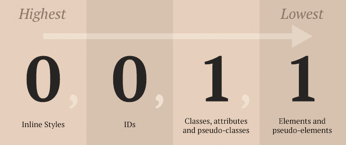
When two competing styles are applied to an element the one with the higher priority specificity gets applied.
A style with 0,0,2,1 (2 classes and 1 element tag) would be applied over a style of 0,0,1,1 (1 class and 1 element tag).
What is the 'score' of ...
div.box.left{
 color: blue;
}red vs. blue
#red{
 color: red;
}div.blue.ocean{
color: blue;
}div a.red{
color: red;
}.blue.ocean{
color: blue;
}div.box.left{
color: red;
}div.box.left{
color: blue;
}
When are your selectors too specific?
div a p > a.link.underline#home{
 text-decoration: underline;
}- use ID's sparingly
- If you don't need a selector don't use it.
In general you want to be light handed with classes and id's.
if we want our links to look a certain way
<a href="www.nima.com" class="link"> </a>instead we know it will be an <a> tag so
<a href="wwww.nima.com" ></a>div{
color: red !important;
}- Important will move the style to the top of the specificity hierarchy.
-
If everything is important than nothing is important
-
If two elements are important than you look at specificity.
Style of CSS should be:
selector {
 /* 2 spaces for indentation, as with everything else */
 key1: value;
 key2: value;
}
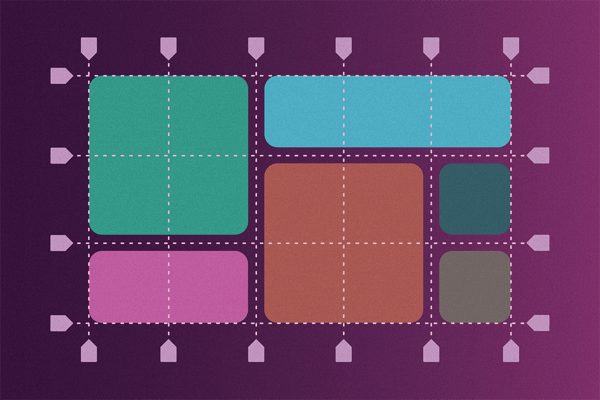
Magazine layout => web layout
   div{
       float: left; //or left or right
   }
DEMO
clear floats When we want our elements to start after an element that has been floated we have to clear the float.
   div{
       clear: both; //or left or right
   }
Inline-Block
- Behaves like inline but you can set the width and height.
- Like Block but does not add a line break after the element.
Aims to correct some of the frustrating parts of the box model by rewriting how we layout the page, but it is not yet universally adopted (sorta).
Box Model is far more common as a layout engine, and is something you need to know.
Flex box is widely supported: http://caniuse.com/#feat=flexbox
Good to know the box-model and the evolution of CSS before flexbox.
It is even newer than Flexbox, and widely supported. It is something you can learn on your own (and it is recommended that you do so).
https://caniuse.com/#search=css%20grid
- MDN
- CSS-Tricks is also great Add MDN to all of your search queries in Google to get MDN-focused results
- Position
- ID's & Classes
- Selectors
- Specificity
- Frameworks
When using shorthand to set the style attribute of a top, right, bottom, left property the order is.
TRBL
div {
  margin: 15 10 15 10;
  padding: 5 10 5 10;
}The position property specifies the type of positioning method used for an element
-
static
- default
- cannot set top, right, bottom , or left
-
relative
- TRBL can be set to change position relative to where it would have been statically positioned.
-
absolute
- TRBL can be set to change position relative to the nearest positioned ancestor, or the html body.
-
fixed
- TRBL is set relative to the viewport so the element stays in the same position even when content is scrolled.
-
sticky
- Bootstrap
- Semantic UI
- Materialize