Mary Rose Cook / mary@maryrosecook.com
Navigate to this project directory, run npm install to install dependencies (this takes a couple minutes), and then run npm start to initialize and connect to a node server with your default browser.
-
Each concern is separated into its own component. This makes the code more readable and maintainable.
-
The code for allocating timeline items to rows is succinct. (See
Timeline.itemsWithRow.) -
The code for allocating timeline items to rows is mostly decoupled from the rest of the code that edits, displays and annotates timeline items. It receives some items and returns a set of row assignments. It only needs a function to map between a date and horizontal placement, and a function to determine the width of an item. (See
Timeline.itemsWithRow.) -
The logic for translating between screen coordinates and dates is isolated to two functions:
Timeline.dateToColumnandTimeline.xPositionToDate.
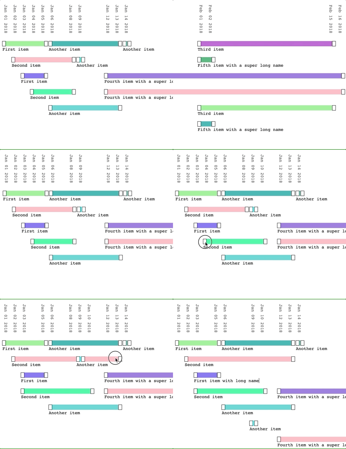
- The rows reflow after the user edits a timeline date. But they don't jump around while the user is still in the middle of editing.
-
I'd find a way to amalgamate the mouse state tracking code (
MouseMonitor) with the date drag control code (ItemDurationDragControl). I couldn't figure out a nice way to get mouse clicks and moves without putting the mouse tracking code near the top level. This reduced coherence (because those chunks of code are distant from each other) and increased complexity (see thatItemDurationDragControl.handleDraghas to monitor incoming props rather that just respond to events). -
I'd add PropTypes to make future refactors easier.
-
(My first implementation used some plain JS objects (
Timeline,Row,Item) to calculate and update item positioning. The idea was to keep that complexity in one place. But, React components are supposed to be for layout. So the layout code ended up spread between the JS objects and the components. Things became a lot simpler when I removed the objects.) -
I'd consider using a min heap when laying out the timeline items in rows. When finding a row in which to place an item, the current code iterates the rows and returns the first one that has space for the item. Instead of this iteration, I could use a heap and pop off the first row that has space in
O(log(n))time. (It seems likely there are better performance improvements that making this change, so I'd check this was a performance bottleneck first.)
-
You can't set an item's start or end to a date outside the current date span of the timeline. To solve this, I'd make dragging a control to the edge of the timeline scroll the view.
-
The date row at the top is too cluttered. The next design I'd try would be like the one below. This would reduce the amount of text, and allow faster scanning of the span of time.
2018
May                                June
1   5     10           22          1    5
-----      -------------           ------
                        ------------
-
I'd allow zooming.
-
I'd handle an item start date being dragged past the item's end date (and vice versa).
-
I'd support item date editing on mobile.
-
I'd adjust the space-to-date mapping code to make the draggable date controls map precisely onto the grid.
-
I designed the first version by sketching on paper. (I spent a while trying to find a nice way to make the timeline vertical, rather than horizontal. This felt like it would be a big win because scrolling through events would be so natural. I could never find a design that a) had room for item names and b) tied an item's date span to its name.)
-
I designed the second version by cutting out strips of paper and laying them out on my desk.
-
I hacked together implementations of ideas and then tried them out.
-
I got my wife to try out the interface and used her feedback to improve the design. (For example, as a result of this feedback, I moved the row of dates from the bottom to the top.)
-
I'd use Jest, because it's nicely integrated with React. I'd probably use Enzyme because it has a nice API over testing React components.
-
The componenents are all pure, so I could test them by just passing in props and checking the right HTML was rendered and the right callbacks were called.
-
When testing a component, I'd test the interfaces between it and its sub components. I'd check its sub-components were rendered and were passed the expected props.
-
I'd also have a few integration tests that checked the output from the whole app to check it worked.
