parcoordtutorial
Tutorial on the parallel coordinates visualization method.
Table of Contents
Introduction
What is parallel coordinate?
Parallel coordinates method was invented by Alfred Inselberg in the 1970s as a way to visualize high-dimensional data. A parallel coordinate plot maps each row in the data table as a line or profile. Each attribute of a row is represented by a point on the line. As opposed to a normal line graph, a single line in a parallel coordinates graph connects a series of values, each associated with a variable. Note that each variable may have different units hence the need for these values to be normalized. The values in a parallel coordinate plot are always normalized into percentages. This means that for each point along the X-axis (attributes), the minimum value in the corresponding column is set to 0% and the maximum value in that column is set to 100% along the Y-axis.If you would like more info, here is link that explains in greater detail. What is a Parallel Coordinate Plot?
How can parallel coordinate helpful?
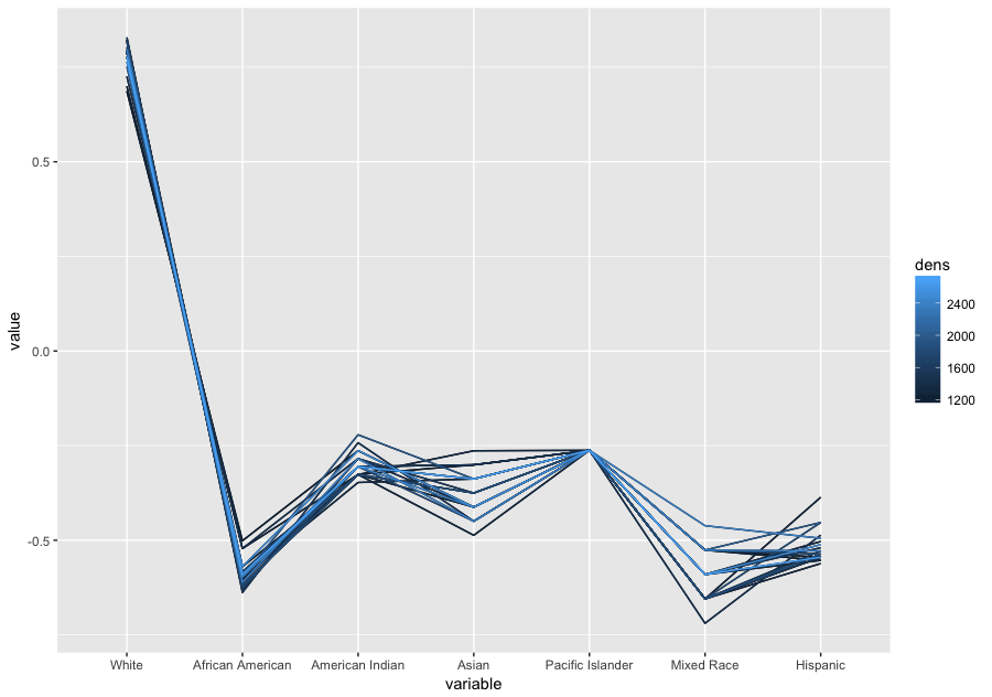
The strength of parallel coordinates is their ability to bring meaningful multivariate patterns and comparisons to light when used interactively for analysis. Parallel coordinates can reveal correlations between multiple variables. This is particularly useful when you want to identify which conditions correlate highly with a particular outcome. For instance, what is the demographic of those who voted for a Donald Trump.Example:
Parcoord Package
Freqparcoord Package
Demographic profile in percentages
| White | African American | American Indian | Asian | Pacific Islander | Mixed Race | Hispanic |
|---|---|---|---|---|---|---|
| 85.16 | 9.54 | 1.75 | 1.41 | 0.12 | 2.02 | 7.83 |
National Demographic profile in percentages
| White | African American | American Indian | Asian | Pacific Islander | Mixed Race | Hispanic |
|---|---|---|---|---|---|---|
| 77.1 | 13.3 | 1.2 | 5.6 | 0.2 | 2.6 | 17.6 |
source US Census Bureau
Code to generate the above plots
Data courtesy of Kaggle
Example:
library(MASS)
data("mtcars")
parcoord( mtcars[,1:4], col=rainbow(length(mtcars[,1])), var.label=TRUE)
Here is a parallel coordinates plot for cars based on their MPG, cylinder, displacement and horsepower
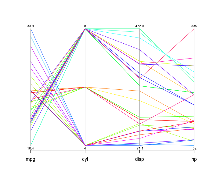
You can tell a lot about the data from looking at this visualization. The cylinders axis stands out because it only has a few different values. The number of cylinders can only be a whole number, and there aren’t more than eight here, so all the lines have to pass through a small number of points. Data similar to this one, and also categorical data, are usually not well suited for the parcoord package. As long as there are only one or two categories, it’s not a problem, but when the data is large or has many categories, the parcoord package renders less than a clear picture.
In the space between MPG and cylinders, you can tell that eight-cylinder cars generally have lower mileage than six- and four-cylinder ones. By following the lines and look at how they intersect: an indication many crossing lines is a presence of an inverse relationship, and such is the case here: the more cylinders the car has, the lower the mileage. While this example would not produce any suprises, it illustrates how the parallel coordinates method works.
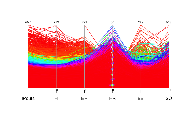
The mtcars data set only has 32 rows, you can imagine that the plot can get very messy if we have a larger dataset. Let's take a look at a much larger data set. Here is Sean Lahman's baseball dataset which has 44,963 rows. Baseball Data
For the complete dataset, please download the data through the link above and import it to R. The pitching data frame is included in data directory. For simplicity, we will be looking at columns 13 to 18, which has the number of innings pitched, hits allowed, earned runs, home runs allowed, balls and strikeouts. Here is how to process the data.
library(MASS)
read.csv('~/parcoordtutorial/data/Pitching.csv') # path to the repo
parcoord( Pitching[,13:18], col=rainbow(length(Pitching[,1])), var.label=TRUE)
To explore other dataset simply download the csv file and use the read.csv() function with the path to the downloaded data as the parameter. Here is a massive list of public datasets.
As you can see the trend in this plot is very much indistinguishable. One common technique to make the plot clearer called brushing, which essentially highlights the part of the data we would like to look bringing it to the foreground while the other lines remained in the background. The result is a brushed part of the lines in heavy black, with the rest still in the background in gray for context.How to make this plot clearer?
The problem with the parallel coordinates plot above is that the screen cluttered with many lines, making the plot hard to identify the trend. In order to avoid this problem, we can use the freqparcoord package which plots only the lines having the highest estimated multivariate density.Example:
library(freqparcoord)
data("mtcars")
freqparcoord(mtcars,m=5,dispcols=1:4,k=7)
x: the data
m: the m most frequest rows of x which will plotted from each group
dispcols: the number of displayed columns
k: the grouping of k nearest neighbors to use for density estimation

The trend is in the plot is very distinguishable, high mpg models have fewer cylinders indicated by the downward-sloping lines from mpg to cyl. It is interesting to see here that the number of cylinders has does not have much of an effect on horsepower, something we could not clearly see from the previous parallel coordinates.
Now, let's take a look at our larger baseball pitching dataset.
Example:
library(freqparcoord)
freqparcoord(Pitching[,13:18],m=10,k=posjitter(70))
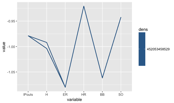
Here you can see that there is a clear correlation between the number of hits allowed and the earned run allowed by a pitcher. The downward sloping line from H to ER indicates that the lower the number of hits allowed by a pitcher, the lower his ER number will be. Likewise, BB and SO also have a similar relation, the lower the BB the higher the strikeouts.
What parallel coordinates methods can do?
How to identify outliers?
With such large data set, outliers are likely normalized and insignificant. But let's take a look at how we can identify them, and see the what kind of characteristic these outliers shared.Let's take another look at our mtcars data.
Example:
library(freqparcoord)
p <- freqparcoord(mtcars[,1:4],-1,k=7,keepidxs=4)
> p$idxs
[1] 31
> mtcars[31,]
              mpg cyl disp  hp drat   wt qsec vs am gear carb
Maserati Bora  15   8  301 335 3.54 3.57 14.6  0  1    5    8
We found our outlier, a Maserati Bora with 335 horsepower! Try to apply the same code to the pitching data. The result should be interesting. The result may be surprising but it shows the nuances of the parallel coordinates method.
Testing for independence of variables
When fitting a model with many potential explanatory variables using the stepwise regression procedure, this can be tedious. As there can many intermediate models needed to be fitted. For example, let's take a look at our mtcars data. There are 11 columns or variables in the data frame. mtcars A data frame with 32 observations on 11 variables. A brief explanation of the variable names are provided below:- mpg: Miles/(US) gallon
- cyl: Number of cylinders
- disp: Displacement (cu.in.)
- hp: Gross horsepower
- drat: Rear axle ratio
- wt: Weight (lb/1000)
- qsec: 1/4 mile time
- vs: V/S
- am :Transmission (0 = automatic, 1 = manual)
- gear: Number of forward gears
- carb: Number of carburetors
We are looking for the relationship between mpg and the other variables. We can do this by fitting a linear model with mpg as the response variable and the others as our explanatory variables. Some of the variables which were supposed to be factors are entered as numeric. As such, these variables can interfere with the analysis we are trying to do. We can remediate this problem by running the following code.
Try to run this code
mtcars$cyl <- as.factor(mtcars$cyl)
mtcars$vs <- as.factor(mtcars$vs)
mtcars$am <- factor(mtcars$am)
mtcars$gear <- factor(mtcars$gear)
mtcars$carb <- factor(mtcars$carb)
lmodel <- lm(mtcars$mpg ~ ., data=mtcars)
Our model is very large. This is not a good thing. We only want to include variables that have an association with our response variable. The rear axle ratio probably has a very minor if any impact on mpg compared to the number of cylinders.
To select the most informative variables, which were included in a multiple (linear) regression model, we can do that by using the stepAIC function. This will go through 8 different steps using the AIC as our selection criteria for the model.
library(MASS)
lmodel <- lm(mtcars$mpg ~ ., data=mtcars)
rlmodel<- stepAIC(lmodel)
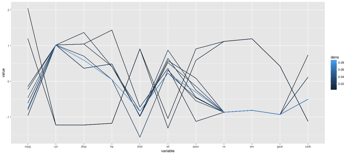
Parallel coordinates can provide a brief overview of which variable should or should not be included in the model. Here the lines between the variables do not follow any pattern. As such, they might be independent of the reponse variable.
Run this code to obtain the plot.
data("mtcars")
freqparcoord(mtcars ,m=10,k=5)
Try changing m and k
How does a higher k value impact our plot?
What about the case for m?
By looking at this parallel coordinates plot, which variable we should include in our linear model?
If we follow the two highest mpg lines in our plot, the lines map to 4 cylinder cars, low horsepower, light weight and manual tranmission. The linear model supports the same observation.
> summary(rlmodel)
Call:
lm(formula = mtcars$mpg ~ cyl + hp + wt + am, data = mtcars)

Residuals:
    Min      1Q  Median      3Q     Max
-3.9387 -1.2560 -0.4013  1.1253  5.0513

Coefficients:
            Estimate Std. Error t value Pr(>|t|)
(Intercept) 33.70832    2.60489  12.940 7.73e-13 ***
cyl6        -3.03134    1.40728  -2.154  0.04068 *
cyl8        -2.16368    2.28425  -0.947  0.35225
hp          -0.03211    0.01369  -2.345  0.02693 *
wt          -2.49683    0.88559  -2.819  0.00908 **
am1          1.80921    1.39630   1.296  0.20646
---
Signif. codes:  0 ‘***’ 0.001 ‘**’ 0.01 ‘*’ 0.05 ‘.’ 0.1 ‘ ’ 1

Residual standard error: 2.41 on 26 degrees of freedom
Multiple R-squared:  0.8659,    Adjusted R-squared:  0.8401
F-statistic: 33.57 on 5 and 26 DF,  p-value: 1.506e-10
Now compare the above plot with a plot of 10 randomly distributed variables below. Do you see the difference?

Cluster Finding
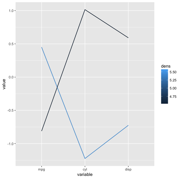
Cluster analysis is statistical techniques used to gain further insight into a group of observations. We use cluster analysis to find out if the observations naturally group together based on some characteristic. Different clusterring algoritm can be applied to a set of data in order to define such groups. One method is through parallel coordinates. Let's take another look at our running example, mtcars. This time we are going to look at the first three columns of the dataset: mpg, cylinder, and displacement.parcoord( mtcars[,1:3], col=rainbow(length(mtcars[,1])), var.label=TRUE)Do you see the clusters in this plot?
Now lets use the same data and apply freqparcoord k-th nearest neighbor density estimation.
With the following parameters:
m (the number of lines of the plot) = 8
k (Number of nearest neighbors to use for density estimation) = 4
freqparcoord( mtcars[,1:3],m=1,k=4, method = "locmax")We employed the locmax method here is to define the clusters. The method uses the local maxima to define the clusters. The rows having the property that their density value is highest in their klm-neighborhood will be plotted.
For more on cluster analysis, you would find the following links helpful.
Introduction to Cluster Analysis
Resources
Websites
Books
Papers
- Parallel Coordinates for Explainatory Modelling analysis
- Multivariate Analysis Using Parallel Coordinates
- Enhancing Parallel Coordinates: Statistical Visualizations for Analyzing Soccer Data
- The Parallel Coordinates Matrix

