CoVisualizing panel data in ways you've never seen!
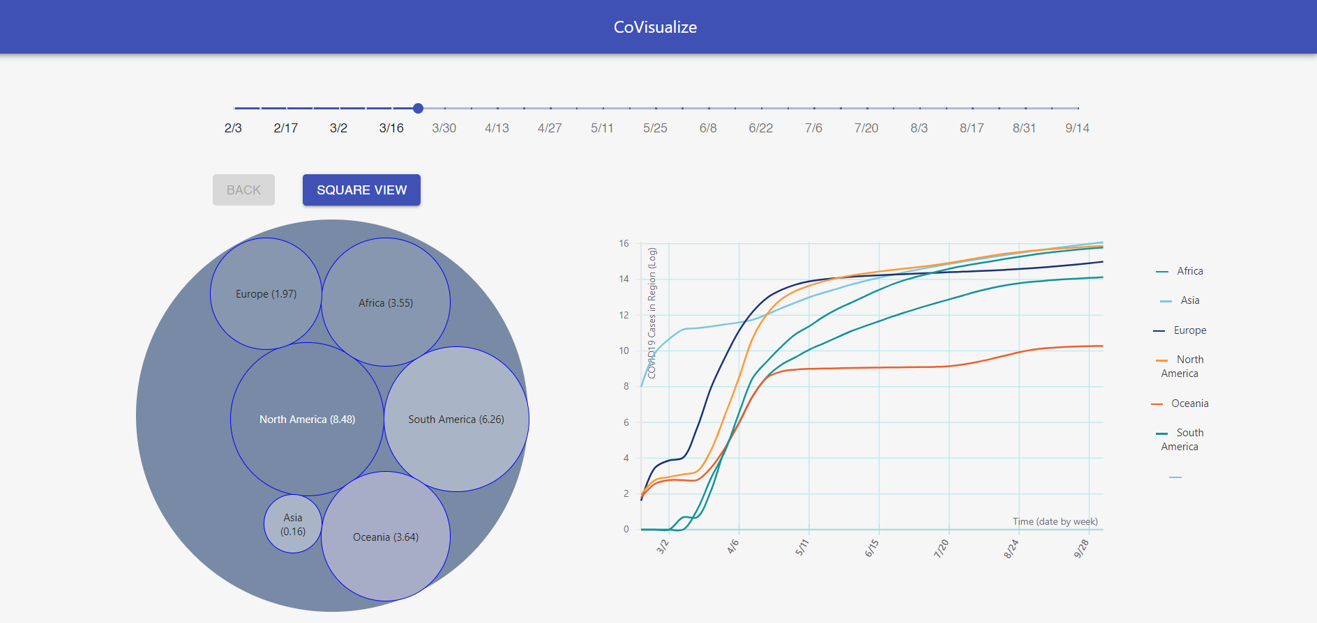
There are copious amounts of COVID data, but many existing visualizations have shortcomings. Our interactive visualization excels over traditional methods since users can easily draw conclusions from the multi-dimensional data grouped by varying levels of granularity (continent-level, country-level, etc.) over time. Existing visualizations are usually static x-y plots which fail to communicate more than 2 dimensions or 2d maps with dots which communicate locality but are difficult to interact with and do not show time-series data. Our visualization shows a rectangle plot proportional to the rate of increase of cases with a slider to monitor the progression over time. Users can click on each rectangle to see higher levels of granularity and return to previous plots at any time. This method allows for easy comparison to draw conclusions of emerging infection hot-spots. An additional 2d plot of active cases complements the rectangle plot by graphing cases over the entire time period.
Submission: here
Installation: (this will take several minutes to install)
git clone https://github.com/matthew29tang/covid-track
cd ./covid-track
npm install
Usage:
npm start
