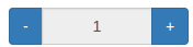
A generic number picker Angular component (v. 2.0.0+) for Twitter Bootstrap
- Angular (2.0.0+)
- Twitter Bootstrap (3.3.5+)
npm install angular2-number-picker -save
Import the NumberPickerComponent in your app.module and add it to the declarations array.
Alternatively, you can import the NumberPickerComponent to a shared module, to make it available across all modules in your Angular application.
You need to import the Angular FormsModule and ReactiveFormsModule as well.
...
import { NumberPickerComponent } from 'angular2-number-picker/components';
import { FormsModule, ReactiveFormsModule } from '@angular/forms';
import { AppComponent } from './app.component';

@NgModule({
  declarations: [
    AppComponent,
    NumberPickerComponent
  ],
  imports: [
    FormsModule,
    ReactiveFormsModule
    ...
  ],
  providers: [],
  bootstrap: [AppComponent]
})
export class AppModule { }
Add the angular2-number-picker directive to the page where you want to use the number picker.
<angular2-number-picker [min]="1" [max]="6" [step]="1" [precision]="1" [inputDisabled]="true" (onChange)="onNumberChanged($event)"></angular2-number-picker>| Attribute | Type | Required | Description |
|---|---|---|---|
| min | [input] Number | No | The minimal number limit on the number picker. 0 by default |
| max | [input] Number | No | The maximum number limit on the number picker. 100 by default |
| step | [input] Number | No | The step value for the number picker. 1 by default |
| precision | [input] Number | No | The decimal precision for the number picker, if the step input value is a decimal value. 1 by default |
| inputDisabled | [input] Boolean | No | Defines if the input input should be disabled / editable by the user. false by default |
| onChange | (output) Number | No | The onChange event of the component. Emits the value of the number picker, every time the user has clicked the - or + button. |