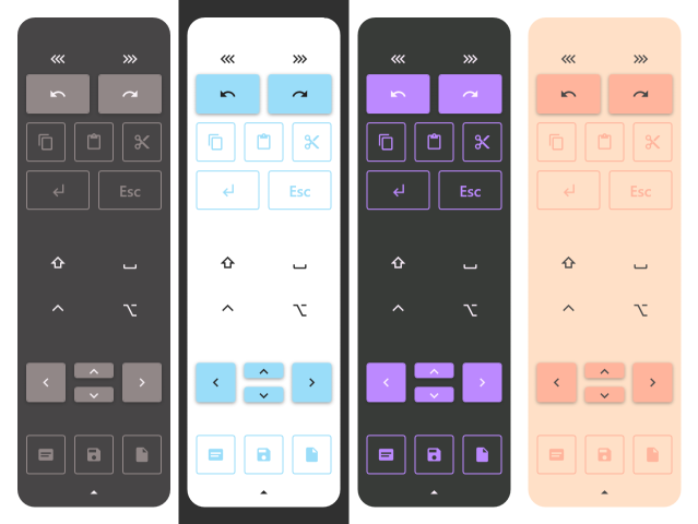
Hey there! Working without a keyboard is hard. When you are on a tablet, you realize how much you miss certain key combinations. Well, no more! Tablet Friend will make your life on Surface Pro or any other Windows tablet easier by providing a highly customizable set of on-screen toolbars.
Whether you are an artist, a casual Windows tablet fan or simply a touchscreen enjoyer, Tablet Friend is the perfect companion for getting stuff done.
Here's what Tablet Friend can do:
- Press buttons and button combinations.
- Toggle buttons.
- Type.
- Press and hold buttons.
- Execute command line commands - this allows you to launch any programs you wish or make custom scripts that do exactly what you want. Batch, Powershell - the sky is the limit.
- Swap and link layouts seamlessly.
- Chain any number of actions.
- Use over 4000 built-in vector icons from https://materialdesignicons.com or arbitrary png icons.
- Dock the toolbar to the side or on top.
- Simply look nice. :)
Grab the latest release from this page, unzip it... and that's it! No multistep installations, no hassle, you can start using the thing right away.
Let's be honest - the default toolbars will probably not be enough for you. But that's ok. It's you who knows best what you need, this is why Tablet Friend is a great toolbar constructor first and a great toolbar second.
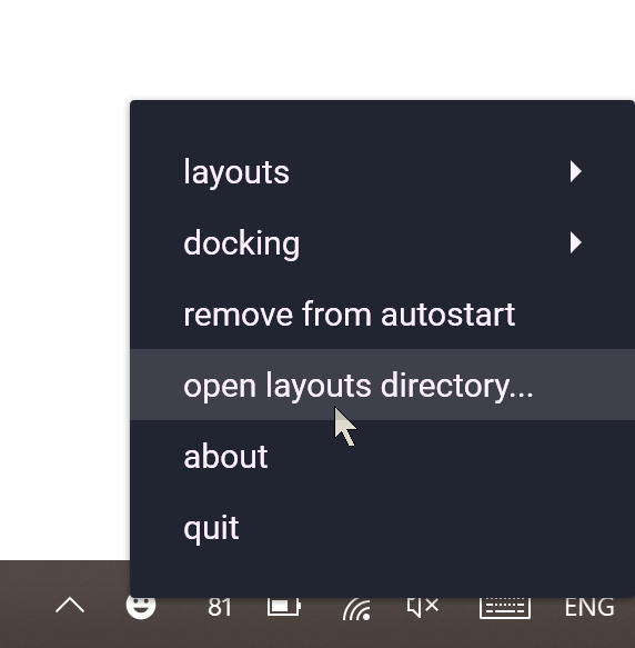
First, right-click the tray icon and press the 'open toolbar directory' button.
This will open a directory with a bunch of .yaml files. These are your toolbars - you can open them with any text editor you like. I know, I know, editing some config files directly may seem scary - luckily, Tablet Friend makes it as easy and intuitive as possible.
Let's make a new toolbar - create a file named my_toolbar.yaml in the toolbars directory, open it and paste this inside:
buttons:
   cut_button:
   	action: ctrl+x
   	text: cut
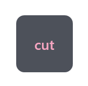
Yes, it's that simple. Let's break down what we just wrote: buttons is a collection of buttons. This is where all your buttons will go. cut_button is the name of your button. Note that all button names should be unique. Its action is ctrl+x press. And it will display text that says "cut" on it. Now, right-click Tablet Friend toolbar and choose "my toolbar" from the list. You don't need to relaunch the program - it updates everything automatically. If you did everything correctly, you will see this:
In just four lines, we got ourselves a working button! But obviously, this is not enough for a functional toolbar. Let's add some more:
buttons:
   cut_button:
   	action: ctrl+x
   	text: cut
   copy_button:
   	action: ctrl+c
   	text: copy
   paste_button:
   	action: ctrl+v
   	text: paste
   	size: 2,1
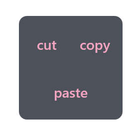
Now, press Ctrl+S and your toolbar will update automatically. Magic!
Paste button is wider that the others, because its size is 2 cells wide and 1 cell high. You also may wonder how do you specify button positions. That's the best thing - you don't. Instead of tediously calculating all the positions by hand, you let Tablet Friend handle this for you.
All buttons are put on the layout from left to right in a single line - until they run out of space. Every layout has a property called 'layout_width'. It tells the layout how many cells it has before it will be forced to put buttons on a second line. By default, this value is 2, but you can change it. Simply paste this on the very first line of your config:
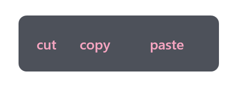
layout_width: 4Press Ctrl+S and your layout will change to this:
Because there is enough space now, all buttons can fit on the same line. You can play around and see what happens at different button sizes, layout width and button amounts. This system is very intuitive once you get the hang of it.
However, what if you want to space out your buttons, or create a specific shape out of your buttons? For that, Tablet Friend has spacers. Change your config to look like this:
layout_width: 2
buttons:
   cut_button:
   	action: ctrl+x
   	text: cut
   copy_button:
   	action: ctrl+c
   	text: copy
   spacer1:
   	spacer: true
   	size: 2,1
   paste_button:
   	action: ctrl+v
   	text: paste
   	size: 2,1
   	style: accent # Let's also change this button's style to something different.
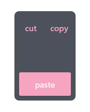
Press Ctrl+S and your toolbar will now have a line of space in-between the buttons:
Spacer stacks just like buttons, but instead of a button, it creates empty space. The only valid property for it is size. Using spacers, you can create absolutely any shape and layout you want.
It is VERY IMPORTANT that you use tab characters instead of spaces for your indents. Indents do matter, since they tell the config what should go where. You can use spaces if you really want to, but keep in mind that all the default layouts use tabs, and tabs and spaces should never mix in one config.
This, of course, are not all the features Tablet Friend offers. You can check out a more advanced example with all features listed.
Tablet Friend is opensource, licensed under MIT and 100% free. You can help out the development by submitting your own toolbars to the issues board or helping out with the code.
If you have any questions, you can contact me at chaifoxes@gmail.com
