rCharts is an R package to create, customize and publish interactive javascript visualizations from R using a familiar lattice style plotting interface.
You can install rCharts from github using the devtools package
require(devtools)
install_github('rCharts', 'ramnathv')The design philosophy behind rCharts is to make the process of creating, customizing and sharing interactive visualizations easy.
rCharts uses a formula interface to specify plots, just like the lattice package. Here are a few examples you can try out in your R console.
require(rCharts)

## Example 1 Facetted Scatterplot
names(iris) = gsub("\\.", "", names(iris))
rPlot(SepalLength ~ SepalWidth | Species, data = iris, color = 'Species', type = 'point')

## Example 2 Facetted Barplot
hair_eye = as.data.frame(HairEyeColor)
rPlot(Freq ~ Hair | Eye, color = 'Eye', data = hair_eye, type = 'bar')rCharts supports multiple javascript charting libraries, each with its own strengths. Each of these libraries has multiple customization options, most of which are supported within rCharts. More documentation is underway on how to use rCharts with each of these libraries.
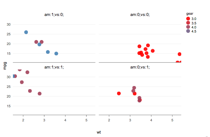
We will create our first chart using Polychart, a javascript charting library based on the grammar of graphics, and inspired by ggplot2.
r1 <- rPlot(mpg ~ wt | am + vs, data = mtcars, type = 'point', color = 'gear')
r1
There, we have our first embedded chart with nice tooltips! Let me add some interactivity to this chart now using javascript.
graph_chart1.addHandler(function(type, e){
  var data = e.evtData;
  if (type === 'click'){
    return alert("You clicked on car with mpg: " + data.mpg.in[0]);
  }
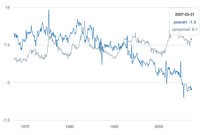
})The next library we will be exploring is Morris.
data(economics, package = 'ggplot2')
econ <- transform(economics, date = as.character(date))
m1 <- mPlot(x = 'date', y = c('psavert', 'uempmed'), type = 'Line',
  data = econ)
m1$set(pointSize = 0, lineWidth = 1)
m1
Hurray! There we have our second chart!
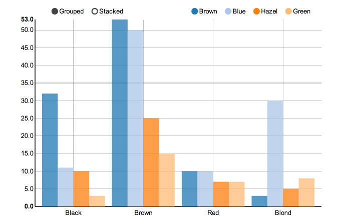
Next, I will demonstrate my all time favorite d3js library, NVD3, which produces amazing interactive visualizations with little customization.
hair_eye_male <- subset(as.data.frame(HairEyeColor), Sex == "Male")
n1 <- nPlot(Freq ~ Hair, group = "Eye", data = hair_eye_male,
  type = 'multiBarChart')
n1
See the interactivity that comes at zero cost!
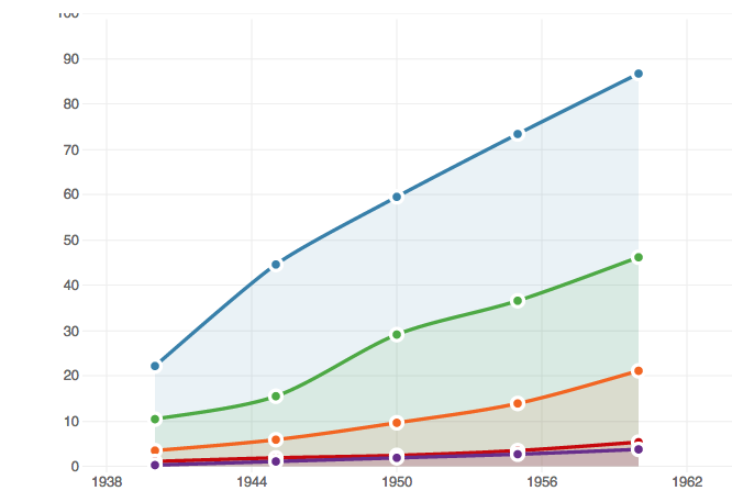
The next library to demo would be xCharts, a slick looking charting library using d3js, made by TenXer.
require(reshape2)
uspexp <- melt(USPersonalExpenditure)
names(uspexp)[1:2] = c('category', 'year')
x1 <- xPlot(value ~ year, group = 'category', data = uspexp,
  type = 'line-dotted')
x1
There is your xChart
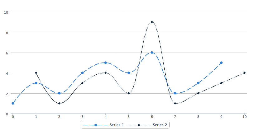
h1 <- Highcharts$new()
h1$chart(type = "spline")
h1$series(data = c(1, 3, 2, 4, 5, 4, 6, 2, 3, 5, NA), dashStyle = "longdash")
h1$series(data = c(NA, 4, 1, 3, 4, 2, 9, 1, 2, 3, 4), dashStyle = "shortdot")
h1$legend(symbolWidth = 80)
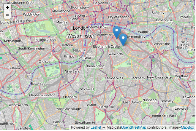
h1map3 <- Leaflet$new()
map3$setView(c(51.505, -0.09), zoom = 13)
map3$marker(c(51.5, -0.09), bindPopup = "<p> Hi. I am a popup </p>")
map3$marker(c(51.495, -0.083), bindPopup = "<p> Hi. I am another popup </p>")
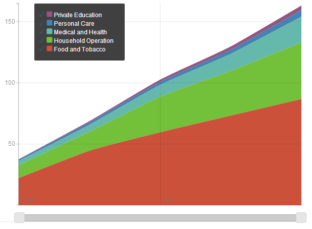
map3usp = reshape2::melt(USPersonalExpenditure)
p4 <- Rickshaw$new()
p4$layer(value ~ Var2, group = 'Var1', data = usp, type = 'area')
p4rCharts allows you to share your visualization in multiple ways, as a standalone page, embedded in a shiny application, or in a tutorial/blog post.
You can publish your visualization as a standalone html page using the publish method. Here is an example. Currently, you can publish your chart as a gist or to rpubs.
##
names(iris) = gsub("\\.", "", names(iris))
r1 <- rPlot(SepalLength ~ SepalWidth | Species, data = iris,
  color = 'Species', type = 'point')
r1$publish('Scatterplot', host = 'gist')
r1$publish('Scatterplot', host = 'rpubs')rCharts is easy to embed into a Shiny application using the utility functions renderChart and showOutput. Here is an example of an rCharts Shiny App.
## server.r
require(rCharts)
shinyServer(function(input, output) {
  output$myChart <- renderChart({
    names(iris) = gsub("\\.", "", names(iris))
    p1 <- rPlot(input$x, input$y, data = iris, color = "Species",
      facet = "Species", type = 'point')
    p1$addParams(dom = 'myChart')
    return(p1)
  })
})

## ui.R
require(rCharts)
shinyUI(pageWithSidebar(
  headerPanel("rCharts: Interactive Charts from R using polychart.js"),

  sidebarPanel(
    selectInput(inputId = "x",
     label = "Choose X",
     choices = c('SepalLength', 'SepalWidth', 'PetalLength', 'PetalWidth'),
     selected = "SepalLength"),
    selectInput(inputId = "y",
      label = "Choose Y",
      choices = c('SepalLength', 'SepalWidth', 'PetalLength', 'PetalWidth'),
      selected = "SepalWidth")
  ),
  mainPanel(
    showOutput("myChart", "polycharts")
  )
))rCharts can also be embedded into an Rmd document using knit2html or in a blog post using slidify. Here are a few examples of tutorials written using rCharts and slidify.
Most of the implementation in rCharts is inspired by rHighcharts and rVega. I have reused some code from these packages verbatim, and would like to acknowledge the efforts of its author Thomas Reinholdsson.
rCharts is licensed under the MIT License. However, the JavaScript charting libraries that are included with this package are licensed under their own terms. All of them are free for non-commercial and commercial use, with the exception of Polychart and Highcharts, both of which require paid licenses for commercial use. For more details on the licensing terms, you can consult the License.md file in each of the charting libraries.
There has been a lot of interest recently in creating packages that allow R users to make use of Javascript charting libraries.
