Supercharged Links is an Obsidian plugin that helps you style the links in your vault based on your notes metadata, such as tags or YAML frontmatter properties. You can automatically add colors, emojis, or other styles to the links, making them more visually appealing and easier to navigate.
When your notes represent something, like a paper, a location, a person or a day in the week, Supercharged links ensures those notes stand out. Another use case might be to give notes with the #todo tag a loud color.
This visual feedback helps you find the right note back quickly!
- Install and enable the Supercharged Links plugin in Obsidian.
- Install and enable the Style Settings Plugin in Obsidian.
This is the overall workflow for Supercharged Links:
- In the Supercharged Links settings, create a new selector for the attribute you want to style
- Choose the type of selector (Tag, Attribute, or Path) and enter the value you want to match.
- In the Style Settings Plugin settings, set up the style for the selected attribute, such as changing the text color, background color, or by adding emojis.
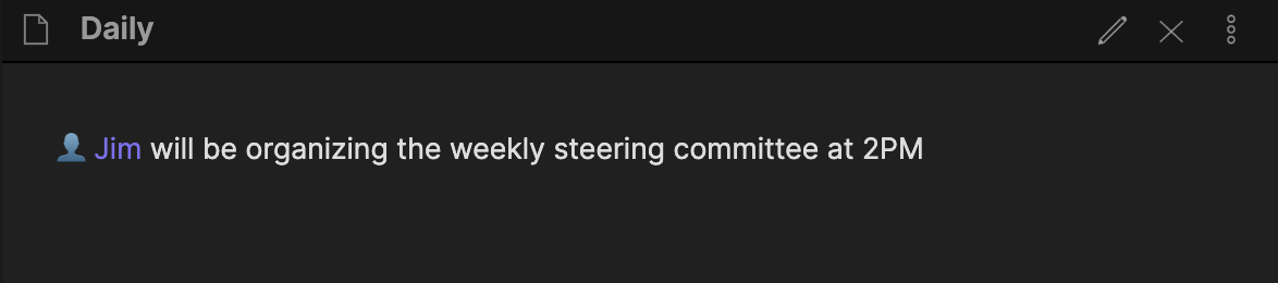
Let's say I have a note about Jim called Jim.md with the tag #person and some YAML frontmatter.
---
status: call soon
age: 42
---

Jim is one of my colleagues

#person
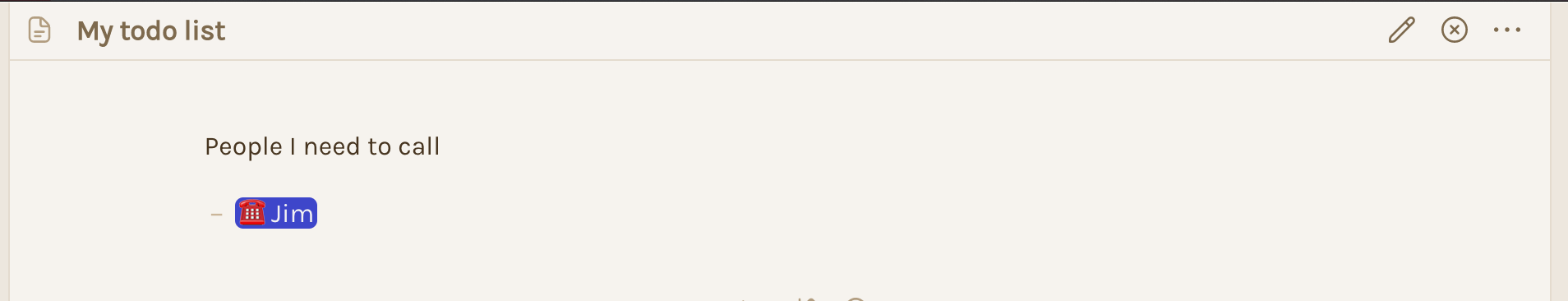
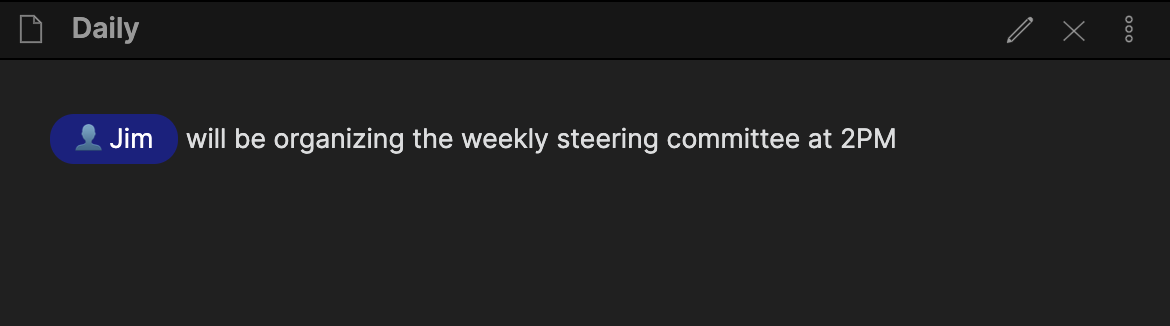
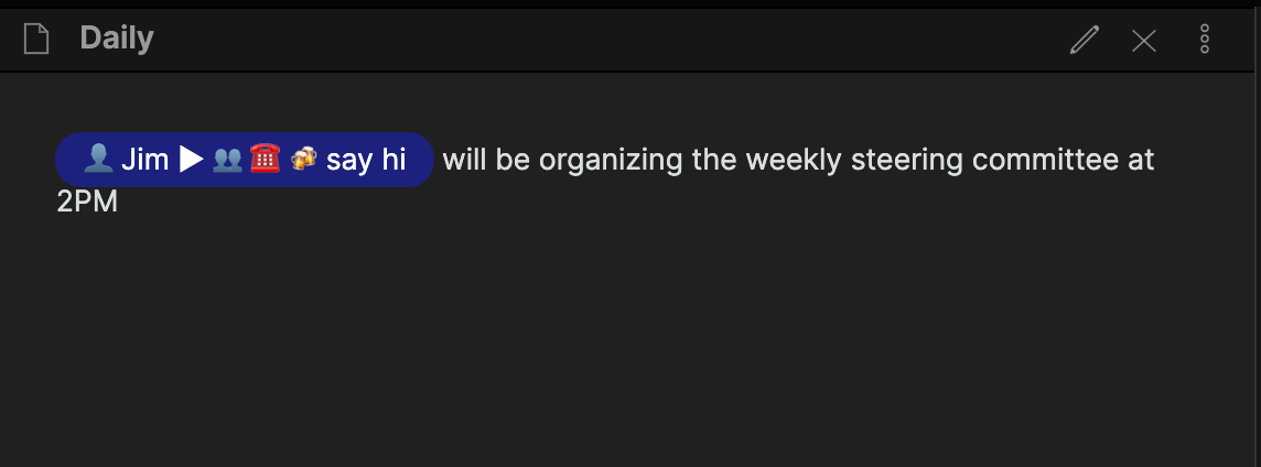
I want to change what links to Jim's note look like. In particular, I want links to persons to have a blue background, and I want persons I have to call to have a telephone emoji ☎️ in front:  .
.
Time to set up the plugin to get this work! Let's go to the plugin settings.
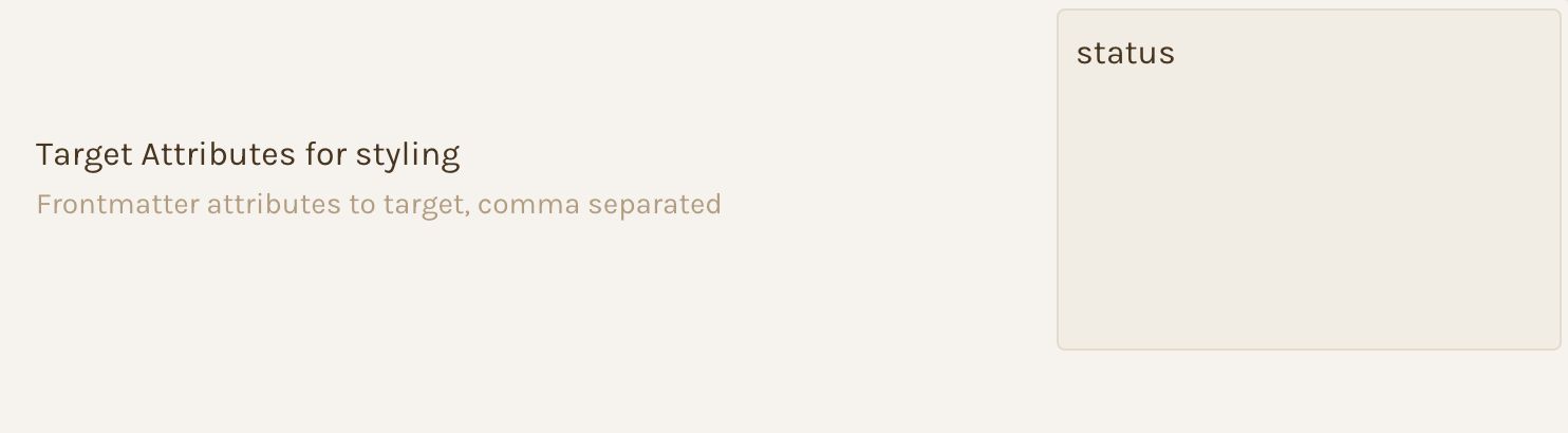
First, you have to tell the plugin what front-matter attributes to include for your styling in the Target Attributes for Styling option on top. Let's add status here, which indicates whether we need to call Jim!
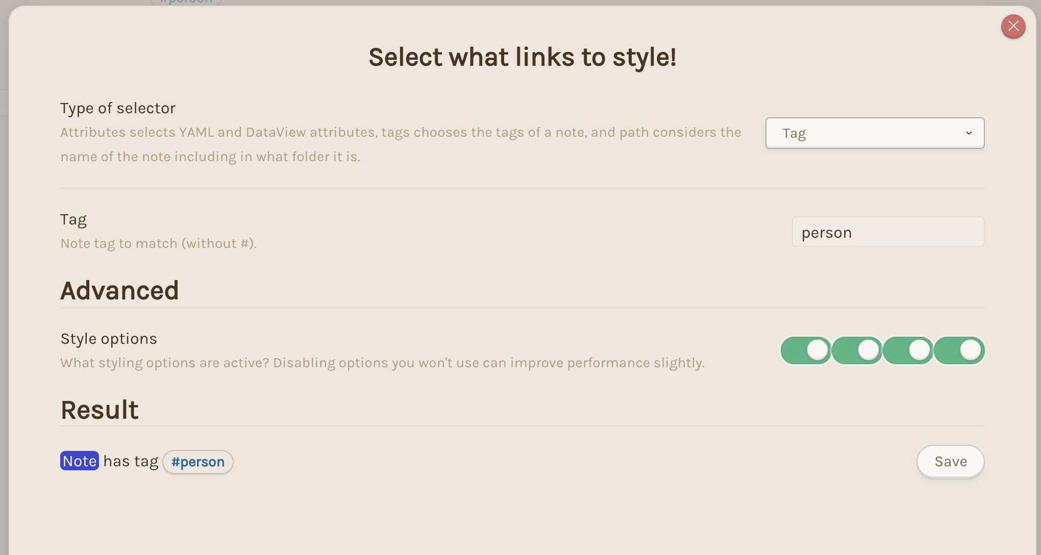
Next, we have to tell the plugin to look for notes with the tag #person. In the settings, under the Styling header, create a new selector. Under types of selector, select "Tag", and add person down below:
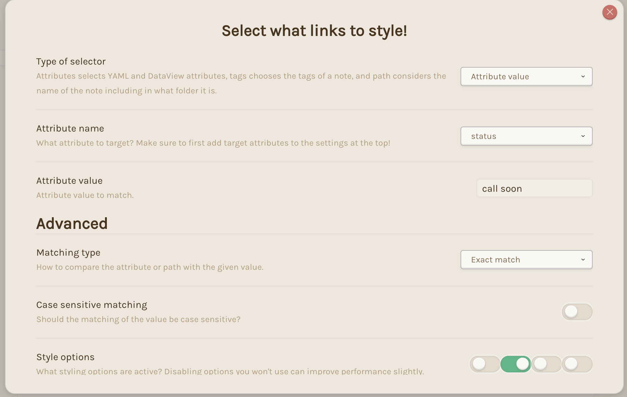
We also want to add an emoji when notes have call soon as its status. We will tell the plugin to look for the attribute status, and that its value should be call soon. Note that this will also look for inline fields called status from DataView.
One important setting for our use case is that we only enable the "Add content before link" option under "Style options", since otherwise this style would override the one from the tag #person!
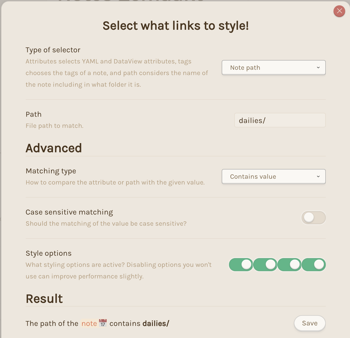
In addition to styling based on attributes or tags, we can also style notes based on their 'path' (which includes its name, folders and extension). For example, we can style all notes in the folder dailies. Make sure to select 'Contains value' under match here instead of 'Exact match':
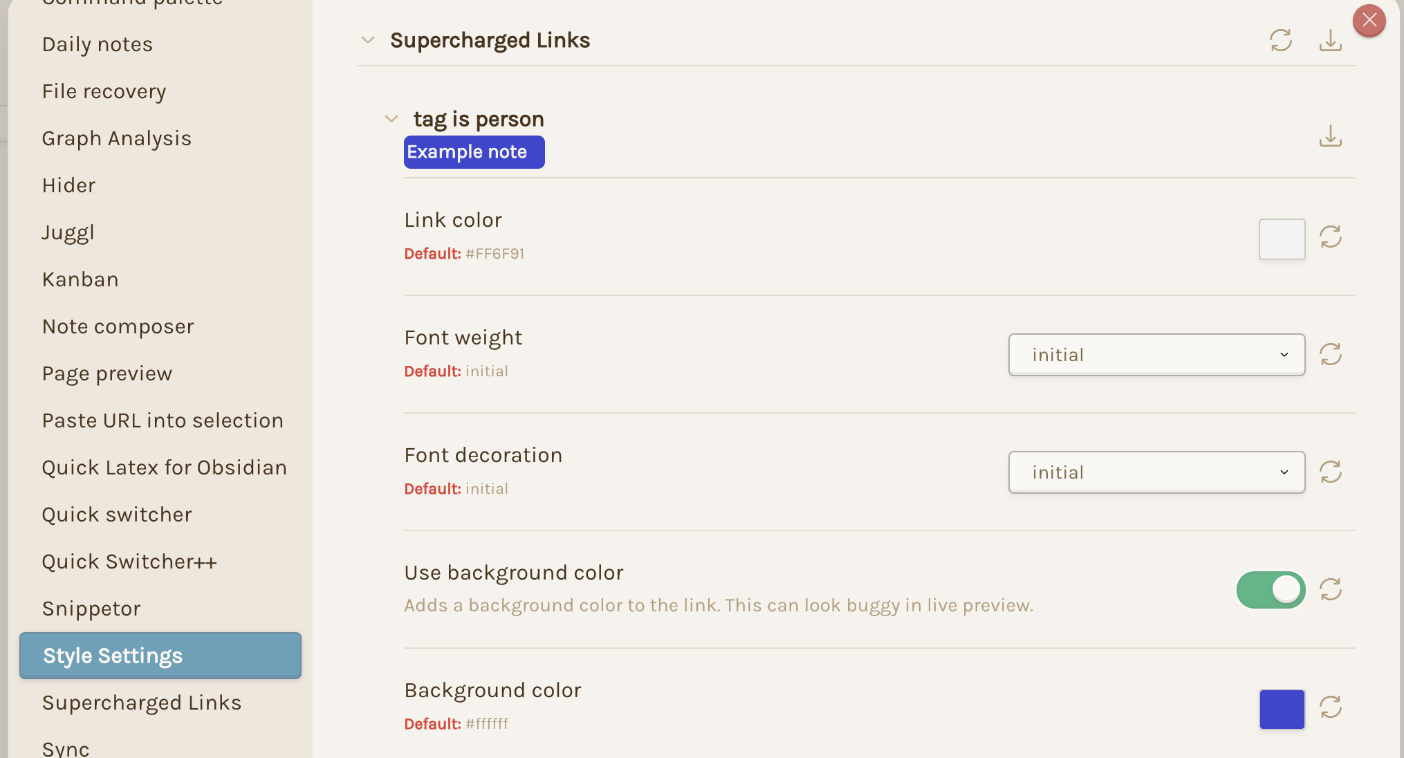
First, make sure you have the Style Settings Plugin installed and enabled. Then, under settings, navigate to the settings of Style Settings. Now we are ready to style our links! Let's start with setting up our style for notes with the tag #person. We will use a white text color, enable the background, and use a nice blue background there.
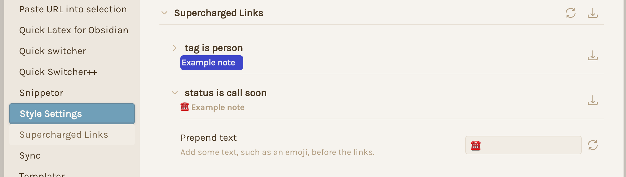
Next, let's add emoji's before notes with the call soon status. All we have to do here is copy the ☎️ into the text area "Prepend text".
And voila!
If you are comfortable with CSS and HTML, you can create even more customized styles for your links using CSS snippets.
- Create a CSS snippet in Obsidian by going to Settings > Appearance > CSS Snippets.
- Write your custom CSS code to style the links based on their data attributes, such as data-link-tags or data-link-status.
- Save the CSS file and enable the snippet in Obsidian.
To explain how this works, let's explain what this plugin does in the background.
Let's say I have some link to [[Jim]] somewhere.
Without the plugin activated, the HTML link element would normally look like this:
<a data-href="Jim" href="Jim" class="internal-link" target="_blank" rel="noopener">Jim</a>
This does not give any information about what is in the Jim.md note! So, we wouldn't be able to customize it.
That's where this plugin comes in: it will add two extra properties in the <a> element : data-link-status and data-link-tags. Importantly, these attributes are prefixed with data-link so that it will not conflict with other attributes in Obsidian.
With the plugin active, the <a>element will be supercharged like this:
<a data-href="Jim" href="Jim" class="internal-link data-link-text data-link-icon data-link-icon-after" target="_blank" rel="noopener" data-link-status="call soon" data-link-tags="#person" >Jim</a>
You can use the flexibility of CSS to customize your links by setting CSS properties in a CSS snippet like links.css. To create a CSS snippet, go to the Obsidian settings, then to Appearance and scroll to the CSS snippets section. Click on the little folder icon, then create a new file in the opened folder called links.css.
To change the color of every appearance of a link to a note based on the tag in the file:
[data-link-tags*="#topic" i]{
    color: #ff6600 !important;
}
This will target all HTML elements that contain the data-link-tags property, that is, all supercharged links.
To put a 👤 emoji before the name of each link to a "category: people" note:
.data-link-icon[data-link-category$="People" i]::before{
    content: "👤 "
}
Selecting specifically .data-link-icon is required to prevent bugs in Live Preview.
To highlight the link in a tag-like blue rounded rectangle when the property status is in the note:
:not(:empty)[data-link-next-status] {
    color: white;
    background-color: rgb(29, 29, 129);
    border-radius: 18px;
    padding: 5px 15px;
}
To display the value of the status property at the target file, but only whenever you hover on the link:
.data-link-icon-after[data-link-status]:hover::after{
    content: " ► "attr(data-link-status)
}
To hide the display of links with the tag #hide from your notes (that is, from preview mode and live preview):
a.internal-link[data-link-tags *="hide"],
.cm-hmd-internal-link > [data-link-tags *="hide"]{
    visibility: hidden !important;
    display: none;
}In addition to adding HTML attributes, Supercharged Links will also add CSS custom properties to your links. This can make it easier to use these values directly in CSS.
All such properties are prefixed with --data-link- -- so a property called "priority" would be expressed as --data-link-priority.
Any property whose value begins with http will be treated as a URL in CSS -- so if you have avatar:: https://avatars.githubusercontent.com/u/124363?v=4 in your document, it will be added as --data-link-avatar: url(https://avatars.githubusercontent.com/u/124363?v=4).
Let's say you add a property colour to a note (for example, with colour:: #8bc34a or colour:: rebeccapurple). You can then use CSS to apply that colour to your link:
[data-link-colour] {
    color: var(--colour);
}Set up your notes so that each "person" note includes a photo attribute. Note that this will need to be an HTTP link. For example:
barryvan.md
    photo:: https://avatars.githubusercontent.com/u/124363?v=4
    website:: https://barryvan.com.au/

    ...my notes about barryvan
Then in your CSS:
/* Used in the editor */
.data-link-icon[data-link-photo^="https" i]:empty {
	width: 1.5em;
	height: 1.5em;
	display: inline-block;
	vertical-align: middle;
	background-image: var(--data-link-photo);
	background-size: cover;
	box-shadow: 0 1px 4px #0008;
	border-radius: 100%;
	margin: -0.5em 0.2em -0.5em 0;
}

/* Used outside the editor -- for example, in search results, tabs, etc. */
.data-link-icon[data-link-photo^="https" i]:not(:empty)::before {
	content: '';
	width: 1.5em;
	height: 1.5em;
	display: inline-block;
	vertical-align: middle;
	background-image: var(--data-link-photo);
	background-size: cover;
	box-shadow: 0 1px 4px #0008;
	border-radius: 100%;
	margin: -0.5em 0.2em -0.5em 0;
}
...to produce something like this:
NOTE: These demos are somewhat outdated.

Live preview, source view, reading mode and the file browser are fully supported in core Obsidian. Other plugins are also supported, as listed below:
Core plugins:
- Backlinks (including Backlinks in edit mode)
- Outgoing links
- Search
- Starred files
- Quick Switcher
Community plugins:
- Breadcrumbs
- Graph Analysis
- Recent files
- Quicker Switcher++
- Another Quick Switcher
- Dataview (inline fields)
- Omnisearch
Want support for another plugin? Create an issue here in the repo!
This plugin also adds context menu items to modifiy target note's frontmatter properties and "inline fields" (dataview syntax) by right-clicking on the link.
This functionality is deprecated and has been migrated to metadata-menu plugin, available with brat https://github.com/mdelobelle/metadatamenu .