Empress is a fast and scalable phylogenetic tree viewer that lets you interactively explore the hierarchical relationships between features in your dataset. While historically these features often represented evolutionary relationships of species in community surveys, and are characterized by their phylogeny or genetic similarity/differences, you can in fact view any type of information with hierarchical organization. For example, you can view trees of amplicon sequence variants (ASVs), or metabolite trees of LC-MS data using q2-qemistree (ref).
Currently, Empress is only accessible as a QIIME 2 plugin. To follow this tutorial you will need to have a QIIME 2 (version 2019.10 or newer) conda environment installed and activated. See the QIIME 2 installation page for installation instructions.
Once you have QIIME 2 installed, make sure the conda environment is activated by running:
conda activate qiime2-2020.6
You can replace qiime2-2020.6 above with whichever version of QIIME 2 you have currently installed.
Now we are ready to install Empress. Run the following commands:
pip install git+https://github.com/biocore/empress.git
qiime dev refresh-cache
qiime empress --help
If you see information about Empress' QIIME 2 plugin, the installation was successful!
In this tutorial we will be using Empress within the QIIME 2 environment, and demonstrating its basic usage with the Moving Pictures tutorial dataset, a set of human microbiome samples from two individuals at four body sites across five timepoints.
Before we start, we’ll need to download the necessary input artifacts. The first four of these artifacts are produced during the Moving Pictures tutorial, and the last artifact was produced afterwards using data from the tutorial. These artifacts are:
- A feature table (a QIIME 2 artifact of type
FeatureTable[Frequency]) - A sample metadata file (a tab-separated-value file)
- A rooted tree (a QIIME 2 artifact of type
Phylogeny[Rooted]) - Taxonomic assignments of our features (a QIIME 2 artifact of type
FeatureData[Taxonomy]) - A PCoA biplot results file (a QIIME 2 artifact of type
PCoAResults % Properties('biplot'))- This artifact in particular was produced by the
qiime diversity pcoaplugin, but ordinations / biplots created by other tools (e.g. DEICODE) also work well with Empress.
- This artifact in particular was produced by the
The last item is required only when displaying an Empress tree plot in tandem with an Emperor PCoA plot/biplot (a.k.a. an Empire plot!)
You can download these files individually by clicking the links below, or using wget to download them directly from your terminal.
table.qzaview | downloadsample_metadata.tsvdownloadrooted-tree.qzaview | downloadtaxonomy.qzaview | downloadbiplot.qzaview | download
First we’ll create a directory to download our files to and change into it:
mkdir empress-tutorial
cd empress-tutorial
Now download the files:
wget https://docs.qiime2.org/2019.10/data/tutorials/moving-pictures/table.qza
wget https://data.qiime2.org/2019.10/tutorials/moving-pictures/sample_metadata.tsv
wget https://docs.qiime2.org/2019.10/data/tutorials/moving-pictures/rooted-tree.qza
wget https://docs.qiime2.org/2019.10/data/tutorials/moving-pictures/taxonomy.qza
wget https://raw.githubusercontent.com/biocore/empress/master/docs/moving-pictures/biplot.qza
We are now ready to create our interactive tree plot.
We’ll start with a simple stand-alone tree visualization artifact and explore our tree using the various features in Empress.
qiime empress plot \
    --i-tree rooted-tree.qza \
    --i-feature-table table.qza \
    --m-sample-metadata-file sample_metadata.tsv \
    --m-feature-metadata-file taxonomy.qza \
--o-visualization empress-tree.qzvTo view the newly made empress-tree.qzv artifact, you can drag and drop the file onto https://view.qiime2.org/ or load it locally by running:
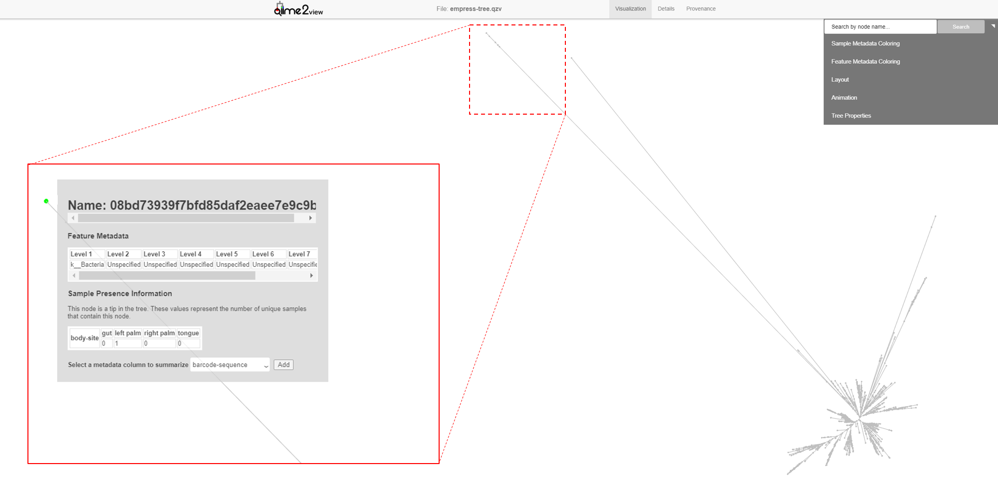
qiime tools view empress-tree.qzvThe starting plot is a simple unrooted tree which has all the normal properties of a phylogenetic tree. The outermost “tips” of the tree are referred to as “leaves”, “terminal nodes”, or “external nodes” and here represent a unique ASV. The line connected to this external node is referred to as a “branch”. A branch connects two or more nodes, in this case an external node to an internal node. These internal nodes represent a divergent point between nodes and the branch length represents the evolutionary distance between divergence points. You can use your mouse’s scroll wheel to zoom in and out, and click and drag anywhere on the plot to move the display to take a closer look at the various tree components. On the top-right we see a display menu with several subcategories that allow us to customize the plot. We will explore these options in more detail below.
The first thing you likely noticed in this plot is the presence of several very long branches that stand out relative to the others. Let’s investigate these further. Zoom in on the external node of the longest branch and click on the node.
A new menu appears with details about the selected node, including its name and taxonomic assignment. You’ll notice that this feature has -unexpectedly- only been classified at the Kingdom level, meaning that our feature-classifier was not able to find a suitable match in our reference database (Greengenes). More often than not, these features correspond to non-biological reads such as chimeras, contaminants, or reads that have index-hopped from other samples. We will explore these possibilities further later. Also note that the tree used in this tutorial was built using the common de novo tree-building approach and it has previously been shown that the presence of these outlier branches in de novo trees can lead to artificial clustering of samples (Janssen et. al 2018).
In this window we can also select to view details about sample-metadata related to this feature. From the drop down menu select body-site and click the Add button. A new Sample Presence Information summary table appears which displays the number of samples containing the selected feature. We can see that our ASV is present in only 1 left palm sample. You can select multiple metadata columns. While the table here does not give us information about the abundance of this feature, we can easily search the feature name in the feature table summary visualization artifact created previously in Moving Pictures tutorial. From there we see that this particular feature has a total abundance of 2, which is another strong indicator of a non-biological read. Try clicking the external nodes in a few other outlier branches. Do you see a similar pattern? Now try clicking on an external node of one of the shorter branches. Notice the much improved classification!
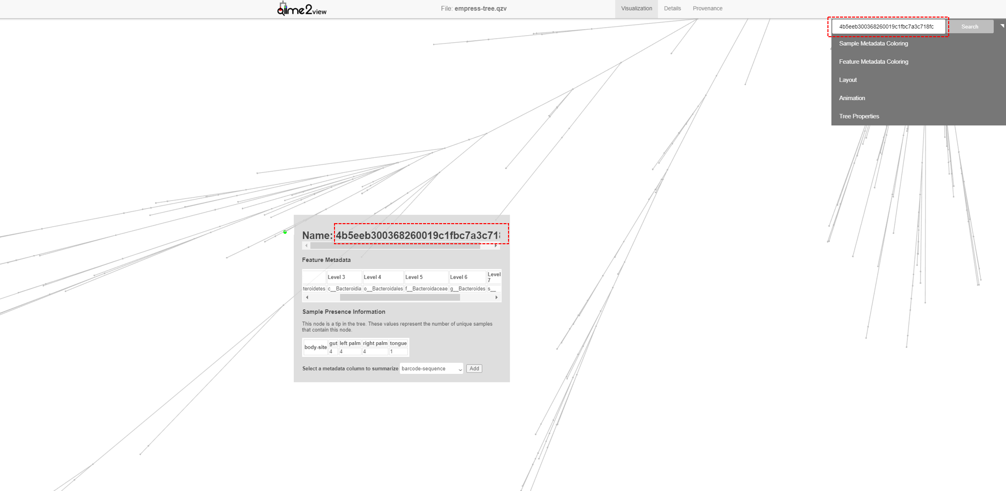
We can also locate specific features of interest using the search bar at the top of the main menu. For example, in our feature-table the most abundant ASV is 4b5eeb300368260019c1fbc7a3c718fc. Paste this name in to the search bar and click Search.
The feature’s external node is now highlighted on the tree as a bright green circle. The most abundant ASV is a species belonging to the Bacteroides genus.
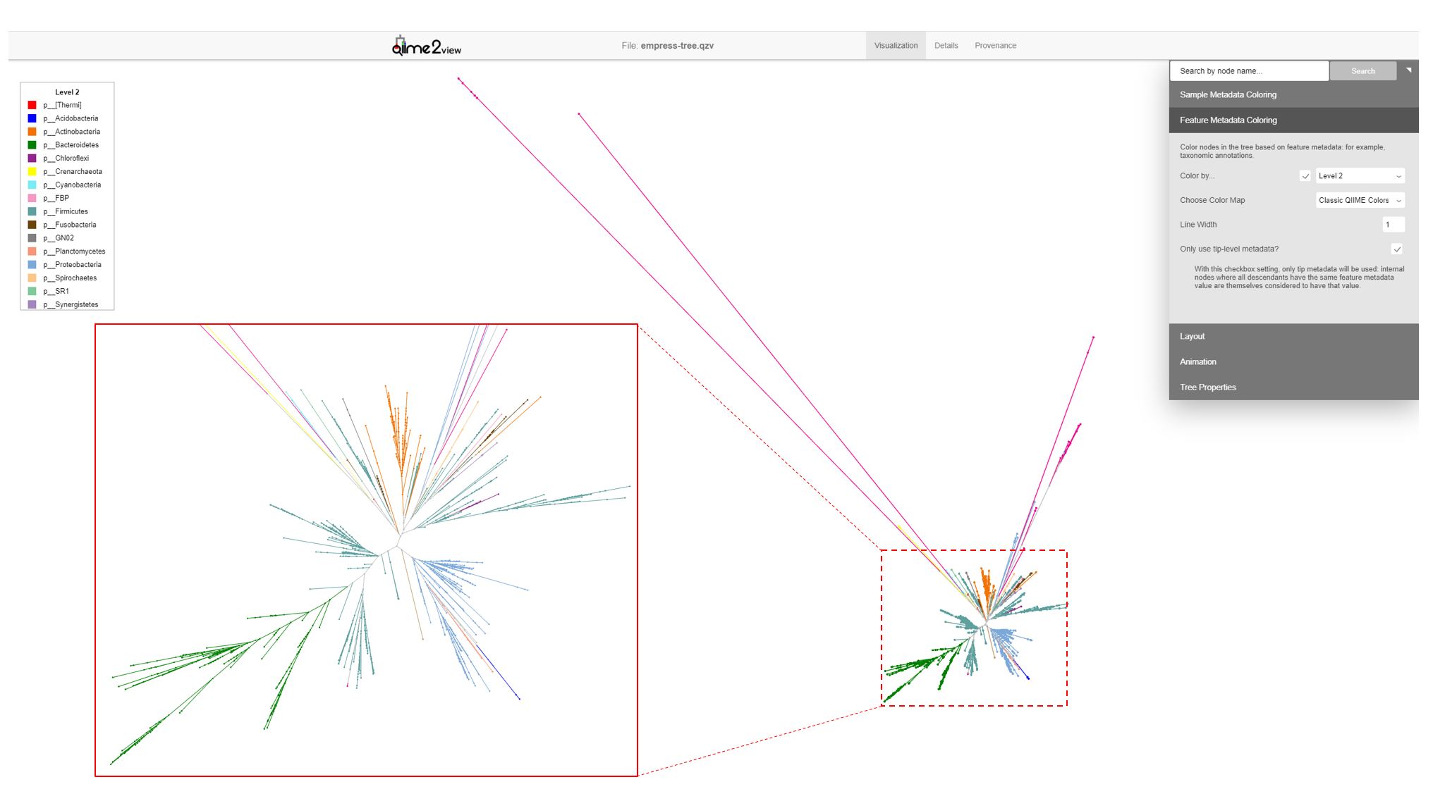
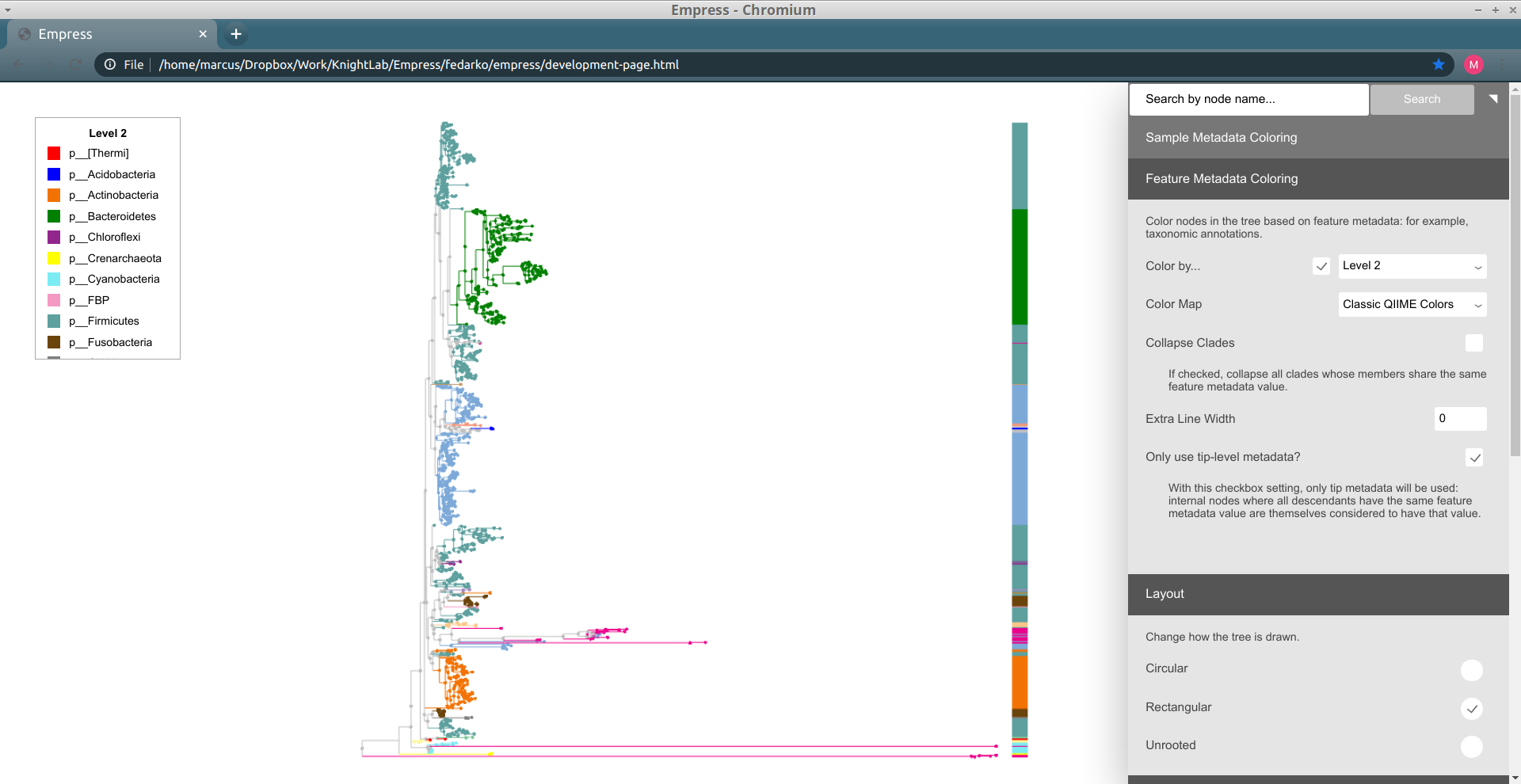
Another way of exploring the classification of our features is to color the branches based on their taxonomic designation. From the main menu, click Feature Metadata Coloring, check the Color by… box and select Level 2 which here corresponds to the Phylum level, and click Update.
The plot is now updated so each branch is now colored by its Phylum level classification. We can see that the extra long branches are all the same color. Hover the cursor over the legend box and scroll to the bottom. The magenta color corresponds to an Unspecified Phylum. You may also have noticed that these outlier branches appear mainly in 2 distinct clusters. While we don’t have any more information about the classification of these features, perhaps we can gain some more insight regarding their classification by looking at their closest common ancestors that do have taxonomic information.
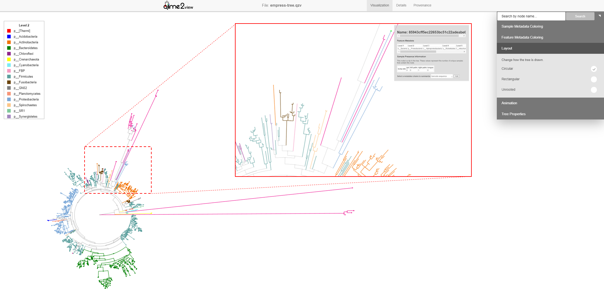
So far, we’ve looked at our data using the default unrooted tree view. To visually locate these features’ closest common ancestors, it may be easier to switch to a different layout. From the main menu, click Layout then select Circular (or Rectangular). Our plot automatically switches to a rooted circular cladogram.
Now zoom into the longest branch of the top cluster and click on the closest external node that has a different Phylum classification (light blue).
Interestingly, we see that this node is classified as Acanthamoeba Palestinensis which is actually not a bacteria but rather a protozoa. It is not uncommon for certain Eukaryotes to appear in bacterial/archaeal reference databases as they may share a similar genetic lineage. Remember that mitochondria and chloroplasts likely evolved from prokaryotes themselves. Explore a few other common ancestral nodes from different outlier branches. We can see other surprising appearances by Cucurbita pepo (a variety of squash or pumpkin), Raphanus sativus (radish), and Streptophyta (an order of plants). Based on these results one might speculate that our Unspecified features likely also belong to either plants or protozoa groups rather than bacteria. Further, since these features appear only on the palm samples, it’s possible the source of these are in fact environmental contaminants rather than common human microbes.
In summary, given the branch length of these features, their very low abundance, lack of close matches in the reference database, and having non-microbial closest common ancestors, it is probably safe to filter these features from our table as non-biologically relevant reads.
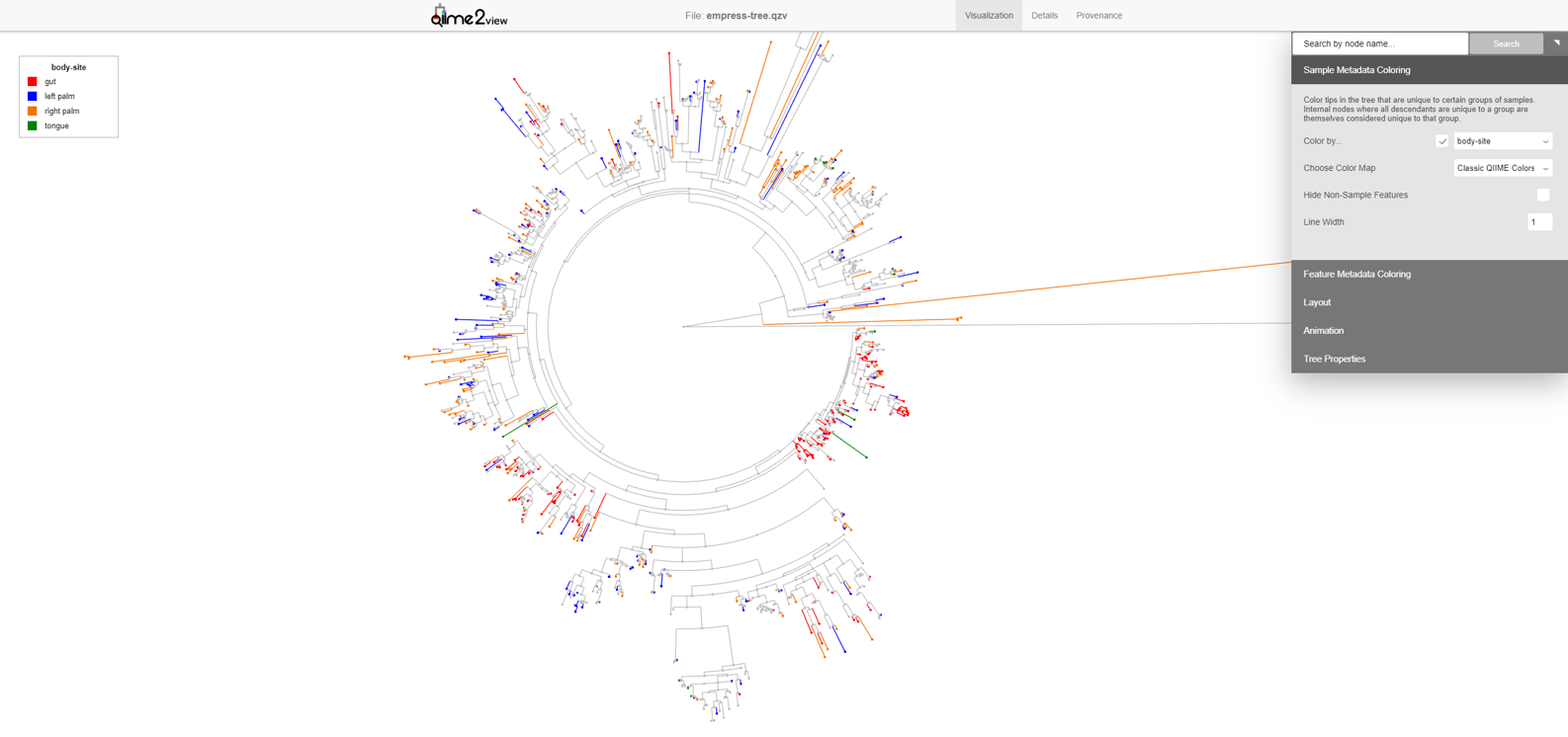
The composition of microbial communities of the gut, tongue, and palms are very different from each other. Suppose we are interested in identifying which features are unique to each body-site and their evolutionary relationships. We can do this in Empress by colorizing our tree based on columns from our sample metadata file. From the main menu, click Sample Metadata Coloring, check the Color by… box, and from the drop-down menu select body-site. Click the Update button.
In this plot the colored branches represent lineages that are unique to the corresponding body site while the greyed branches are those that are shared across at least 2 body-sites and thus cannot be displayed with a single color. While it is not surprising to see a large number of unique features in the gut samples (red) compared to the palm samples (blue and orange), it is interesting to see a large number of unique features between the left and right palm. Can you think of any biological reasons why the left and right palms may contain such different unique microbes? Even though the left and right palm do harbor unique features, the representative clades appear more integrated among themselves, suggesting that their phylogeny are still more similar to each other than the gut taxa which appear to cluster mainly among themselves.
Similarly to other tree visualization tools like iTOL, Empress can draw barplots in order to annotate tips of the tree with various types of information. Barplots are useful for doing this (moreso than node coloring, sometimes) because multiple "layers" of barplots can be shown at the same time -- this allows for us to view multiple types of data for the same tip simultaneously. Check out Figure 1 of Song and Sanders et al. 2020 for just one example of a tree visualization using multiple layers of barplots for a pretty and effective figure.
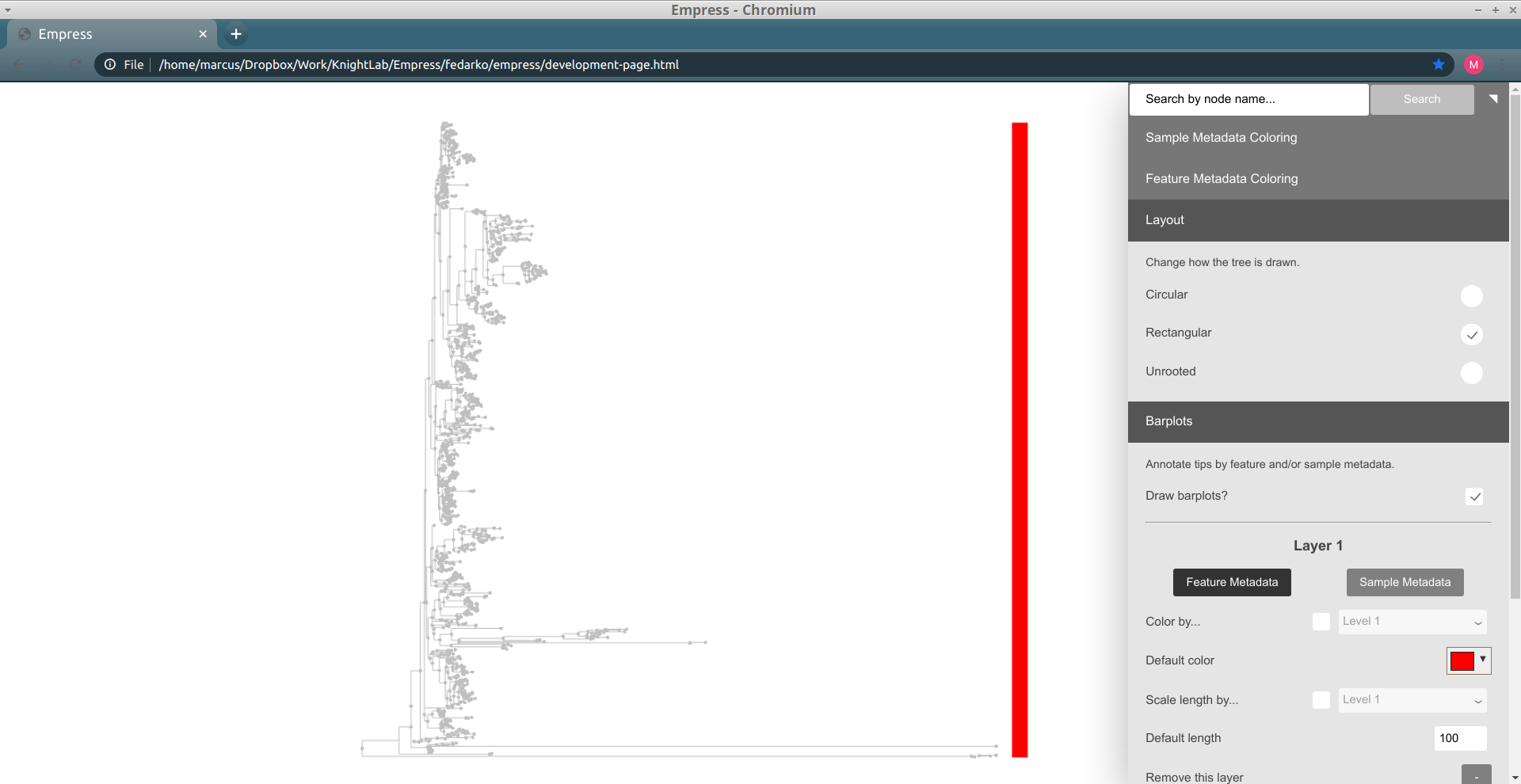
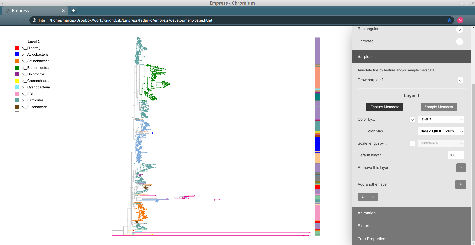
Barplots in Empress are currently only compatible with the rectangular layout, but support for circular-layout barplots is planned. To use barplots, change the layout to Rectangular (using the Layout section of the main menu), and then open up the Barplots section of the main menu and check the Draw Barplots? checkbox. By default, a red bar of uniform length will be drawn for every tip in the tree:
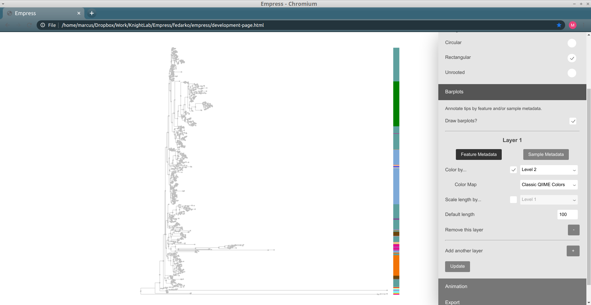
Although these bars are not very useful by default, we can encode them with information based on the feature or sample metadata you passed in to Empress when generating a visualization. Let's try coloring each tip's bar by its Level 2 feature metadata field (a.k.a. the phylum-level taxonomic assignments for the tips in this dataset): under the Layer 1 header, check the Color by... box, and from the drop-down menu select Level 2. Click the Update button.
These patterns should look familiar -- this is the same information as we showed when coloring the tree earlier. We can confirm this by trying out feature metadata coloring by Level 2 again, using the same Classic QIIME Colors color map (see the "Exploring groups of features" section above for a refresher on how to do this):
Since both the node colorings and the barplot layer are showing the same information (Level 2), this display is a bit redundant. Let's try taking things down a level, and adjust our barplot layer to show the Level 3 feature metadata field (a.k.a. the class-level taxonomic assignments). To do this, adjust the drop-down menu next to the Color by... box (under the Layer 1 header in the Barplots section, not in the Feature Metadata Coloring section) to go from Level 2 to Level 3, and then click the Update button again.
Things still seem mostly the same as before, but some of the large groups of phyla have now been split up into collections of different classes. Notice how the lavender-colored class is present at roughly five separate "clusters" throughout the tree: this doesn't necessarily mean that this is the same class at all of these clusters, since colors can be reused if there are more classes than colors for a given color map, but in this case coloring the tree by Level 3 (and looking at the resulting legend) lets us confirm that there's only one lavender class. Try clicking on a node within one of these clusters to see what this class is.
It turns out that these lavender classes are all Clostridia. Does it make sense that representatives of this class are spread out throughout the tree so much? Unfortunately, yes, since Clostridia are -- to quote Wikipedia -- "a highly polyphyletic class." (As an exercise, we recommend trying out adding on extra barplot layers for lower levels of taxonomy -- order, family, genus, etc. -- and seeing how things change.)
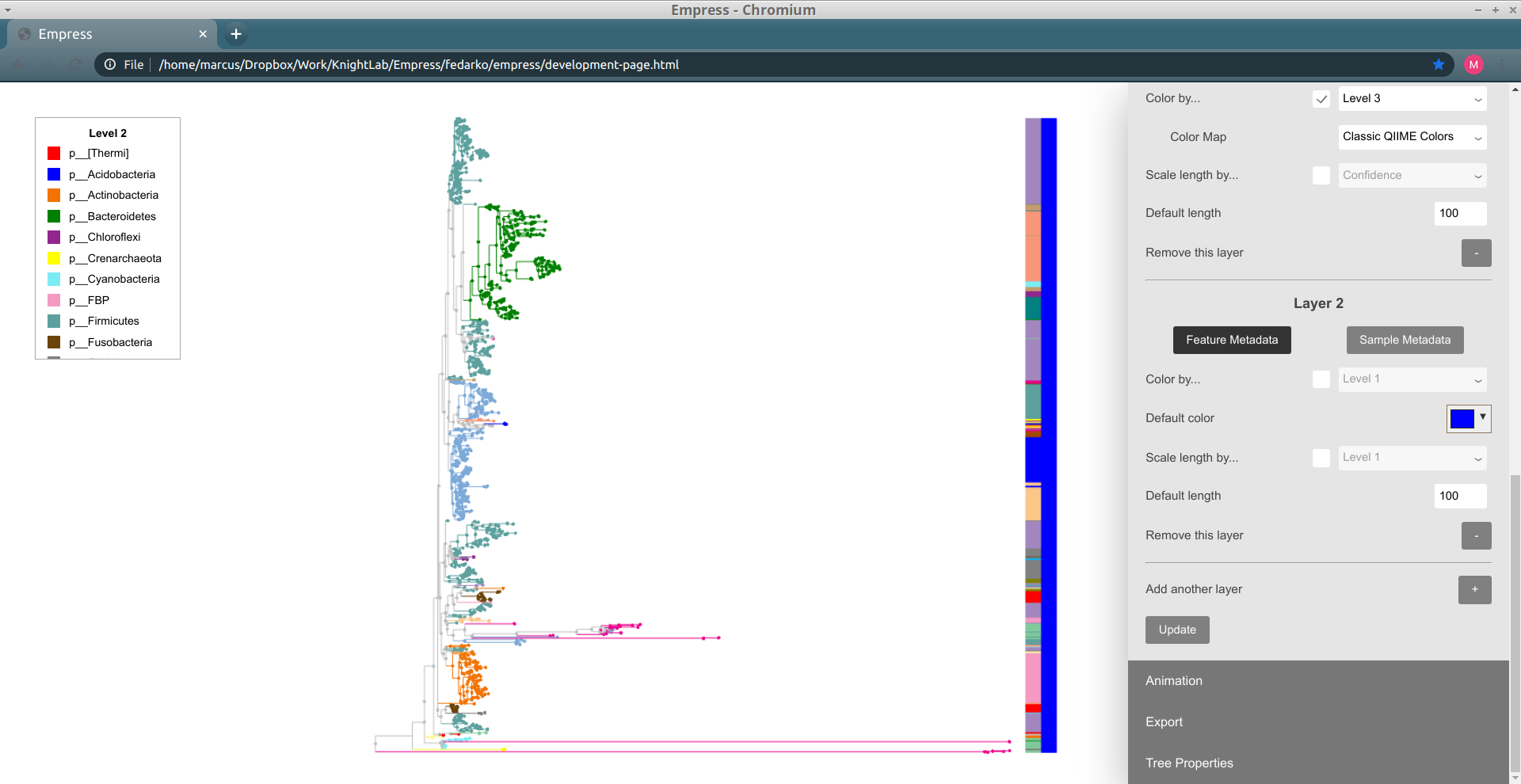
Up until now, we've just been working with a single "barplot layer." We can add on more layers if we want -- this will let us visualize additional tip information alongside the layer we have that currently shows Level 3 information. To add a new layer, click on the + button (with the label Add another layer). Now, click Update again to see what this new layer looks like.
We have a new layer to work with!
One thing we might be interested in doing is seeing what types of samples contain each tip. This is possible using the Sample Metadata Coloring functionality described above, but this only lets us see information about tips that are unique to a given sample metadata category -- and in practice many tips are often shared between multiple metadata categories, complicating things.
Let's revisit our analysis above of which tips are unique to which body sites in this dataset -- now, we'll instead be asking the related question of "which tips are most frequently seen in which body sites in this dataset?" To investigate this, we'll use our new barplot layer to show this information.
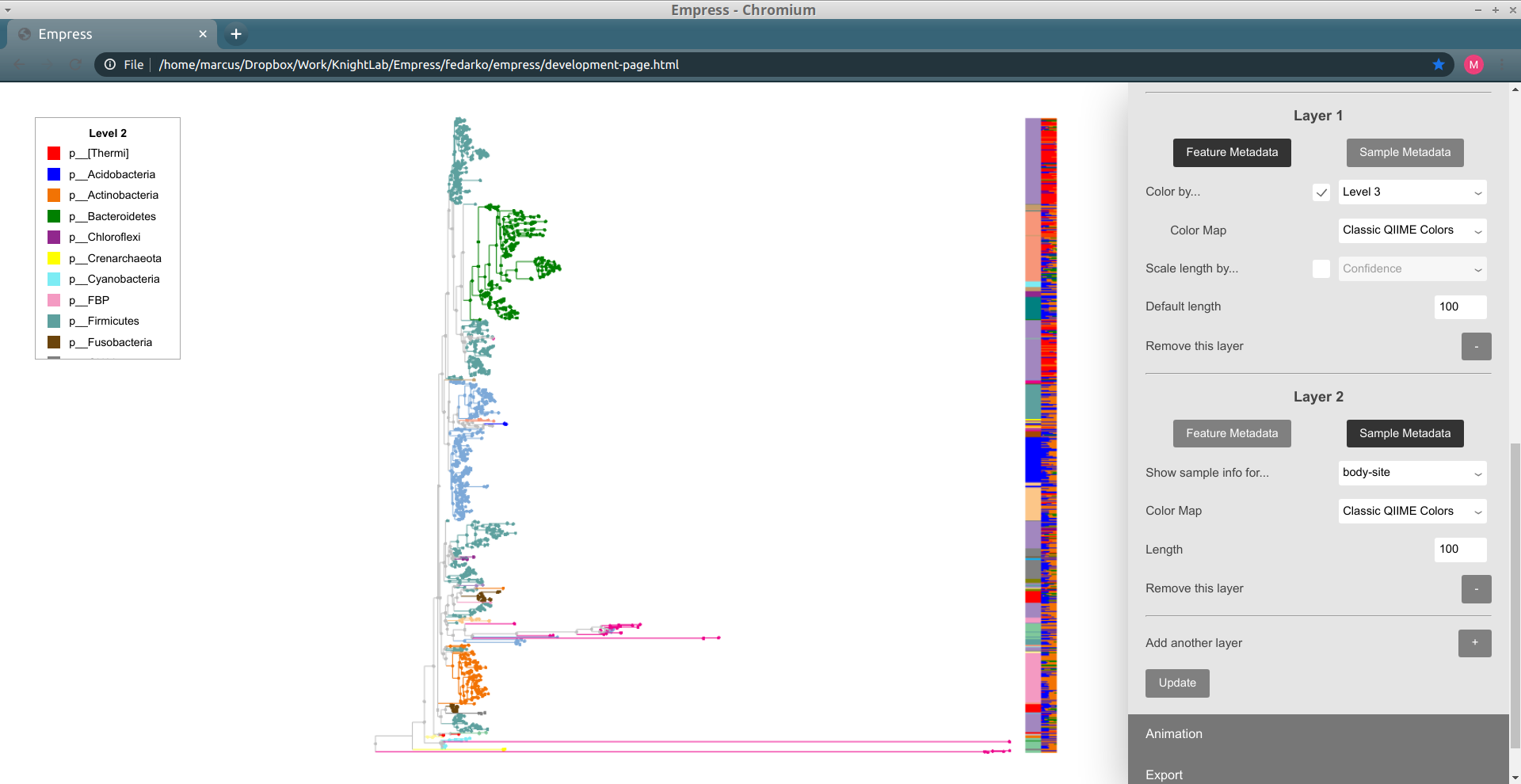
In order to do this, we'll need to change our new layer ("Layer 2") from a feature metadata layer to a sample metadata layer. You can do this by clicking on the Sample Metadata button underneath the text "Layer 2". The controls available for this barplot layer should change; in order to show sample presence information for body sites, change the Show sample info for... drop-down menu to body-site. Try clicking Update to see what our new Layer 2 looks like.
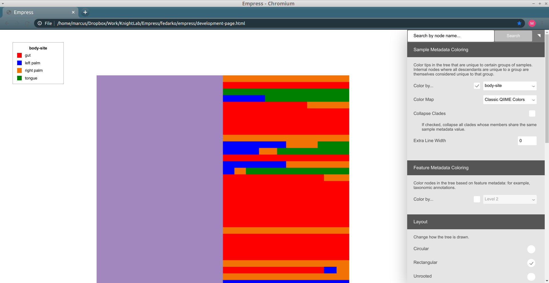
Layer 2 now shows a stacked barplot for each tip, based on the proportions of sample groups containing a given tip. The colors used in this barplot are the same as with sample metadata coloring -- red corresponds to gut samples, green corresponds to tongue samples, etc. When we zoom in, we can see things in detail (you may want to re-color the tree using the Sample Metadata Coloring controls and body-site so you can see what these colors mean):
The top-most tip is only present in right palm samples, the second-from-the-top tip is only present in gut samples, and so on. The length taken up by a "block" for a given tip is proportional to how many samples of that type contain the tip (relative to the total number of samples containing the tip; it's not absolute) -- so the fourth-from-the-top tip, for example, is present in mostly tongue samples but also present (albeit in fewer) left palm samples. When we click on this tip (name 9f1913b781d2cde1c8a4c57b7dc2ab83) in the tree, we can see that this matches up with the Sample Presence Information body-site summary for this tip: it's present in 2 tongue samples and 1 left palm sample.
This was a brief introduction to some of the barplot functionality available in Empress. There's a lot more that hasn't been documented here -- scaling bars' lengths by a continuous feature metadata field, coloring bars by a continuous feature metadata field (e.g. an importance score or Songbird/ALDEx2-style feature differential), adjusting the default colors or lengths of bars, and so on. We encourage you to try things out; feel free to contact us if you have any questions!
Once you are done customizing your tree, you can export the tree as an .SVG file by going to the Export section in the main menu and clicking on Export tree as SVG.
Now that you are familiar with basics, let’s try something a bit more advanced. One of the unique features of Empress is its ability to integrate a tree plot with an Emperor PCoA plot and visualize them side-by-side (these plots are internally referred to as Empire plots). To achieve this we provide a PCoA matrix (PCoAResults type artifact), which can be any beta diversity distance matrix, including biplots. Ordination biplots that are made using the qiime diversity pcoa-biplot plugin, incorporate feature loadings represented by arrows that describe explanatory variables in the dataset. This functionality is also compatible with DEICODE biplots. In this example we’ll use a PCoA biplot calculated using Unweighted UniFrac distances. To create this new plot, run the following:
qiime empress plot \
    --i-tree rooted-tree.qza \
    --i-pcoa biplot.qza \
    --i-feature-table table.qza \
    --m-sample-metadata-file sample_metadata.tsv \
    --m-feature-metadata-file taxonomy.qza \
    --p-filter-extra-samples \
    --p-number-of-features 10 \
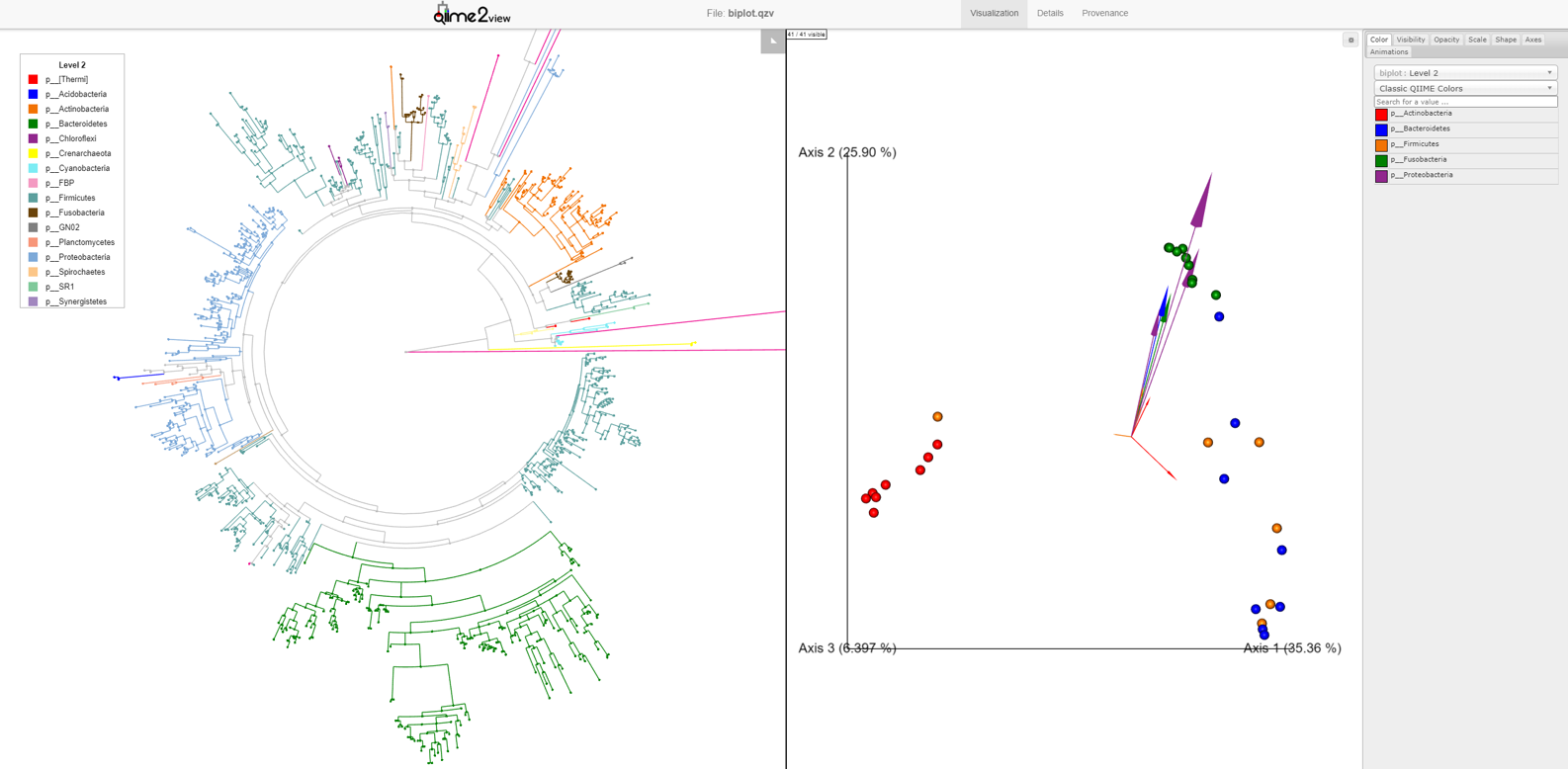
--o-visualization empire-biplot.qzvLoad the new Empire plot. Here we see the Empress plot as before on the left, and on the right is an Emperor PCoA biplot. If you are unfamiliar with Emperor plots, you can learn more about them here. Briefly, each individual circle represents a single sample’s microbial community and the distances between these circles corresponds to the Unweighted UniFrac distance between them in a reduced dimensional space. The top 10 explanatory features are shown as arrows alongside their id names. The number of features that is shown on the biplot is determined by the --p-number-of-features parameter.
For clarity, let’s remove the long feature-id labels. Right click anywhere on the Emperor plot and select Toggle label visibility. Next, in Emperor, from the main menu click on Select a color category and select body-site under the scatter subheading. Now our samples are color coded based on their body site origin. Notice the clear clustering of these sample-types. Next, click on the same drop-down menu and this time under the biplot subheading select Level 2. Now we can see the top explanatory features (arrows) colored by their Phyla designation. Switch over to Empress, change the plot layout to Circular, and set the Feature metadata coloring to Level 2 also. Minimize the menu bar to fully appreciate the plots!
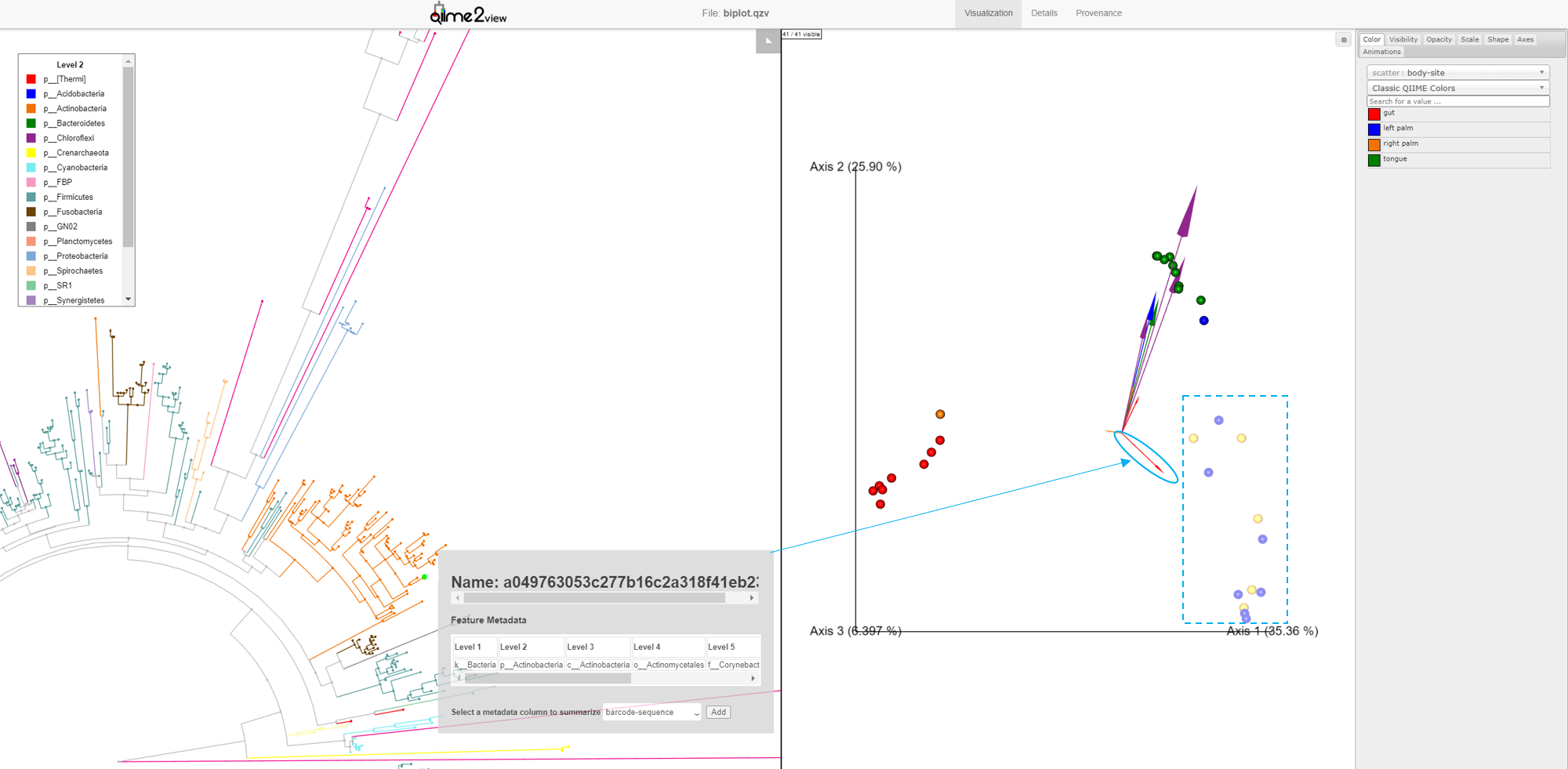
Looking at our Emperor plot, we see a single feature from the Actinobacteria Phylum (small red arrow) that is associated with the palm samples. Click on this arrow; two changes automatically occur: 1) on the Emperor plot, the samples that contain that feature will go dim, and 2) in Empress, the plot will zoom in on the external node corresponding to that feature, where you can explore the feature’s details further as before.
This interaction between Empress and Emperor can go the other direction. Selecting a node on the Empress plot will dim the samples in Emperor in which that feature is present in.
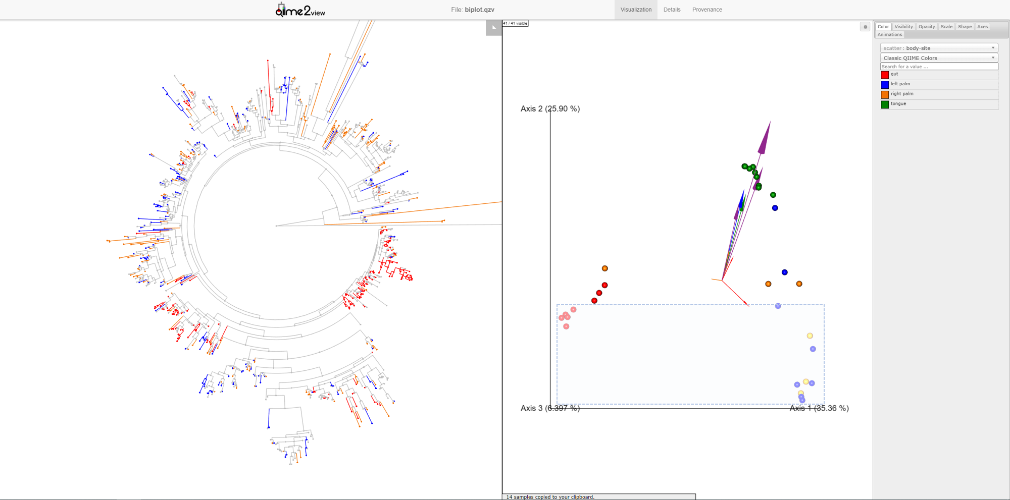
Another way to explore our data is to select samples on Emperor and look for the corresponding features in Empress. In Emperor, hold the shift button and draw a box around a sample. The Empress plot will now temporarily highlight the branches corresponding to that sample. If you select multiple samples from different body-sites, Empress will only highlight the branches/nodes that are unique to those sample types. The shared branches remain grey. Let’s see how we can utilize this function in our dataset.
You may have noticed that in the Emperor plot, one of the Right Palm samples, is strangely clustering closer to the gut samples rather than the other palm samples. On Emperor, select some of the gut samples as well as some of the palm samples from the right hand side, taking care to not include the outlier palm sample on the left. On the Empress plot you will see several branches light up as either red, orange, or blue. These colors represent the unique features found in only that body-site, shared features are left grey.
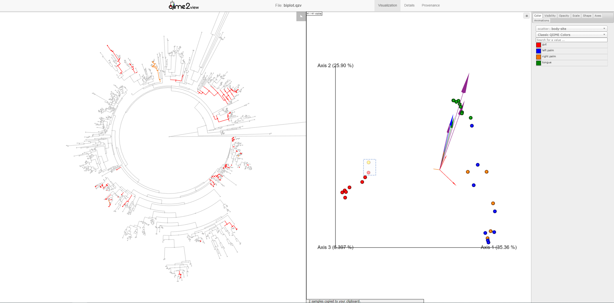
Once the samples have been deselected (within a couple of seconds), select the outlier palm sample + one of the gut samples. What do you notice? You’ll see that there are very few unique orange branches light up, suggesting that this sample shares many more features with the gut samples than the other palm samples.
This is a good example of when your data can tell you something about your metadata that you may have missed. In reality, in this experiment, this palm sample was in fact mislabelled by accident.
Note: When your ordination was created from a subset of your original dataset (e.g. the feature table was rarefied, or certain low-frequency features or samples were otherwise filtered out), we recommend that you carefully consider which feature table you would like to visualize in Empress. You can use either:
- A filtered table that matches the ordination (e.g. with rarefaction done, and/or with low-abundance features/samples removed), or
- A raw table -- that is, the original table before performing rarefaction/filtering for the ordination.
There are some pros and cons for either of these choices. If you use a filtered table, then the Empress visualization will include less data than in the raw dataset: this will impact sample presence information, sample metadata coloring, and other parts of the visualization. If you select the raw table, you might find that some nodes in the tree won't be represented by any of the samples in the ordination (if the ordination was made using a filtered table, and --p-no-filter-unobserved-features-from-phylogeny is used). If you'd like to read more about this, there's some informal discussion in pull request 237.
The command above uses the raw dataset and removes extra samples not represented in the ordination (using the --p-filter-extra-samples flag)
This work is supported by IBM Research AI through the AI Horizons Network. For more information visit the IBM AI Horizons Network website.
Empress' JavaScript code is distributed with the source code of various
third-party dependencies (in the empress/support_files/vendor/ directory).
Please see
DEPENDENCY_LICENSES.md
for copies of these dependencies' licenses.
