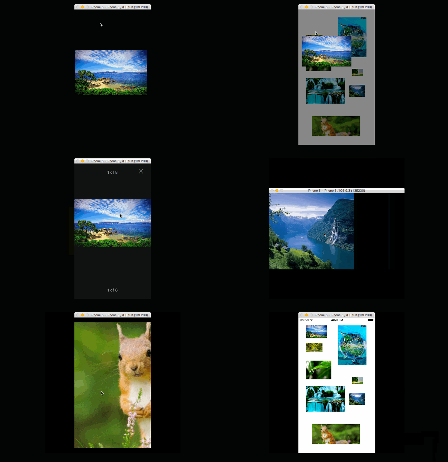
ImageViewer 2.0 represents a major update to our single-image cappable ImageViewer 1.2. Version 2 brings multiple image support in a carousel-like scrollable gallery fashion. We delivered some of the improvements to which we committed in our version 1.x roadmap. Showing multiple images raised overall complexity but also provided us with an opportunity to add new features around the content-rich visual presentation.
CocoaPods:
# source 'https://github.com/CocoaPods/Specs.git'
# use_frameworks!
# platform :ios, "8.0"

pod "ImageViewer"
Carthage:
github "MailOnline/ImageViewer"
let imageProvider = SomeImageProvider()

let frame = CGRect(x: 0, y: 0, width: 200, height: 24)
let headerView = CounterView(frame: frame, currentIndex: displacedView.tag, count: images.count)
let footerView = CounterView(frame: frame, currentIndex: displacedView.tag, count: images.count)

let galleryViewController = GalleryViewController(imageProvider: imageProvider, displacedView: displacedView, imageCount: images.count, startIndex: displacedView.tag)
galleryViewController.headerView = headerView
galleryViewController.footerView = footerView

galleryViewController.launchedCompletion = { print("LAUNCHED") }
galleryViewController.closedCompletion = { print("CLOSED") }
galleryViewController.swipedToDismissCompletion = { print("SWIPE-DISMISSED") }

galleryViewController.landedPageAtIndexCompletion = { index in

print("LANDED AT INDEX: \(index)")

headerView.currentIndex = index
footerView.currentIndex = index
}

self.presentImageGallery(galleryViewController)let imageProvider = SomeImageProvider()
let buttonAssets = CloseButtonAssets(normal: UIImage(named:"close_normal")!, highlighted: UIImage(named: "close_highlighted"))
let configuration = ImageViewerConfiguration(imageSize: CGSize(width: 10, height: 10), closeButtonAssets: buttonAssets)
let imageViewer = ImageViewer(imageProvider: imageProvider, configuration: configuration, displacedView: sender)
self.presentImageViewer(imageViewer)imageProvider: An object that is able to provide an image via a callbackUIImage? -> Void.configuration: Contains information about the assets that will be used for the close button and the image to be displayed's size.displacedView: The view that is about to be displayed in fullscreen.
Besides keeping all the features from version 1.2 below, here is a complete list of additions in 2.0:
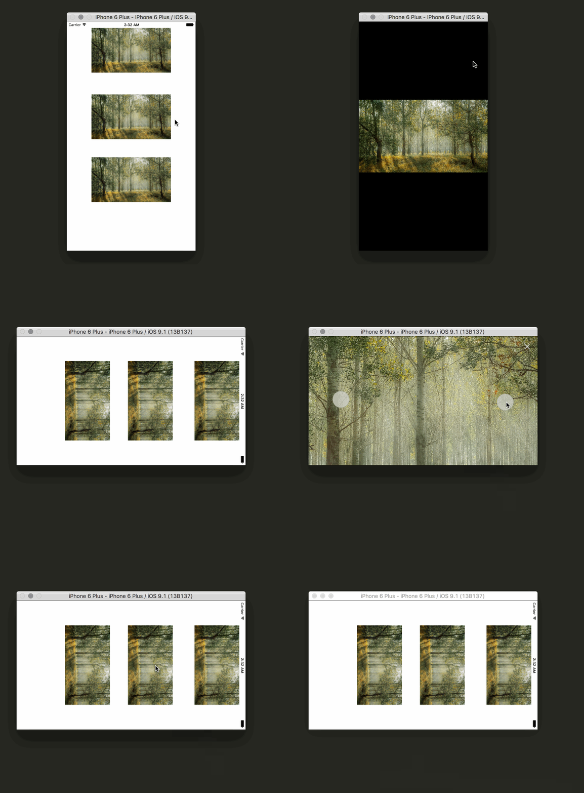
Multiple Images: Show as many images as you want in a single run.Intelligent memory handling: Thanks to behind the scenes usedUIPageViewController's datasource handling, you will never experience memory warnings caused by this component. The underlying view controllers that support detail image manipulation are loaded lazily and there is never more than 4-5 of them occupying precious memory space.Asynchronous background thread image loading: In ImageViewer 1.2 you had to designate an object that conformed to our ImageProvider protocol, the viewer would then ask your object to provide an image. This protocol is now expanded with a second function to ask for image at a particular index. We now guarantee that the process will not block the main thread and thus the UI.Completions blocks: To be able to hook up onto the presentation lifecycle - i.e. launch, image landing, close & swipe to dismiss states - we provide convenient completion blocks. These are exposed as optional properties and are not part of designated initializer.Decoration views: You can now set your own Close button implementation. Additionally the viewer has a concept of header and footer views. These are both opaque from viewer's perspective, they can be any UIView subclass. Both are exposed as optional properties. They are global from perspective of viewer's view hierarchy and sit on top of individual images. See our built-in project example using a simple image counter being as a centered header view.Decoration views hiding: Single tap the viewer's area to show/hide all decoration views.Expanded configuration options: We have expanded the list of visual related options that are now configurable.Config option - Paging Mode: Set the viewer to either go from first to last image or work in a carousel mode in an infinite loop.Config option - Decoration Views pinning: You can chose what kind of layout behaviour serves your needs best. Close button, header view & footer can all be pinned to left or right side or kept in the center.Config option - Spine Width: Set the width of the spine that separates images from each other.Config option - Status Bar Hiding: You can set the status bar to be hidden while the gallery is running.Config option - Decoration Views Hiding: You can set the decoration views to be hidden on start.Config option - Spinner customization: We are showing an activity indicator while the image is loading. You can set its style and color.Horizontal swipe to dismiss: If you run the viewer in Standard (non-carousel) mode, once you reach the beginning or the end of image collection, the next horizontal swipe will dismiss the whole viewer. This gesture is interactive and cancelable.Image displacement: Displacement still works, we now also keep track of the displaced image index, that means if you page back and forth through images, and you page to the originally displaced image, tapping the close button will return the image to its position in parent view. Closing with any other image uses the standard cross-dissolve transition.Host app rotation support: Previously, we handled rotations separately from the host app. We kept this meaning you still can get rotations for a portrait only app, but now we also support being hosted by an app that has rotations enabled globally.Butter smooth & super fast rotation re-layout with correct anchor points: All the views in a view hierarchy follow the most logical paths when resizing (because of rotation), images rotate around their natural centers all thanks to the magic of manual layout. (Sorry auto-layout engine, you are a bit slow on 4S)Transition to current rotated state: Tapping any image in your parent view will launch the viewer in a rotated state and displace the image while rotating it to its desired position at the same time. (We couldn't resist :))
Displace image: The image you tap will visually detach from its parrent view and will become part of full screen presentation.' In our context, you can imagine an image as part of an article and when it's tapped, the image is animated into full screen.Double tap to zoom: Double tapping the image will toggle between Aspect Fit and Aspect Fill zoom scale.Focused zoom: When you double tap an image that is aspect Fit, it will zoom in specifically focusing into the tap area.'Manual zooming: Use the well know two finger gesture to zoom in and out.Swipe to dismiss: Close the viewer by vertically swiping and "throwing" the image away.Rotation support: ImageViewer 1.2 supports rotation regardless of rotation support in the host app.
Regardless of how you set up ImageViewer as a dependency (fixed to a particular commit, version 1.2 or the tip of master) you don't need to do anything to keep it working as before. We have implemented the new functionality with a set of new classes and the overlap between 1.2 and 2.0 versions (from public API's perspective) is minimal. To expand and use the gallery functionality, you will have to write a few line of code though.
- Setup Travis
- Clean up internal logic (refactoring mostly)
- Remove the XIB file and create the UI with code
-
Use UITraitCollection for rotation.traitCollectionDidChangeis not called if only Portrait is enabled at a project configuration level - Investigation
- Investigate the usage of custom transitions
- Investigate a more idiomatic way of dealing with the orientation changes
- Change anchor points to improve rotations animation paths
- UI Testing
- Expand the ImageViewer to a Gallery
- Consider UIVisualEffectView for the Close button as default option
- Consider a global thumbnail view in a grid like fashion sitting on top of images for quick jump to images.
Because ImageViewer was created with a given configuration in mind, it might be limiting factor for certain apps:
- Currently the library will only behave correctly in apps that have rotation disabled (only Portrait). Since we are applying transformations and listening for
UIDeviceOrientationDidChangeNotification. We have a couple of ideas on how to solve this problem and provide a more predictable behaviour. Given all this, you shouldn't use for an iPad app. ImageVieweris currently aUIViewControllersubclass, we are considering making it aUIView, as we find the later lifecycle more reliable. We are addingImageViewer's root view to theUIWindow'ssubViewsand itself as achildViewControllerof thewindow.rootViewController. We are still looking into a way of making this part a bit more idiomatic, while maintaining the great fullscreen look.- We are seeing some issues with the animations due to different aspect ratio between the
displacedViewand the fullscreenUIImageView. We aren't sure if it's worth to fix this, as we don't run into this problem.
ImageViewer is licensed under the MIT License, Version 2.0. View the license file
Copyright (c) 2015 MailOnline


