Material Design Lite Ext (MDLEXT). Components built with the Google Material Design Lite framework. MDLEXT provides the following components.
- Accordion
A WAI-ARIA friendly accordion component with vertcial or horizontal layout.
Note: The accordion has been refactored and is not compatible with accordion prior to version 0.9.13 - Bordered fields
The Material Design Lite Ext (MDLEXT) bordered fields component demonstrates how you can create your own theme of MDL text fields. - Carousel
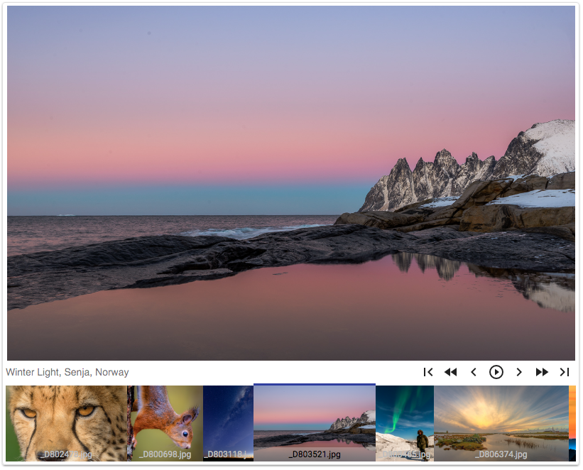
A responsive image carousel. - Collapsible
Accessible collapsible content regions. - Color themes
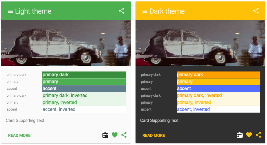
Material design color themes. - Formatfield
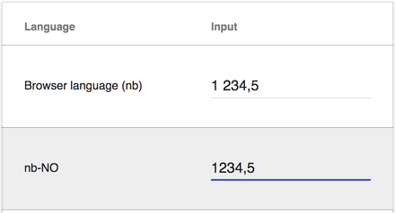
Language sensitive numberformatting. - Grid
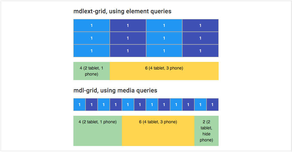
A responsive grid based on element queries in favour of media queries. - Lightboard
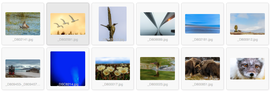
A lightboard is a translucent surface illuminated from behind, used for situations where a shape laid upon the surface needs to be seen with high contrast. In the "old days" of photography photograpers used a lightboard to get a quick view of, sorting and organizing their slides. - Lightbox
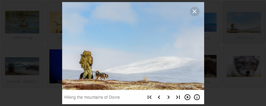
A lightbox displays an image filling the screen, and dimming out the rest of the web page. It acts as a modal dialog using the<dialog>element as a container for the lightbox. - Menu Button
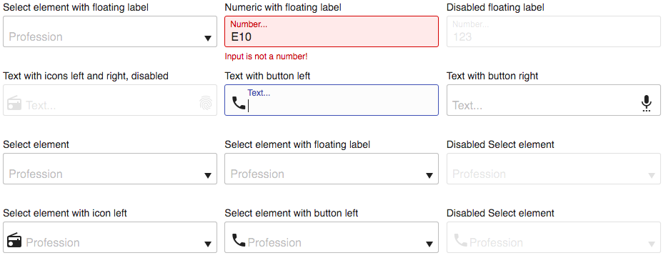
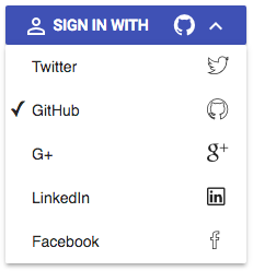
A WAI-ARIA friendly menu button. - Selectfield
The Material Design Lite Ext (MDLEXT) select field component is an enhanced version of the standard HTML<select>element. - Sticky Header
A sticky header makes site navigation easily accessible anywhere on the page and saves content space at the same.
A Live demo of MDLEXT is available here
Works with modern browsers. Tested on Edgde, IE11. Firefox: OSX, Ubuntu. Opera: OSX. Safari: OSX, IOS. Chrome: Win, Ubuntu, OSX, IOS, Android.
The MDLEXT component library is built with responsiveness in mind. The pre built CSS provided in the lib directory therefore comes
in two versions; one based on media queries and one based on element queries, using eq.js.
If you build the CSS from SASS, just import the correct sass file, mdl-ext.scss or mdl-ext-eqjs.scss.
A common metod in responsive design is to use media queries to apply styles based on device
characteristics. The problem with media queries is that they relates to the viewport - so every time you
write a media query for max-width or min-width, you’re connecting the appearance of your module to the
width of the entire canvas, not the part of the canvas the component occupies.
Some developers claim that media queries are a hack, and I totally agree! Imagine a design with a sidebar and a content area. In a responsive, fluent design both the sidebar and the content has "unknown" widths. Trying to add e.g. a responsive grid into the content area which relies on media queries, where you have no knowledge of how much space your content occupies, is in my opinion almost an impossible task.
An element query is similar to a media query in that, if a condition is met, some CSS will be applied.
Element query conditions (such as min-width, max-width, min-height and max-height) are based on elements,
instead of the browser viewport. Unfortunately, CSS doesn’t yet support element queries, but there are a
couple of JavaScript-based polyfrills involving various syntaxes. They are not standard - but that
should not stop us from using them. Element-first design is the spirit of the Atomic design principle, but
looks very different in practice than how most people implement Atomic design using their mobile-first mindset.
Instead of writing styles on advance for every conceivable situation a widget may find itself in, we are able
to allow individual parts of the layout to adapt responsively when those elements require it.
Some of the polyfrills available are:
These are all good libraries, and they serve the purpose. After some evaluation I decided to go for eq.js. It is a small library with support for width based breakpoints. It works without requiring a server to run (no Ajax stuff). It does not break the existing CSS standard. I can use SASS for styling, and it works well in a Webpack workflow.
If you haven't done so already, install Material Design Lite.
$ npm install --save material-design-liteInstall mdl-ext
$ npm install --save mdl-extInstall eq.js if you choose to use the element query CSS/SASS version.
$ npm install --save eq.js<!DOCTYPE html>
<html>
<head>
<title>Material Design Lite Extensions</title>
<link rel="stylesheet" href="https://fonts.googleapis.com/css?family=Roboto:regular,bold,italic,thin,light,bolditalic,black,medium&lang=en">
<link rel="stylesheet" href="https://fonts.googleapis.com/icon?family=Material+Icons">
<link rel="stylesheet" href="node_modules/material-design-lite/material.css" />
<link rel="stylesheet" href="node_modules/mdl-ext/lib/mdl-ext.min.css" />
</head>
<body>
<div class="mdl-layout mdl-js-layout mdl-layout--fixed-drawer">
<main class="mdl-layout__content">
</main>
</div>
<script src="https://cdn.polyfill.io/v2/polyfill.min.js"></script>
<script type="text/javascript" src="node_modules/material-design-lite/material.min.js" charset="utf-8"></script>
<script type="text/javascript" src="node_modules/mdl-ext/lib/mdl-ext.min.js" charset="utf-8"></script>
</body>
</html>Note: You'll probably need several polyfills. If you don't want to waist time writing your own polyfills, the polyfill.io hosted service is a good choice.
<script src="https://cdn.polyfill.io/v2/polyfill.min.js"></script><!DOCTYPE html>
<html>
<head>
<title>Material Design Lite Extensions</title>
<link rel="stylesheet" href="https://fonts.googleapis.com/css?family=Roboto:regular,bold,italic,thin,light,bolditalic,black,medium&lang=en">
<link rel="stylesheet" href="https://fonts.googleapis.com/icon?family=Material+Icons">
<link rel="stylesheet" href="node_modules/material-design-lite/material.css" />
<link rel="stylesheet" href="node_modules/mdl-ext/lib/mdl-ext-eqjs.min.css" />
</head>
<body>
<div class="mdl-layout mdl-js-layout mdl-layout--fixed-drawer">
<main class="mdl-layout__content">
</main>
</div>
<script src="https://cdn.polyfill.io/v2/polyfill.min.js"></script>
<script type="text/javascript" src="node_modules/material-design-lite/material.min.js" charset="utf-8"></script>
<script type="text/javascript" src="node_modules/mdl-ext/lib/mdl-ext.min.js" charset="utf-8"></script>
<script type="text/javascript" src="node_modules/eq.js/dist/eq.min.js" charset="utf-8"></script>
</body>
</html>Note: Always import
mdl-extcss aftermaterialcss. Adjust path tonode_modules(libraries) according to where your HTML file is located.
Import SASS files into your main SCSS file, e.g. ./src/styles.scss
@charset "UTF-8";

// 1.  Configuration and helpers

// MDL image path
$image_path: '~material-design-lite/src/images';

// 2. Vendors

// Import MDL
@import '~material-design-icons/iconfont/material-icons.css';
@import '~roboto-fontface/css/roboto-fontface.css';
@import '~material-design-lite/src/material-design-lite';

// Import MDLEXT
@import '~mdl-ext/src/mdl-ext';

// ... or import mdl-ext-eqjs
//@import '~mdl-ext/src/mdl-ext-eqjs';

// 3. Your stuff
@import 'stylesheets/variables';
@import 'stylesheets/app/whatever';
Import material-design-lite, mdl-ext and styles.scss into your main JavaScript file, e.g. ./scr/index.js
import 'material-design-lite/material';
import 'mdl-ext';
import './styles.scss';
If you choose to use element queries, import eq.js
import eqjs from 'eq.js';
window.eqjs = eqjs; // Put in global scope - for use with script in pageIt is possible to use a selection of the provided MDLEXT components. Just import the specific MDLEXT SASS module and the corresponding ES2015 JavaScript component. The following example demonstrates a setup that uses only two of the MDLEXT components; menu-button and selectfield.
Import SASS files into your main SCSS file, e.g. ./src/styles.scss
@charset "UTF-8";

// 1.  Configuration and helpers

// MDL image path
$image_path: '~material-design-lite/src/images';

// Material Design Lite
@import '~material-design-lite/src/variables';
@import '~material-design-lite/src/mixins';

// mdl-ext
@import '~mdl-ext/src/variables';
@import '~mdl-ext/src/mixins';
@import '~mdl-ext/src/functions';

// 2.  Vendors

// Import MDL
@import '~material-design-icons/iconfont/material-icons';
@import '~roboto-fontface/css/roboto/sass/roboto-fontface-light';
@import '~material-design-lite/src/material-design-lite';

// Import required MDLEXT SASS modules
@import '~mdl-ext/src/aria-expanded-toggle/aria-expanded-toggle';
@import '~mdl-ext/src/menu-button/menu-button';
@import '~mdl-ext/src/selectfield/selectfield';

// 3. Your stuff
@import 'stylesheets/variables';
@import 'stylesheets/app/whatever';
Import material-design-lite, mdl-ext components and styles.scss into your main JavaScript file, e.g. ./scr/index.js
import 'material-design-lite/material';

// Import MDLEXT components from the es folder
import 'mdl-ext/es/menu-button/menu-button';
import 'mdl-ext/es/selectfield/selectfield';

import './styles.scss';
You can find a webpack project with this setup in the example-webpack folder. Clone this repo, cd
into the example-webpack folder. Run npm install, then run npm start and open a browser @ http://localhost:8080/
Note: The
example-webpackproject is a stripped down version of the webpack2-boilerplate project. If you need a complete project setup, start with the webpack2 boilerplate or a similar boilerplate project.
A WAI-ARIA friendly accordion component with vertcial or horizontal layout.
The Material Design Lite Ext (MDLEXT) bordered fields component demonstrates how you can create your own theme of MDL text fields.
A responsive image carousel.
Collapsed
Expanded
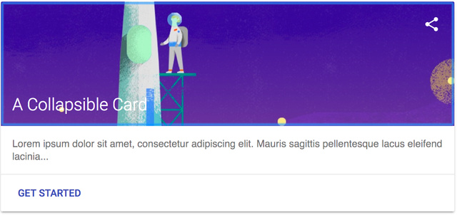
Accessible collapsible content regions.
The color-themes component demonstrates how you can create your own themes of material design colors.
The formatfield component formats an input field using language sensitive number formatting.
A responsive grid based on element queries in favour of media queries.
A lightboard is a translucent surface illuminated from behind, used for situations where a shape laid upon the surface needs to be seen with high contrast. In the "old days" of photography photograpers used a lightboard to get a quick view of, sorting and organizing their slides.
A lightbox displays an image filling the screen, and dimming out the rest of the web page.
It acts as a modal dialog using the <dialog> element as a container for the lightbox.
A menu button is a button that opens a menu. It has roles, attributes and behaviour as outlined in WAI-ARIA Authoring Practices, 2.20 Menu Button.
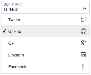
The Material Design Lite Ext (MDLEXT) select field component is an enhanced version
of the standard [HTML <select>] (https://developer.mozilla.org/en/docs/Web/HTML/Element/select) element.
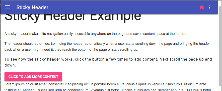
A sticky header makes site navigation easily accessible anywhere on the page and saves content space at the same.
The header should auto-hide, i.e. hiding the header automatically when a user starts scrolling down the page and bringing the header back when a user might need it: they reach the bottom of the page or start scrolling up.
A Live demo of MDLEXT is available here.
You can also download or clone a demo project from here: https://github.com/leifoolsen/mdl-webpack. The demo project demonstrates how you can set up MDL with Babel(6) and Webpack, and how to self host Font Roboto and Material Icons in your web application.
Polyfills you might need:
If you use Material Design Lite in a dynamic page, e.g. a single page application, you must call
componentHandler.upgradeElement and componentHandler.downgradeElements accordingly to properly initialize an clean up
component resources when sections of the page is updated. In a static web application there should be no need to call
componentHandler.downgradeElements.
The following code snippet demonstrates how to properly clean up MDL components before removing them from DOM.
// Call 'componentHandler.downgradeElements' to clean up
const content = document.querySelector('#content');
const components = content.querySelectorAll('.is-upgraded');
componentHandler.downgradeElements([...components]);

// Remove elements from DOM.
// See: http://jsperf.com/empty-an-element/16
const removeChildElements = (element, forceReflow = true) => {
  while (element.lastChild) {
    element.removeChild(element.lastChild);
  }
  if(forceReflow) {
    // See: http://jsperf.com/force-reflow
    const d = element.style.display;
    element.style.display = 'none';
    element.style.display = d;
  }
}

removeChildElements(content); © Leif Olsen, 2016. Licensed under an Apache-2 license.
This software is built with the Google Material Design Lite framework, which is licenced under an Apache-2 licence.


