Users should be able to:
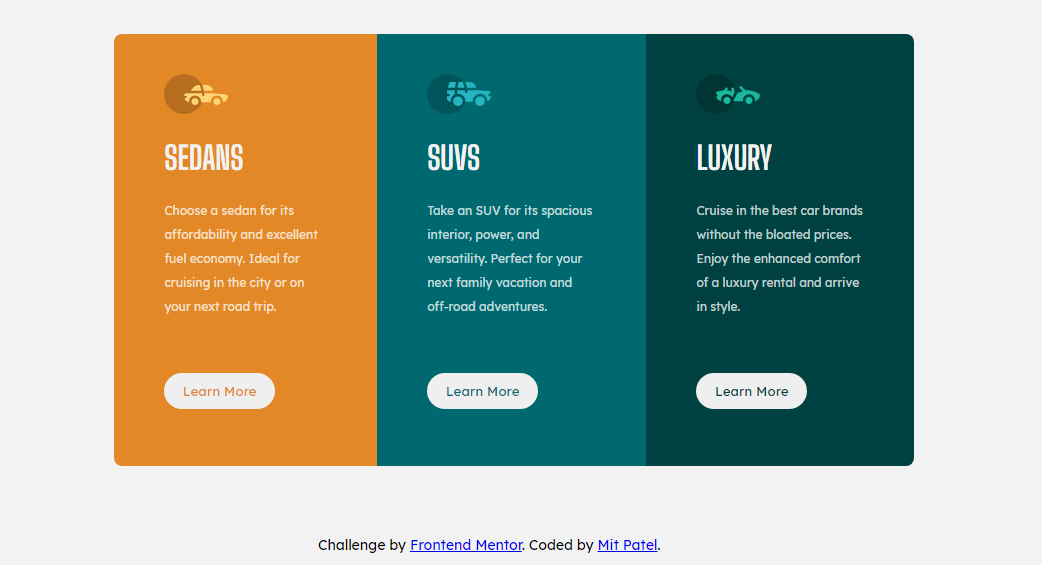
- View the optimal layout depending on their device's screen size
- See hover states for interactive elements
- Semantic HTML5 markup
- CSS custom properties
- Flexbox
From this challenge I learned more about flexbox and how it is usefeul to organize divs into columns or rows. I also learned that using flexbox also makes it easier to format the components in a mobile view.

