CSS provides easy ways to measure content on screen according to the viewport, but some browsers and some devices don't quite behave the way you'd expect.
Example (Demo)
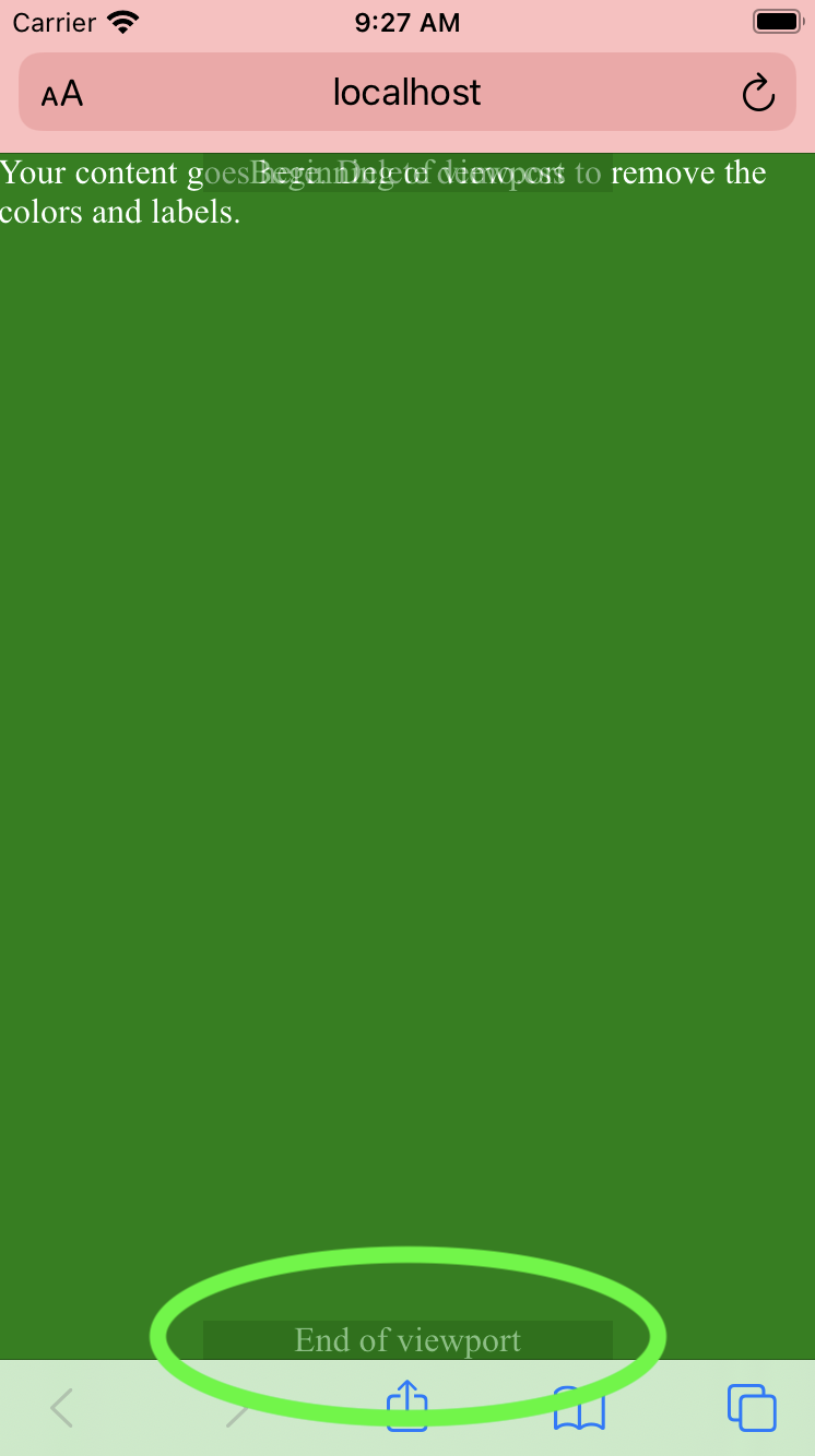
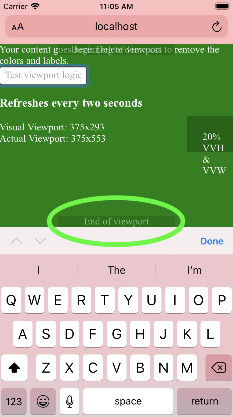
Notice the "end of viewport" label at the bottom.
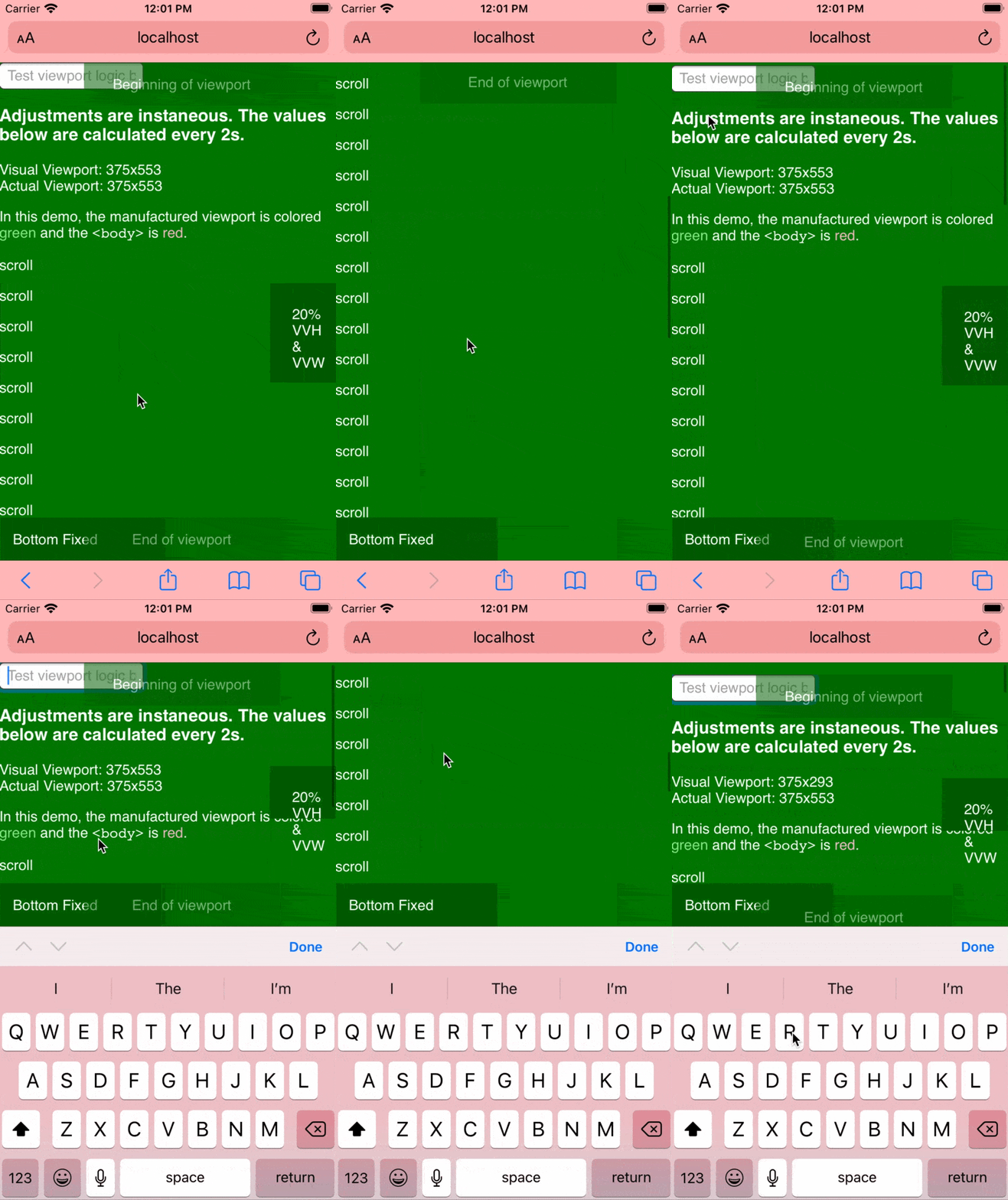
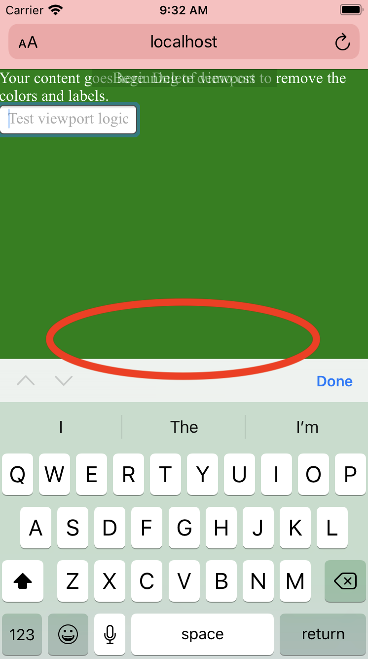
Once we toggle the Safari keyboard, the viewport calculation does not take into account the space obscured by the keyboard.
With A Viewport that Works, we can fix this instantly with very little CSS and JavaScript
Copy index.html and delete these lines
<!-- To use this HTML file in a real project, remove these lines. -->
<link rel="stylesheet" href="css/demo.css">
<script src="js/demo.js"></script>
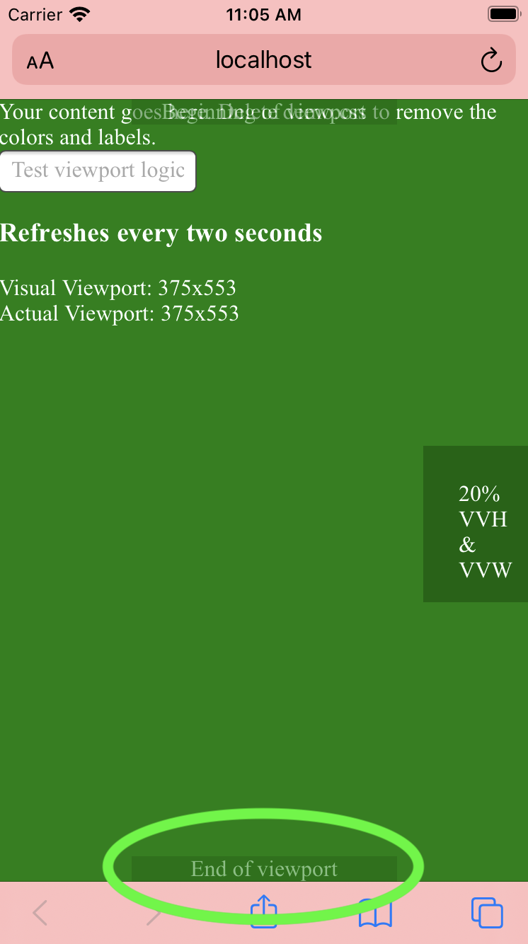
You'll now have a blank canvas like this:
Now just treat <div id="viewport"></div> as if it were the <body> tag.
In an existing HTML file, you'll need the following:
-
Import normalize and viewport-fix.css in the
<head><link rel="stylesheet" href="css/normalize.css"> <link rel="stylesheet" href="css/viewport-fix.css">
-
<div id="viewport"></div>Directly under the<body>tag. -
Import and instantiate viewport-fix.js
<script src="js/viewport-fix.js"></script>
<script>new VVP()</script>
Now just treat <div id="viewport"></div> as if it were the <body> tag.
Use the CSS variables --100vvh and --100vvw in place of 100vh and 100vw respectively.
I recommend passing in the native 100vh or 100vw as the fallback value. This will allow
the browser to use the regular viewport height/width for the split second until the visual
viewport has done its initial calculation.
.sidebar {
  height: var(--100vvh, 100vh);
}
For partial measurements, use calc() with a decimal value.
Instead of
.button {
  height: 20vh;
}
...do this
.button {
  height: calc(var(--100vvh, 100vh) * 0.2);
}<div id="viewport"></div> is meant to work as if it were the <body> of the document.
As such, viewport-fix.css sets it as position: relative and overflow: auto.
This means as long as elements are in #viewport with no relative positioned elements
in between, you can simply absolute position your elements as you would in
<body>.
.bottom-menu-bar {
  position: absolute;
  bottom: 0;
  left: 0;
  right: 0;
}
Fixed positioning is a little different, so the values --offset-h and --offset-w are provided.
Instead of
.sticky-bottom-menu-bar {
  position: fixed;
  left: 0;
  right: 0;
  bottom: 0;
}
...do this
.sticky-bottom-menu-bar {
  position: fixed;
  left: 0;
  right: 0;
  bottom: var(--offset-h, 0);
}If a nonzero number is required, again, just use CSS calc()
Instead of
.sticky-bottom-menu-bar {
  position: fixed;
  left: 0;
  right: 0;
  bottom: 20px;
}
...do this
.sticky-bottom-menu-bar {
  position: fixed;
  left: 0;
  right: 0;
  bottom: calc(var(--offset-h, 0) + 20px);
}In order to use as little JavaScript as possible, we listen to the new window.visualViewport
resize() event and pull from the visualViewport height and width.
To let you keep writing CSS, these values are written into the DOM in a style tag as so:
<style id="viewport_fix_variables">
  :root {
    --100vvw: 1503px;
    --100vvh: 1082px;

    --offset-w: 0px;
    --offset-h: 0px;
  }
</style>
By simply using native CSS functions for variables and calculation, the CSS will
automatically respect these values in place of vh and vw.
