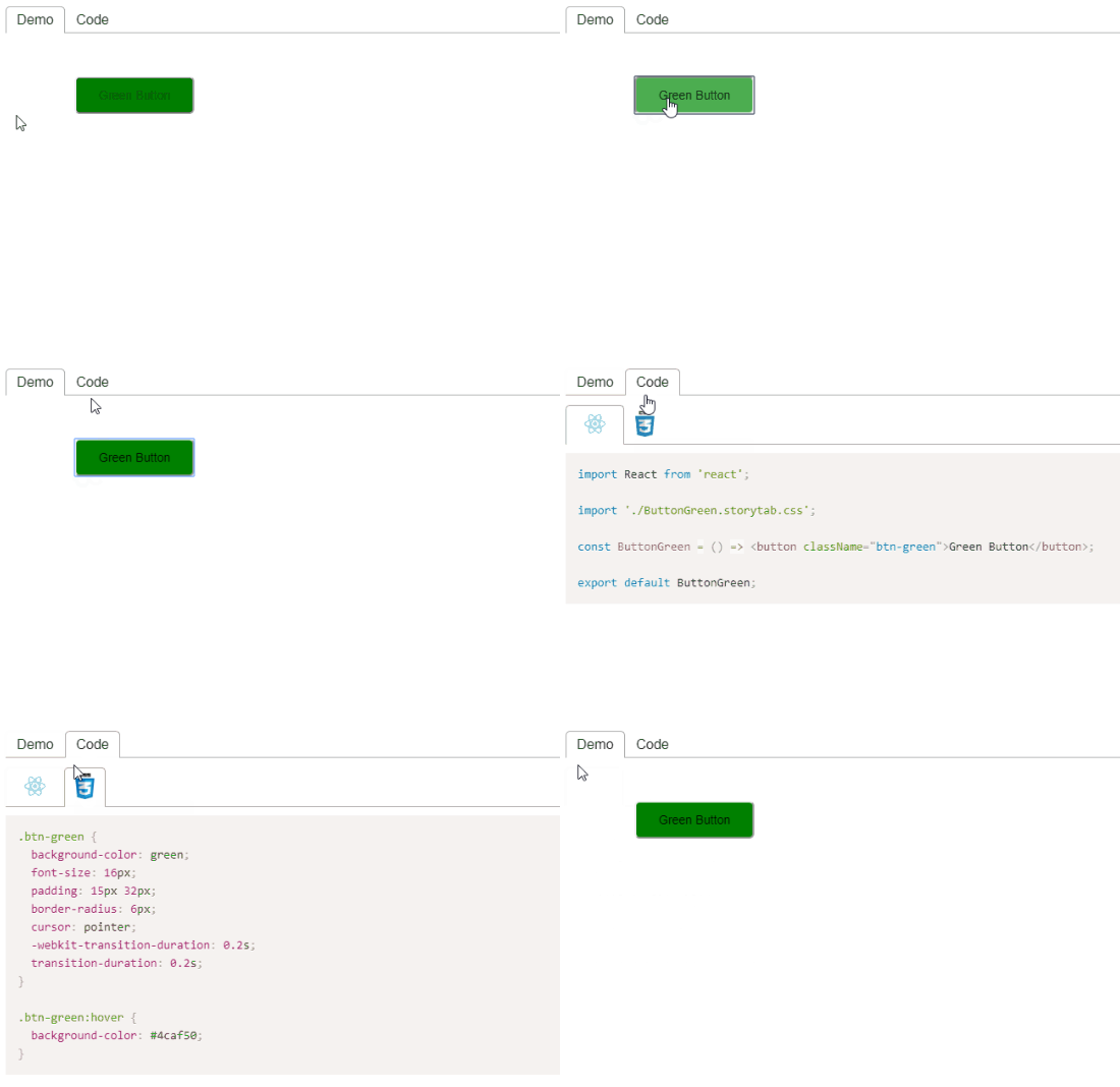
React component to easily create demos of other components
npm install react-demo-tabimport React from 'react';
import ReactDOM from 'react-dom';
import DemoTab from 'react-demo-tab';
import DemoComponent from './ButtonGreen';
const demoCode = `
import React from 'react';
import './ButtonGreen.css';
const ButtonGreen = () => <button className="btn-green">Green Button</button>;
export default ButtonGreen;`;
const demoStyle = `
.btn-green {
background-color: green;
font-size: 14px;
padding: 12px 26px;
border-radius: 6px;
}`;
const App = () => {
return (
<DemoTab code={demoCode} style={demoStyle}>
<DemoComponent />
</DemoTab>
);
};
ReactDOM.render(<App />, document.getElementById('root'));Create demo of component that is passed as a child.
Below is the complete list of possible props and their options:
▶︎ indicates optional prop with default value
code: string
Demo code. Required.
style: string ▶︎ undefined
Demo style.
codeExt: 'jsx' | 'tsx' ▶︎ jsx
Code file extension for image to be displayed.
styleExt: 'css' | 'scss' ▶︎ css
Style file extension for image to be displayed.
Instead of manually creating demos, automate the process with DemoZap CLI.
Easily set up a local development environment!
Build project and start storybook on localhost:
- clone
npm installnpm start
Start coding! 🎉
All contributions are welcome!


