Welcome to Nielsen's Global Design System. This repository is a collection of styles, components and utilites that help implement Nielsen's Global Design.
The goal of this project is to be a platform agnostic implementation of the design system. Web applications built using React, Angular, Vue, Svelte, Vanilla Js, etc. can all ingest and use these foundations and components.
So what exactly does GDS Packages consist of?
gds-core: This is Nielsen's core styles library. Built withscssthis library contains all of the GDS Design Tokens, mixins, fonts, and utilities for GDS.gds-react:gds-types:gds-utilites:gds-web:
- NX - Next generation build system with first class monorepo support and powerful integrations.
- Vite - Next Generation Frontend Tooling
- TypeScript - TypeScript is a strongly typed programming language that builds on JavaScript, giving you better tooling at any scale.
- PostCSS - A tool for transforming CSS with JavaScript.
- React - A JavaScript library for building user interfaces.
- Lit - Simple. Fast. Web Components.
- SCSS - Sass is the most mature, stable, and powerful professional grade CSS extension language in the world.
- Jest - Jest is a delightful JavaScript Testing Framework with a focus on simplicity.
- Storybook - Storybook is a frontend workshop for building UI components and pages in isolation. Thousands of teams use it for UI development, testing, and documentation. It’s open source and free.
- ESLint - ESLint statically analyzes your code to quickly find problems. It is built into most text editors and you can run ESLint as part of your continuous integration pipeline.
- Prettier - An opinionated code formatter.
If you want to contribute or consume these packages in your project, you'll need the proper permissions. Since we are using GitLab this can be done easily.
The first thing we need to do is create an access token in GitLab.
In GitLab, under your profile, click on Access Tokens in the sidebar. This will bring up a screen for us to create a new token under our profile.
- Name token whatever you'd like. Example
my-gds-token. - You can leave the expiration date blank.
- You can select all scopes.
- Press the
Create personal access tokenbutton.
This will refresh the screen and present you with a shiny, brand-new access token. Copy it, we will be putting it to work.
We now need to tell npm that we want to use a private repository when installing our package GDS Packages.
- At the root of the project create a
.npmrcfile and paste the following into this file.
@nielsen-media:registry=https://gitlab.com/api/v4/packages/npm/
@nielsen-media:registry=https://gitlab.com/api/v4/projects/40331883/packages/npm/
//gitlab.com/api/v4/packages/npm/:_authToken=ACCESS_TOKEN
//gitlab.com/api/v4/projects/40331883/packages/npm/:_authToken=ACCESS_TOKEN
registry=https://registry.npmjs.org/
always-auth=true
With our access token and .npmrc file configured we're all done with this section. Let's proceed.
If you're a contributor check out this Contributing section.
If you're unfamilar with Storybook, Storybook is a development environment for UI components that enables you to create and showcase components in an environment outside your main application.
Let's quickly go over storybook and how to use it.
If you navigate to the [GDS Web components Storybook](TODO ADD LINK) and look toward the top you should see two tabs; Canvas and Docs. Canvas should be selected by default. Click on Icons in the left sidebar an option of Icon should appear. Click on it. This will open a visual of our icon component and controls panel underneath it. The controls panel tells us what type of props our component is expecting.
You can play around with the dropdowns in the controls to see the different properties the component expects and the values you can pass to them.
Note: This is true of all components that are inside of storybook.
The next thing we need to know about is the Docs tab. It lives next to the Canvas tab toward the top of the page. Click it.
This will open a similar tab to canvas but with an added bonus. Below the title of our component is a cell with a visual of our component and at the bottom right a button with Show code. Click it!
This will show a snippet of how to write our component with the current default props passed to it.
<!-- Example -->
<gds-display-icon
  size="40"
  icon="active-check"
  outlined="false"
  foreground="gray"
  foregroundlevel="900"
  background="none"
  backgroundlevel="100"
></gds-display-icon>
Note: In the storybook code snippet you might see something that looks like <!--?lit$320247633$-->. above the tag. Ignore it. It's not needed to import our element.
And that's it! It's that simple.
Since this component library is built using Web Components it can be universally used and treated as Frontend framework agnostic. Meaning, that GDS should work no matter the framework your teams uses; Vanilla JS, React, Svelte, Vue, etc... All you need is access to the repository and you can import in your desired component, icon, styles and more.
However...
There are some know hardships and constraints when working with React and Web components. Particularily around React's Virtual DOM and Web components Shadom DOM and also some issues around events. You can read about it here. The React team is working to address the issues between the two libraries and have an active experimental branch that will hopefully resolve these issues soon. You can read more about that here.
In the interim; this means that some of the web components may need to have a React wrapper around them to attach either data or events directly to a DOM element. Not all components need this wrapper to be used in a React app but, some of the more complex components may.
The good news is that most of these wrappers have already been created and we're working hard on adding them as npm packages that you can easily install in your application, but for now, they will need to be manually wrapped until the package is released. The process is pretty straightforward and the following will demonstrate how to use a GDS Web Component with and without wrapping it.
If you're unfamiliar with the GDS Web Components Storybook, now is a great time to check it out, along with the Storybook section in these docs.
Let's first look at how to use a simple component like gds-action-icon in our project.
To import an icon, we simply install the gds-web package from Gitlab by running this command in our terminal:
npm i @nielsen-media/gds-webOnce its installed we can simply import the package at the entry point of our project, this is the index.js file in Create React App.
import React from "react";
import ReactDOM from "react-dom/client";
import App from "./App";
import reportWebVitals from "./reportWebVitals";
import "./index.css";
import "@nielsen-media/gds-web"; // Import GDS

const root = ReactDOM.createRoot(document.getElementById("root"));
root.render(
  <React.StrictMode>
    <App />
  </React.StrictMode>
);

// If you want to start measuring performance in your app, pass a function
// or send to an analytics endpoint. Learn more: https://bit.ly/CRA-vitals
reportWebVitals();
Note: Importing the package here gives the entire project access to the GDS Web Component library.
Once the package is imported we can use it.
// App.js
import React, { useState } from "react";
import { nanoid } from "nanoid";
import "./App.css";

function App() {
  const [todos, setTodos] = useState([
    { id: 1, text: "Walk fish" },
    { id: 2, text: "Make balloon animals" },
  ]);
  const [text, setText] = useState("");

  const handleSubmit = () => {
    setTodos([...todos, { id: nanoid(), text: text }]);
    setText("");
  };

  const handleChange = (event) => {
    setText(event.target.value);
  };

  const handleDelete = (id) => {
    const index = todos.findIndex((todo) => todo.id === id);
    const copy = [...todos];
    copy.splice(index, 1);
    setTodos(copy);
  };

  return (
    <div>
      <input type="text" onChange={handleChange} value={text} />
      <button onClick={handleSubmit}>Submit</button>
      <ul>
        {todos.map((todo) => (
          <li
            style={{
              display: "flex",
              alignItems: "center",
              gap: "4px",
            }}
            key={todo.id}
          >
            <h4 style={{ margin: 0 }}>{todo.text}</h4>
            <gds-action-icon
              size="compact"
              onClick={() => handleDelete(todo.id)}
              icon="close"
            ></gds-action-icon>
          </li>
        ))}
      </ul>
    </div>
  );
}

export default App;At this point, you've likely hit a TypeScript error when trying to use a gds web component in a React/TS environment. Basically, React/TS doesn't know what our Web Component is, so we need to tell it.
To fix this TS error, we can create a file called index.d.ts or global.d.ts, next to our entry file index.ts. Then, inside of that file we can add the following.
// We need to import React because we need access to some
// React specific types.
import * as React from "react";
// Import the needed type from gds-types
import { GDSActionIconProps } from "@nielsen-media/gds-types";
// Implicitly makes our index.d.ts file a module type.
export {};
declare global {
namespace JSX {
// We can extend the IntrinsicElements interface
// to include some our own and then use an intersection type
// to extend some needed behavior/props to our web components
interface IntrinsicElements {
"gds-action-icon": GDSActionIconProps & {
// Action icon doesn't technically need a ref property
// but its been added as an example.
ref?: React.RefObject<HTMLButtonElement>;
};
}
}
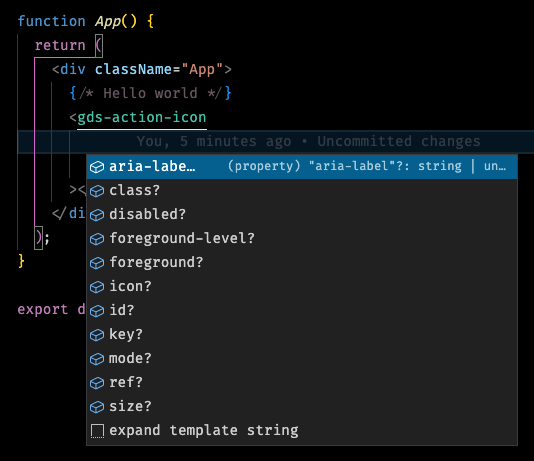
}Flip back over to App.tsx and the TypeScript Error should now be gone, and as an added bonus you can now trigger a code action on the GDS Web Component in VSCode by hitting the buttons ctrl + space right before the closing > after the name of the component and this will open a window displaying all of the component required and optional props.
It's as easy as that!
Most of the web components you can use "as is" inside of a React project, but there are instances where a Web Component may need to take in some type of data or complex event as a prop, and when that happens things can get a bit more complicated with React and Web Components.
To be able to pass data as a prop to our Web Components in a React environment, we need to first wrap our Web component with a React Component. We need to do this because we need to manually create, and attach a ref directly to the Web Component element. Then, when the React Component mounts, inside of a useEffect or another lifecycle method, we can reference the direct DOM element and attach any data or event listener needed directly to the ref.
Let's checkout an example using a React wrapper component. Let's add a gds-checkbox component.
First, we need to create the wrapper. We can make a new file, call it something like GDSCheckboxWrapper.tsx, and add the following:
import { GDSCheckboxProps } from "@nielsen-media/gds-types";
import { useEffect, useRef } from "react";

// We can extend the Window Event Map
// with our own onClick
interface WindowEventMap {
  onClick: CustomEvent;
}

export const GDSCheckboxWrapper = (props: GDSCheckboxProps) => {
  // Because of the way React and Web Components work together, we
  // need to extend our components props and add an event listener to it.
  // This is only for React.
  const ref = useRef<
    GDSCheckboxProps & {
      addEventListener<K extends keyof WindowEventMap>(
        type: K,
        listener: (this: Window, ev: WindowEventMap[K]) => any,
        useCapture?: boolean
      ): void;
    }
  >(null);

  useEffect(() => {
    if (!props) return;

    if (ref.current) {
      if (props.items) {
        // Data needs to be added programmatically and directly
        // to the DOM element via ref
        ref.current.items = props.items;
      }
      // We have to manually attach our listeners directly to DOM ref.
      ref.current.addEventListener("onClick", (e: CustomEvent) => {
        // This prevents event firing twice.
        e.stopImmediatePropagation();
        if (props.onClick) {
          props.onClick(e);
        }
      });
    }
  }, []);

  // We need to pass all expected props/attributes
  return (
    <gds-checkbox
      ref={ref}
      checked={props.checked}
      disabled={props.disabled}
      helpText={props.helpText}
      id={props.id}
      items={props.items}
      indeterminate={props.indeterminate}
      label={props.label}
      mode={props.mode}
      size={props.size}
      value={props.value}
    ></gds-checkbox>
  );
};
Once the wrapper has been created we can simply use the component just like we would any other React component.
      // Single Checkbox
      <GDSCheckbox
        // checked
        // disabled
        // error
        helpText="Help text"
        id="completed-1"
        indeterminate={false}
        items={[]}
        label="Completed?"
        mode="light"
        size="compact"
        value="label"
        onClick={(e) => null}

      />

      // Nested Checkbox Example
      <GDSCheckbox
        // checked
        // disabled
        // error
        helpText="Help text"
        id="switch-1"
        indeterminate={false}
        items={[
          { id: "test1", label: "Test 1", value: "test1", checked: false },
          { id: "test2", label: "Test 2", value: "test2", checked: false },
          { id: "test3", label: "Test 3", value: "test3", checked: false },
        ]}
        label="Label"
        mode="light"
        size="compact"
        value="label"
        onClick={(e) => null}
      />
As mentioned before, not every component needs a Wrappercomponent. For a complete list of components that need to be wrapped checkout the gds-react wrappers directory in the GDS Packages Repository. All of the Wrappers have already been written and our in the process of being created as npm package but until that happens, users can copy the already written code and paste it directly into their own applications.
GDS Table is built using two technologies, Lit Element (Web Components) and TanStack Table(formerly React Table). The idea for Nielsen’s GDS Table component is a simple one. The GDS Web Component is simply a wrapper around TanStack Table. Allowing us to style the table according to Nielsen’s Global Design System, while leaving the all of the functionality and heaving lifting to TanStack itself. If you’re unfamiliar with TanStack you can read through the documentation here. There are several adapters that can be used with TanStack (React, SolidJS, Vue and TS). Nielsen’s GDSTable leverages the core of TanStack Table by using only the TypeScript version allowing the table to work across multiple frameworks.
The GDSTable component can be used with many framework or with TypeScript or without. Below are guides how to get started with GDSTable in different environments.
Due to the relationship between Web Components and React (SHADOM vs VIRTUAL DOM), we have to do a bit of extra work getting the two UIs working together. You can read more about how React and Lit work together here and the issues between them in this article.
The first thing we need to do to get the gds-table component to work in a React env is to create a wrapper component using the @lit-labs/react npm package.
npm i @lit-labs/reactOnce installed we can create a new React Component called GDSTableReactWrapper.tsx and paste the following.
import * as React from "react";
import { createComponent } from "@lit-labs/react";
// @ts-expect-error because gds-web exports everything rather than one off exports as web component.
import { GDSTable } from "@nielsen-media/gds-web";

export const GDSReactTableWrapper = createComponent({
  elementClass: GDSTable,
  react: React,
  tagName: "gds-table",
});
Once the wrapper is created you can use the GDSTable component as a React Component.
<GDSReactTableWrapper
  data={data}
  columns={columns}
  headerSize={headerSize}
  background={background}
  mode={mode}
  rowSize={rowSize}
  searchOnly={searchOnly}
  sortable={sortable}
  tableTitle={tableTitle}
  textAlignment={textAlignment}
  withHeader={withHeader}
/>
Note: Because we use the @lit-labs/react package to wrapper our web component we unfortunately lose the auto complete to our typings in vscode. The above example is all of the props that the gds-table component can consume. The only required props are data and columns. An issue for this has been created and a fix should hopefully come soon.
GDSTable expects an array of objects to be passed as its data props. Below are two examples of data that gds-table can be passed.
#TypeScript

export type Person = {
  firstName: string;
  lastName: string;
  age: number;
  visits: number;
  status: string;
  progress: number;
};

export const people: Person[] = [
  {
    firstName: "tanner",
    lastName: "linsley",
    age: 24,
    visits: 100,
    status: "In Relationship",
    progress: 50,
  },
  {
    firstName: "tandy",
    lastName: "miller",
    age: 40,
    visits: 40,
    status: "Single",
    progress: 80,
  },
  {
    firstName: "joe",
    lastName: "dirte",
    age: 45,
    visits: 20,
    status: "Complicated",
    progress: 10,
  },
];
# React
export const people = [
{
firstName: "tanner",
lastName: "linsley",
age: 24,
visits: 100,
status: "In Relationship",
progress: 50,
},
{
firstName: "tandy",
lastName: "miller",
age: 40,
visits: 40,
status: "Single",
progress: 80,
},
{
firstName: "joe",
lastName: "dirte",
age: 45,
visits: 20,
status: "Complicated",
progress: 10,
},
];GDSTable leverages TanStack Table to do all of its heavy lifting and that includes how it makes its columns. You can check out there official documentation for more information but below are two example of how to create columns to pass into gds-table.
# TypeScript

// Import helper function from tanstack
import { createColumnHelper } from "@tanstack/table-core";

// Column helper requires generic of data type from 'data' array (see creating columns).
const columnHelper = createColumnHelper<Person>();

// Column helper allows us to construct our columns by assigning id, cell, header and
// more.  Check out TanStack documentation for more info.
const peopleColumns = [
  columnHelper.accessor("firstName", {
    id: "firstName",
    cell: (info) => info.getValue().toString(),
    header: "First Name",
  }),
  columnHelper.accessor((row) => row.lastName, {
    id: "lastName",
    header: "Last Name",
    cell: (props) => props.getValue().toString(),
  }),
  columnHelper.accessor((row) => row.age, {
    id: "age",
    header: "Age",
    cell: (props) => props.getValue().toString(),
  }),
  columnHelper.accessor((row) => row.visits, {
    id: "visits",
    header: "Visits",
    cell: (props) => props.getValue().toString(),
  }),
  columnHelper.accessor((row) => row.status, {
    id: "status",
    header: "Status",
    cell: (props) => props.getValue().toString(),
  }),
  columnHelper.accessor((row) => row.progress, {
    id: "progress",
    header: "Profile Progress",
    cell: (props) => props.getValue().toString(),
  }),
];
# React
// Import helper function from tanstack
import { createColumnHelper } from "@tanstack/table-core";
const columnHelper = createColumnHelper();
// Column helper allows us to construct our columns by assigning id, cell, header and
// more. Check out TanStack documentation for more info.
const peopleColumns = [
columnHelper.accessor("firstName", {
id: "firstName",
cell: (info) => info.getValue().toString(),
header: "First Name",
}),
columnHelper.accessor((row) => row.lastName, {
id: "lastName",
header: "Last Name",
cell: (props) => props.getValue().toString(),
}),
columnHelper.accessor((row) => row.age, {
id: "age",
header: "Age",
cell: (props) => props.getValue().toString(),
}),
columnHelper.accessor((row) => row.visits, {
id: "visits",
header: "Visits",
cell: (props) => props.getValue().toString(),
}),
columnHelper.accessor((row) => row.status, {
id: "status",
header: "Status",
cell: (props) => props.getValue().toString(),
}),
columnHelper.accessor((row) => row.progress, {
id: "progress",
header: "Profile Progress",
cell: (props) => props.getValue().toString(),
}),
];Once data and columns have been created they can be passed as props to the React Component.
<GDSReactTableWrapper
  data={data}
  columns={columns}
  headerSize={headerSize}
  background={background}
  mode={mode}
  rowSize={rowSize}
  searchOnly={searchOnly}
  sortable={sortable}
  tableTitle={tableTitle}
  textAlignment={textAlignment}
  withHeader={withHeader}
/>Interested in contributing? Contact the GDS team to get add to the repo, and up and running!
Getting started is a fairly simple process. If you haven't created a Personal Access Token in Gitlab, read the Installation section first then come back here.
Steps:
# Clone the repo
git clone git@gitlab.com:nielsen-media/ma/design-libraries/gds-packages.git
The development branch is the project current working branch. Main is for production only. When contributing, developers should create feature branches based off of development.
# Checkout development branch
git checkout development
# Install Dependencies
npm i --legacy-peer-depsNote: Sometimes installation hangs on TypeScript, if this happens you can kill the install process ctrl + D and rerun npm i --legacy-peer-deps and it should work on the second pass.
# Build all GDS packages
npm run bootstrap
or, alternatively, you can build packages separately by running npm run build:PACKAGE_NAME.
npm run build:gds-webFinally, we can spin up the storybook for the component set we are actively developing. Likely, you will want the gds-web storybook. You can spin this up by running:
npm run dev:gds-webor, alternatively, you can run other packages that have story books by running npm run dev:PACKAGE_NAME.
A demo component been created to make fairly easy to get started with your first component. In gds-web under /src/lib all component have been placed into groups (actions, content, feedback, etc...). Under demo a template of sorts has been created for you. Simply copy the directory and Hello World and paste it into the directory where the component you are creating is going to live. Once that is done, you just need to go through your files and rename everything to reflect your new component.
Note: Be sure to do the same in your index.stories.scss. Update the "title" property to configure where the component story should be placed within the folder structure.