IMPORTANT: I am able to plot on iPython Notebook, however the plots are not visible when I published the Notebook on GitHub. More on this issue
- My visual plots can be viewed in Images
- The rest of the code is in the the File: San Fransisco Real Estate Market Analysis
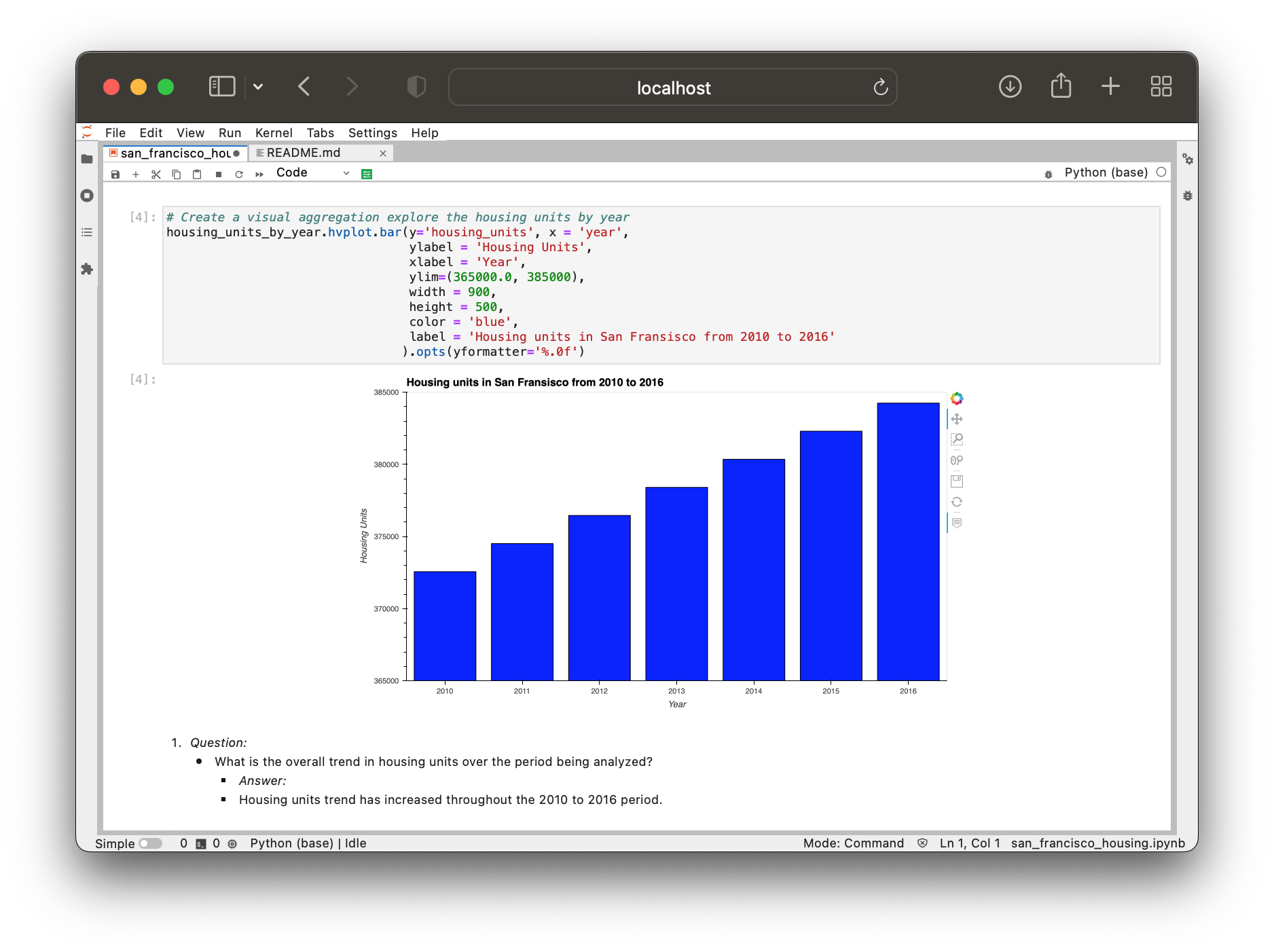
- Use the
groupbyfunction to group the data by year. - Aggregate the results by the
meanof the groups. - Use the
hvplotfunction to plot thehousing_units_by_yearDataFrame as a bar chart. - Make the x-axis represent the
yearand the y-axis represent thehousing_units. - Style and format the line plot to ensure a professionally styled visualization.
- Group the data by year, and then average the results.
- What’s the lowest gross rent that’s reported for the years that the DataFrame includes?
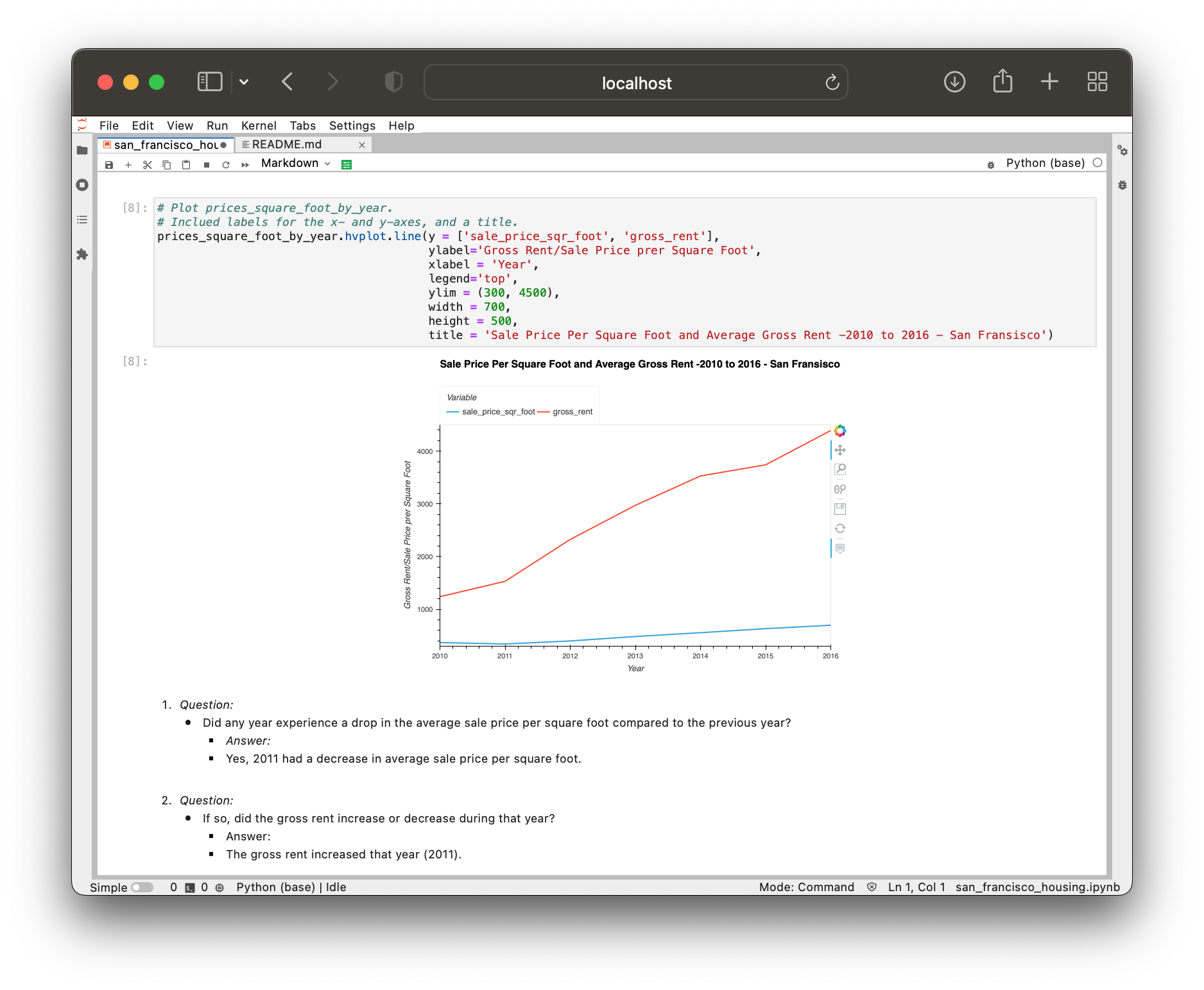
- Create a new DataFrame named
prices_square_foot_by_yearby filtering out the “housing_units” column. - The new DataFrame should include the averages per year for only the sale price per square foot and the gross rent.
- Use hvPlot to plot the
prices_square_foot_by_yearDataFrame as a line plot. - This single plot will include lines for both
sale_price_sqr_footandgross_rent. - Style and format the line plot to ensure a professionally styled visualization.
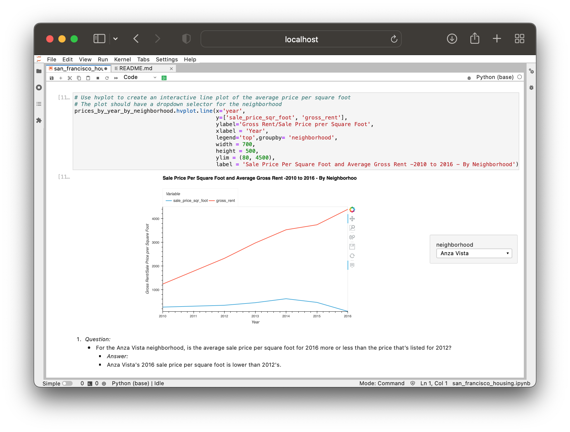
- Create a new DataFrame that groups the original DataFrame by year and neighborhood. Aggregate the results by the
meanof the groups. - Filter out the “housing_units” column to create a DataFrame that includes only the
sale_price_sqr_footandgross_rentaverages per year. - Create an interactive line plot with hvPlot that visualizes both
sale_price_sqr_footandgross_rent. - Set the x-axis parameter to the year (
x="year"). - Use the
groupbyparameter to create an interactive widget forneighborhood. - Style and format the line plot to ensure a professionally styled visualization.
- Read the
neighborhood_coordinates.csvfile from theResourcesfolder into the notebook, and create a DataFrame namedneighborhood_locations_df. - Be sure to set the
index_colof the DataFrame as “Neighborhood”. - Using the original
sfo_data_dfDataframe, create a DataFrame namedall_neighborhood_info_dfthat groups the data by neighborhood. - Aggregate the results by the
meanof the group. - Review the two code cells that concatenate the
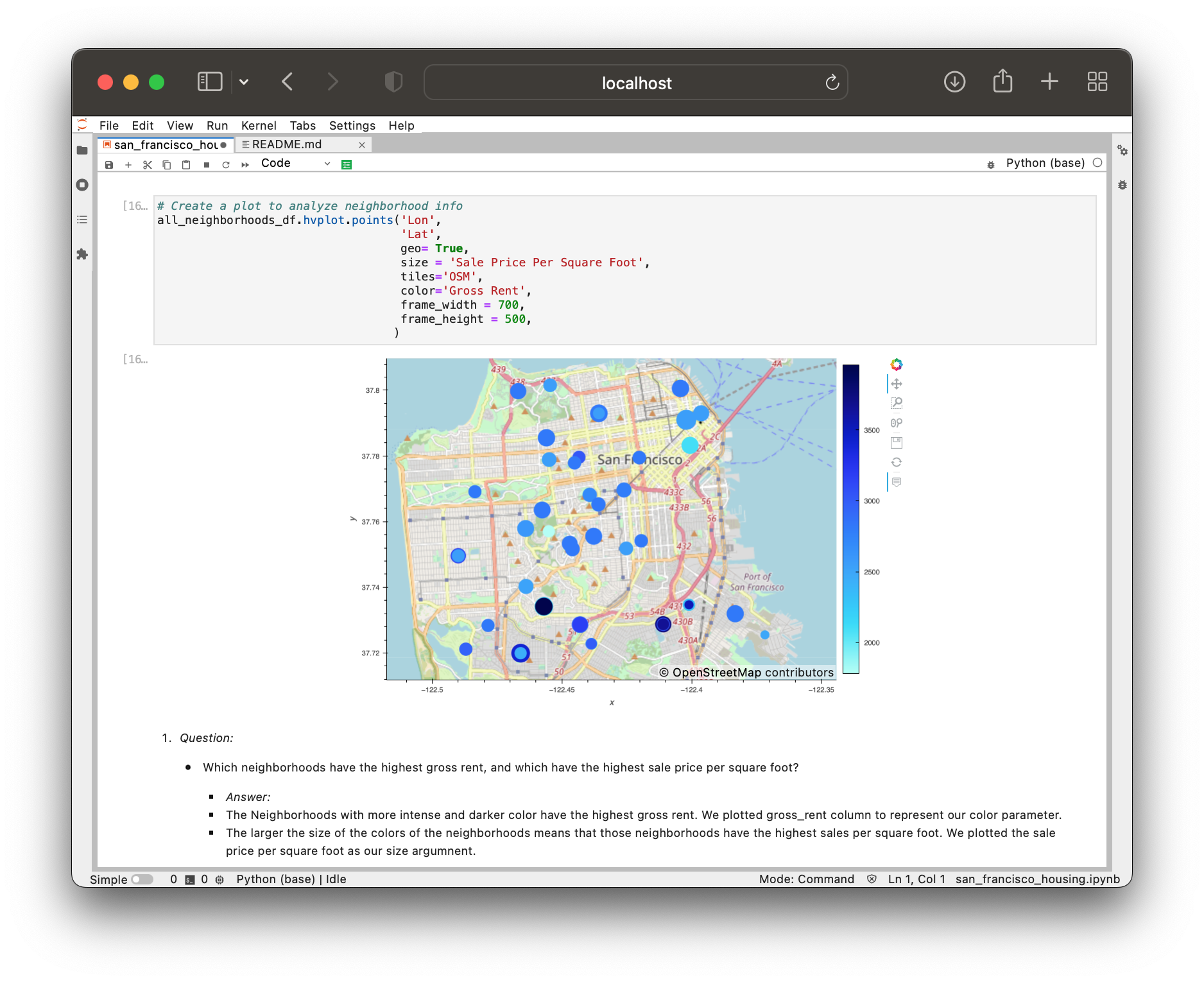
neighborhood_locations_dfDataFrame with theall_neighborhood_info_dfDataFrame. - Using hvPlot with GeoViews enabled, create a
pointsplot for theall_neighborhoods_dfDataFrame. - Use the interactive map to answer the following question:
- Based on the visualizations that you created, answer the following questions:
- How does the trend in rental income growth compare to the trend in sales prices? Does this same trend hold true for all the neighborhoods across San Francisco?
- What insights can you share with your company about the potential one-click, buy-and-rent strategy that they're pursuing? Do neighborhoods exist that you would suggest for investment, and why?


