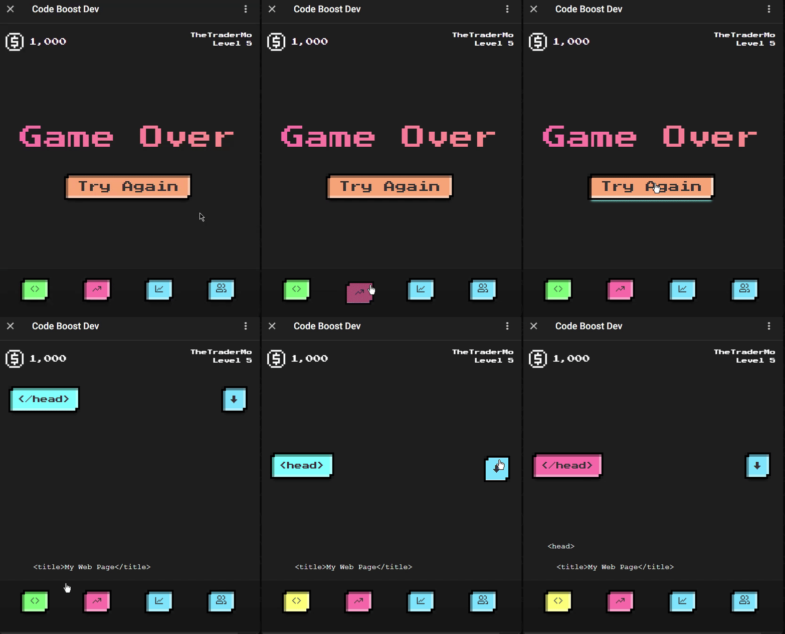
The TetrisButton component is a customizable button styled to have a retro pixelated look, inspired by classic video game aesthetics. It allows users to specify various font properties and includes interactive effects for hover and click actions.
The RetroButton component uses styled-components for styling. It includes:
Random Background Color: Each button instance gets a random background color from a predefined set of retro colors. Pixelated Borders: The button has solid pixelated borders and shadows to give it a retro look. Interactive Effects: Hover: On hover, the button's shadow and inset effects are intensified. Active: On click, the button appears to be pressed down with adjusted shadows and a slight translation. Custom Font Properties: Users can customize the font properties such as size, family, weight, letter spacing, and line height.
npm install tetris-buttonTo run Storybook for this component, use the following command:
npm run storybookimport TetrisButton from "tetris-button";
const App = () => (
<TetrisButton
colors={["#ff77aa", "#77ddff", "#77ff77"]}
fontSize="medium"
fontFamily="Arial, sans-serif"
fontWeight="bold"
letterSpacing="0.1em"
lineHeight="1.5"
onClick={() => console.log("Button clicked")}
>
Click Me
</TetrisButton>
);
export default App; textAlign?: 'left' | 'center' | 'right';
isSelected?: boolean;
fontSize?: 'tiny' | 'small' | 'medium' | 'large';
fontFamily?: string;
fontWeight?: 'normal' | 'bold' | 'bolder' | 'lighter' | number;
letterSpacing?: string;
lineHeight?: 'normal' | '1.2' | '1.5' | '2' | '3.2';
backgroundColor?: string;
children: React.ReactNode;
onClick?: (e?: unknown) => void;
colors?: string[];