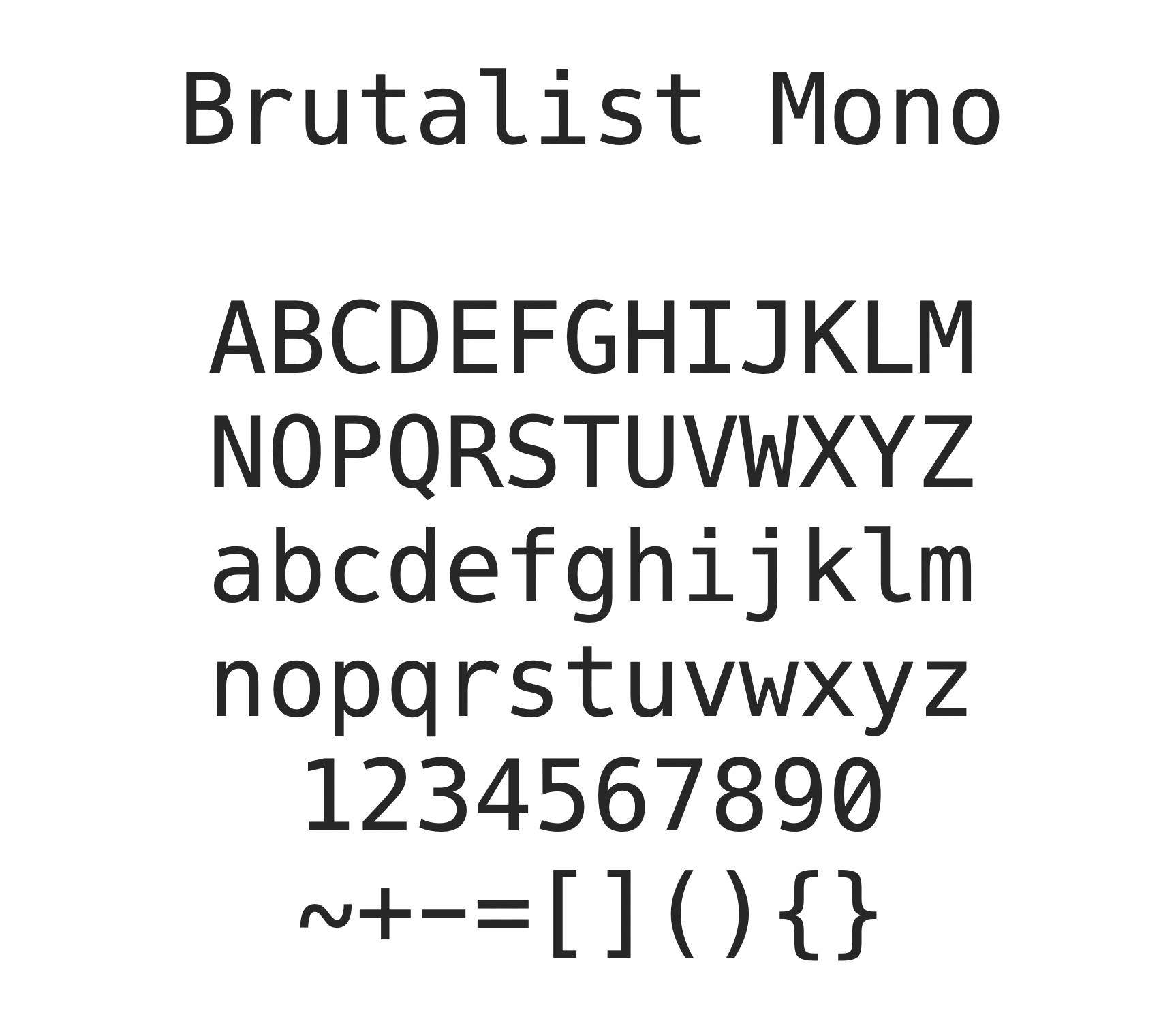
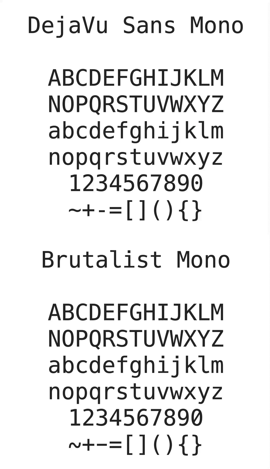
Brutalist Mono is a very simple modification on top of DejaVu Sans Mono (yes, another one), making it more suitable for coding. The changes are very nitpicky and you can probably just move along.
Comparison to DejaVu Sans Mono:
v1.0:
r– offset to the left_– increase height, reduce width-(minus) – make wider0– slashed instead of dotted
v1.1:
l– increase upper arm and recenteriandj– increase dot sizes, making them square
v1.2:
l– drop foot below the baselineC– flatter terminalsG– flatter top terminalJ– flatter bottom terminalS– flatter terminalsa– flatter top terminalc– flatter terminalse– flatter bottom terminalg– flatter bottom terminalr– flatter top terminals– flatter terminals2– flatter top terminal3– flatter terminals5– flatter bottom terminal and mid stroke6– flatter top terminal9– flatter bottom terminal$– flatter terminals
v2.0:
C– slightly rounder shapeG– more even upper terminalS– more even terminalsc– more even terminalsl– more pedantic bottomr– wider right terminals– more even terminals9– more even lower terminalg– more even lower terminalJ– clean up lower terminal~– blatantly stolen from Hackt– make bottom curved the same aslj– make bottom curved the same asl[– make wider, matchlparen's width]– make wider, matchrparen's width5– more even bottom terminal, add back the "spike" in the middley– curved bottom terminal$– more even terminals
v2.1:
,,.,;,:,!,?– use rounded dots and commas (adapted from Hack)*– use Menlo variantl– clean up bottom curve a little bit
v2.1.1
- fix: font not showing up as monospace (#2)
Another DejaVu/Vera Mono clone? Yes. But this one is opinionated:
- I don't care about "readability on small font sizes". Make your font larger and/or get a decent monitor. It's the 21st century.
- I don't care about font hinting. Modern monitors are high-DPI.
- Note: The native renderer on Windows seems to require manual hinting instructions to be added even when rendering at high DPI screens. I will not be adding this. Therefore, this font looks terrible on Windows, unless you're using an Electron app (VS Code, Atom, etc). They're using a custom renderer and render correctly.
- I don't care about
O0,lI1|, or any of that crap. It's fine. See point #1.
If any of this bothers you, try Hack. It's awesome. I made my mod available as well.
Hack is great, but has way too many unnecessary modifications on top of the baseline DejaVu Sans Mono. To name a few:
- the parentheses are unnecessarily spread out in earlier versions, and too rounded in newer ones
- the
1has an awkward downward facing arm - contributing is complicated if you're only using plain old FontForge (I don't want to shell out EUR 250 for Glyphs.app)
- alt-hack is great but I ended up just using it to revert most mods back to the original DejaVu style, so I figured why bother?
- the uppercase
Nis hideously wide (once you see it, you can not unsee it) - punctuation is unnecessarily exaggerated
- there are many weird tweaks done to it (relative to its parent Bitstream Vera Sans Mono) to make it render better on ancient Mac OS versions with low-DPI monitors, which disqualifies it immediately (see point #1 in "Motivation" above)
This typeface is almost perfect for programming†, except:
- the underscore is ridiculously thin, making it visually odd when reading
THINGS_WITH_MANY_UNDERSCORESand esoteric C/C++ identifiers with__multiple__underscores__ - the lowercase
ris offset a bit to the right (Hack has got this right – once you see it, you can not unsee it) - the
-glyph is ridiculously narrow - other nitpicky stuff you really don't care about but I do
† – Source Code Pro is still the king, and I don't dare come at the king.
Short version:
- Edit the .sdf files with FontForge (if you want to mod)
make- observe the
buildfolder
This will probably fail, so: long version.
If you really convince me.
Same as DejaVu fonts, see LICENSE.

