Exploratory-Data-Analysis
Introducing Data Visualization to help explain data through various visualizations
Overview
Using the Penguins Dataset we developed numerous ways to visualize the dataset
Statastical Insights
Penguins Dataset Statistical Insights
Boxplot
Boxplots are a good way to check the outliers or understand the relationship between a categorical and continuous feature by showing the distribution of data.
Histogram
Histograms are used to depict the frequency distribution. It can be only used with numerical data
Kdeplot
kdepot is another way to visualize the distribution of the data.
Bar Plot
In a bar plot, the x-axis represents a categorical variable while the y-axis is a numerical variable. That is why the bar plot depicts a relationship between these two variables. For instance, below the body masses of the penguins for each islands are seen. The categorical data in the x-axis is the islands whereas the numerical data in y-axis is the body mass of the penguin.
Cross Tab
Crosstab is a pandas function that displays the relationship between two or more variables that can be analyzed.
Count Plot
A count plot is similiar to a bar plot but used for only categorical data. It plots the cout of observations by category in form of a bar plot. It differs from a bar plot because bar plots show the mean of a feature by category
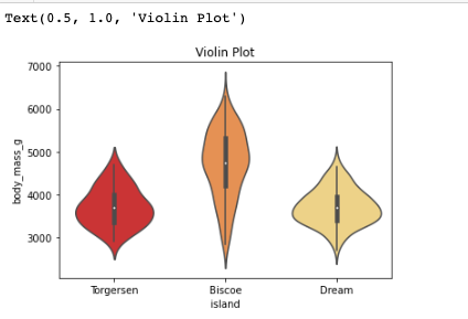
Violin Plot
Violin plots have common properties with box plots and used when the objective is to observe the distribution of numerical data for different categories.It gives more insights than a box plot, because two different categories might have the same mean but it doesn’t mean that they are the same. Their distributions might differ and in that case, violin plots would be more useful to observe.
Correlation Matrix
Correlation Matrix is the summarization of the dataset. The matrix shows the correlations between features. In this dataset the relationship between length of flipper and body mass shows a correlation of 0.87, which is quite high.
Summary
This dataset is quite small yet really useful in performing data analysis. The numerous and different visualizations play a key role in helping us understand the broader picture of datasets.
Resoures
Files
-
penguins_size.csv
-
Exploratory Data Visualization.ipynb


