iOS Template is an iOS SwiftUI starter kit based on Sketch Elements.
This section of the documentation describes the props and examples for all the components from iOS SwiftUI Template based on Sketch Elements. Please take some time to explore all of the components. The following is the list of screens provided by this template.
- Navigation
- Theming
- Dark mode
- Modal
- Lazy Loading (Images)
- Food
- Social
- Travel
- Music
- Photography
After downloading the files just unzip it and open Xcode. From the welcome window select open existing project. After opening the project make sure to configure all settings as is the bundle identifier and signing as you are used to.
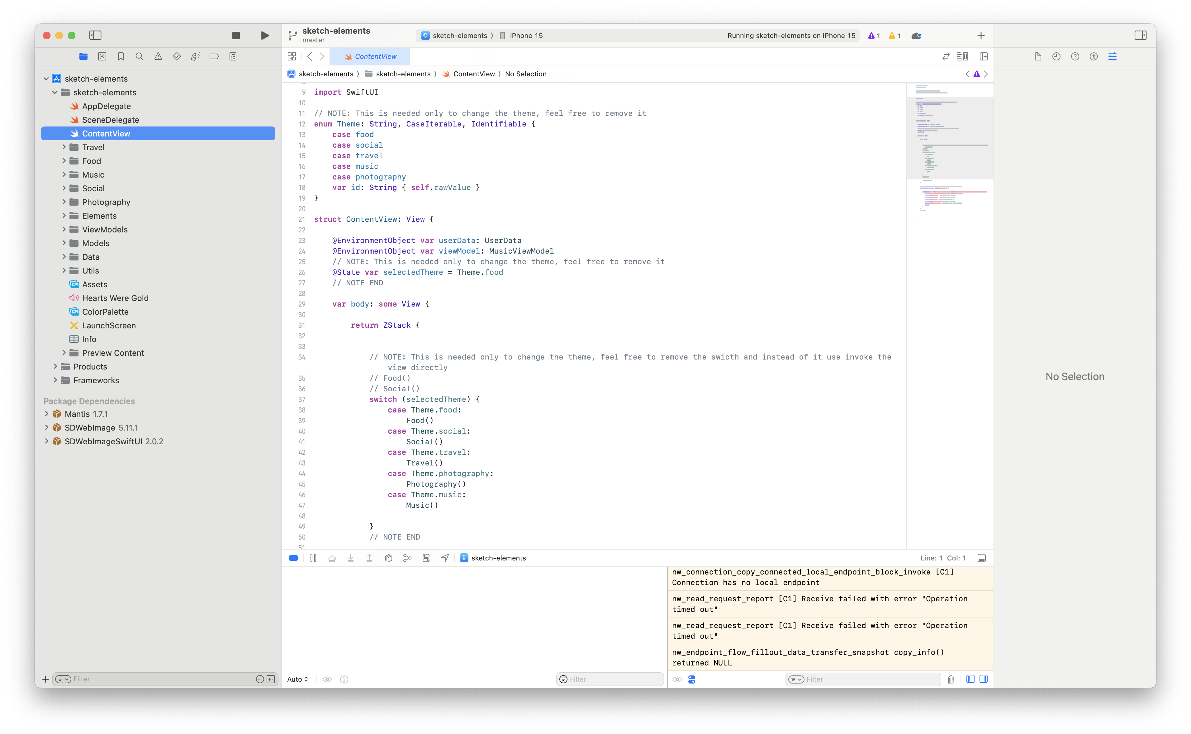
The best way to use this project is to create your custom folder in the project root e.g. MyApp With default user story. I will copy past here Travel.swift content to simulate it. Then in ContentView.swift delete or comment out all the unnecessary lines you don’t want to use. Here is minimal example.
Now you should be able to run your project.
Customization can be done by defining the Theme in ContentView.swift as follows
@State var selectedTheme = Theme.foodOr through the color variables, icons, and components used across the projects. You can edit it directly as it is best way how to use this project.
All color variables are located in ColorPalette.xcassets and the defaults are:
- BrandPrimary
- Contras
- Default
- Gray
- SocialPrimary
- Transparent
- TravelPrimary
These colors come in 3 variations Any Appearance, Light Appearance, and Dark Appearance. All the colors are then defined in Models/Constants.swift file. Usage is then as easy as
var tintColor: Color = Constant.color.travelPrimaryMock data are loaded to the app through Models/Data.swift, where they are parsed to the models defined in Models folder.
For example Recipes.json
   {
     "id": "hummus",
     "title": "Hummus",
     "category": "vegetarian",
     "people": 6,
     "minutes": 10,
     "picture": {
       "uri": "https://firebasestorage.googleapis.com/v0/b/react-native-e.appspot.com/o/hummus.jpeg?alt=media&token=86b00866-3989-492e-9206-9127bbd9745d",
       "preview": "data:image/jpeg;base64,/9j/4AAQSkZJRgABAQAAYABgAAD/4QCMRXhpZgAATU0AKgAAAAgABQESAAMAAAABAAEAAAEaAAUAAAABAAA…”.
     },
     "instructions": [
       "In the bowl of a food processor, combine the tahini and lemon juice and process for 1 minute.",
       "Add the olive oil, minced garlic, cumin, and a 1/2 teaspoon of salt to the whipped tahini and lemon juice. Process for 30 seconds, scrape the sides and bottom of the bowl then process another 30 seconds or until well blended.",
       "Add half of the chickpeas to the food processor and process for 1 minute. Scrape sides and bottom of the bowl, then add remaining chickpeas and process until thick and quite smooth; 1 to 2 minutes."
     ],
     "ingredients": [
       {
         "checked": true,
         "name": "Chickpeas",
         "quantity": "15 ounces"
       },
       {
         "checked": true,
         "name": "Fresh lemon",
         "quantity": "1"
       },
       {
         "checked": false,
         "name": "Well-stirred tahini",
         "quantity": "¼ cup"
       }
     ]
   }
It is parsed as a Recipe model defined in Recipe.swift
struct Recipe: Hashable, Codable, Identifiable {
    var id: String
    var title: String
    var people: Int
    var minutes: Int
    var instructions: [String]
    var ingredients: [Ingredient]
    var picture: Picture
    var category: String
}

struct Category: Hashable, Codable, Identifiable {
    var id: String
    var title: String
    var subtitle: String
    var picture: Picture
}

struct Ingredient: Hashable, Codable, Identifiable {
    var id: String {name}
    var checked: Bool
    var name: String
    var quantity: String
}

struct Instruction: Hashable, Codable, Identifiable {
    var description: String
    var id: String {description}
}
For other data it is similar. Here is a list of other data used for mocks.
- recipes
- restaurants
- recipeCategories
- stories
- conversations
- posts
- users
- guides
- cities
All reusable components are located in the Elements folder. Usage is similar across all the components and can be seen in the preview for each component. E.g. Stars Component is defined in Elements/Stars.swift and its structure is as follows:
struct Stars: View {

	// implementation

}

// usage example
struct Stars_Previews: PreviewProvider {
    static var previews: some View {
        Stars(4, label: "167 reviews", color: Color("TravelPrimary"))
    }
}
Here is the list of all reusable components.
- Modal
- Card
- Header
- Button
- Table
- Stars
- Segmented Picker
- Collapsable Picker
- SegmentedPickerCollapsed
- Count Picker
- Profile
- VenuesList
Modifiers can be used through extension API defined in Elements/ViewExtensions.swift. For TabBarModifier it is:
TabView() {
	Text(“Tab 1”)
	}
        .tabBarOpaque()
There are 3 modifiers that can be used across the project.
- NavigationBarModifier
- TabBarModifier
- SizeAwareViewModifier
The whole project uses only modern Swift Page Manager and is not dependent on any other managers as is CocoaPods etc. These Swift packages are managed from the Project view in the Swift Packages tab. 
Even with the great documentation, you're likely to get stuck at some point. If you've encountered a bug with this iOS Template, please post an issue and one of our maintainers will happily reach out to you. No question's too silly to ask but we recommend checking the documentation and existing issues before opening and a new one.
If you find this useful, consider supporting independent open-source development and buy me a coffee.


