$ yarn add @r0b0t3d/react-native-carousel
Note: Currently, I am using react-native-reanimated for animation. So you should install it as well
$ yarn add react-native-reanimated
There is new alpha version that using context to provide better way to interact with carousel. If you'd like to give it a try, run this
$ yarn add @r0b0t3d/react-native-carousel@alpha
More info #17
- Changed:
renderItemnow required and add more props to easy customization
renderItem: (
  data: { item: T; index?: number },
  animatedData?: { scrollPosition?: Animated.SharedValue<number>, offset?: number }
) => React.ReactNode
- Added:
animatedPage: animated value used which is current selected page. Used to pass into thePaginationIndicatorfor animation.
- Removed:
useIndicator,indicatorContainerStyle,renderIndicator, . UsedPaginationIndicatorinsteadrenderOverlay: you can render overlay insiderenderItemfunction
- Changed:
renderImage->renderItem
- requires
react-native-reanimated@2.1.0
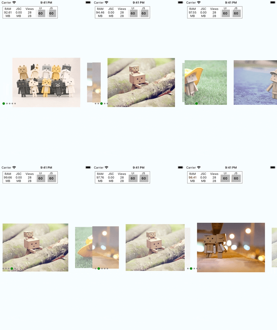
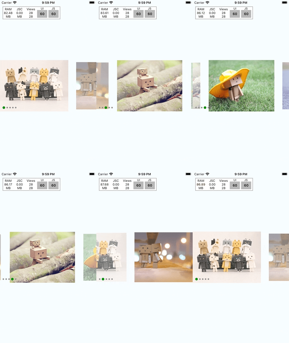
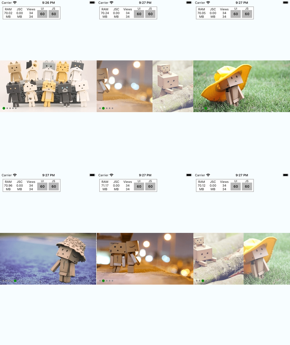
| Loop | Scale | Alignment |
|---|---|---|
 |
 |
 |
<Carousel
  loop={true}
  autoPlay={true}
  duration={3000}
  animation="parallax"
/><Carousel
itemWidth={width - 100}
inactiveOpacity={0.5}
inactiveScale={0.9}
/><Carousel
itemWidth={width - 100}
inactiveOpacity={0.5}
inactiveScale={0.9}
firstItemAlignment="start"
/>import Carousel from '@r0b0t3d/react-native-carousel';
function MyCarousel() {
const currentPage = useSharedValue(0);
return (
<View>
<Carousel
style={{ height: 200 }}
data={data}
loop={false}
autoPlay={true}
duration={3000}
itemWidth={width - 100}
inactiveOpacity={0.5}
inactiveScale={0.9}
firstItemAlignment="start"
spaceBetween={20}
animatedPage={currentPage}
renderItem={({item}) => {
return (
<Image
style={{
flex: 1,
backgroundColor: 'red',
}}
source={{ uri: item.url }}
/>
);
}}
/>
<View>
<PaginationIndicator
totalPage={data.length}
currentPage={currentPage}
containerStyle={{ marginTop: 20 }}
activeIndicatorStyle={{
width: 20,
height: 10,
borderRadius: 5,
}}
indicatorConfigs={{
spaceBetween: 10
}}
/>
</View>
</View>
}| Props | Description | Default |
|---|---|---|
| data | Array of item to be rendered. - id: string: this will be used as key to render- source: ImageSourcePropType: optional. Image source. If you don't want to pass source here. You could use renderItem below to render your custom image. ------ Or it could be array of string |
|
| loop? | Whether your carousel can loop or not | false |
| initialPage? | Set the first page show up | 0 |
| additionalPagesPerSide? | When looping, how many page will be added at head and tail to perform loop effect | 2 |
| autoPlay? | Auto animate to next image with duration. |
false |
| duration? | Duration to animate. used with autoPlay above |
1000 |
| animation? | Predefined animation. Will be parallax for now |
|
| sliderWidth? | Define slider width | screen's width |
| itemWidth? | Define item width | screen's width |
| firstItemAlignment? | `'center' | 'start'` Align first item |
| inactiveOpacity? | [0 - 1] Define opacity for inactive items | 1 |
| inactiveScale? | [0 - 1] define scale value for inactive items | 1 |
| spaceBetween? | Add additional space between items | 0 |
| spaceHeadTail? | Add more space in head/tail. This only work if firstItemAlignment = 'start' |
0 |
| animatedPage? | Animated value which is the current page. This value used to pass into PaginationIndicator for animation |
|
| renderItem | (data: { item: T; index?: number }, animatedData?: { scrollPosition?: Animated.SharedValue<number>, offset?: number }) => React.ReactNodeRender carousel item |
|
| onPageChange? | (index: number) => voidCallback to notify when page change |
| Method | Description |
|---|---|
| goNext | Go to next index |
| goPrev | Go to previous index |
| snapToItem | (index: number, animated?: boolean) => voidSnap to specific index - index: destination index- animated: should animate or not, default is true |
See the contributing guide to learn how to contribute to the repository and the development workflow.
MIT
