Getting Started | Usage | Props | License
Configuration props | Styling props | Animation props | Icon props
-
Install react-native-vector-icons and the icon sources you want. In the main example, we use
Ionicons. You can see all the sources and its icons here -
Install this library. You can use
$ yarn add react-native-search-selector$ npm install react-native-search-select
- Import the library and your choosen icon source
import SearchSelect from "react-native-search-select";
import Ionicons from 'react-native-vector-icons/Ionicons';- Create the options state
const [options, setOptions] = useState([
  {
    key: "0",
    label: "Option 1",
    selected: false,
  },
  {
    key: "1",
    label: "Option 2",
    selected: false,
  },
  {
    key: "2",
    label: "Option 3",
    selected: false,
  },
]);- Use the library
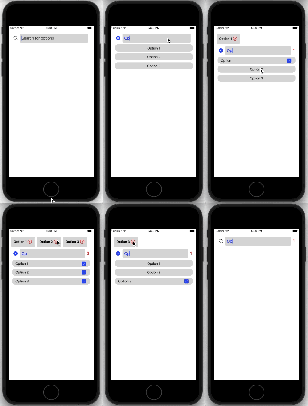
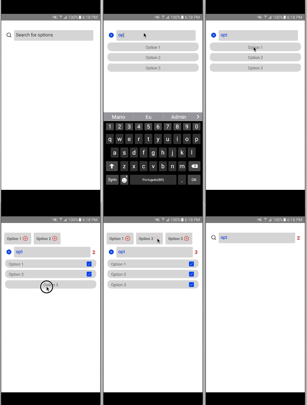
You can use to select multiple options, like this
<View style={{flex: 1, paddingTop: 35, alignItems: 'center'}}>
  <SearchSelect
    // configuration
    multipleSelect={true}
    options={options}
    setOptions={setOptions}
    showSelectedOptionsOnTop={true}
    showSelectedOptionsCounter={true}
    // animation
    animationInput="bounceIn"
    animationList="fadeInUpBig"
    // styling
    placeholder="Search for options"
    searchTextColor="blue"
    // icon
    IconSource={Ionicons}
    searchIcon="ios-search-outline"
    searchIconColor="black"
    closeIcon="ios-close-circle"
    closeIconColor="blue"
    optionSelectedIcon="ios-checkbox"
    optionSelectedIconColor="blue"
    closeTopOptionIcon="ios-close-circle-outline"
  />
</View>
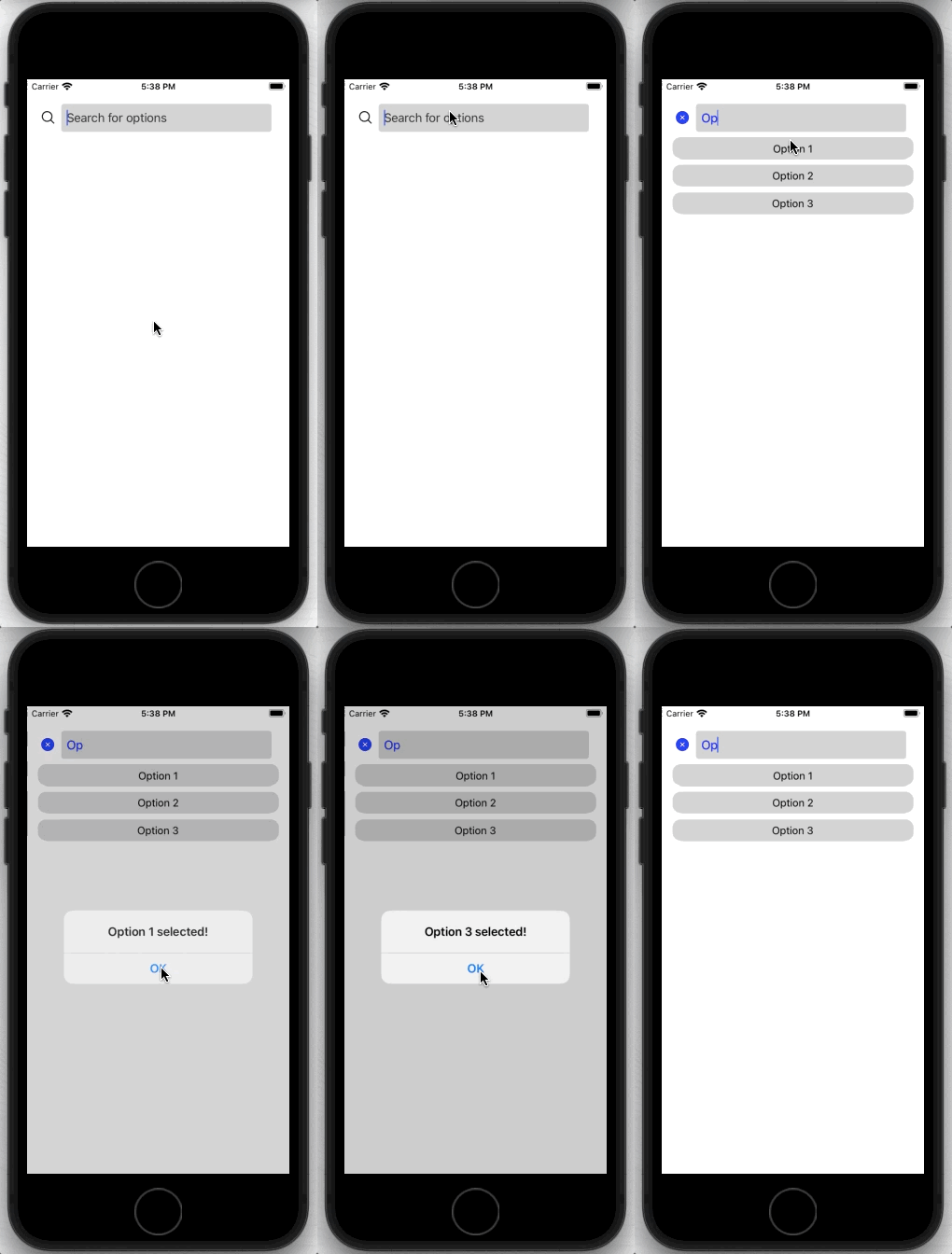
You can also use to perform an action when a option is selected, using onSelectOption
<View style={{flex: 1, paddingTop: 35, alignItems: 'center'}}>
  <SearchSelect
    // configuration
    multipleSelect={false}
    options={options}
    onSelectOption={(index, option) => Alert.alert(option.label + ' selected!')}
    // animation
    animationInput="bounceIn"
    animationList="fadeInUpBig"
    // styling
    placeholder="Search for options"
    searchTextColor="blue"
    // icon
    IconSource={Ionicons}
    searchIcon="ios-search-outline"
    searchIconColor="black"
    closeIcon="ios-close-circle"
    closeIconColor="blue"
    optionSelectedIcon="ios-checkbox"
    optionSelectedIconColor="blue"
  />
</View>| Property | Type | Required | Description |
|---|---|---|---|
| options | array of { key: string; label: string; selected: boolean } | True | array of items to search and select |
| setOptions | function | False | function that set the value of options array |
| multipleSelect | Boolean | True | if the search should allow to select multiple options or not |
| showSelectedOptionsOnTop | Boolean | False | boolean value that says if the selected option should appear on the top of the bar |
| showSelectedOptionsCounter | Boolean | False | boolean value to show a counter of selected options. Shows nothing when there is no selected options. |
| onSelectOption | Boolean | False | if the search should allow to select multiple options or not. Use as (selectedIndex, selectedOption) => {} |
| setIsShowingList | function | False | function that sets a boolean value that says if the list is showing or not |
| setHasSelectedOptions | function | False | function that sets a boolean value that says if there is any option selected |
| Property | Type | Required | Description |
|---|---|---|---|
| placeholder | String | False | placeholder of the searchbar TextInput |
| placeholderTextColor | String | False | color of the placeholder of the searchbar TextInput |
| searchTextColor | String | False | color of the text of the serch in the serachbar TextInput. It can also be set in the inputStyle |
| searchContainerStyle | ViewStyle | False | style of the View that wraps the searchBar |
| itemListContainerStyle | ViewStyle | False | style of the View that wraps individually the result of the search |
| inputStyle | ViewStyle | False | style of the searchbar TextInput |
| optionsOnTopContainerStyle | ViewStyle | False | style of every view that wraps the selected option at the top of the bar |
| optionsOnTopTextStyle | TextStyle | False | style of the text in selected options in the top of the bar |
| counterTextStyle | TextStyle | False | style of the text of the selected options counter |
| counterContainerStyle | ViewStyle | False | style of the view of the selected options counter |
| Property | Type | Required | Description |
|---|---|---|---|
| animationList | String | False | name of the choosen react-native-animatable animation for the entrance of the list |
| animationInput | String | False | name of the choosen react-native-animatable animation for the entrance of the input |
| Property | Type | Required | Description |
|---|---|---|---|
| IconSource | React-native-vector-icons icon component | True | name of the selected source of the React-native-vector-icons source |
| searchIcon | String | False | name of the icon that it will represent the search. It will be located in the right of the searchBar TextInput. It will only appears when there isn’t any item selected on the list |
| searchIconColor | String | False | color of the icon that represent the search. Default is 'black' |
| searchIconSize | Number | False | size of the icon that represent the search. Default is 6% of the width |
| closeIcon | String | False | name of the icon that it will represent closing the search. It will be located in the right of the searchBar TextInput. It will only appears when there is selected items on the list |
| closeIconColor | String | False | color of the icon that represent closing the search. Default is 'black' |
| closeIconSize | Number | False | size of the icon that represent closing the search. Default is 6% of the width |
| optionSelectedIcon | String | False | name of the icon that it will represent when the the individual item is selected. It will only appers at the right side of the selected item |
| optionSelectedIconColor | String | False | color of the icon when the option is selected. Default is 'black' |
| optionSelectedIconSize | Number | False | size of the icon when the option is selected. Default is 6% of the width |
| closeTopOptionIcon | String | False | name of the icon that it will represent when an option at the top of the bar will be deleted |
| closeTopOptionIconSize | Number | False | size of the icon the icon that it will represent when a selected option at the top of the bar will set as unselected |
| closeTopOptionIconColor | String | False | color of the icon the icon that it will represent when a selected option at the top of the bar will set as unselected |
This project is under the MIT license. See the LICENSE for more information.


