The data set included with the assignment is based on 2014 ACS 1-year estimates: https://factfinder.census.gov/faces/nav/jsf/pages/searchresults.xhtml, but you are free to investigate a different data set. The current data set incldes data on rates of income, obesity, poverty, etc. by state. MOE stands for "margin of error."
You need to create a scatter plot between two of the data variables such as Healthcare vs. Poverty or Smokers vs. Age.
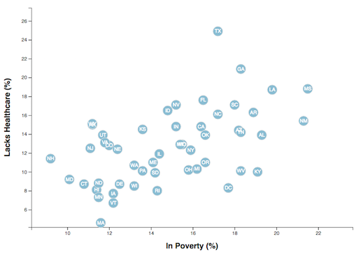
Using the D3 techniques we taught you in class, create a scatter plot that represents each state with circle elements. You'll program this graphic in the app.js file of your homework directory—make sure you pull in the data from data.csv by using the d3.csv function. Your scatter plot should ultimately appear like the image at the top of this section.
-
Include state abbreviations in the circles.
-
Create and situate your axes and labels to the left and bottom of the chart.
-
Note: You'll need to use
serveorpython -m http.serverto run the visualization.
Why make a static graphic when D3 lets you interact with your data?
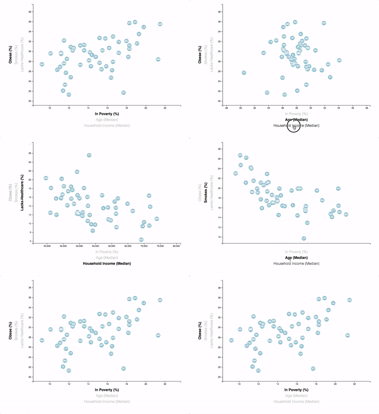
You're going to include more demographics and more risk factors. Place additional labels in your scatter plot and give them click events so that your users can decide which data to display. Animate the transitions for your circles' locations as well as the range of your axes. Do this for two risk factors for each axis. Or, for an extreme challenge, create three for each axis.
- Hint: Try binding all of the CSV data to your circles. This will let you easily determine their x or y values when you click the labels.
Your final product will be assessed on the following metrics:
-
Completion of all steps in chosen level
-
Coherency of scatter plot (labels, ticks)
-
Visual attraction
-
Professionalism
Good luck!
Data Boot Camp © 2018. All Rights Reserved.


