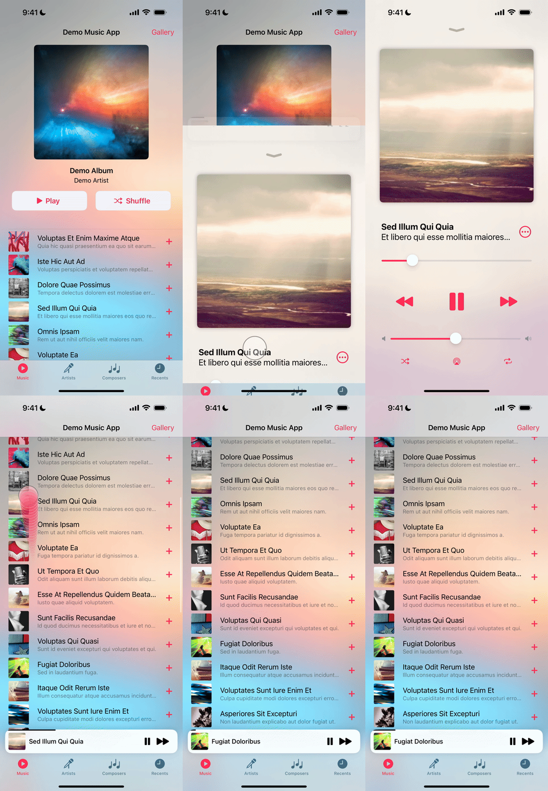
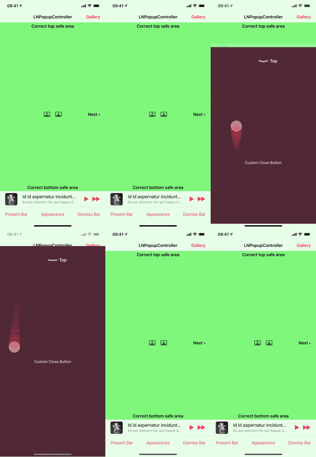
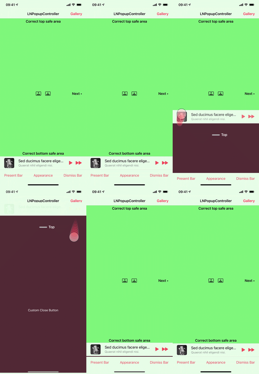
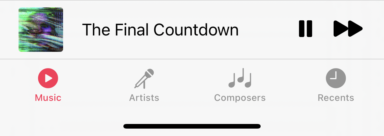
LNPopupController is a framework for presenting view controllers as popups of other view controllers, much like the Apple Music and Podcasts apps.
For SwiftUI, check out my LNPopupUI library.
Once a popup bar is presented with a content view controller, the user can swipe or tap the popup bar at any point to present the popup. After finishing, the user dismisses the popup by either swiping or tapping the popup close button.
The framework is intended to be very generic and work in most situations, so it is implemented as a category over UIViewController. Each view controller can present a popup bar, docked to a bottom view.
For UITabBarController subclasses, the default docking view is the tab bar.
For UINavigationController subclasses, the default docking view is the toolbar.
For other classes, the popup bar is presented at the bottom of the screen. View controller subclasses can provide their own docking views.
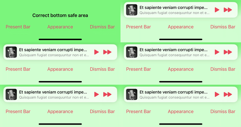
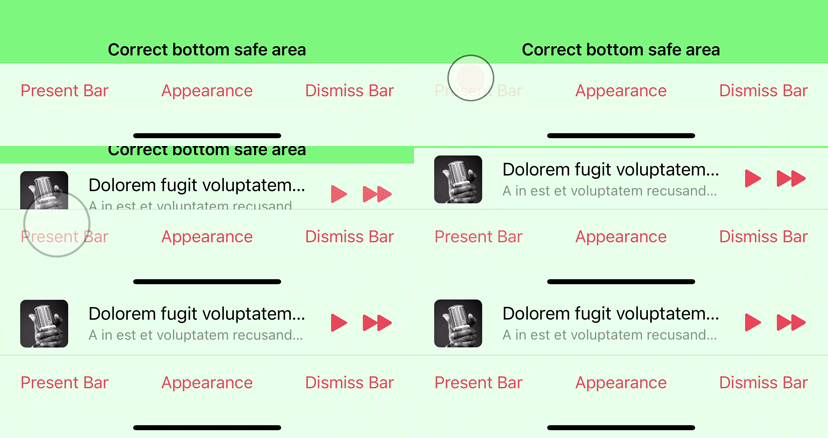
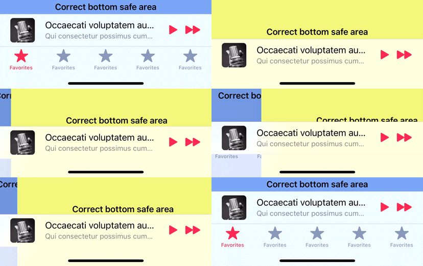
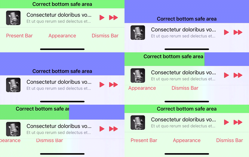
The framework correctly maintains the safe area insets of the container controller’s view and its child controllers, as the popup bar is presented and dismissed.
The information displayed on the popup bar is provided dynamically with popup item objects (instances of the LNPopupItem class) associated with the popup content view controllers. To change this information, update the popup item of the view controller.
Generally, it is recommended to present the popup bar on the outermost container controller. So if you have a view controller contained in a navigation controller, which is in turn contained in a tab bar controller, it is recommended to present the popup bar on the tab bar controller.
Check the demo project for many common use cases of the framework in various scenarios. It contains examples in Swift and Objective C.
- Available for iOS 13 and above, as an Xcode framework or an SPM package
- Good citizen in modern UIKit world
- Modern Objective C syntax and great Swift interoperability
- For SwiftUI, check out my LNPopupUI library.
Swift Package Manager is the recommended way to integrate LNPopupController in your project.
LNPopupController supports SPM versions 5.5 and above. To use SPM, you should use Xcode 13 to open your project. Click File -> Swift Packages -> Add Package Dependency, enter https://github.com/LeoNatan/LNPopupController. Select the version you’d like to use.
You can also manually add the package to your Package.swift file:
.package(url: "https://github.com/LeoNatan/LNPopupController.git", from: "2.15.0")And the dependency in your target:
.target(name: "MyExampleApp", dependencies: ["LNPopupController"]),Add the following to your Cartfile:
github "LeoNatan/LNPopupController"
Make sure you follow the Carthage integration instructions here.
Drag the LNPopupController.xcodeproj project to your project, and add LNPopupController.framework to Embedded Binaries in your project target's General tab. Xcode should sort everything else on its own.
CocoaPods is not supported. There are many reasons for this. Instead of CocoaPods, use Swift Package Manager from within Xcode. You can continue using CocoaPods for for your other dependencies and Swift Package Manager for LNPopupController.
While the framework is written in Objective C, it uses modern Objective C syntax, so using the framework in Swift is very easy and intuitive.
Import the module in your project:
import LNPopupControllerA popup item should always reflect the popup information about the view controller with which it is associated. The popup item should provide a title and subtitles to display in the popup bar, when the view controller is presented as a popup content controller. In addition, the item may contain additional buttons to display on the leading and/or trailing edges of the popup bar using leadingBarButtonItems and trailingBarButtonItems.
To present the popup bar, create a content controller, update its popup item and present the popup bar.
let demoVC = DemoPopupContentViewController()
demoVC.view.backgroundColor = .red
demoVC.popupItem.title = "Hello World"
demoVC.popupItem.subtitle = "And a subtitle!"
demoVC.popupItem.progress = 0.34

tabBarController?.presentPopupBar(withContentViewController: demoVC, animated: true, completion: nil)
You can present a new content controller while the popup bar is presented and when the popup itself is open.
To open and close the popup programatically, use openPopup(animated:completion:) and closePopup(animated:completion:) respectively.
tabBarController?.openPopup(animated: true, completion: nil)Alternatively, you can present the popup bar and open the popup in one animation, using presentPopupBar(withContentViewController:openPopup:animated:completion:).
tabBarController?.presentPopupBar(withContentViewController: demoVC, openPopup:true, animated: true, completion: nil)To dismiss the popup bar, use dismissPopupBarAnimated:completion:.
tabBarController?.dismissPopupBar(animated: true, completion: nil)If the popup is open when dismissing the popup bar, the popup content will also be dismissed.
Any UIViewController subclasses can be popup container view controllers. The popup bar is attached to a bottom docking view. By default, UITabBarController and UINavigationController subclasses return their bottom bars as docking view, while other controllers return a hidden 0pt height view on the bottom of the view. In your subclass, override bottomDockingViewForPopupBar and defaultFrameForBottomDockingView and return your view and frame accordingly. The returned view must be attached to the bottom of the view controller's view, or results are undefined.
override var bottomDockingViewForPopupBar: UIView? {
  return myCoolBottomView
}

override var defaultFrameForBottomDockingView: CGRect {
  var bottomViewFrame = myCoolBottomView.frame

  if isMyCoolBottomViewHidden {
    bottomViewFrame.origin = CGPoint(x: bottomViewFrame.x, y: view.bounds.height)
  } else {
    bottomViewFrame.origin = CGPoint(x: bottomViewFrame.x, y: view.bounds.height - bottomViewFrame.height)
  }

  return bottomViewFrame
}LNPopupController provides three distinct styles of popup look and feel, each based on Music app looks and feels, that Apple has introduced over the years. Popup bar styles are labeled "floating”, “prominent" and "compact", matching the appropriate Apple style. Popup interaction styles are labeled "snap" for modern style snapping popups and "drag" for iOS 9 interactive popup interaction. Popup close buttons styles are labeled "chevron" for modern style chevron close button and "round" for iOS 9-style close buttons. For each, there is a "default" style for choosing the most suitable one for the current platform and operating system version.
The defaults are:
-
iOS 17:
-
Floating bar style
-
Snap interaction style
-
Chevron close button style
-
No progress view style
-
-
iOS 16 and below:
- Prominent bar style
-
Snap interaction style
-
Chevron close button style
-
No progress view style
You can also present completely custom popup bars. For more information, see Custom Popup Bars.
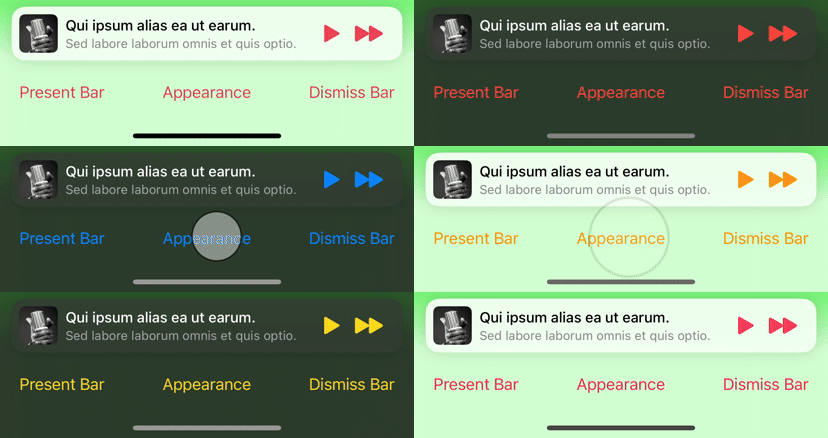
By default, for navigation and tab bar container controllers, the appearance of the popup bar is determined according to the bottom bar's appearance. For other container controllers, a default appearance is used, most suitable for the current environment.
To disable inheriting the bottom bar’s appearance, set the inheritsAppearanceFromDockingView property to false.
Customizing the popup bar style is achieved by setting the popup bar's barStyle property.
navigationController?.popupBar.barStyle = .compactCustomizing the popup interaction style is achieved by setting the popup presentation containing controller's popupInteractionStyle property.
navigationController?.popupInteractionStyle = .dragCustomizing the popup bar progress view style is achieved by setting the popup bar's progressViewStyle property.
navigationController?.popupBar.progressViewStyle = .topTo hide the progress view, set the progressViewStyle property to LNPopupBarProgressViewStyle.none.
Customizing the popup close button style is achieved by setting the popup content view's popupCloseButtonStyle property.
navigationController.popupContentView.popupCloseButtonStyle = .roundTo hide the popup close button, set the popupCloseButtonStyle property to LNPopupCloseButtonStyle.none.
Supplying long text for the title and/or subtitle will result in a scrolling text, if text marquee is enabled. Otherwise, the text will be truncated.
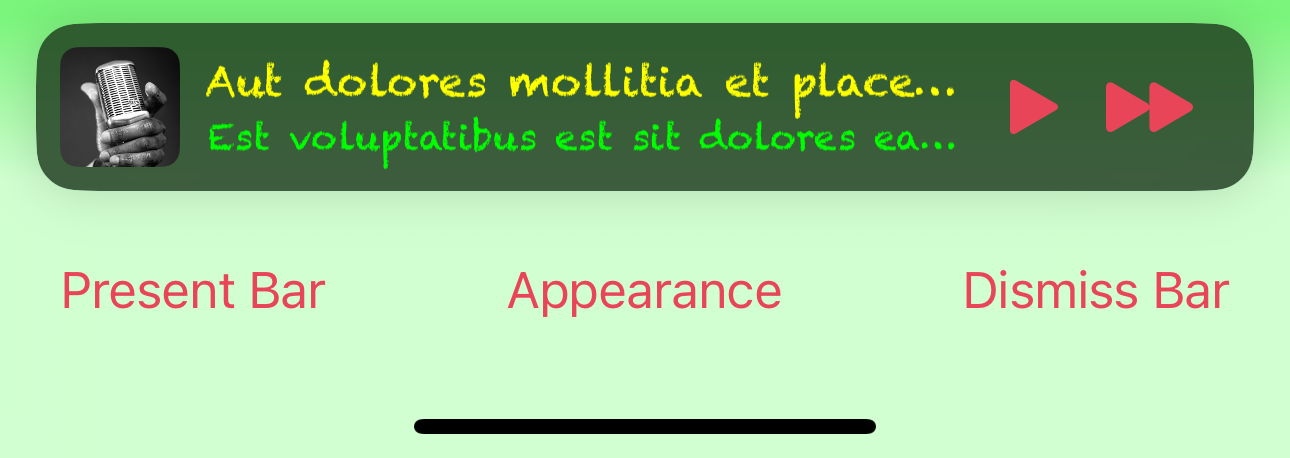
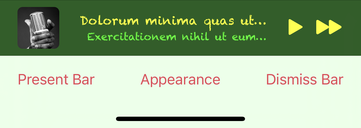
LNPopupBar exposes API to customize the default popup bar's appearance, either through UIAppearance API or directly on a specific popup bar object. Use LNPopupBarAppearance objects to define the standard appearance of the bar.
Remember to set the inheritsAppearanceFromDockingView property to false, or your customization is likely to be overridden by the bottom bar’s appearance.
let appearance = LNPopupBarAppearance()
appearance.titleTextAttributes = [.font: UIFont(name: "Chalkduster", size: 14)!, .foregroundColor: UIColor.yellow]
appearance.subtitleTextAttributes = [.font: UIFont(name: "Chalkduster", size: 12)!, .foregroundColor: UIColor.green]
appearance.backgroundEffect = UIBlurEffect(style: .systemChromeMaterialDark)

let appearanceProxy = LNPopupBar.appearance(whenContainedInInstancesOf: [UINavigationController.self])
appearanceProxy.inheritsAppearanceFromDockingView = false
appearanceProxy.standardAppearance = appearance
appearanceProxy.tintColor = .yellowThe framework supports implementing custom popup bars.
To implement a custom popup bar, you subclass LNPopupCustomBarViewController.
In your LNPopupCustomBarViewController subclass, build your popup bar's view hierarchy and set the controller's preferredContentSize property with the preferred popup bar height. Override any of the wantsDefaultTapGestureRecognizer, wantsDefaultPanGestureRecognizer and/or wantsDefaultHighlightGestureRecognizer properties to disable the default gesture recognizers functionality in your custom popup bar.
In your subclass, implement the popupItemDidUpdate() method to be notified of updates to the popup content view controller's item, or when a new popup content view controller is presented (with a new popup item). You must call the super implementation of this method.
Finally, set the customBarViewController property of the popup bar object to an instance of your LNPopupCustomBarViewController subclass. This will change the bar style to LNPopupBarStyle.custom.
The included demo project includes two example custom popup bar scenes.
The hidesBottomBarWhenPushed property is supported for navigation and tab bar controllers. When set to true, the popup bar will transition to the bottom of the pushed controller's view. Setting isToolbarHidden = true and calling setToolbarHidden(_:animated:) are also supported.
Status bar management of the popup content view controller is respected and applied when appropriate.
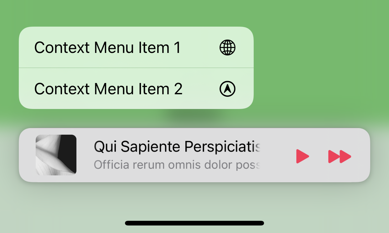
Context menus are supported. Add a UIContextMenuInteraction interaction object to the popup bar, and it will behave as expected.
Pointer interactions are supported, and a default implementation is provided for system bar styles.
For custom popup bar controllers, the LNPopupCustomBarViewController class implements the UIPointerInteractionDelegate protocol. Implement the protocol's methods inside your subclass to implement custom pointer interactions.
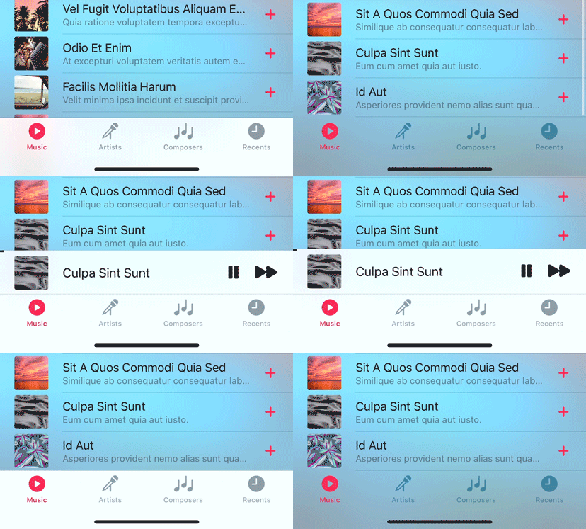
Starting with iOS 15, scroll edge appearance is automatically disabled for toolbars and tab bars when a popup bar is presented, regardless of the scroll position of the content. Once the popup bar is dismissed, the scroll edge appearance is restored.
LNPopupController fully supports ProMotion on iPhone and iPad.
For iPhone 13 Pro and above, you need to add the CADisableMinimumFrameDurationOnPhone key to your Info.plist and set it to true. See Optimizing ProMotion Refresh Rates for iPhone 13 Pro and iPad Pro for more information. LNPopupController will log a single warning message in the console if this key is missing, or is set to false.
LNPopupContentView exposes access to the popup interaction gesture recognizer in the way of the popupInteractionGestureRecognizer property. This gesture recognizer is shared between opening the popup content, by panning the popup bar up (when the popup bar is closed), and closing the popup content, by panning the popup content view (when the popup bar is open).
When opening the popup, the system queries the viewForPopupInteractionGestureRecognizer property of the popup content view controller to determine to which view to add the interaction gesture recognizer. By default, the property returns the controller's root view. Override the property's getter to change this behavior.
You can implement the delegate of the interaction gesture recognizer in order to influence its behavior, such as preventing popup interaction when the user is interacting with other controls or views inside the popup content.
Note: If you disable the gesture recognizer after opening the popup, you must monitor the state of the popup and reenable the gesture recognizer once closed by the user or through code. Instead, consider implementing the gesture recognizer's delegate and providing custom logic to disable the interaction.
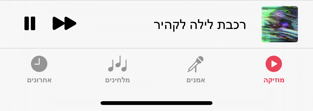
The framework has full right-to-left support.
By default, the popup bar will follow the system's user interface layout direction, but will preserve the bar button items' order.
To customize this behavior, modify the popup bar's semanticContentAttribute and barItemsSemanticContentAttribute properties.
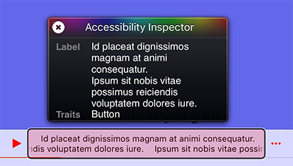
The framework supports accessibility and will honor accessibility labels, hints and values. By default, the accessibility label of the popup bar is the title and subtitle provided by the popup item.
To modify the accessibility label and hint of the popup bar, set the accessibilityLabel and accessibilityHint properties of the LNPopupItem object of the popup content view controller.
demoVC.popupItem.accessibilityLabel = NSLocalizedString("Custom popup bar accessibility label", comment: "")
demoVC.popupItem.accessibilityHint = NSLocalizedString("Custom popup bar accessibility hint", comment: "")
To add accessibility labels and hints to buttons, set the accessibilityLabel and accessibilityHint properties of the UIBarButtonItem objects.
let upNext = UIBarButtonItem(image: UIImage(named: "next"), style: .plain, target: self, action: #selector(nextItem))
upNext.accessibilityLabel = NSLocalizedString("Up Next", comment: "")
upNext.accessibilityHint = NSLocalizedString("Double tap to show up next list", comment: "")
To modify the accessibility label and hint of the popup close button, set the accessibilityLabel and accessibilityHint properties of the LNPopupCloseButton object of the popup container view controller.
tabBarController?.popupContentView.popupCloseButton.accessibilityLabel = NSLocalizedString("Custom popup close button accessibility label", comment: "")
tabBarController?.popupContentView.popupCloseButton.accessibilityHint = NSLocalizedString("Custom popup close button accessibility hint", comment: "")
To modify the accessibility label and value of the popup bar progress view, set the accessibilityProgressLabel and accessibilityProgressValue properties of the LNPopupItem object of the popup content view controller.
demoVC.popupItem.accessibilityImageLabel = NSLocalizedString("Custom image label", comment: "")
demoVC.popupItem.accessibilityProgressLabel = NSLocalizedString("Custom accessibility progress label", comment: "")
demoVC.popupItem.accessibilityProgressValue = "\(accessibilityDateComponentsFormatter.stringFromTimeInterval(NSTimeInterval(popupItem.progress) * totalTime)!) \(NSLocalizedString("of", comment: "")) \(accessibilityDateComponentsFormatter.stringFromTimeInterval(totalTime)!)"- Legacy non-translucent tab bar and toolbars are not supported and can cause visual artifacts or layout glitches. Apple has many problem with such bars, and supporting those is not a priority for
LNPopupController- The correct way to achieve an opaque bar is to use the
UIBarAppearance.configureWithOpaqueBackground()API, which is supported byLNPopupController
- The correct way to achieve an opaque bar is to use the
- Manually setting bottom bar properties, such as setting a tab bar’s or a toolbar’s
isHidden = trueis explicitly discouraged by Apple and not supported by the framework; it will lead to undefined behavior by the framework
The framework uses:
- MarqueeLabel Copyright (c) 2011-2020 Charles Powell
Additionally, the demo project uses:
- LoremIpsum Copyright (c) 2013 Lukas Kubanek


