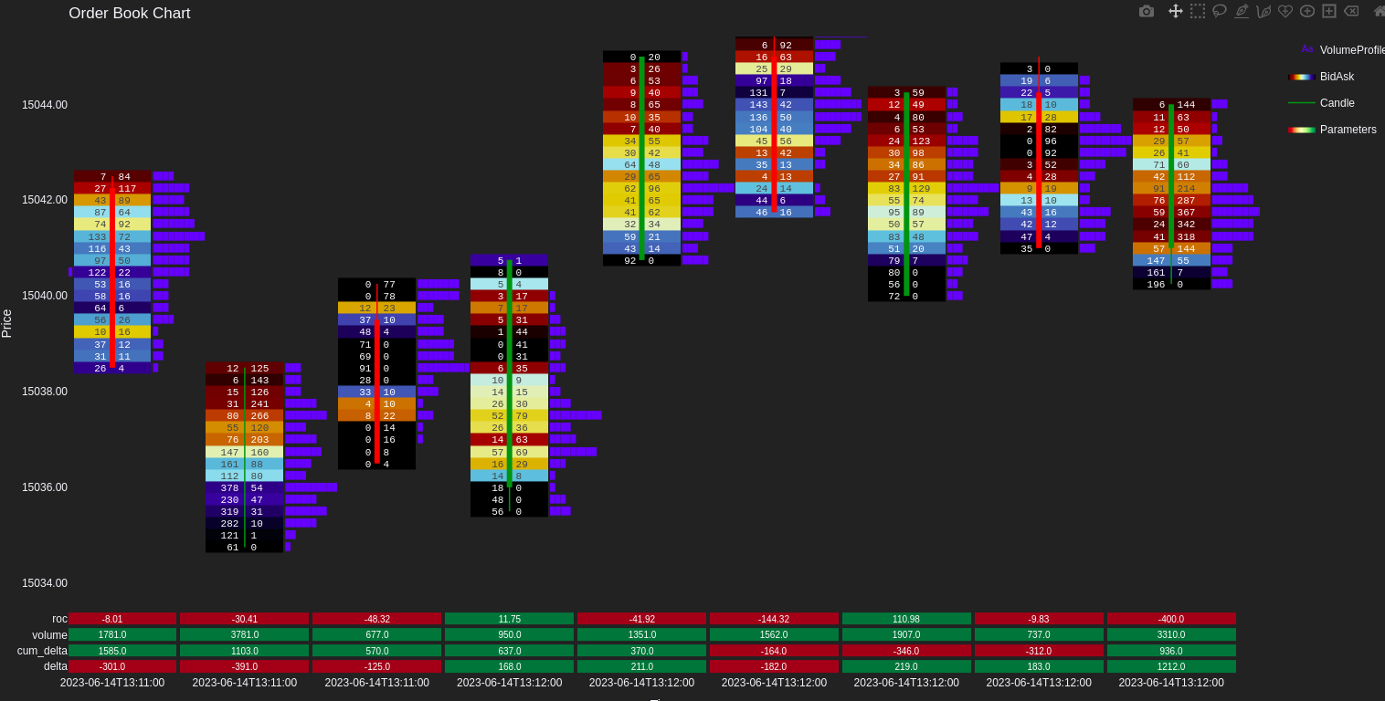
Welcome to the OrderflowChart project! This project empowers you to visualize orderflow footprint charts effortlessly using Python and Plotly.
The heart of the project is the OrderFlowChart class constructor. It's designed to simplify the process of plotting orderflow data on footprint charts, leveraging Plotly's capabilities.
from OrderFlow import OrderFlowChart# Read orderflow data from CSV orderflow_data = pd.read_csv( ORDERFLOW_CSV, names=['bid_size', 'price', 'ask_size', 'identifier'], index_col=0, parse_dates=True )
# Read OHLC data from CSV ohlc_data = pd.read_csv( OHLC_CSV, index_col=0, parse_dates=True, names=['open', 'high', 'low', 'close', 'identifier'] )
# Create an instance of OrderFlowChart orderflowchart = OrderFlowChart( orderflow_data, ohlc_data, identifier_col='identifier' )
# Plot the orderflow chart orderflowchart.plot()
orderflow_data: Your orderflow data, containing columns like 'bid_size', 'price', 'ask_size', and 'identifier'. If the 'imbalance' column needs to be calculated, simply provide it along with the previous mentioned columnsohlc_data: Your OHLC data with columns 'open', 'high', 'low', 'close', and 'identifier'. The 'identifier' column bridges the gap between orderflow and OHLC data.identifier_col: The column that uniquely identifies candles in both datasets. Incase your data is time-indexed i.e. each candle has a unique timestamp that acts as index, pass None.imbalance_col: The column name that contains imbalance for each price level. Provide None if to be calculated.
The above code snippet generates a stunning orderflow chart like this:
With OrderflowChart, you can effortlessly transform complex orderflow data into visually appealing and insightful footprint charts. Feel free to explore, customize, and gain new perspectives from your data with this powerful tool.
If you have your data preprocessed and stored in a JSON format, you can use the OrderFlowChart.from_preprocessed_data class method to simplify the process further. This method allows you to directly load and plot your orderflow chart without manually reading and parsing CSV files.
from OrderFlow import OrderFlowChart import pandas as pd import json # Load preprocessed data from JSON with open('data/preprocessed_data.json', 'r') as f: preprocessed_data = json.load(f)# Create an OrderFlowChart instance using preprocessed data orderflowchart = OrderFlowChart.from_preprocessed_data(preprocessed_data)
# Plot the orderflow chart orderflowchart.plot()
This approach is particularly useful when dealing with datasets that have been previously cleaned, aggregated, or transformed, allowing for a streamlined visualization process. Ensure your preprocessed data adheres to the expected format as described in the provided Pydantic model documentation. For detailed information on the data structure and the Pydantic model used for preprocessing, please refer to the Data Model Documentation.
