
Visit https://www.material-tailwind.com/docs/react/installation for full documentation.
| Accordion | Alert | Avatar |

|

|
|
| Breadcrumbs | Button | Card |
|
|

|
| Checkbox | Chip | Dialog |

|
|

|
| Icon Button | Input | Menu |
|
|
|

|
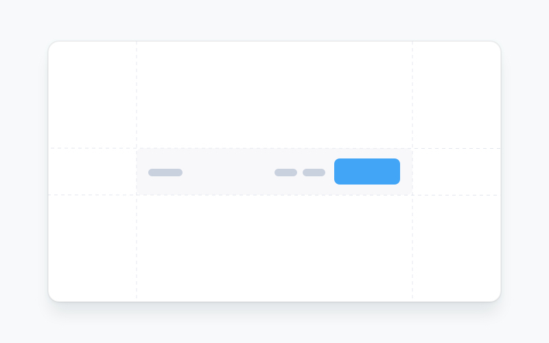
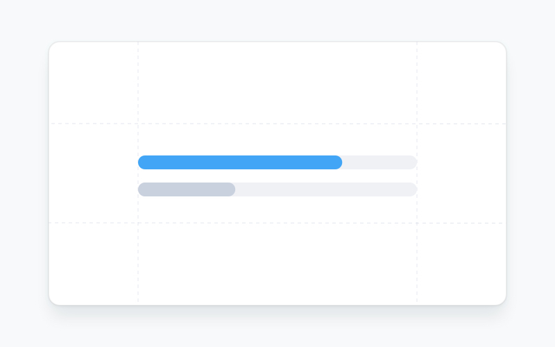
| Navbar | Popover | Progress Bar |
|

|
|
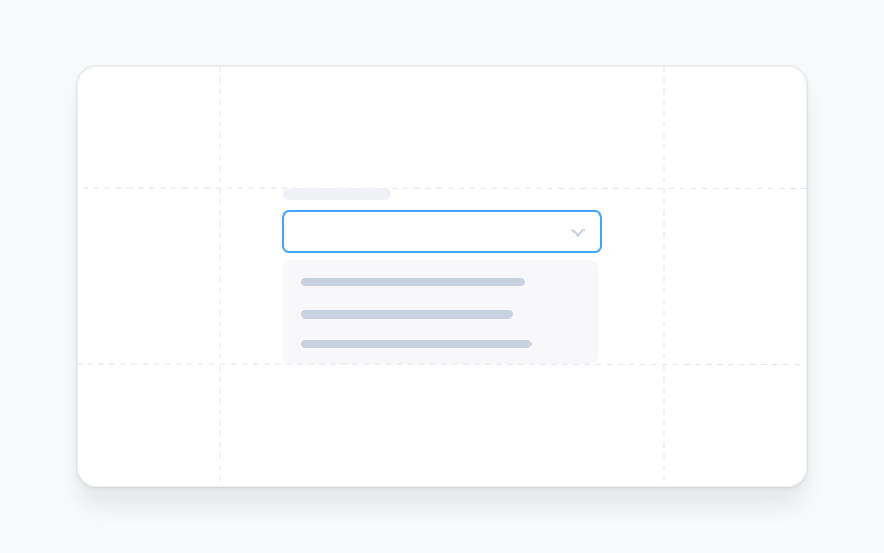
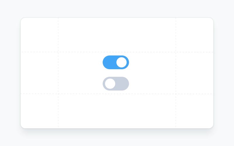
| Radio Button | Select | Switch |

|
|
|
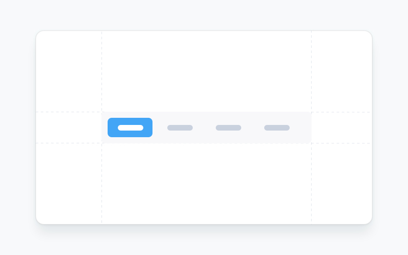
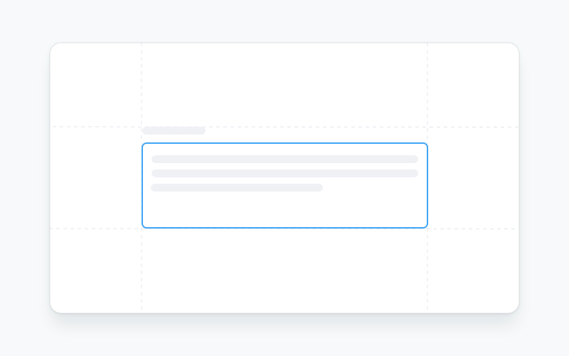
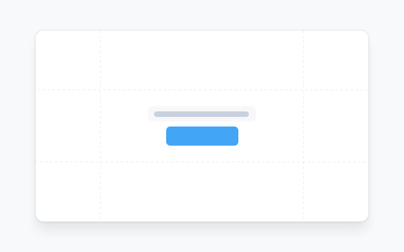
| Tabs | Textarea | Tooltip |
|
|
|
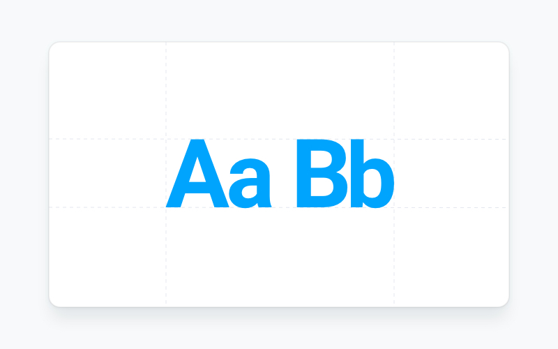
| Typography | ||
|
Learn how to use @material-tailwind/react components to quickly and easily create elegant and flexible pages using Tailwind CSS.
@material-tailwind/react is working with Tailwind CSS classes and you need to have Tailwind CSS installed on your project - Tailwind CSS Installation.
- Intall
@material-tailwind/react.
npm i @material-tailwind/react- Once you install @material-tailwind/react you need to wrap your tailwind css configurations with the
withMT()function coming from @material-tailwind/react/utils.
const withMT = require("@material-tailwind/react/utils/withMT");

module.exports = withMT({
  content: ["./src/**/*.{js,jsx,ts,tsx}"],
  theme: {
    extend: {},
  },
  plugins: [],
});- @material-tailwind/react comes with a theme provider that set's the default theme/styles for components or to provide your own theme/styles to your components. You need to wrap your entire application with the
ThemeProvidercoming from @material-tailwind/react.
import React from "react";
import ReactDOM from "react-dom/client";
import App from "./App";

// @material-tailwind/react
import { ThemeProvider } from "@material-tailwind/react";

const root = ReactDOM.createRoot(document.getElementById("root"));

root.render(
  <React.StrictMode>
    <ThemeProvider>
      <App />
    </ThemeProvider>
  </React.StrictMode>,
);- Congratulations 🥳, you did it, now you're ready to use @material-tailwind/react.
import { Button } from "@material-tailwind/react";

export default function Example() {
  return <Button>Button</Button>;
}Visit https://www.material-tailwind.com/docs/html/installation for full documentation.
| Accordion | Alert | Avatar |

|
|
|
| Breadcrumbs | Button | Card |
|
|

|
| Checkbox | Chip | Dialog |

|
|

|
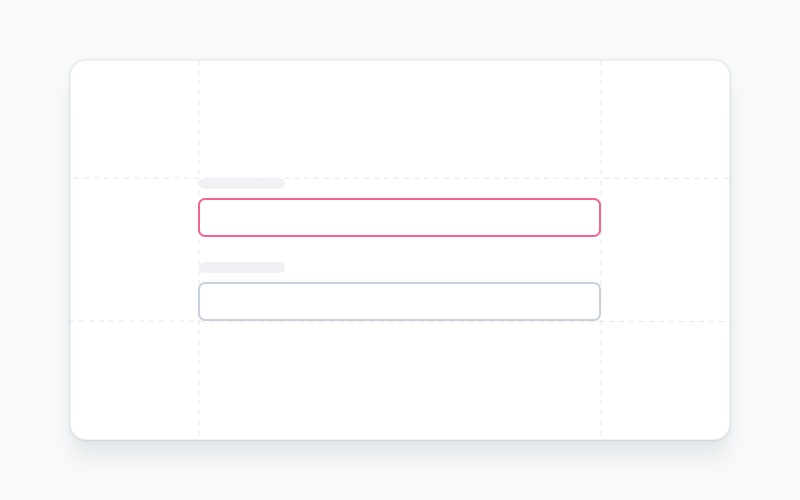
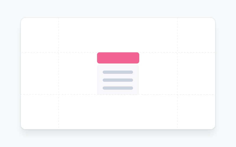
| Icon Button | Input | Menu |
|
|
|
|
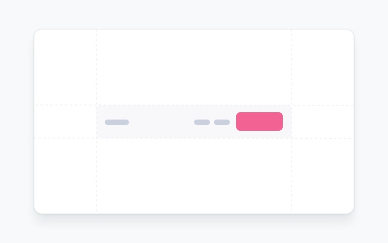
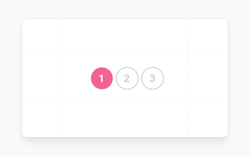
| Navbar | Pagination | Popover |
|
|

|
| Progress Bar | Radio Button | Select |

|
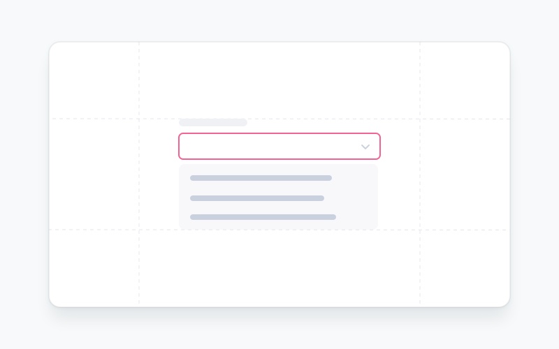
|
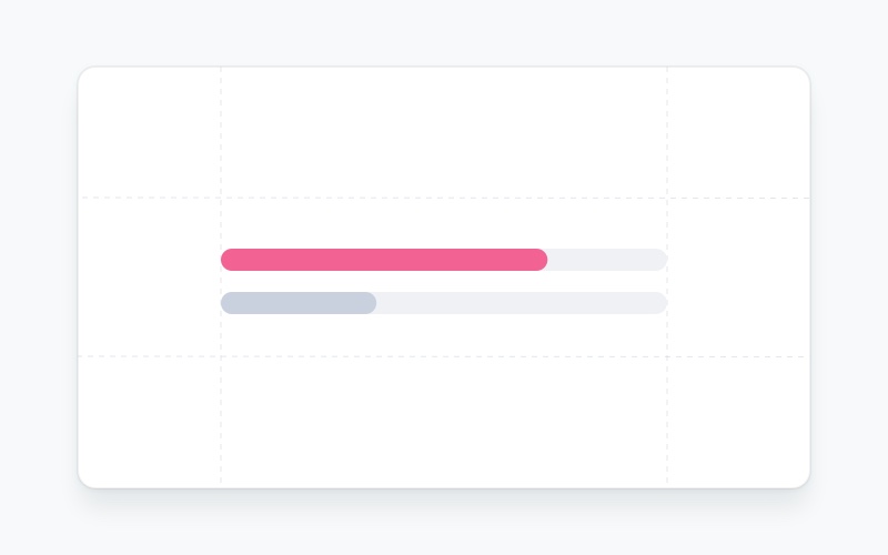
|
| Switch | Tabs | Textarea |
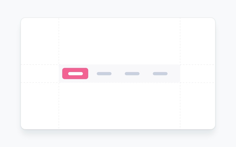
|
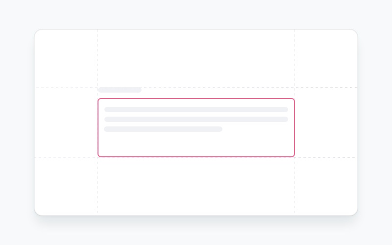
|
|
| Tooltip | Typography | |
|
|
Learn how to use @material-tailwind/html components to quickly and easily create elegant and flexible pages using Tailwind CSS.
@material-tailwind/html is working with Tailwind CSS classes and you need to have Tailwind CSS installed on your project - Tailwind CSS Installation.
- Intall
@material-tailwind/html
npm i @material-tailwind/html- Once you install @material-tailwind/html you need to wrap your tailwind css configurations with the
withMT()function coming from @material-tailwind/html/utils.
const withMT = require("@material-tailwind/html/utils/withMT");

module.exports = withMT({
  content: ["./index.html"],
  theme: {
    extend: {},
  },
  plugins: [],
});- Congratulations 🥳, you did it, now you're ready to use @material-tailwind/html.
We're excited to see the community adopt Material Tailwind, raise issues, and provide feedback. Whether it's a feature request, bug report, or a project to showcase, please get involved!
Contributions are always welcome!
See CONTRIBUTING.md for ways to get started.
Please adhere to this project's CODE_OF_CONDUCT.md.


