Joachim Gassen
I am an applied economist studying the economic effects of regulatory interventions on corporate transparency and leading the Open Science Data Center (OSDC) of the TRR 266 Accounting for Transparency, which is funded by the German Science Foundation (DFG). The OSDC has the objective to make research transparent in a way that others can contribute and collaborate.
This is the spirit that motivated me to set up this package. I am clearly no epidemiologist so I will abstain from from providing infrastructure for analyzing the spread of the disease or estimating the effects of non-pharmaceutical interventions. Instead this package serves the purpose to facilitate the use of various Covid-19 related data sources with a special focus on non-pharmaceutical interventions.
In that way, I hope that it might be helpful for others that are interested in doing research on the Covid 19 pandemic by promoting the benefits of open science.
There are several packages that provide data and infrastructure related to Covid-19. Two prominent cases are:
{nCov2019}: This package has a focus on Chinese data but also contains data on other countries and regions. It contains a shiny dashboard.{conronavirus}: This package provides the Johns Hopkins University CSSE dataset together with a dashboard
Additional R related resources on Covid-19 can be found here and here.
Other than the packages mentioned above, the key objective of the {tidycovid19} package is to provide transparent access to various data sources at the country-day level, including data on governmental interventions. It does not contain any data per se. Instead, it provides functions to pull data from publicly available authoritative sources. Also, it does not provide sub-country level data for the time being.
For those interested in speedy downloads it alternatively provides the
option to download from the cached data in this repo (stored in the
directory cached_data). The cached data is updated daily.
If you rather want to start your own project by customizing the code of this package to fit your needs, I suggest that you take a look at my Github repository “tidy_covid19” (mind the underscore). This repo presents a forkable code infrastructure for Covid 19 projects using the same data infrastructure.
Currently, the package offers the following functions to download data:
download_jhu_csse_covid19_data(): Downloads and tidies Covid-19 data from the Johns Hopkins University CSSE Github Repo. This data has developed to a standard resource for researchers and the general audience interested in assessing the global spreading of the virus. The data is aggregated to the country level.download_acaps_npi_data(): Downloads and tidies the Government measures dataset provided by the Assessment Capacities Project (ACAPS). These relatively new data allow researchers to study the effect of non-pharmaceutical interventions on the development of the virus.download_oxford_npi_data(): Downloads and tidies data from the Oxford Covid-19 Government Response Tracker, an alternative data source for governmental interventions. Currently, I do not include the financial measures of this data set and also do not include its data in the merged data file (see below) as I view the ACAPS data to be better suited (this blog post details why).download_apple_mtr_data(): Downloads Mobility Trends Reports provided by Apple related to Covid-19.download_google_cmr_data(): Downloads Google COVID-19 Community Mobility Reports data. As of April 17, Google provides a nice and clean CSV file containing country-day and region-day data. This makes the PDF scraping code that used to be part of this package obsolete. If you are interested in it for didactic reasons, you can still find it in the git hstory.download_google_trends_data(): Downloads and tidies Google Trends data on the search volume for the term “coronavirus” (Thank you to Yan Ouaknine for bringing up that idea!). This data can be used to assess the public attention to Covid-19 across countries and over time within a given country.download_wbank_data(): Downloads and tidies additional country level information provided by the World Bank using the {wbstats} package. These data allow researchers to calculate per capita measures of the virus spread and to assess the association of macro-economic variables with the development of the virus.download_merged_data(): Downloads all data sources and creates a merged country-day panel sample.
The focus of the package lies on data collection and not on visualization as there are already many great tools floating around. Rgeardless, there are three functions that allow you to visualize some od the key data that the package provides.
The function plot_covid19_spread() allows you to quickly visualize the
spread of the virus in relation to governmental intervention measures.
It is inpired by the insightful displays created by John Burn-Murdoch
from the Financial Times and offers various customization options.
#remotes::install_github("joachim-gassen/tidycovid19")

library(tidycovid19)

merged <- download_merged_data(cached = TRUE, silent = TRUE)
plot_covid19_spread(
  merged, highlight = c("ITA", "ESP", "FRA", "DEU", "USA"),
  intervention = "lockdown", edate_cutoff = 50
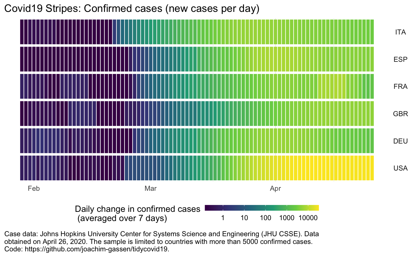
)NEW: Another option to visualize the spread of Covid-19, in particular if you want to compare many countries, is to produce a stripes-based visualization. Meet the Covid-19 stripes:
plot_covid19_stripes()Again, the function comes with many options. As an example, you can easily switch to a per capita display:
plot_covid19_stripes(
  per_capita = TRUE,
  population_cutoff = TRUE,
  sort_countries = "magnitude"
)
Or single out countries that you are interested in
plot_covid19_stripes(
  type = "confirmed",
  countries = c("ITA", "ESP", "FRA", "GBR", "DEU", "USA"),
  sort_countries = "countries"
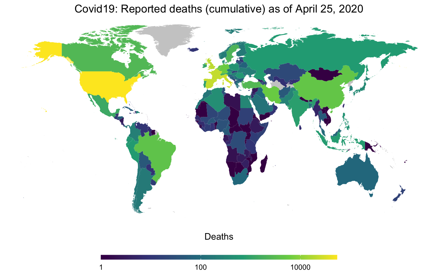
)NEW: Finally, as Covid-19 has become a truly world-wide pandemic, I
decided to also include a basic mapping function. map_covid19() allows
you to map the spread of the virus at a certain date both world-wide
…
map_covid19(merged, cumulative = TRUE)… or for certain regions.
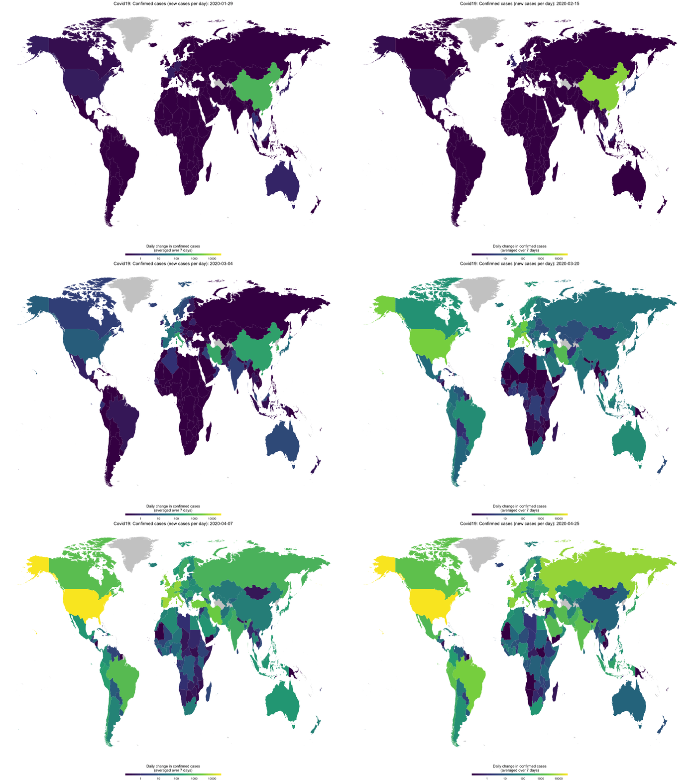
map_covid19(merged, type = "confirmed", region = "Europe")If you have enough time (takes several minutes), you can also create an animation to visualize the spread of the virus over time.
map_covid19(merged, type = "confirmed", dates = unique(merged$date))Again, you can customize the data that you want to plot and of course
you can also modify the plot itself by using normal ggplot syntax.
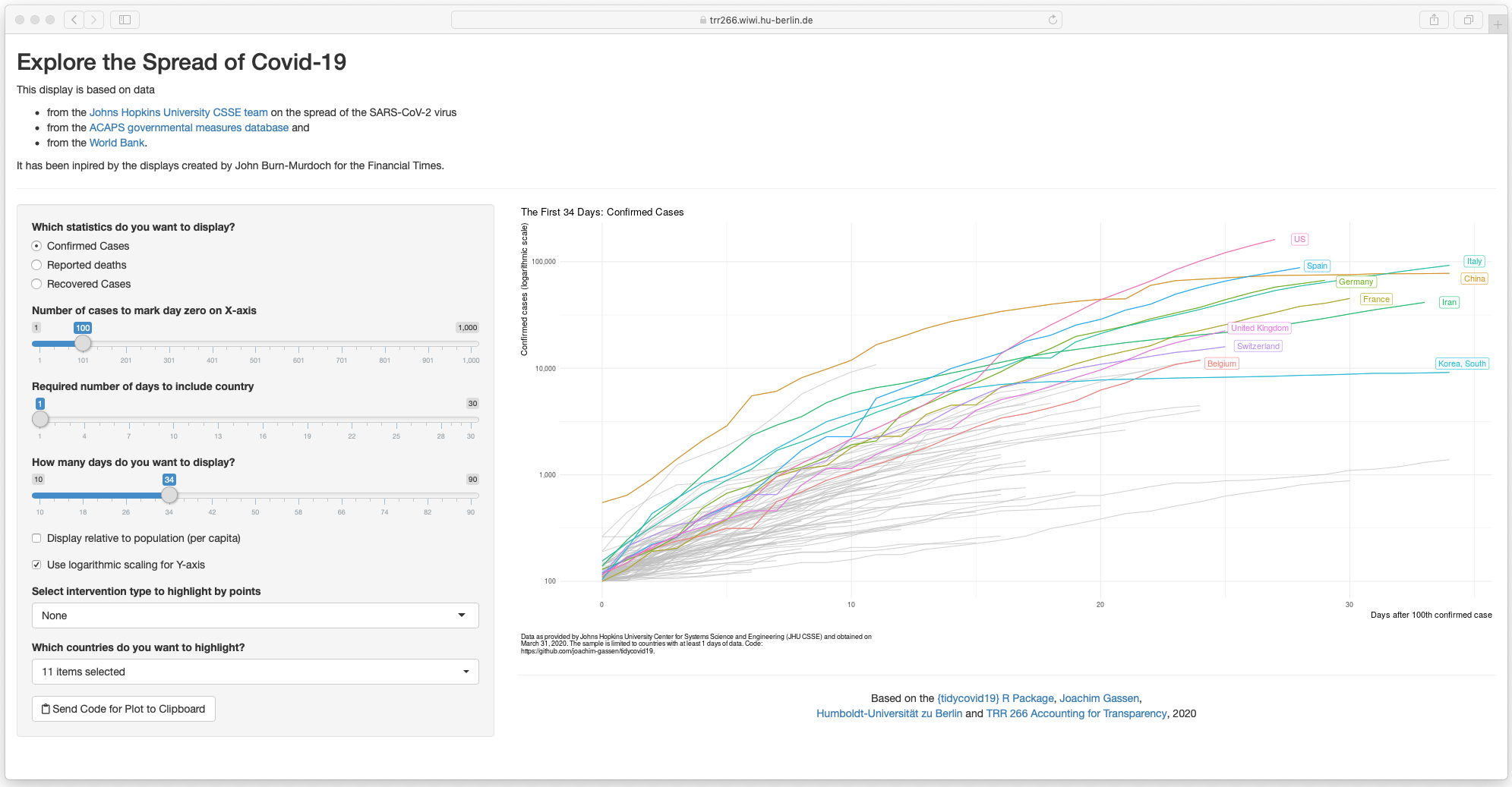
Sorry, I could not resist. The options of the plot_covid19_spread()
make the implementation of a shiny app a little bit to tempting to pass.
The command shiny_covid19_spread() starts the app. Click on the image
to be taken to the online app. You can use it to customize your
plot_covid19_spread() display as it allows copying the plot generating
code to the clipboard, thanks to the fine
{rclipboard} package. You can
now also customize the app by providing plot_covid19_spread() options
as a list to the plot_options parameter.
As the shinyapps.io server has had some issues with exhausting connections, you can also use this alternative server.
-
A blog post on the PDF scraping of the new Google Covid-19 Community Movement Reports.
-
A blog post comparing the ACAPS and Oxford data on governmental interventions.
-
An intro blog post containing not much more information then this README.
-
An older blog post that showcases some descriptive visuals to see what one can do with the data retrieved by this package.


